TYPE DESIGN INFORMATION PAGE last updated on Fri May 1 17:33:14 EDT 2026
FONT RECOGNITION VIA FONT MOOSE
|
|
|
|
Klavika
Eric Olson's sans family Klavika (2004) has many followers. Yves Peters writes: Klavika is a versatile workhorse typeface. Despite its clean design, it manages to retain a certain warmth and openness. The roman sports a lovely lowercase a, a cute little alternate ampersand, and one of the most beautiful lowercase g's I have seen in this type of design. The fact that it is released as fat OpenType is just icing on the cake and gives the competition a serious run for its money. Eric Olson explains: I was a little reluctant about the typeface for several months and even shelved it completely at one point. Anytime you apply some amount of simple geometry (in this case, straight sides) to a typeface the chances for stylistic overlap become great. Faces like DIN, Sophisto, Bell Gothic etc. have straight sides so the push to differentiate from them was tough. In the end I just forgot about it and tried to make an open, solid and logical typeface. Hopefully something flexible and rugged. Similar typefaces, as listed by Stephen Coles: |
EXTERNAL LINKS |
| | |

file name: Dave Farey Monotype Zemestro 2003
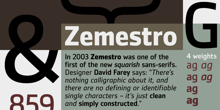
file name: Dave Farey Monotype Zemestro 2003b

file name: Dave Farey Monotype Zemestro Bold 2003
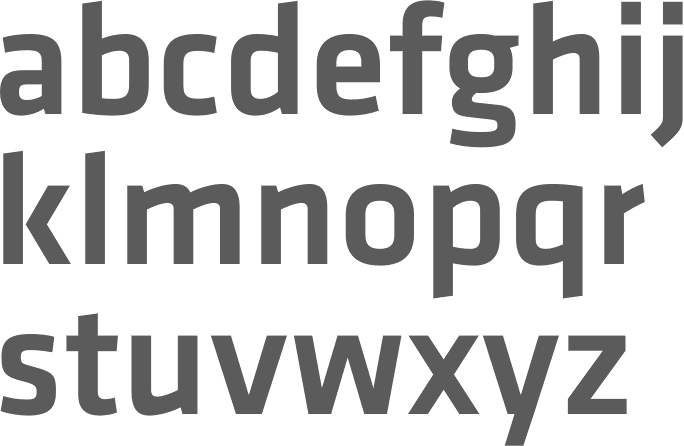
file name: Eric Olson Klavika Medium 2004
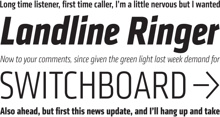
file name: Process Type Foundry Klavika Condensed
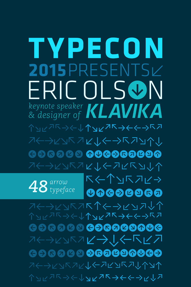
file name: Mary Stratton Michele Wong Kung Fong Eric Olson Klavika Poster 2012

file name: Eric Olson Klavika Display 2012
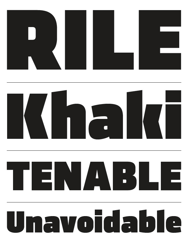
file name: Eric Olson Klavika Display 2012b
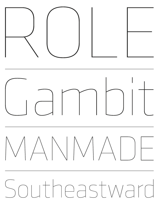
file name: Eric Olson Klavika Display 2012c

file name: Eric Olson Klavika
| | |
|
Luc Devroye ⦿ School of Computer Science ⦿ McGill University Montreal, Canada H3A 2K6 ⦿ lucdevroye@gmail.com ⦿ https://luc.devroye.org ⦿ https://luc.devroye.org/fonts.html |
