TYPE DESIGN INFORMATION PAGE last updated on Thu Apr 16 22:04:39 EDT 2026
FONT RECOGNITION VIA FONT MOOSE
|
|
|
|
Linotype 1 Microsoft 0
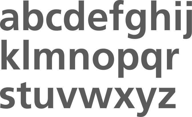
In January 2004, Microsoft tried to register its new font, Segoe, as a "registered community design" in the European Union's Designs Department. Typophiles had already reacted with astonishment to Segoe, as it looked so much like Frutiger Next. In February 2004, Linotype, which markets Frutiger Next, reacted and asked the "Invalidity Division" to recognize Frutiger Next as a prior design, and to invalidate the registration of Segoe. In February 2006, the "Invalidity Division" agreed with Linotype and declared the registration of Segoe invalid (in the EU, with implications for other markets I guess, but I am not a lawyer). The champaign is flowing chez Frutiger, and I can hear the cowbells all the way in Canada. A quote from the decision: As rightfully observed by the Applicant [Linotype] and uncontested by the Holder [Microsoft], the prior design [Frutiger Next] and the RCD [Segoe] are to be considered identical. The typefaces of both designs have the same stroke thickness. The ratio from cap-height to descender height is equal. The proportion of character height to character pitch is identical. The type typeface in the specimen text does not show any differences. The minuscule "a", "c", "e" "g" and "t" have the same proportion in the prior design [Frutiger Next] and the RCD [Segoe]. The height of the crossbeam at the "e" is identical. The height of the bow at the "a" is identical. The "c" shows the same shape and the same loophole. The lowercase "s" and the capital "S" show the same sweep. The capital "G" and "S" are totally identical in both designs. The numeric characters "3", "5", "6" and "9" do not show any difference. |
EXTERNAL LINKS |
| | |

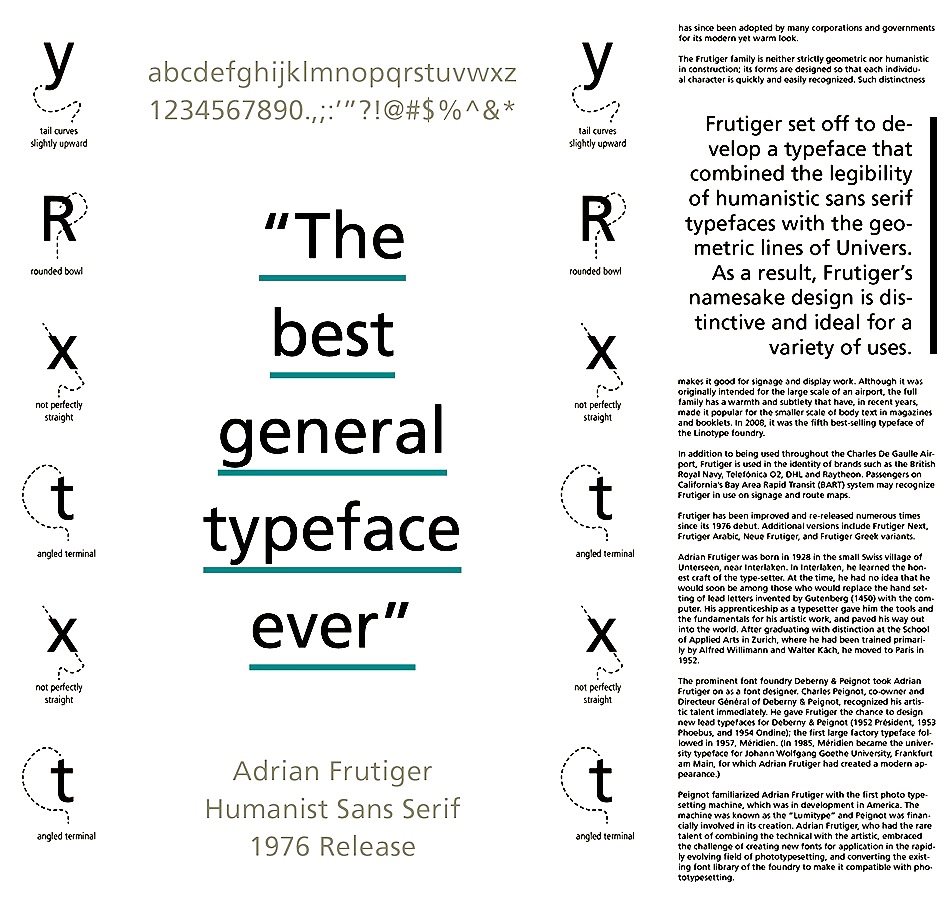
file name: Adrian Frutiger Frutiger 1976 Poster by Grace Heitmann 2015

file name: Adrian Frutiger Frutiger 1976 Poster by Ilenia Guardigli 2016

file name: Adrian Frutiger Frutiger Bold Adobe 1976

file name: Steve Matteson Segoe T V 1997 2004
| | |
|
Luc Devroye ⦿ School of Computer Science ⦿ McGill University Montreal, Canada H3A 2K6 ⦿ lucdevroye@gmail.com ⦿ https://luc.devroye.org ⦿ https://luc.devroye.org/fonts.html |
