|
The Monotype--Ascender business plan
[Bill Troop]

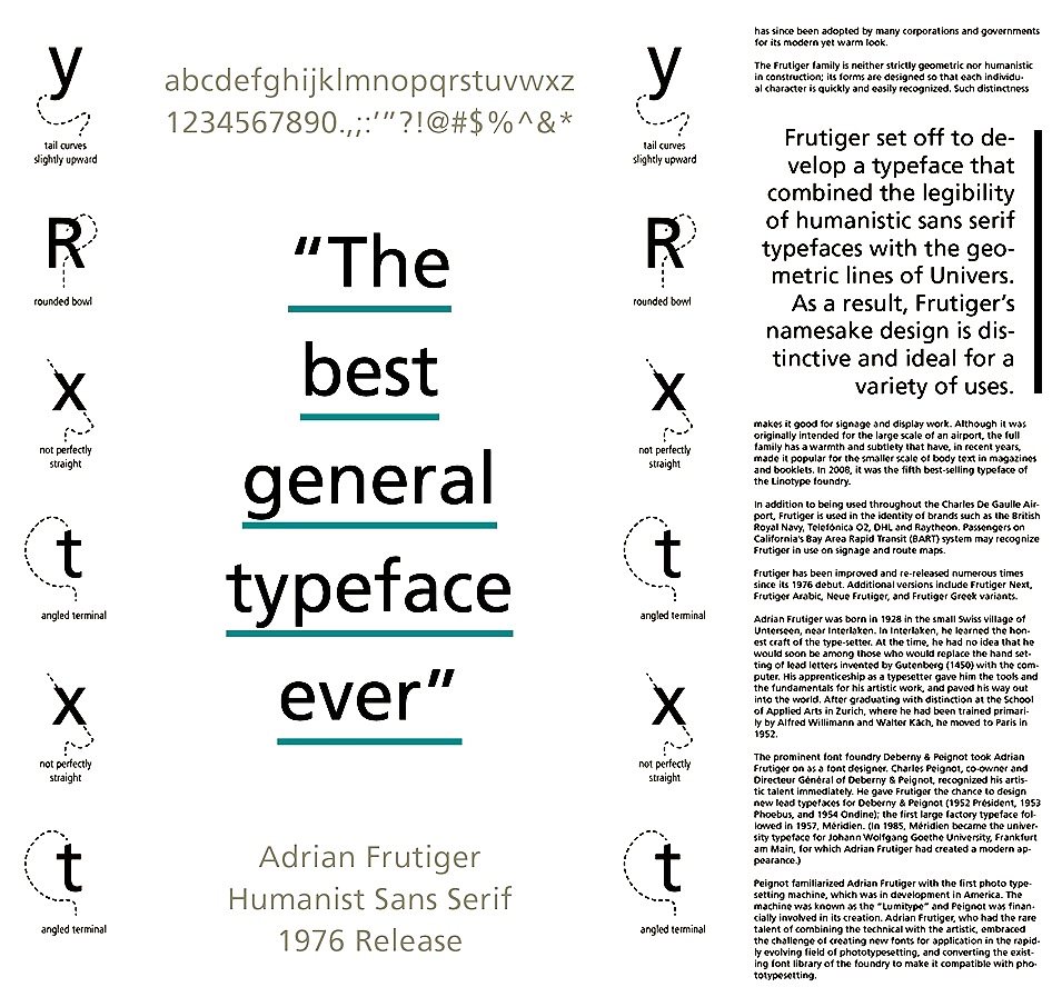
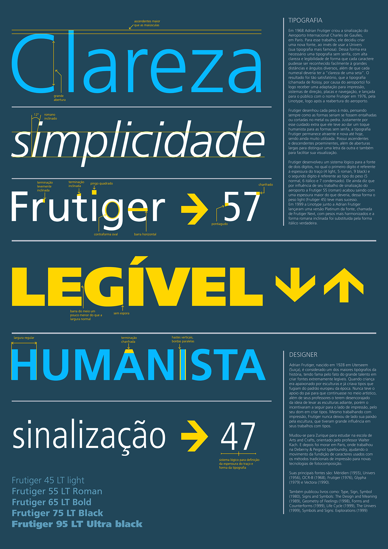
Bill Troop analyzes Monotype's corporate strategy, after the latest episode in which Linotype's Frutiger Next was cloned by Microsoft/Ascender as Segoe. I quote passages: As I understand it, this font [Segoe] was already in Monotype's library of Frutiger clones (which also include Univers, used by HP, as well as Linotype clones designed by others). Part of Monotype's business model, apparently, is selling Linotype clones. I believe I am not mistaken in asserting that Segoe was available as a Frutiger clone before Microsoft came a-knocking? Am I not also right in assuming that Monotype marketed Segoe as a direct copy? Am I not further right in assuming that Microsoft asked for a few trivial changes to be made?
One must also consider the substantial body of intellectual property law that has been evolving on derivative works over the past two decades. If a work can be shown to be derivative, then it is infringing. From this point of view, Myriad [note: Myriad is Adobe's Frutiger semi-lookalike] would, we may suppose, be found infringing. In the base weight, there are a few characters that are different from Frutiger, and the differences are slight, though real. It is clearly a highly derivative work, unusually so, even for type.
But as regards intent, Myriad is in a different category from Segoe altogether. Developed over a three year period, it was not commissioned to resemble Frutiger, was not intended to be Frutiger, did not start off as Frutiger. It only became Frutiger towards the end of a long, painful developement process when Robert discovered that he simply could not come up with a good design of his own. The sans serif is not his metier, and nor, for that matter, is originality. These are not the qualities which make him an interesting and a good designer.
In the case of Segoe, it is obvious that the font was created either by directly appropriating and manipulating the digital data with the intent of disguising not the design but the origination of the data points, or it was created by tracing over the outlines with the intention of matching them exactly but creating new data points. Whichever it was (and I think Linotype's analysis favours the former technique), it is a very different process from the painful journey that Adobe underwent.
Monotype intended to make a literal copy of Frutiger from the start, and they succeeded. Adobe intended to create an entirely original typeface but one that was nevertheless generic in style. That was John Warnock's simple brief for Myriad: create a generic sans serif.
It only became Frutiger after a very long process in which the designer discovered that he couldn't do it to his satisfaction. One must give him credit for recognizing that, and for spending some years working towards that recognition.
The story of Myriad is an almost heroic, almost tragic narrative of a designers discovery that he cannot do what he was commissioned to do. That is something we can all sympathize with. And we can learn from it.
We can also appreciate the many things that Slimbach (and to a much lesser extent Twombley) did to make Frutiger more flexible and useful. It is worth noting, too, that they probably would not have been permitted to do this had Adobe from the start licensed Frutiger for MM development. How they could have achieved this in an entirely ethical, above board fashion is not readily apparent to me. But again, as regards intent, they did not start off with Frutiger in mind, even if they ended, three years later, with Frutiger very much in mind.
The story of Segoe, by contrast, is one of pure pilfery from the very start. Segoe, after all, is only one of the Frutiger clones in Monotype/Ascender's portfolio. There is also the Univers clone, for example, an exact duplicate of that font, which they sold to Hewlett-Packard. And there are others.
In other words, we may have to bring ourselves to accept that Segoe is not a unique case. A substantial part of Monotype's business for well over a decade has been the offering of precise Linotype clones to companies who don't wish to pay Linotype's fees.
The root of the problem isn't Segoe. The root of the problem is Monotype's business plan. The Univers/HP clone was only used for branding. It didn't gain mindshare. Only when Monotype's thefts (I will revert to my own preferred word here) became widely apparent on the public stage (which only happened in the case of Palatino/Book Antiqua and Frutiger/Segoe) did ethical and legal questions come to occupy our interest.
Let us even go a little further: had Monotype not stood up at ATypI and presented Book Antiqua as an entirely original design in type history to a distinguished audience which included Hermann Zapf, and had Microsoft not, again, quite publicly presented Segoe as an original design to be considered as such by historians, and had Microsoft furhter not attempted to register the design as legal, we would not be discussing the matter today.
In both these cases, the crime of fraud was quite openly practised. It is this which accounts for our ire.
|
EXTERNAL LINKS
The Monotype--Ascender business plan
MyFonts search
Monotype search
Fontspring search
Google search
INTERNAL LINKS
David and Goliath ⦿
|


