TYPE DESIGN INFORMATION PAGE last updated on Fri May 1 17:33:36 EDT 2026
FONT RECOGNITION VIA FONT MOOSE
|
|
|
|
Dino Sanchez
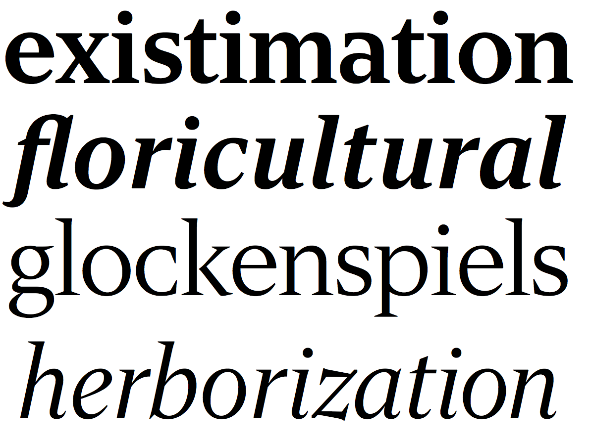
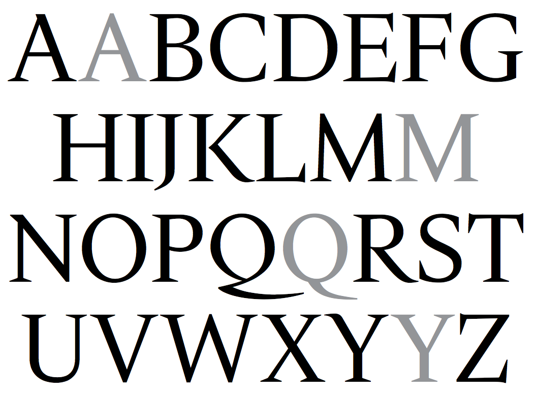
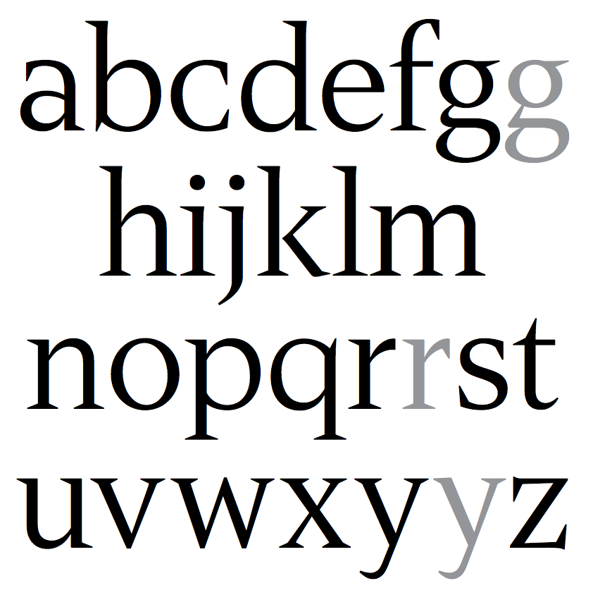
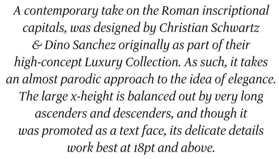
Chicago-based industrial designer who cofounded Orange Italic in 2000 with Christian Schwartz. Together, they have collaborated on logos, illustrations, and typefaces. The six-weight Luxury family (2006, House Industries; but as early as 2002 at Orange Italic) contains three serif text weights called Luxury Text, as well as three display typefaces, called Platinum (art deco), Gold, and Diamond (all caps with triangular serifs). They were designed by Christian Schwartz and Dino Sanchez. In 2014, Christian Schwartz and Dino Sanchez co-designed the roman inscriptional typeface Gravitas. The name was already in use by Riccardo de Franceschi (since 2011), Laura Eames (since 2013) and Keith Tricker (since earlier in 2014), so there may be some emails flowing between these type designers. They write: The primary inspiration for Gravitas was Augustea Nova, Aldo Novarese's quirky and spiky Latin interpretation of the Roman inscriptional caps for the Nebiolo Type Foundry, released in a single weight in the 1950s. It's fairly common to see Augustea Open these days, but his lowercase apparently didn't survive the transition to phototype. Many designers have tackled the problem of matching a lowercase to the classical Roman capitals, with decidedly mixed results. The Bold Italic was drawn by Jesse Vega. |
EXTERNAL LINKS |
| | |

file name: Christian Schwartz Dino Sanchez Gravitas 2014

file name: Christian Schwartz Dino Sanchez Gravitas 2014a

file name: Christian Schwartz Dino Sanchez Gravitas 2014b

file name: Christian Schwartz Dino Sanchez Gravitas 2014e

file name: Christian Schwartz Dino Sanchez Gravitas 2014vb
| | |
|
Luc Devroye ⦿ School of Computer Science ⦿ McGill University Montreal, Canada H3A 2K6 ⦿ lucdevroye@gmail.com ⦿ https://luc.devroye.org ⦿ https://luc.devroye.org/fonts.html |

