TYPE DESIGN INFORMATION PAGE last updated on Wed May 6 16:15:15 EDT 2026
FONT RECOGNITION VIA FONT MOOSE
|
|
|
|
Letterlabor
[Kai Bernau]
Kai Bernau (Letterlabor) is a German type designer (b. 1978) who studied graphic design at the University of Applied Sciences Schwäbisch Gmünd. He created "The neutral typeface" (2005), a sans family, as his thesis project at the KABK in Den Haag. The typeface was born as a mathematical average of ten sans typefaces: AG Buch, Neue Helvetica, Univers, Grotesque, Franklin Gothic, Frutiger, Trade Gothic, Documenta Sans, The Sans and Syntax. He graduated there in 2006 with a masters degree. Together with his wife Susana Carvalho, they formed Atelier Carvalho Bernau, a practice that designs printed matter (mainly books), bespoke and retail typefaces, and identity programs. At Commercial Type, he published Lyon Text and Lyon Display in 2009, described by Commercial Type as follows: Begun as Kai Bernau's degree project on the Type + Media course at the Royal Academy of Art (KABK) in The Hague, Bernau extensively revised the typeface in time for its debut in the New York Times Magazine in 2009. Like many of the great seriffed typefaces it draws intelligently from the work of Robert Granjon, the master of the Renaissance, while having a contemporary feel. Its elegant looks, are matched with an intelligent, anonymous nature, making it excellent for magazines, book and newspapers. The Atelier also has other typefaces on its site, all done between 2007 and 2010, such as Neutraface Slab (for House Industries), Atlas Grotesk (2012, by Kai Bernau, Susan Carvalho and Christian Schwartz, Commercial Type: a revival of Dick Dooijes's Mercator), Neutral (an outgrowth of Kai's thesis work), PDU (a French stencil revival project), and some custom typefaces such as Proprio. |
EXTERNAL LINKS |
| | |

file name: Kai Bernau Susan Carvalho Christian Schwartz Atlas Grotesk 2012
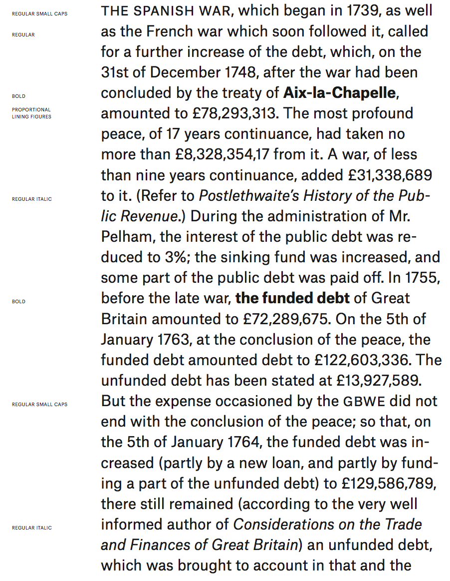
file name: Kai Bernau Susan Carvalho Christian Schwartz Atlas Grotesk 2012b

file name: Kai Bernau Susan Carvalho Christian Schwartz Atlas Grotesk 2012c

file name: Kai Bernau Susan Carvalho Christian Schwartz Atlas Grotesk 2012d

file name: Susana Carvalho Kai Bernau Ilya Ruderman Atlas Grotesk Atlas Typewriter 2012 2020

file name: Susana Carvalho Kai Bernau Ilya Ruderman Atlas Grotesk Atlas Typewriter 2012 2020

file name: Susana Carvalho Kai Bernau Ilya Ruderman Atlas Grotesk Atlas Typewriter 2012 2020

file name: Susana Carvalho Kai Bernau Ilya Ruderman Atlas Grotesk Atlas Typewriter 2012 2020

file name: Kai Bernau Neutral 2005 2009

file name: Kai Bernau Neutral 2005 2009b

file name: Kai Bernau Neutral 2005 2009c

file name: Atelier Carvalho Bernau Lyon Display 2010

file name: Atelier Carvalho Bernau Lyon Display 2010d

file name: Atelier Carvalho Bernau Lyon Text 2010

file name: Atelier Carvalho Bernau Lyon Text 2010d
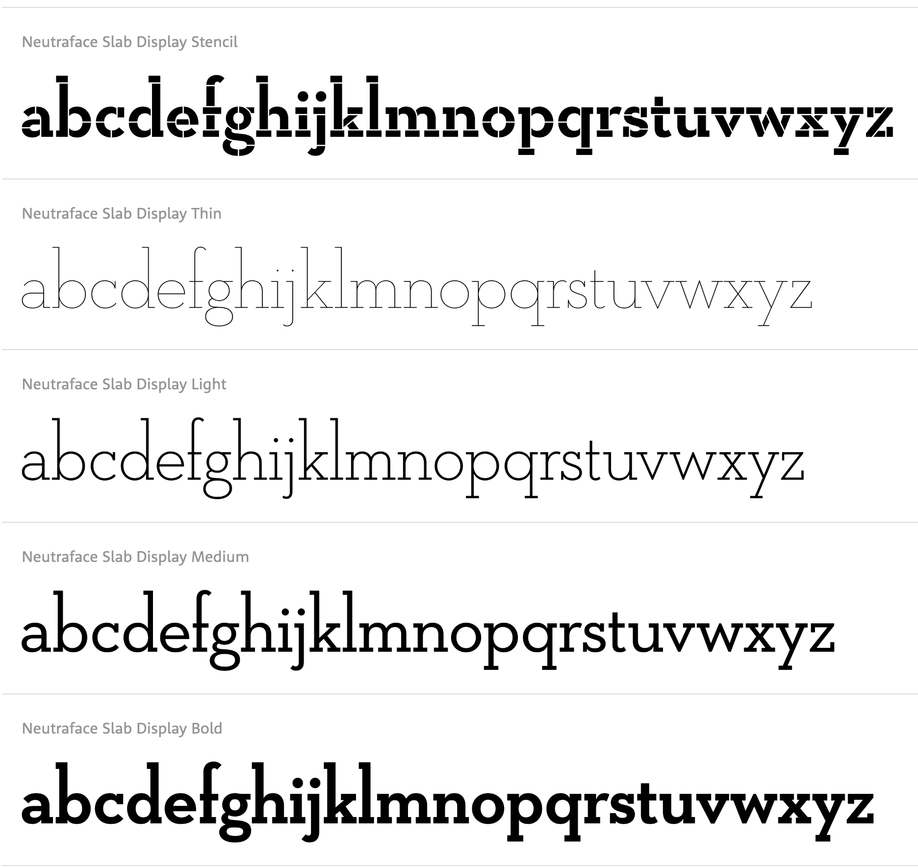
file name: House Industries Neutraface Slab Display 2021
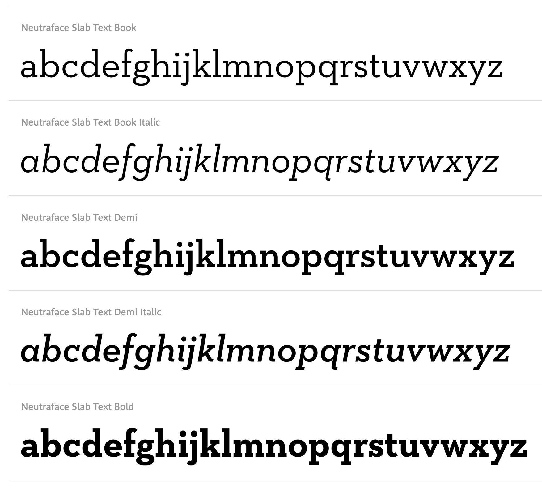
file name: House Industries Neutraface Slab Text 2021
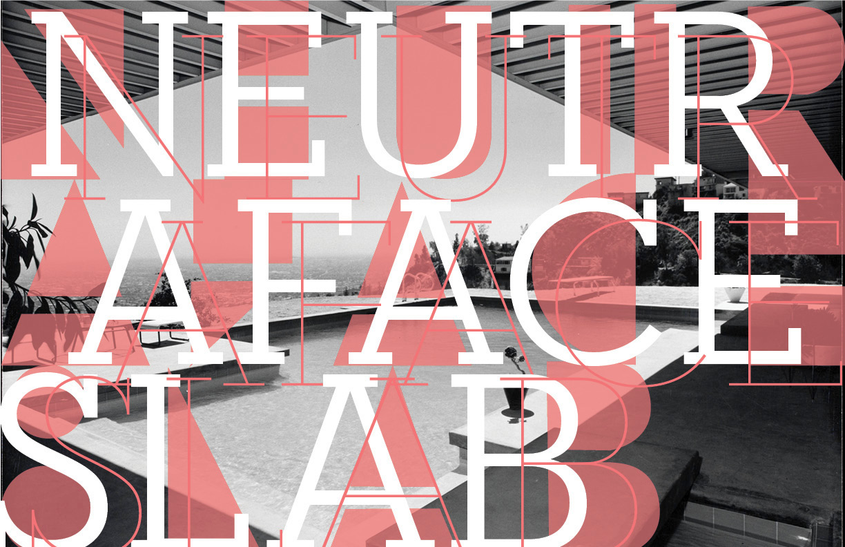
file name: Atelier Carvalho Bernau Neutraface Slab 2010 Poster by Emily Ruskey 2016
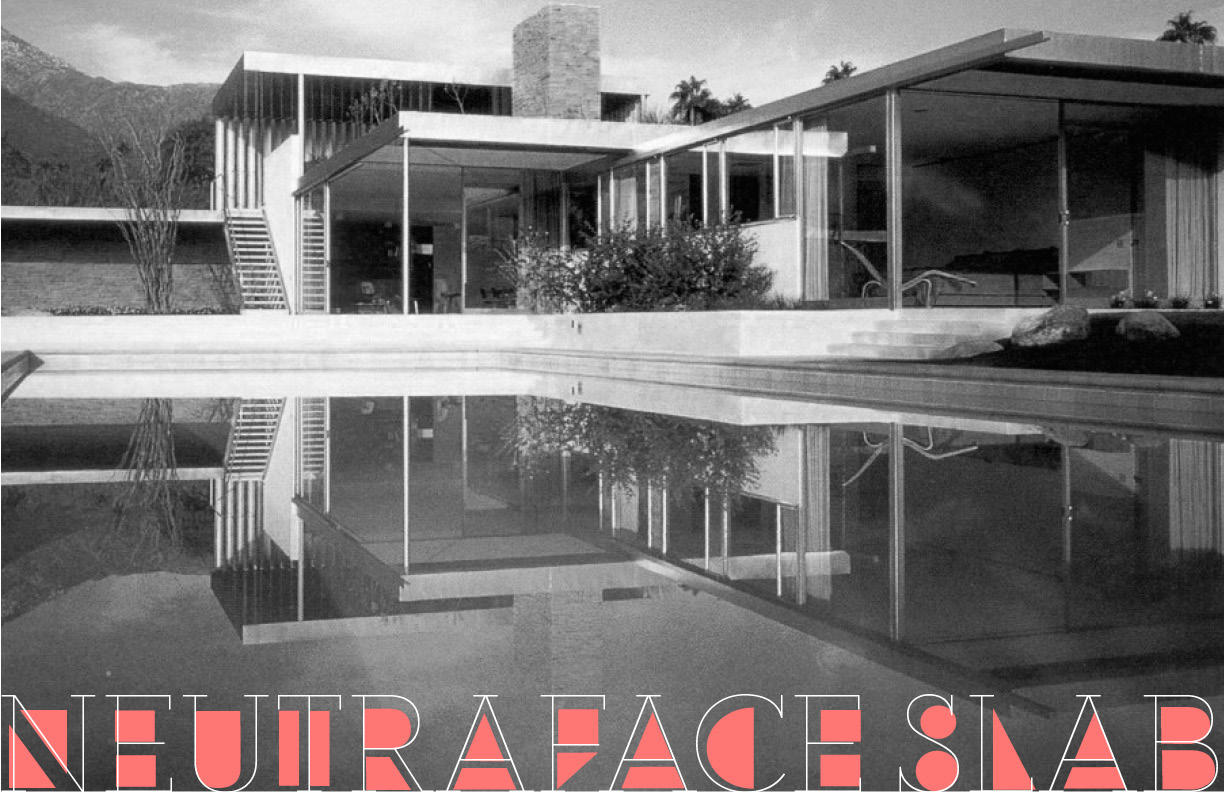
file name: Atelier Carvalho Bernau Neutraface Slab 2010 Poster by Emily Ruskey 2016b
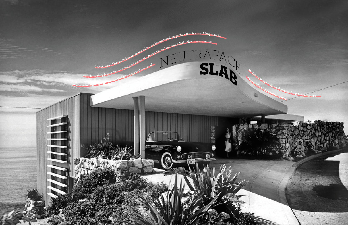
file name: Atelier Carvalho Bernau Neutraface Slab 2010 Poster by Emily Ruskey 2016c
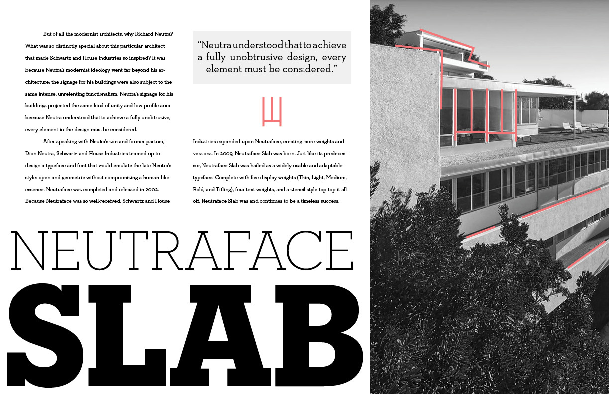
file name: Atelier Carvalho Bernau Neutraface Slab 2010 Poster by Emily Ruskey 2016d

file name: Atelier Carvalho Bernau Neutraface Slab 2010

file name: Atelier Carvalho Bernau Neutraface Slab 2010b

file name: Atelier Carvalho Bernau Proprio 2009
| | |
|
Luc Devroye ⦿ School of Computer Science ⦿ McGill University Montreal, Canada H3A 2K6 ⦿ lucdevroye@gmail.com ⦿ https://luc.devroye.org ⦿ https://luc.devroye.org/fonts.html |
