TYPE DESIGN INFORMATION PAGE last updated on Mon Jun 8 18:03:54 EDT 2026
FONT RECOGNITION VIA FONT MOOSE

|
|
|
|
Before & After
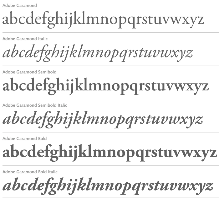
Great recommendations on how to choose a typeface for text at Before&After magazine: Character widths should be similar. For example, Futura or Avant Garde are bad. Medium height-to-width ratio, so no compressed types. Medium x-height. Small variations in stroke weight: out with the didones. No mirrors. Pick typefaces in which letters are sufficiently different. Avoid large counters. Avoid quirkiness. Their favorite text typefaces: Adobe Caslon (11/12.75pt), Adobe Garamond (11.5/12.75pt), ITC Stone Serif (9.5/12.75pt), Janson Text 55 Roman (10.5/12.75pt, Linotype). PDF file. |
EXTERNAL LINKS |
| | |


file name: Adobe Caslon Pro

file name: Adobe Caslon a

file name: Adobe Caslon Pro Poster by Abilash Lobo

file name: Adobe Caslon Pro Poster by Abilash Lobo

file name: T D C2006 Robert Slimbach Garamond Premier Pro
file name: Adobe Garamond Pro
file name: Robert Slimbach Adobe Garamond Poster by Eva Antoinette 2015
file name: Robert Slimbach Adobe Garamond Poster by Eva Antoinette 2015b
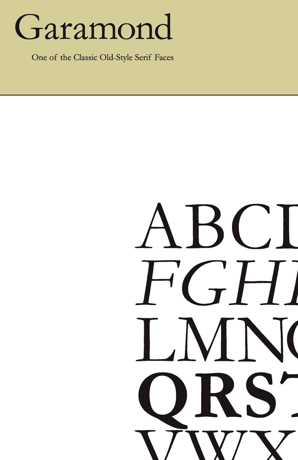
file name: Robert Slimbach Adobe Garamond 1989 2001 poster by Dayne Petera 2014
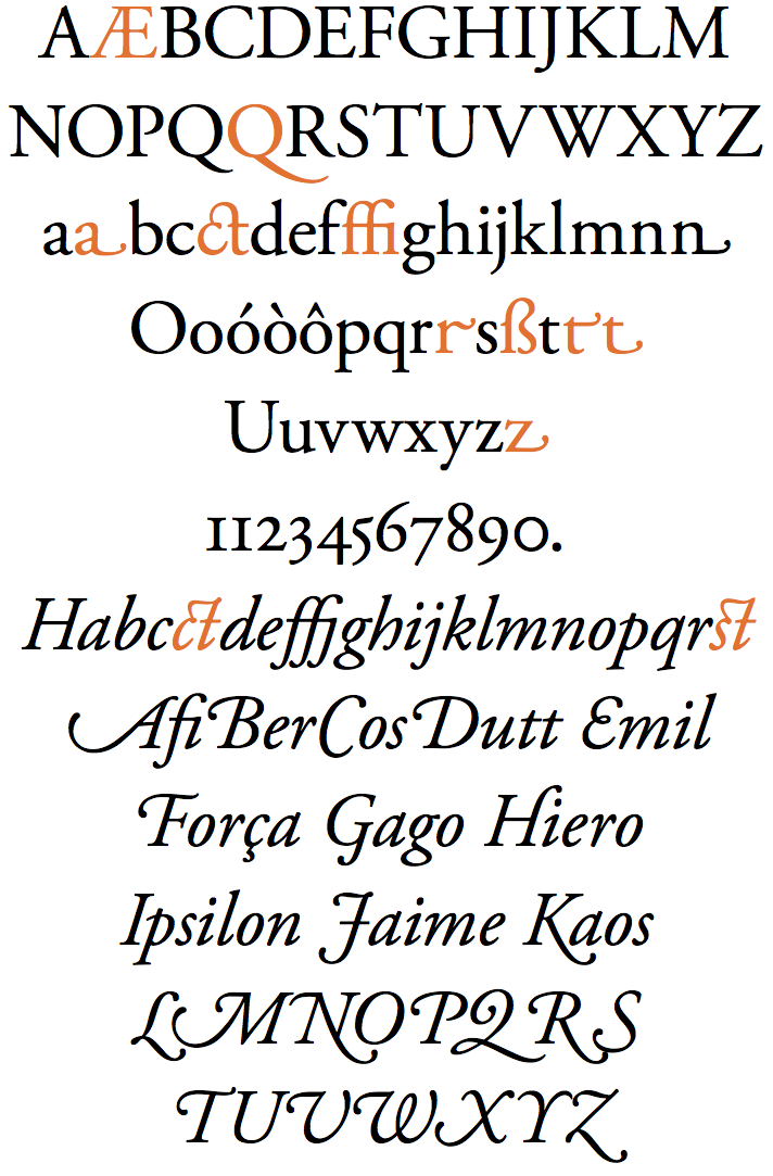
file name: Robert Slimbach Adobe Garamond 1989 2001

file name: Robert Slimbach Adobe Garamond 1989 2001b
file name: Robert Slimbach Adobe Garamond 1989 2001d

file name: Robert Slimbach Adobe Garamond Bold 1989 2001

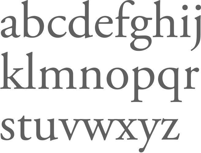
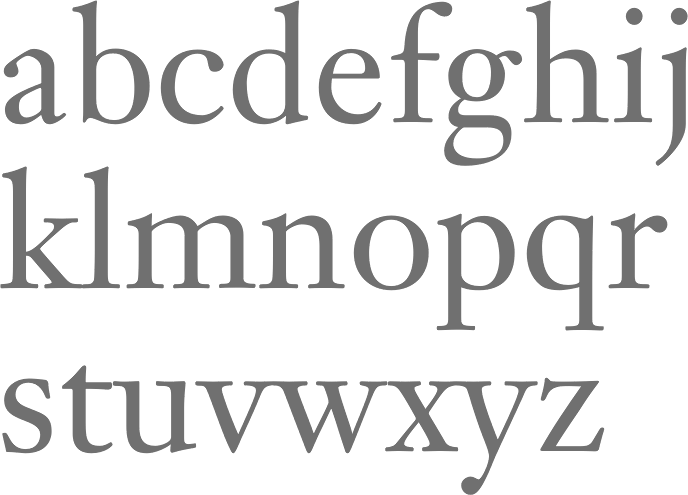
file name: Sumner Stone Stone Serif I T C
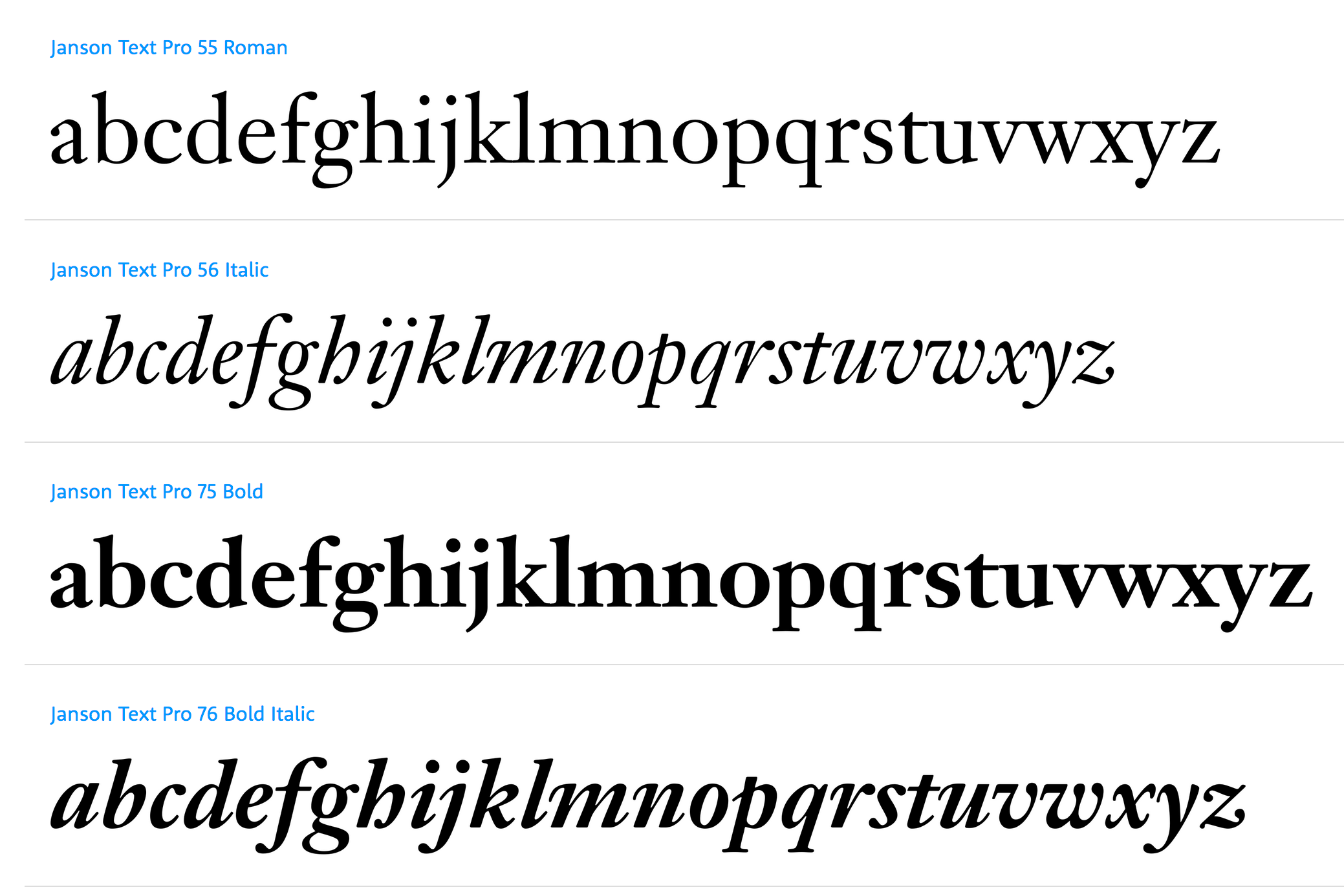
file name: Linotype Janson Text
file name: Linotype janson Text55 Roman 1985
| | |
|
Luc Devroye ⦿ School of Computer Science ⦿ McGill University Montreal, Canada H3A 2K6 ⦿ lucdevroye@gmail.com ⦿ https://luc.devroye.org ⦿ https://luc.devroye.org/fonts.html |