|
Sans serif favorites

The typophiles list their favorite typefaces in May 2007. Here is their list, with some comments (not mine). - Bryant Pro: Nice contemporary friendly face. Very clean on and off screen.
- Galaxy Polaris: Great workhorse for the studio, but a little limited. Basically our Helvetica. I just wish it had a small caps and ideally an extra light weight. If that font ever had a condensed weight then it would be a perfect typeface.
- Stratum: Good ultra modern font, that straddles a nice line between ultra-tech but not overly so.
- Klavika: Nice modern squarish sans.
- Legato: Good for both text and larger use, very large family. Suggested by several typophiles.
- Fedra Sans: Especially nice when combined with Fedra Serif.
- Locator: No special reason.
- Engel: More friendly then Klavika.
- Sansa (+ Soft): Just pure genius, imo.
- Fresco Sans: Works well for body text (and then theres the serif that goes with it.)
- Quadraat Sans: Same as Fresco Sans.
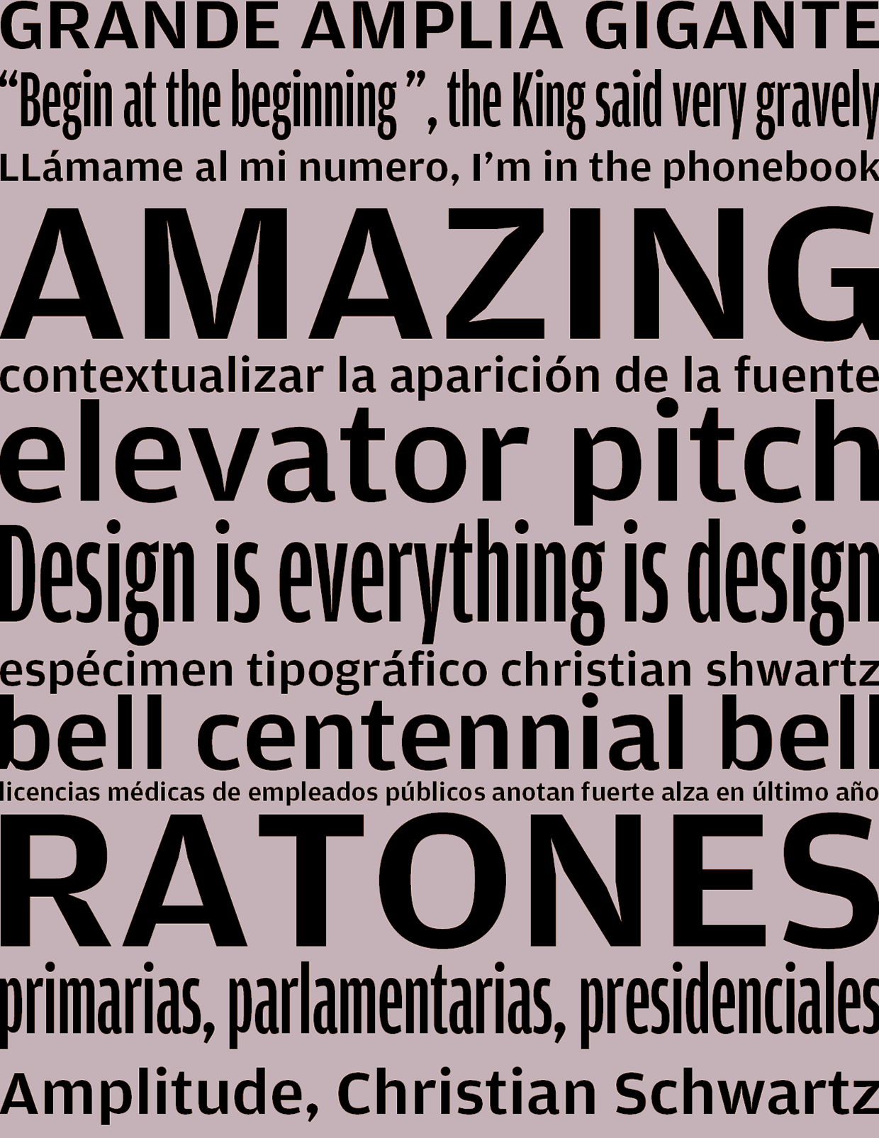
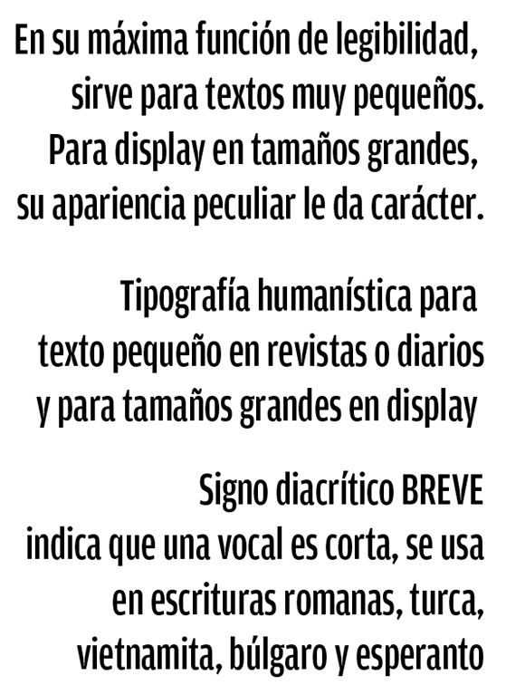
- Amplitude by Christian Schwartz: After three years, its still my favorite workhorse. Amplitude looks right in almost any setting clean and readable at text sizes, vibrant and powerful in headlines. With an inktrapless version and italics on the way, soon youll be able to use Amplitude for anything.
- FF Strada and FF Strada Condensed by Albert Pinggera: Its warm curves can make it friendly if it needs to be, but you can use it to set serious text too. Wonderfully readable at small sizes, unique detail when large. One of few contemporary typefaces drawn by an Italian.
- Maquette by Angus Shamal: A new large x-heighted alternative in the grotesque style of Gotham and Proxima Nova.
- Apex New from Village: I second Apex New. Forget the original Apex. This is how it should be.
- Hypatia from Adobe: Nearly nothing gives the flavor and poise of this new/old fashioned design.
- Chianti from Bitstream: Has very pleasing modeling, almost a woodcut or handcut punch look. Lots of flavor and some unusual swash and ligature forms, along with small caps etc.
- Sebastian by Storm: Very unusual, modeled like Chianti but more baroque.
- Suite by Inigo Jerez Quintana. Needs to be seen and used more. For that matter all his types are interesting, and there are several sans at the textasis site.
- National Grotesque and Karbon by Kris Sowersby: I guess I like my sans with a bit of flavor.
- John Sans and Juvenis by Storm.
- Maple by Eric Olson: I wish it had small caps. I especially like the bolder weight.
- Lisboa by Fountain: I like my sans with a dash of Tabasco sauce.
|
EXTERNAL LINKS
Sans serif favorites
MyFonts search
Monotype search
Fontspring search
Google search
INTERNAL LINKS
Choice of fonts ⦿
|


