TYPE DESIGN INFORMATION PAGE last updated on Mon Jul 13 21:24:28 EDT 2026
FONT RECOGNITION VIA FONT MOOSE

|
|
|
|
Autobahn
[Maarten Dullemeijer]
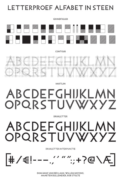
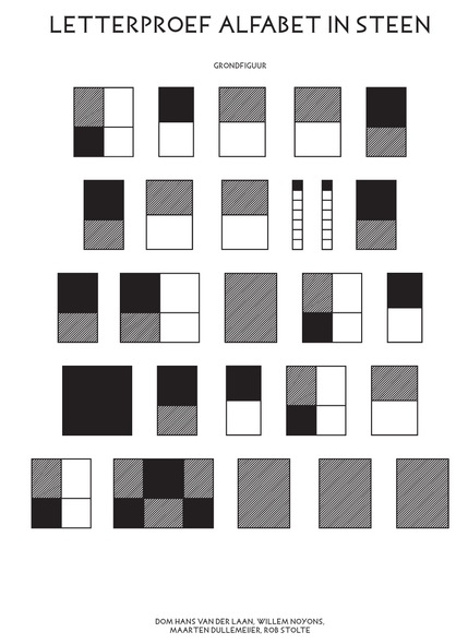
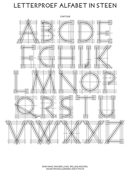
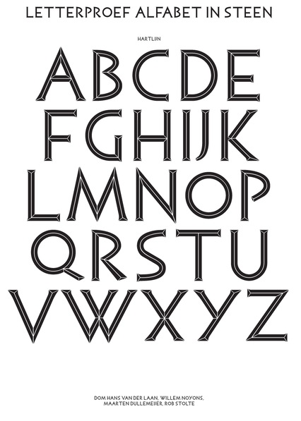
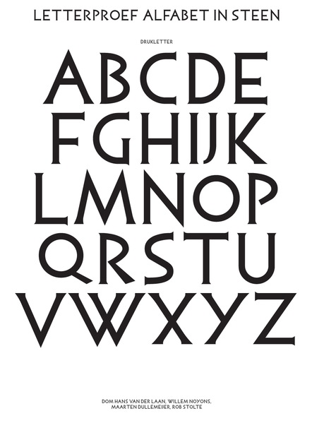
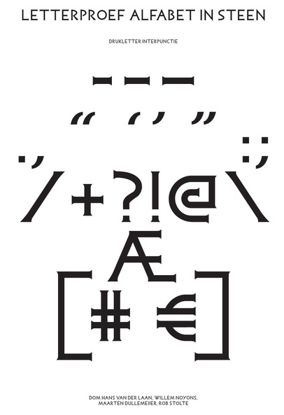
Dutch company run by Jeroen Breen, Maarten Dullemeijer and Rob Stolte, who all graduated from Utrecht School of the Arts (HKU). Autobahn designs special graphical projects, often with an illustrative and typographical angle. They offered these free fonts made with tomato paste, toothpaste and other things: Autobahn-Gelvetica, Autobahn-Heldentica, Autobahn-Tomatica (2008). Autobahn Grafisch Ontwerp is based in Utrecht, The Netherlands. The designers are Jeroen Breen (b. 1981), Maarten Dullemeijer (b. 1982) and Rob Stolte (b. 1981). Their house fonts are Air Light (techno) and LEF. In 2010, they produced the exquisite typeface Petronius, which is based upon a typeface designed by surrealist Joop H. Moesman (1909-1988). The Alphabet in stone typeface by Dom Hans van der Laan, a Dutch monk who lived from 1904 until 1991, was digitized in 2011, and the project can be seen here. Contributors include Willem Noyons, Maarten Dullemeijer and Rob Stolte. This typeface is based on the proportions found in Trajan. In 2017, they created the typeface Jakobus for the identity of 1N, an old church that was reshaped into living space by Zecc Architects. The typeface cmes close to Dutch deco. In a project called Hacking Habitat (2015), they combined Arial Black and Times into a hybrid typeface. |
EXTERNAL LINKS |
| | |

file name: Autobahn Jakobus 2017

file name: Autobahn Jakobus 2017b

file name: Autobahn Jakobus 2017c

file name: Autobahn Jakobus 2017d

file name: J H Moesman Petronius

file name: Rob Stolte Autobahn Petronius 2010 after J H Moesman
file name: Dom Hans Van Der Laan Alfabet In Stone 2011
file name: Dom Hans Van Der Laan Alfabet In Stone 2011b
file name: Dom Hans Van Der Laan Alfabet In Stone 2011c
file name: Dom Hans Van Der Laan Alfabet In Stone 2011d
file name: Dom Hans Van Der Laan Alfabet In Stone 2011e
file name: Dom Hans Van Der Laan Alfabet In Stone 2011f

file name: Autobahn Hacking Habitat 2015

file name: Autobahn Hacking Habitat 2015b

file name: Autobahn Hacking Habitat 2015c

file name: Autobahn Hacking Habitat 2015d

file name: Autobahn Hacking Habitat 2015e
| | |
|
Luc Devroye ⦿ School of Computer Science ⦿ McGill University Montreal, Canada H3A 2K6 ⦿ lucdevroye@gmail.com ⦿ https://luc.devroye.org ⦿ https://luc.devroye.org/fonts.html |