TYPE DESIGN INFORMATION PAGE last updated on Thu Apr 16 22:05:55 EDT 2026
FONT RECOGNITION VIA FONT MOOSE
|
|
|
|
DooType
[Eduilson Wessler Coán]
Curitiba-based Brazilian digital type foundry, est. in 2008 by the successful and talented type designer Eduilson Wessler Coan (b. 1983, Curutiba). Myfonts link. Coan joined Fabio Haag Type. Their fonts:
Klingspor link. Creative Market link. Behance link. MyFonts interview. |
EXTERNAL LINKS |
| | |

file name: Fabio Haag Type Seiva 2021

file name: Fabio Haag Type Seiva 2021

file name: Fabio Haag Type Seiva 2021

file name: Fabio Haag Type Seiva 2021

file name: Fabio Haag Type Seiva 2021

file name: Fabio Haag Type Seiva 2021

file name: Fabio Haag Type Seiva 2021
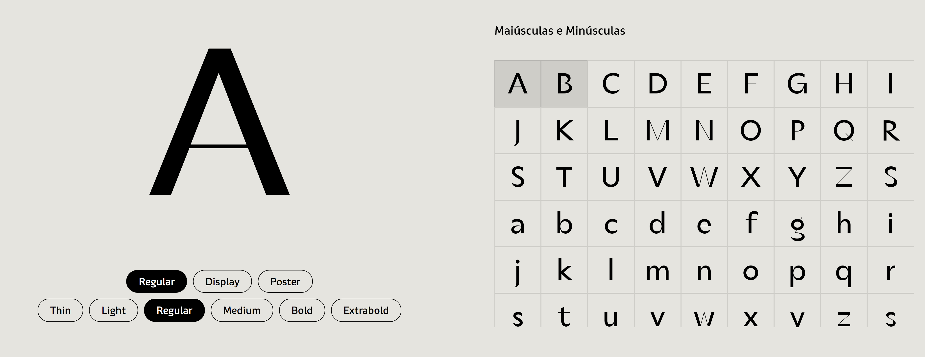
file name: Fabio Haag Type Seiva 2021

file name: Fabio Haag Type Seiva 2021

file name: Fabio Haag Type Seiva 2021

file name: Fabio Haag Type Seiva 2021

file name: Fabio Haag Type Seiva 2021
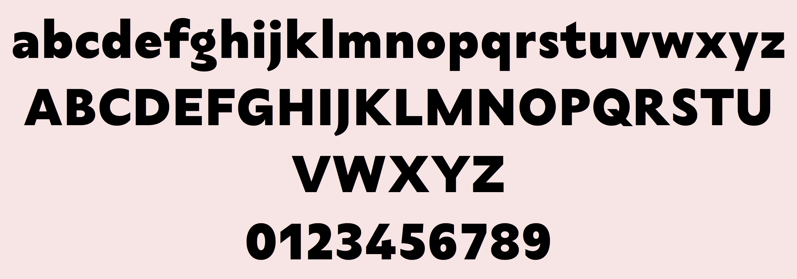
file name: Fabio Haag Type Seiva 2021

file name: Fabio Haag Type Seiva 2021
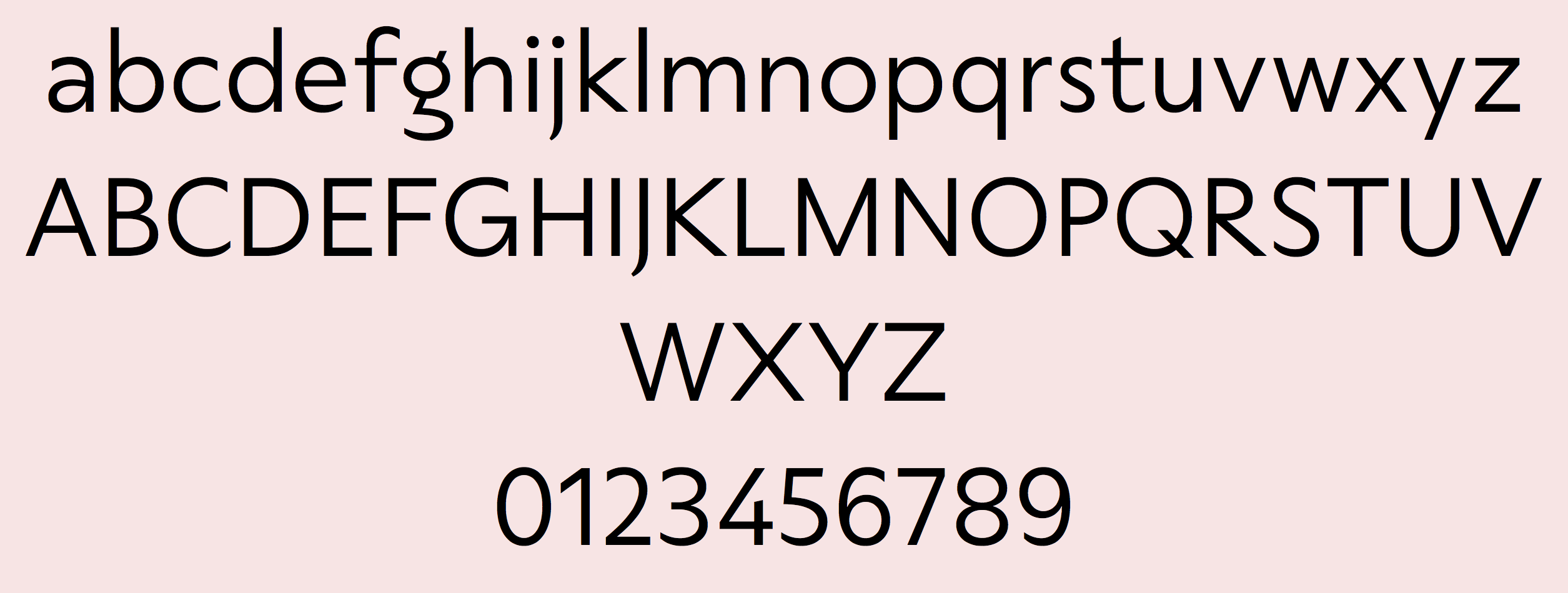
file name: Fabio Haag Type Seiva 2021
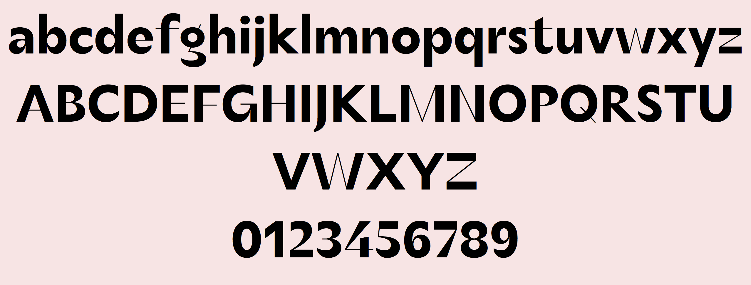
file name: Fabio Haag Type Seiva 2021
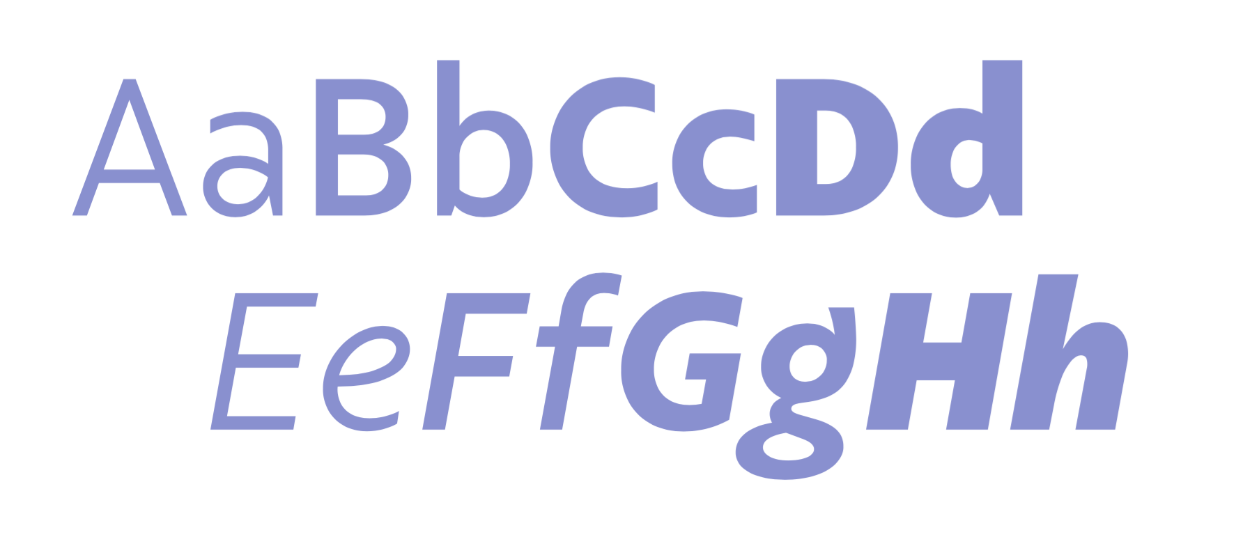
file name: Eduilson Coan Fabio Haag Type Salva 2021

file name: Eduilson Coan Fabio Haag Type Salva 2021

file name: Eduilson Coan Fabio Haag Type Salva 2021
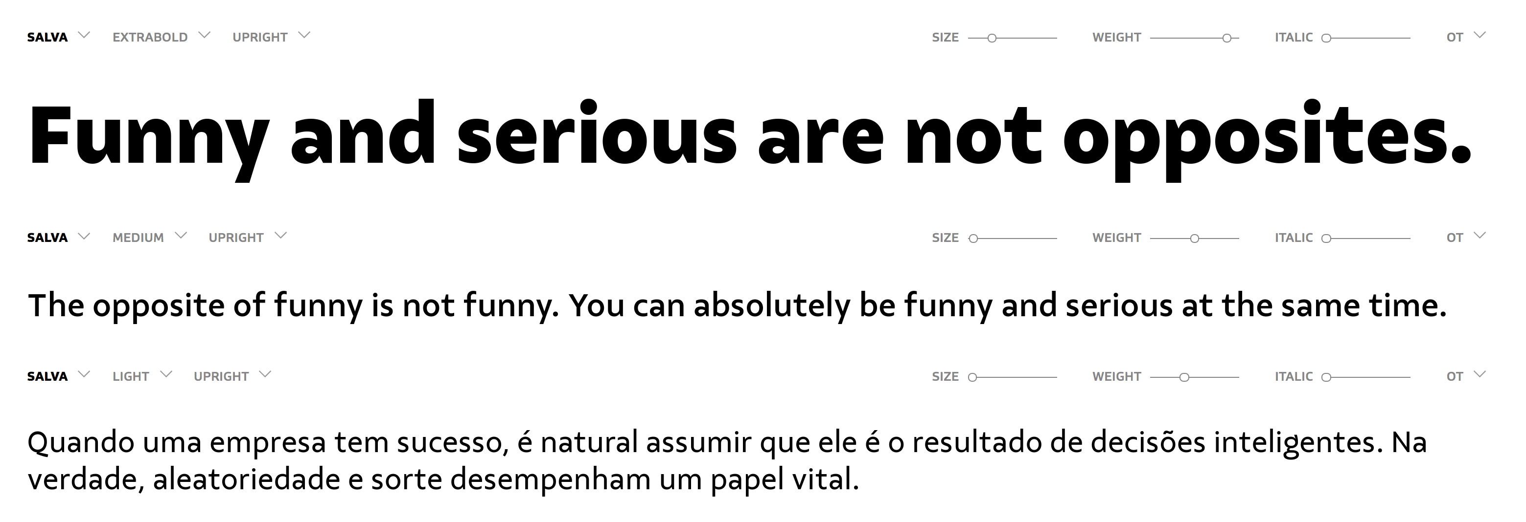
file name: Eduilson Coan Fabio Haag Type Salva 2021

file name: Eduilson Coan Fabio Haag Type Salva 2021

file name: Eduilson Coan Fabio Haag Type Salva 2021

file name: Eduilson Coan Fabio Haag Type Salva 2021

file name: doo Type d T Ampla 2018 262530

file name: doo Type d T Ampla 2018

file name: Eduilson Wessler Coan Gustavo Soares d T Jakob 2017 244460

file name: Eduilson Wessler Coan Gustavo Soares d T Jakob 2017 244464

file name: Eduilson Wessler Coan Gustavo Soares d T Jakob 2017 244465

file name: Eduilson Wessler Coan Gustavo Soares d T Jakob 2017 244466

file name: Eduilson Wessler Coan Gustavo Soares d T Jakob 2017 244467

file name: Eduilson Wessler Coan Gustavo Soares d T Jakob 2017 244468

file name: Eduilson Wessler Coan Gustavo Soares d T Jakob 2017

file name: Eduilson Wessler Coan Gustavo Soares d T Jakob 2017a

file name: Eduilson Wessler Coan Fluence Two 2012

file name: Eduilson Wessler Coan Fluence 2012

file name: Eduilson Wessler Coan Ninfa Serif 2012

file name: Eduilson Wessler Coan Ninfa Serif 2012b

file name: Eduilson Wessler Coan Ninfa Serif 2012d

file name: Eduilson Wessler Coan Ninfa

file name: Eduilson Wessler Coan Maestra Bold 2012

file name: Eduilson Wessler Coan Maestra 2012

file name: Eduilson Wessler Coan Maestra 2012b

file name: Eduilson Wessler Coan Maestra 2012c

file name: Eduilson Wessler Coan Maestra 2012d

file name: Eduilson Wessler Coan Maestra 2012e

file name: Eduilson Wessler Coan Maestra 2012f

file name: Eduilson Wessler Coan Delicatta 2017 251707

file name: Eduilson Wessler Coan Delicatta 2017 251708

file name: Eduilson Wessler Coan d T Delicatta 2017 251702

file name: Eduilson Wessler Coan d T Delicatta 2017 251703

file name: Eduilson Wessler Coan d T Delicatta 2017 251704

file name: Eduilson Wessler Coan d T Delicatta 2017 251709

file name: Eduilson Wessler Coan d T Delicatta 2017 251710

file name: Eduilson Wessler Coan d T Delicatta 2017

file name: Eduilson Wessler Coan Delicatta 2012

file name: Eduilson Wessler Coan Delicatta 2012b

file name: Eduilson Wessler Coan Delicatta 2012c

file name: Volnei Antonio Matte Eduilson Wessler Coan Sica 2015

file name: Volnei Antonio Matte Eduilson Wessler Coan Sica 2015b

file name: Volnei Antonio Matte Eduilson Wessler Coan Sica 2015c

file name: Volnei Antonio Matte Sica Condensed 2015

file name: Eduilson Wessler Coan Thiago Bellotti Accura 2014

file name: Eduilson Wessler Coan Thiago Bellotti Accura 2014b

file name: Eduilson Wessler Coan Thiago Bellotti Accura 2014c

file name: Eduilson Wessler Coan Thiago Bellotti Accura 2014d

file name: Eduilson Wessler Coan Thiago Bellotti Accura 2014e

file name: Eduilson Wessler Coan Thiago Bellotti Accura 2014f

file name: Coan Ninfa2008

file name: Eduilson Wessler Coan Unimed 2013

file name: Eduilson Wessler Coan Unimed 2013b

file name: Eduilson Wessler Coan Unimed 2013c

file name: Eduilson Wessler Coan Unimed 2013d

file name: Eduilson Wessler Coan Unimed 2013h

file name: Eduilson Wessler Coan Niks Sans 2012

file name: Eduilson Wessler Coan Niks Bold 2012

file name: Eduilson Wessler Coan Bommer Slab 2014b

file name: Eduilson Wessler Coan Bommer Slab 2014d

file name: Eduilson Wessler Coan Bommer Slab Black 2014

file name: Eduilson Wessler Coan Bommer Slab Bold 2014

file name: Eduilson Wessler Coan Bommer Slab 2014e

file name: Eduilson Wessler Coan Bommer Slab Rounded 2014

file name: Eduilson Wessler Coan Bommer Sans 2016 211074

file name: Eduilson Wessler Coan Bommer Sans 2016 211077

file name: Eduilson Wessler Coan Bommer Sans 2016 211078

file name: Eduilson Wessler Coan Bommer Sans 2016

file name: Eduilson Wessler Coan Tres Tres Chic 2012

file name: Eduilson Wessler Coan Tres Tres Chic 2012b

file name: Eduilson Wessler Coan Tres Tres Chic 2012c

file name: Eduilson Wessler Coan Tres Tres Chic 2012d

file name: Eduilson Wessler Coan Tres Tres Chic 2012e

file name: Eduilson Wessler Coan Encorpada Black 2011

file name: Eduilson Wessler Coan Encorpada Black 2011b

file name: Eduilson Wessler Coan Encorpada Black 2011c

file name: Eduilson Wessler Coan Encorpada 2012b

file name: Eduilson Wessler Coan Encorpada Pro 2012c

file name: Eduilson Coan Encorpada Pro 2012

file name: Eduilson Wessler Coan Encorpada Classic Bold 2013

file name: Eduilson Wessler Coan Encorpada Classic Bold 2013b

file name: Eduilson Wessler Coan Encorpada Classic Bold 2013c

file name: Eduilson Wessler Coan Encorpada Essential 2014

file name: Eduilson Wessler Coan Encorpada Essential 2014b

file name: Eduilson Wessler Coan Encorpada Essential 2014c

file name: Eduilson Wessler Coan Encorpada Essential 2014d

file name: Eduilson Wessler Coan Encorpada Essential 2014e

file name: Eduilson Wessler Coan Encorpada Essential Black 2014

file name: Eduilson Wessler Coan Encorpada Essential Semibold 2014

file name: Eduilson Wessler Coan Encorpada 2012 Poster by Luanna Correia 2016

file name: Eduilson Wessler Coan Encorpada 2012 Poster by Luanna Correia 2016b

file name: Eduilson Wessler Coan Encorpada Classic Compressed 2015

file name: Eduilson Wessler Coan Encorpada Classic Compressed 2015b

file name: Eduilson Wessler Coan Encorpada Classic Compressed 2015c

file name: Eduilson Wessler Coan Encorpada Classic Compressed 2015d

file name: Eduilson Wessler Coan Encorpada Classic Compressed 2015e

file name: Eduilson Wessler Coan Encorpada Classic Compressed 2015f

file name: Eduilson Wessler Coan Encorpada Classic Condensed 2015

file name: Eduilson Wessler Coan Encorpada Classic Condensed 2015b

file name: Eduilson Wessler Coan Encorpada Classic Condensed 2015c

file name: Eduilson Wessler Coan Encorpada Classic Condensed 2015d

file name: Eduilson Wessler Coan Encorpada Classic 2013 Poster by Yumi Tanimoto 2017

file name: Eduilson Wessler Coan Encorpada Classic 2013 Poster by Yumi Tanimoto 2017
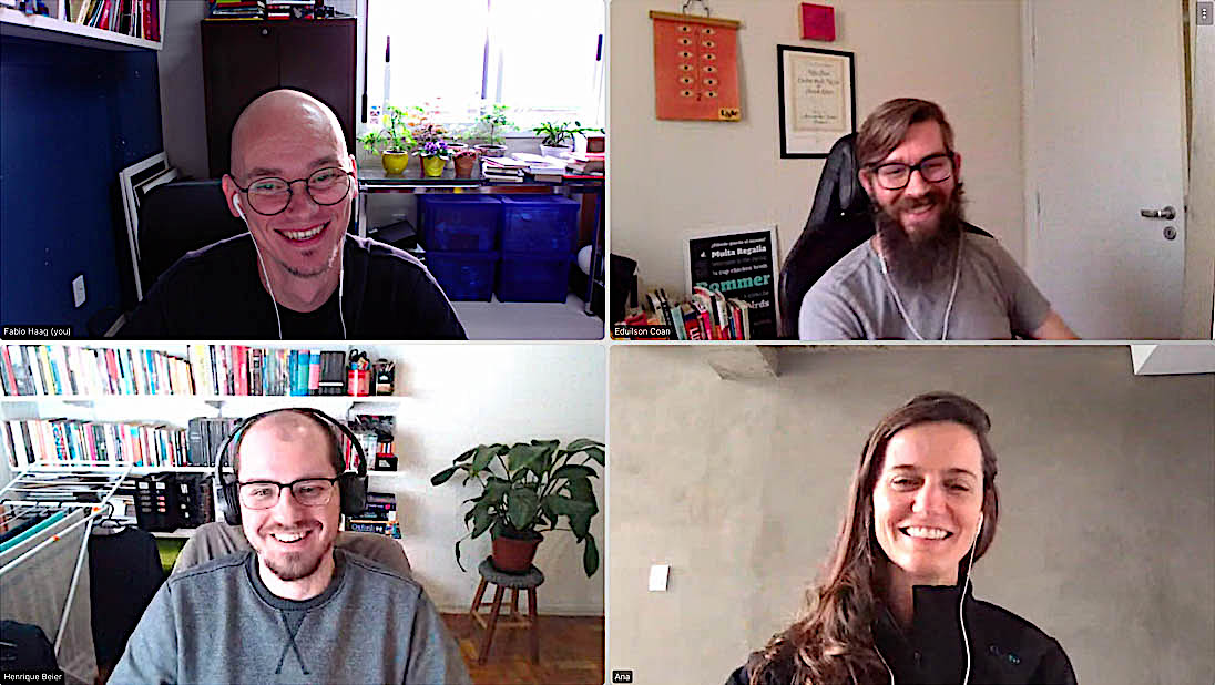
file name: Fabio Haag Type Fabio Haag Henrique Beier Ana Laydner Eduilson Coan 2020

file name: Fabio Haag Type Fabio Haag Henrique Beier Ana Laydner Eduilson Coan 2020

file name: Fabio Haag Type 2020

file name: Eduilson Wessler Coan

file name: Eduilson Wessler Coan Pic
| | |
|
Luc Devroye ⦿ School of Computer Science ⦿ McGill University Montreal, Canada H3A 2K6 ⦿ lucdevroye@gmail.com ⦿ https://luc.devroye.org ⦿ https://luc.devroye.org/fonts.html |

