TYPE DESIGN INFORMATION PAGE last updated on Thu Jul 16 06:54:20 EDT 2026
FONT RECOGNITION VIA FONT MOOSE

|
|
|
|
Bureau Roffa (was: Designtown)
[Jasper Michael De Waard]
Dutch creator (b. 1996, Rotterdam) of the free Google Web Font display typeface Expletus Sans (2011). The theme of this typeface: disconnect the strokes, but not totally. He runs a one-man design studio located in Rotterdam. He created the six-style family Rotterdam (2008), which he describes as art deco with a typeface lift, and Disc (2008, CD-inspired). In 2013, Jasper founded Bureau Roffa. A much better name than Designtown, Roffa is slang for Rotterdam. At Bureau Roffa, one can buy the 12-style humanist sans typeface family Sensato (2013). The regular weight is free. Features of Sensato include the Garamond heritage, the diagonal stress, some ink traps, slightly tilted outlines, open counters (for legibility), and solid spacing. Due to a trademark issue, De Waard was forced to rename Sensato to Proza. In 2015, he added the more daring and contrast-rich Proza Display. For a free version at Google Fonts, see Proza Libre. See also Open Font Library. In 2017, Jasper published Ricardo, a sans family that combines geometric simplicity with some humanist features. Designer of Goldich (2021, Bold Monday). Award winner at 25 TDC in 2022. The Goldich type family contains five weights from regular to black, all with matching italics. Klingspor link. (Old) Designtown link. Behance link. Google Plus link. |
EXTERNAL LINKS |
| | |

file name: Bureau Roffa Logo

file name: Jasper De Waard Goldich 2022

file name: Jasper De Waard Ricardo 2017 235049

file name: Jasper De Waard Ricardo 2017 235050

file name: Jasper De Waard Ricardo 2017 235051

file name: Jasper De Waard Ricardo 2017 235052

file name: Jasper De Waard Ricardo 2017 235055

file name: Jasper De Waard Ricardo 2017 235056

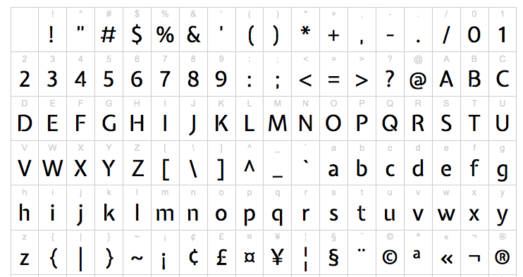
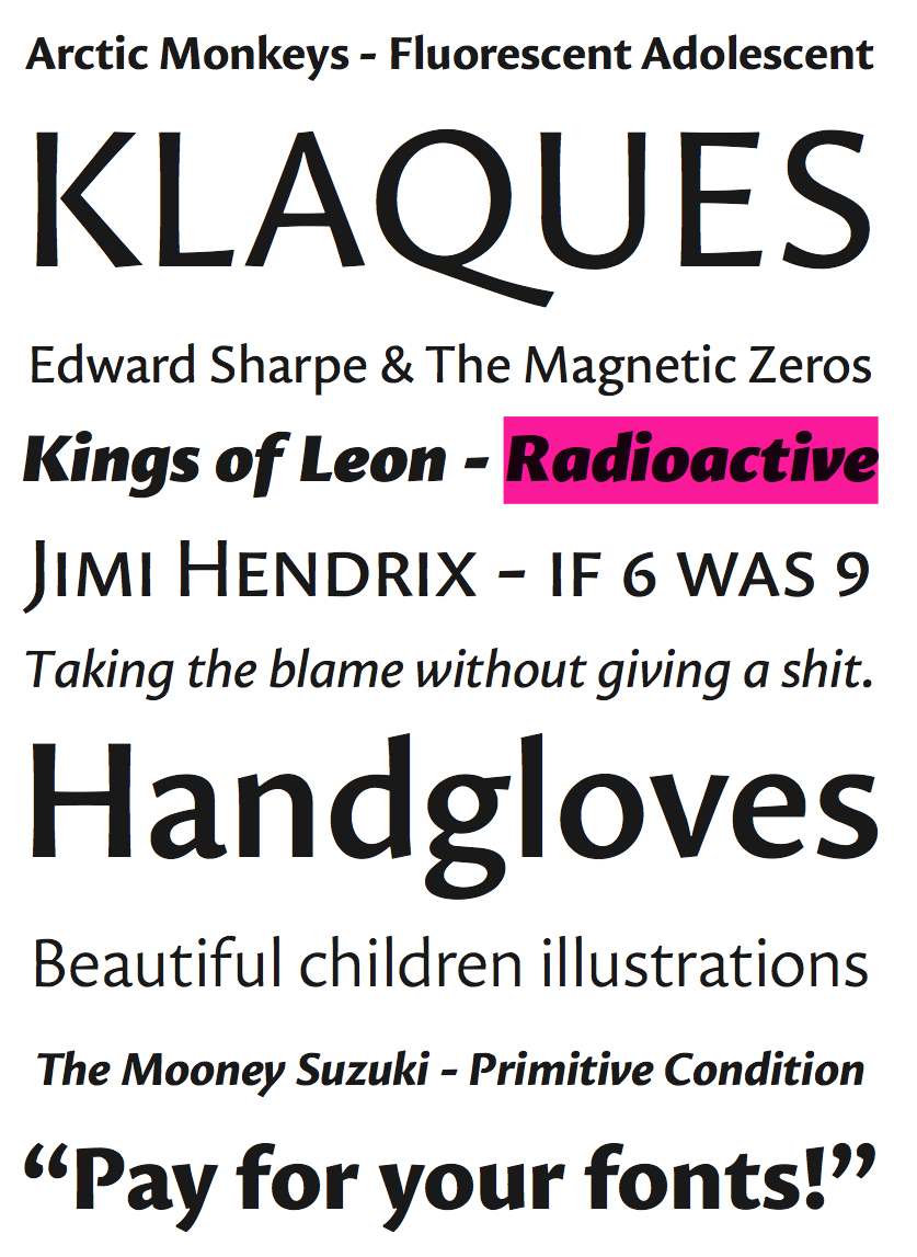
file name: Jasper De Waard Ricardo 2017

file name: Jasper De Waard Expletus Sans 2011 Poster by Cari Esposito 2018
file name: Jasper De Waard Expletus Sans 2011

file name: Jasper De Waard Expletus Sans Medium 2011

file name: Jasper De Waard Sensato 2013

file name: Jasper De Waard Sensato 2013b

file name: Jasper De Waard Sensato 2013c

file name: Jasper De Waard Sensato 2013d

file name: Jasper De Waard Sensato 2013e

file name: Jasper De Waard Sensato 2013f
file name: Jasper De Waard Sensato 2013g

file name: Jasper De Waard Sensato 2013h

file name: Jasper De Waard Sensato 2013i

file name: Jasper De Waard Sensato 2013j

file name: Jasper De Waard Sensato 2013k

file name: Jasper De Waard Sensato 2013l

file name: Jasper De Waard Sensato 2013m

file name: Jasper De Waard Proza 2013

file name: Jasper De Waard Proza 2013b

file name: Jasper De Waard Proza 2013c

file name: Jasper De Waard Proza 2013e

file name: Jasper De Waard Proza 2013f

file name: Jasper De Waard Proza 2014

file name: Jasper De Waard Proza 2014b

file name: Jasper De Waard Proza 2014c

file name: Jasper De Waard Proza 2014d

file name: Jasper De Waard Proza 2014f

file name: Jasper De Waard Proza Black 2014

file name: Jasper De Waard Proza Display 2015

file name: Jasper De Waard Proza Display 2015b

file name: Jasper De Waard Proza Display 2015c

file name: Jasper De Waard Proza Display Black 2015

file name: Jasper De Waard Proza Display Semi Bold 2015

file name: Jasper De Waard Proza Libre 2015

file name: Jasper De Waard Pic

file name: Bureau Roffa Panorama Rotterdam
| | |
|
Luc Devroye ⦿ School of Computer Science ⦿ McGill University Montreal, Canada H3A 2K6 ⦿ lucdevroye@gmail.com ⦿ https://luc.devroye.org ⦿ https://luc.devroye.org/fonts.html |