TYPE DESIGN INFORMATION PAGE last updated on Wed May 6 16:16:36 EDT 2026
FONT RECOGNITION VIA FONT MOOSE
|
|
|
|
Simon Pascal Klein
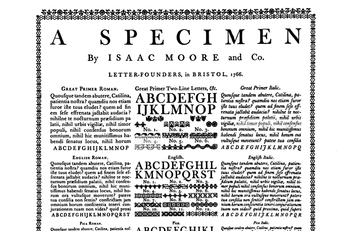
Designer from Canberra, Australia, but born in Mainz, Germany. Leader of Open Baskerville, an open source project for a digital revival of the famous Baskerville typefaces. Open Baskerville is based upon Fry's Baskerville, a Baskerville derivative from ca. 1768 created by Isaac Moore, a punchcutter who worked for John Baskerville. Besides Klein, contributors include James Puckett and Robin Mientjes. Typophile discussion. OFL link. They explain the project: In order to be historically correct and entertain typophiles, Open Baskerville is to be a revival of a Baskervillian ‘clone’ by Isaac Moore, a punchcutter who worked for the type foundry of Joseph Fry in Bristol and later in London. It is believed that he did so because Baskerville had little financial success, never selling his types which were at their making considered vulgar in their stark contrast of the lettershapes and ‘damaging to the eyes’. Further, no other printer had the technology to accurately print with the high-contrast, sharp hairline punches at the time anyway. Fry’s Baskerville was created as a derivative of Baskerville that could be used with the less expensive papers, presses, and the inks that were common. Moore created a huge series of fonts in this style, complete with ornaments, a (subjectively weak) italic, and old-style figures for the text weights. The typeface was cut around 1766 and the original matrices still exist. They were purchased from the Fry foundry by Stephenson, Blake & Co. in 1910 having already acquired the Fry foundry materials off the Sir Charles Reed foundry. The surviving punches and even original matrices are in the collection of the Type Museum, London and The Smithsonian National Museum of American History, though both inaccessible, the latter due to their location in a warehouse containing asbestos. Sadly only two complete original specimens exist, both in libraries that are currently inaccessible. The first, a broadside specimen printed in Bristol in 1766 is currently housed at the Providence library and the second specimen is in the Royal Library in Stockholm. A copy of the 1766 specimen was reprinted in Updike’s Printing Types, figure 276 though obtaining a high-quality scan is desireable. A contact attempt was made at the Providence with no luck whereas the cost of having a Stockholm copy digitized is presumed to be around the USD $100 mark — this is an option worth considering. There is a very large, multi-page specimen in the Library of Congress, but it only shows the ‘ Morris Fuller Benton revived the Moore design for ATF and it first appears in the 1923 ATF specimen (also note a 12pt scan from 1923), as well as later again in the 1934 ATF specimen and in the 1941 ATF specimen. Interestingly Benton did not choose to use Moore’s italic, instead opting for an italic which was in fact copied from the type of Richard Austin that English Monotype later made under the name of ‘Bell’ and also very similar to ‘Bulmer’. So also up for discussion is the selection of an italic; Moore’s italic has been received poorly and as just noted, even Benton choose to replace it. We may do the same, using or basing it off an existing italic or if we’re feeling particularly fruity, draw our own. Dunwich Type Founders [James Puckett] explains in an abrasive style Open Baskerville's origins, and destroys it as a possible web font: In 2007 I was working in-house at an organization that used ITC New Baskerville as the serif typeface of its identity. New Baskerville is a great design, but it lacks the high contrast needed for large sizes. This inspired me to start work on Large Fry's, a revival of Fry's Baskerville by Isaac Moore. Large Fry's had extreme contrast for big print use. I left that job in 2008 and never finished Large Fry's. Later a heated discussion about free/open-source/libre fonts occurred on a web forum. I ended up releasing my unfinished Large Fry's into the public domain in hopes that some of the libre fonts geeks could turn it into something worthwhile. That never happened; the project went off track when open-source zealots wanted to move the entire thing to Fontforge, which nobody with type design skills really wants to use to design type. So the files wasted away in online repositories, which is not really a loss to anyone. Then, in 2010, web fonts happened. And someone decided to make web fonts out of Open Baskerville. This was a horrible idea---Open Baskerville was not intended to be a general purpose print font. It needs to be used larger than 36 pixels just to be readable. |
EXTERNAL LINKS |
| | |

file name: http://klepas.org/openbaskerville/specimens/ Updike Printing Types 1766 Fry Baskerville scan
| | |
|
Luc Devroye ⦿ School of Computer Science ⦿ McGill University Montreal, Canada H3A 2K6 ⦿ lucdevroye@gmail.com ⦿ https://luc.devroye.org ⦿ https://luc.devroye.org/fonts.html |
