TYPE DESIGN INFORMATION PAGE last updated on Wed May 6 16:17:19 EDT 2026
FONT RECOGNITION VIA FONT MOOSE
|
|
|
|
Graphic, multimedia and type designer from Basel, Switzerland, b. 1978. Her first degree was from Burg Giebichenstein HKD Halle (Germany). She was a freelance graphic and multimedia designer in Basel. Graduate of the Type & Media program at KABK in Den Haag in 2014, were her graduation typeface was Mica. She set up Typologic in Den Haag, The Netherlands, and started working as senior designer at Frere Jones Type in Brooklyn in the summer of 2016. She teaches at Yale School of Art. Nina Stoessinger designed her first font in 2001, and obtained a degree in multimedia design in Halle, Germany, in 2008. She created a family of bitmap typefaces called Svenja (2004). Blog. Her funny FF Legato illustration. Speaker at ATypI 2010 in Dublin. In 2010, she and Hrant Papazian set up Armenotype. In 2011, Nina published FF Ernestine (extensions by Hrant Papazian), and writes: FF Ernestine was born from the search for a versatile monoline text typeface that would feel warm yet serious, feminine yet rigid, charming yet sturdy. Its rather large x-height and wide, open shapes enable it to work well down to small sizes; ligatures, stylistic and contextual alternates, a selection of arrows, and two sizes of small caps enrich its typographic palette. Nina Stössinger first drew the Roman as a study project at the postgraduate Type Design programme in Zurich, and the Italic in dialogue with Hrant Papazian's Armenian design. Both the Roman and the Italic (which doubles as a harmonious companion to the Armenian component) are available in four individually drawn weights. In 2013, she published the free dotted typeface Sélavy together with Paul Soulellis: Sélavy is the result of a serendipitous collaboration with Paul Soulellis. For his project Library of the Printed Web, Paul was looking for a dotted typeface reminiscent of the punched-out caps on Marcel Duchamp's 1934 Green Box. As he could not find a typeface close enough, I [Nina] was spontaneously tempted to make one. This is it. Sélavy (named after Duchamp's pseudonym Rrose Sélavy) is a dotted typeface that does not follow a non-dotted model. Mica (2014, KABK) is an attempt to create a serif text typeface with horizontals that are thicker than the verticals. It later was renamed Nordvest, which was published in 2016 by Monokrom and won third prize in the TDC Typeface Design competition in 2017. With Tobias Frere-Jones, she designed Conductor. In 2018, Tobias Frere-Jones and Nina Stössinger co-designed the modernized roman inscriptional typeface Empirica Headline (with contributions by Fred Shallcrass). It has original lower case letters and italics. In 2021, Tobias Frere-Jones, Nina Stössinger and Fred Shallcrass designed Seaford for use in Microsoft's Office. They write: Seaford is a robust, versatile sans serif that evokes the familiarity and comfort of old-style seriffed type. With everyday Office users in mind---professionals typing up reports or correspondence, preparing school handouts or corporate presentations---we designed Seaford to be inviting, engaging, and effortlessly readable. A good font family for a miserable piece of software. Home page. Keynote speaker at TypeCon 2018 in Portland, OR. Interview in 2021. |
EXTERNAL LINKS |
| | |
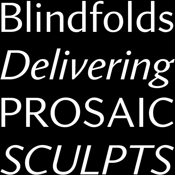
file name: Tobias Frere Jones Nina Stoessinger Fred Shallcrass Seaford 2021

file name: Tobias Frere Jones Nina Stoessinger Fred Shallcrass Seaford 2021
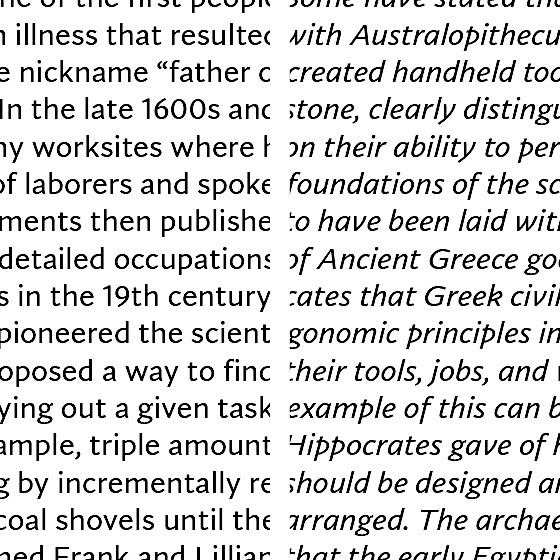
file name: Tobias Frere Jones Nina Stoessinger Fred Shallcrass Seaford 2021
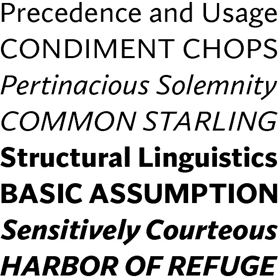
file name: Tobias Frere Jones Nina Stoessinger Fred Shallcrass Seaford 2021

file name: Tobias Frere Jones Nina Stoessinger Fred Shallcrass Seaford 2021

file name: Microsoft Corporation Seaford Bold 2020

file name: Tobias Frere Jones Nina Stossinger Empirica 2018

file name: Tobias Frere Jones Nina Stossinger Empirica 2018b
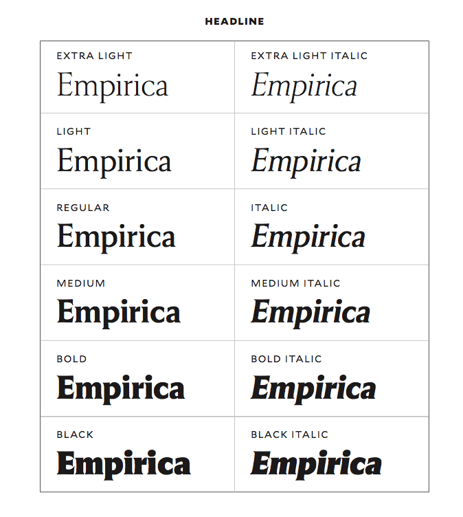
file name: Tobias Frere Jones Nina Stossinger Empirica 2018c
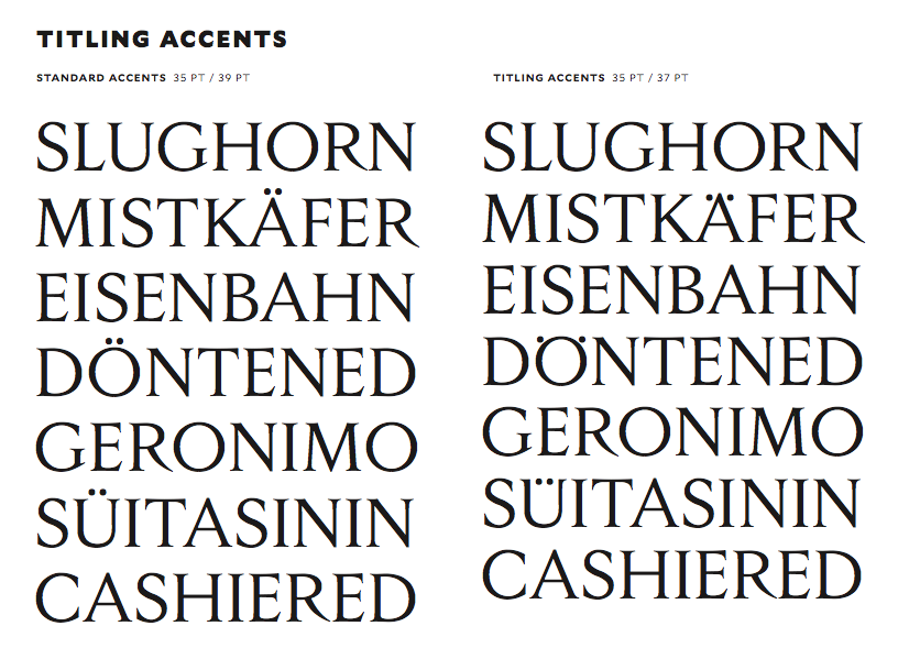
file name: Tobias Frere Jones Nina Stossinger Empirica 2018d
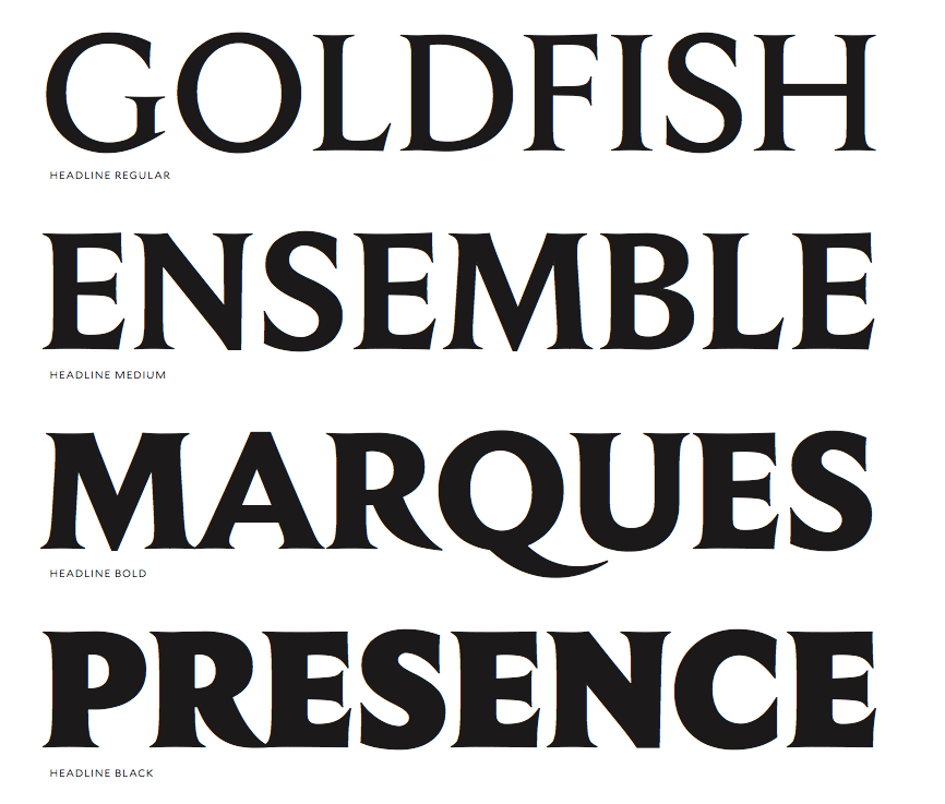
file name: Tobias Frere Jones Nina Stossinger Empirica 2018e

file name: Tobias Frere Jones Nina Stossinger Empirica 2018f
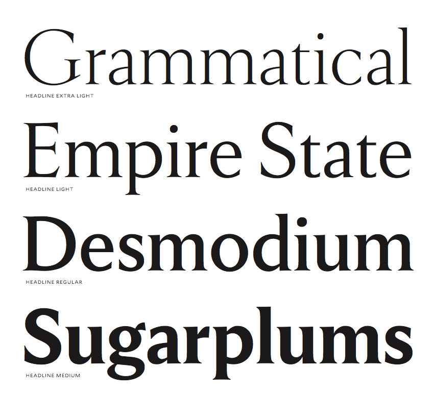
file name: Tobias Frere Jones Nina Stossinger Empirica 2018g

file name: Tobias Frere Jones Nina Stoessinger Conducto 2018

file name: Tobias Frere Jones Nina Stoessinger Conductor 2018

file name: Tobias Frere Jones Nina Stoessinger Conductor 2018

file name: Tobias Frere Jones Nina Stoessinger Conductor Bold Regular 2018

file name: Underground Agatha 2019

file name: Nina Stoessinger Mica 2014

file name: Nina Stoessinger Mica 2014b

file name: Nina Stoessinger Mica 2014c

file name: Nina Stoessinger Mica 2014d

file name: Nina Stoessinger Mica 2014e

file name: Nina Stoessinger Mica 2014f

file name: Nina Stoessinger Mica 2014g

file name: Nina Stoessinger Mica 2014h

file name: Nina Stoessinger Mica 2014i

file name: Nina Stoessinger Mica 2014j

file name: Nina Stoessinger Mica 2014k
file name: Nina Stoessinger Nordvest 2015

file name: Nina Stoessinger Nordvest 2015 Poster by Bill Dawson 2015

file name: Nina Stossinger Nordvest 2016

file name: Nina Stossinger Nordvest 2016b

file name: Nina Stossinger Nordvest 2016c

file name: Nina Stossinger Nordvest 2016d

file name: Nina Stossinger Nordvest 2016e

file name: Nina Stossinger Nordvest 2016f

file name: Nina Stossinger Nordvest 2016g

file name: Nina Stossinger Nordvest 2016h

file name: Nina Stossinger Nordvest 2016i

file name: Nina Stossinger Nordvest 2016j

file name: Nina Stoessinger Paul Soulellis Selavy 2013

file name: Nina Stoessinger Paul Soulellis Selavy 2013b

file name: Nina Stoessinger Paul Soulellis Selavy 2013c

file name: Nina Stoessinger Paul Soulellis Selavy 2013d

file name: Nina Stoessinger F F Ernestine 2011

file name: Nina Stoessinger F F Ernestine 2011

file name: Nina Stoessinger F F Ernestine Offc Pro Regular 2011

file name: Nina Stoessinger F F Ernestine Pro Bold 2011

file name: Nina Stoessinger Svenja Symbol2004

file name: Nina Stoessinger fflegato

file name: Nina Stoessinger Pic by Andrew Lichtenstein 2021

file name: Nina Stoessinger Pic

file name: Nina Stoessinger Typecon 2016
| | |
|
Luc Devroye ⦿ School of Computer Science ⦿ McGill University Montreal, Canada H3A 2K6 ⦿ lucdevroye@gmail.com ⦿ https://luc.devroye.org ⦿ https://luc.devroye.org/fonts.html |

