TYPE DESIGN INFORMATION PAGE last updated on Wed Nov 20 11:48:19 EST 2024

SEARCH THIS SITE:

IMAGE SEARCH:

FONT RECOGNITION VIA FONT MOOSE

LUC DEVROYE


ABOUT


Stephen Coles: Helvetica and Alternatives to Helvetica [Stephen Coles]

Stephen Coles reviews alternatives for Helvetica. He writes: Despite all the substitutes, sometimes the old reliable is still the best bet. Neue Helvetica (German for "New") is the most complete and usable set of Helvetica fonts. Over the years, the Helvetica family was expanded to include many different weights, but these were not as well coordinated with each other as they might have been. In 1983, D. Stempel AG redesigned and digitized the "Neue Helvetica" typeface for Linotype and made it a self-contained font family. He offers a nice gradual classification, starting off with "cool, crisp, clean": Much of Helvetica's appeal comes from its cold, almost clinical modernity. Here are some related sans serif fonts that exude that vibe.

  • Univers: Univers is widely considered Adrian Frutiger's masterpiece. Its 27 styles go from Ultra Condensed Thin to Extra Extended Black, but still give an impression of steadiness and homogeneity when combined. Why it's not Helv: In some ways, even more spare (no beards or tails). Uniformity across a broad spectrum of styles.
  • Heldustry: In 1978, prolific photo type designer Phil Martin added "just the right touch of Eurostile's squareness" to Helvetica and created a new font for a cable TV news network.
  • FF Schulbuch (1992): A series of fonts based on the historical textbook types used in Northern and Southern Germany, and Bavaria. The Nord (North) variant is the closest relative of Helvetica.
  • Neuzeit S: Wilhelm C. Pischner's Neuzeit Grotesk preceded Helvetica by more than 30 years. The more humanist Neuzeit S was introduced by Linotype-Hell AG in 1966, intended for large bodies of text. Why it's not Helv: A gentle, almost Avenir-ish geometry.
  • Maxima: In 1990 Gerd Wunderlich revisited Univers and created this slightly more contemporary option.
  • Paralucent: The first text sans serif from Rian Hughes, a master of stylized display typefaces. It still shows signs of his distinctive hand, from the big round i dots and wedge terminals to the daring lowercase g. Paralucent was designed to be more consistent than Helvetica, and a solid modern workhorse of a font, elegant enough for headline and robust enough for text.
In the ":Getting Warmer" category, he lists typefaces with their own idiosyncrasies and irregularities. They feel warmer, less manufactured.
  • Basic Commercial: Appearing in hot metal at the turn of the 20th century, Basic Commercial (like Akzidenz-Grotesk?) is based on designs which influenced all the modern grotesques that followed. Basic Commercial was distributed for many years in the United States under the name Standard Series which is seen most notably in Massimo Vignelli's signage for the New York City subway. Why it's not Helv: Angled stroke endings (S, C, e) open up the counters and add life. Taller ascenders lend elegance.
  • FF Bau: Helvetica is cold and calculated, but its roots lie in much quirkier material. Its earliest direct ancestor was first introduced around 1880. Christian Schwartz updated the family for contemporary needs without rationalizing away the spirit and warmth of the original. Why it's not Helv: A double-storey g. Lowercase a keeps its tail in all weights. Optional oldstyle figures.
  • Monotype Grotesque: A British type from the 1900s, MT Grotesque's ten very different styles read like a timeline of grots to come - Bell Gothic, Trade Gothic, Helvetica - but none of those match its warmth and character. See it big and you'll get what I mean. Why it's not Helv: Delightfully irregular, a type that shows signs of rough cut metal. Footnote: Arial is based on Monotype Grotesque.
  • Folio: Designed by Konrad F. Bauer and Walter Baum, and released in several weights and widths by the Bauer Type Foundry from 1956 to 1963. Why it's not Helv: Key differences are in a, G, and Q. Warmer and more irregular overall.
  • Venus: Created in the early 1900s, Venus precedes Helvetica by many years. Some sources note that it was designed for German map production. Why it's not Helv: Antique, not modernist. Very idiosyncratic for that vintage hot metal look.
  • ARS Region (2002): A brand new release from a brand new foundry, ARS Type, Region is Helvetica with trademark Shamal oddities. Why it's not Helv: Would be cold and crisp if it weren't for the soft stroke connections on letters like the G, t, and k. A lowercase g that takes FF Meta's lead.
  • Titling Gothic: The newest family on our list is also the most extensive. FB Titling Gothic is an immense series of nearly fifty styles inspired by that century-old favorite ATF Railroad Gothic (see also: Wilma). Why it's not Helv: Every possible width you could need for setting headlines. Antique, American flavor. Very little stroke modulation, even in heavy and wide styles.
  • Adesso: French designer Thierry Puyfoulhoux's rounded sans is the furthest from Helvetica on this list, but it's definitely soft and warm while maintaining the basic grotesque lettershapes.

EXTERNAL LINKS
Stephen Coles: Helvetica and Alternatives to Helvetica
MyFonts search
Monotype search
Fontspring search
Google search

INTERNAL LINKS
Choice of fonts ⦿


file name: Phil Martin Heldustry Demi 1978


file name: Bauersche Giesserei Venus Breit Fett


file name: Bauersche Giesserei Venus Breit Fett


file name: Bauersche Giesserei Venus Breit Halbfett


file name: Bauersche Giesserei Venus Breit Halbfett


file name: Bauersche Giesserei Venus Breit Mager


file name: Bauersche Giesserei Venus Dreiviertelfett


file name: Bauersche Giesserei Venus Fett


file name: Bauersche Giesserei Venus Fette Kursiv


file name: Bauersche Giesserei Venus Grotesk


file name: Bauersche Giesserei Venus Magere Kursiv


file name: Bauersche Giesserei Venus Schmal Dreiviertelfett


file name: Bauersche Giesserei Venus Schmal Halbfett


file name: Bauersche Giesserei Venus Schmal Mager


file name: Just Van Rossum F F Schulbuch 1991 1992


file name: Angus R Shamal A R S Region 2002


file name: Angus R Shamal A R S Region 2002b


file name: Angus R Shamal A R S Region 2002c


file name: Angus R Shamal A R S Region 2002d


file name: Max Miedinger Helvetica 1956 Poster by Pablo Marques 2014


file name: Max Miedinger Helvetica Bold 1956 Poster by Ciera Shaver 2014


file name: Frank Hinman Pierpont Grotesque M T Bold Extended 1926 after Berthold Ideal Grotesque


file name: Frank Hinman Pierpont Grotesque M T Extra Condensed 1926 after Berthold Ideal Grotesque


file name: Frank Hinman Pierpont Monotype Grotesque Std Black 1926 after Berthold Ideal Grotesque


file name: Frank Hinman Pierpont Monotype Grotesque Std Black 1926 after Berthold Ideal Grotesqueb
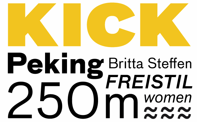

file name: Christian Schwartz Erik Spiekermann F F Bau 2001 2004


Luc Devroye ⦿ School of Computer Science ⦿ McGill University Montreal, Canada H3A 2K6 ⦿ lucdevroye@gmail.com ⦿ https://luc.devroye.org ⦿ https://luc.devroye.org/fonts.html