TYPE DESIGN INFORMATION PAGE last updated on Thu Apr 16 22:07:00 EDT 2026
FONT RECOGNITION VIA FONT MOOSE
|
|
|
|
Sans serif classification
Several groups are generally distinguished:
Credit for some images below: Danielle West. |
EXTERNAL LINKS |
| | |

file name: H Berthold Akzidenz Grotesk 1896 Poster by Danielle West 2014

file name: H Berthold Akzidenz Grotesk 1896 Poster by Danielle West 2014b

file name: H Berthold Akzidenz Grotesk 1896 Poster by Tony Pham 2017

file name: H Berthold Akzidenz Grotesk 1896 Poster by Tony Pham 2017b

file name: U R W Franklin Gothic after Morris Fuller Benton 1902
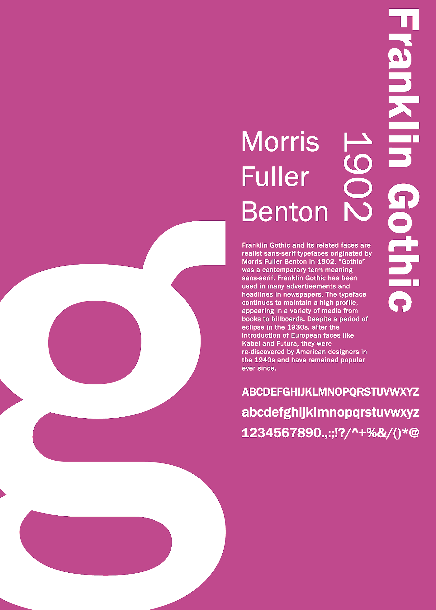
file name: Morris Fuller Benton Franklin Gothic 1902 Poster by Zekai Saltoglu 2016

file name: Monotype Franklin Gothic Extra Condensed after Morris Fuller Benton 1904

file name: Tobias Frere Jones Jesse M Ragan Gotham 2003 01

file name: Tobias Frere Jones Jesse M Ragan Gotham 2003 02

file name: Tobias Frere Jones Jesse M Ragan Gotham 2003 03

file name: Tobias Frere Jones Jesse M Ragan Gotham 2003 04

file name: Tobias Frere Jones Jesse M Ragan Gotham 2003 05

file name: Tobias Frere Jones Jesse M Ragan Gotham 2003 07

file name: Tobias Frere Jones Jesse M Ragan Gotham 2003 08

file name: Tobias Frere Jones Jesse M Ragan Gotham 2003 09

file name: Tobias Frere Jones Jesse M Ragan Gotham 2003 12

file name: Tobias Frere Jones Jesse M Ragan Gotham 2003 14

file name: Tobias Frere Jones Jesse M Ragan Gotham 2003 15

file name: Tobias Frere Jones Jesse M Ragan Gotham 2003 16

file name: Tobias Frere Jones Jesse M Ragan Gotham 2003 17

file name: Tobias Frere Jones Jesse M Ragan Gotham 2003 Poster by Bill Dawson 2015

file name: Monotype Century Gothic 1991 Poster by Erika Davies 2016

file name: Monotype Century Gothic 2012

file name: Monotype Century Gothic 1991 Poster by Cassandra Mayo 2016
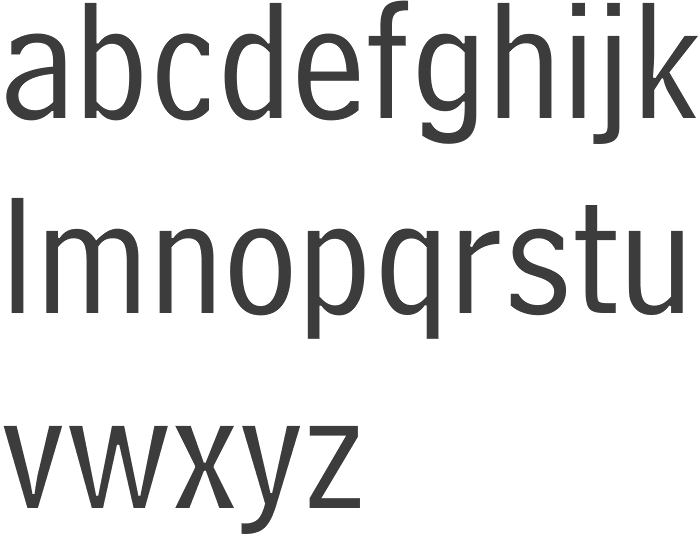
file name: Chauncey Griffith Bell Centennial Address 1937 Bitstream Version 1978
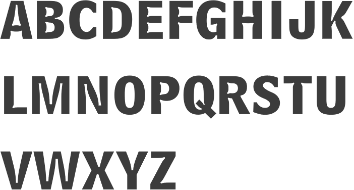
file name: Chauncey Griffith Bell Centennial Bold Listing 1937 Bitstream Version 1978
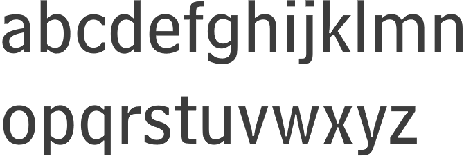
file name: Matthew Carter Bell Centennial Sub Caption 1978

file name: Monotype Gill Sans W G L 1990 1998
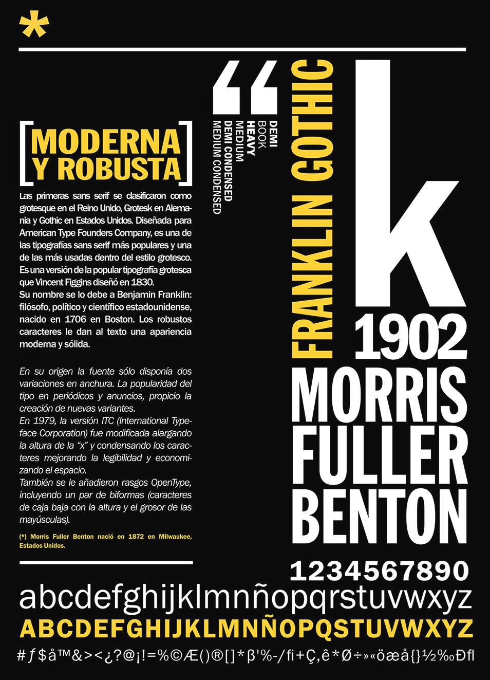
file name: Morris Fuller Benton Franklin Gothic 1902 Poster by Juana Caudal 2014
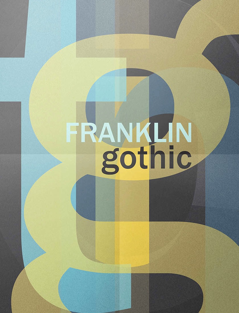
file name: Morris Fuller Benton Franklin Gothic 1902 poster by Daniela Carusone 2016

file name: Robert Slimbach Carol Twombly Fred Brady Christopher Slye Myriad 1992
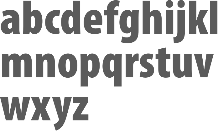
file name: Robert Slimbach Carol Twombly Fred Brady Christopher Slye Myriad Pro Cond Black 1992

file name: Robert Slimbach Carol Twombly Fred Brady Christopher Slye Myriad Pro Semibold 1992

file name: Robert Slimbach Carol Twombly Fred Brady Christopher Slye Myriad Pro Semiext Black 1992
| | |
|
Luc Devroye ⦿ School of Computer Science ⦿ McGill University Montreal, Canada H3A 2K6 ⦿ lucdevroye@gmail.com ⦿ https://luc.devroye.org ⦿ https://luc.devroye.org/fonts.html |

