TYPE DESIGN INFORMATION PAGE last updated on Wed May 6 16:17:43 EDT 2026
FONT RECOGNITION VIA FONT MOOSE
|
|
|
|
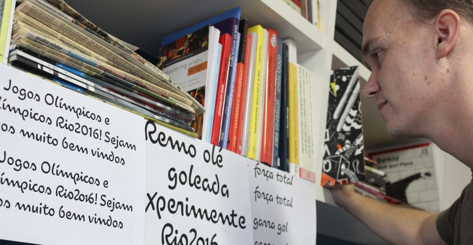
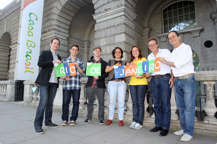
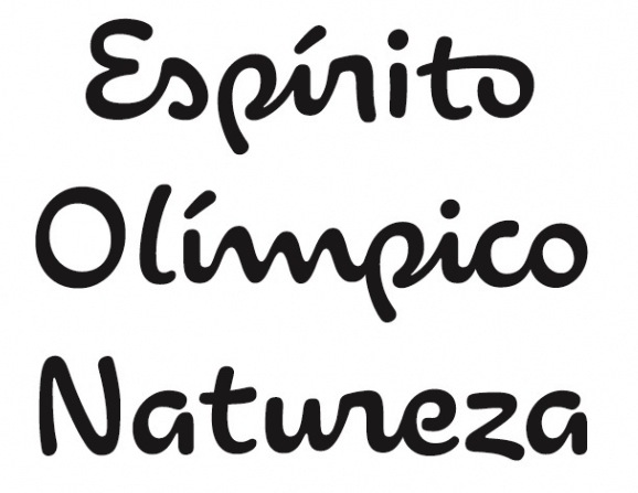
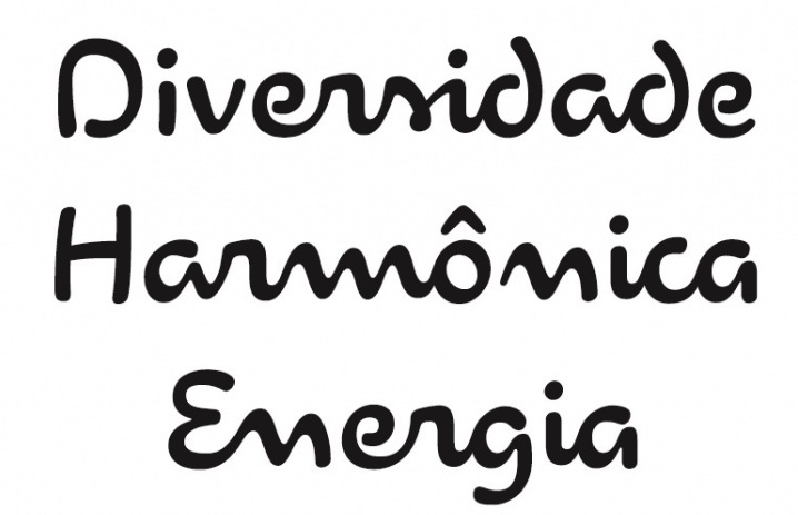
Brazilian type designer Fernando Caro won an award at Tipos Latinos 2010 for his typeface family Arauto and for his text typeface Petra. In 2012, the Dalton Maag Brazil team designed the font for the Rio 2016 Olympic Games. Theis 5448-character connected script font Rio2016 was developed by Dalton Maag Brazil, and involved a team that includes Fabio Haag, Fernando Caro and Gustavo Soares. Beth Lula is the Branding Director of the Rio 2016 Olympic and Paralympic Games Organising Committee. Passages of the press release: Each letter expresses a characteristic of Rio 2016 Games, its people and city. The letters are written with a single continuous linework, with a fast and fluid movement, suggesting the movements of the athletes in action. The variety of curves in the letters has a unique informality, inspired by the joyfulness of the Brazilian people. Fabio Haag, Creative Director at Dalton Maag: As a Brazilian typophile, designing the Rio 2016 font was a dream job. This is a milestone for the design scene in Brazil---it's a great example of how type designers can collaborate with graphic designers, sharing their expertise to strengthen an identity. Codesigner with Bruno Mello, Fabio Haag, Rafael Saraiva and Ron Carpenter of Soleto (2014, Dalton Maag), a sans typeface that won an award at Tipos Latinos 2014. In 2014, Bruno Maag, Ron Carpenter, Fernando Caro and Rafael Saraiva co-designed the rounded organic sans typeface Oscine (Dalton Maag). Another winner flowed from Fernando's desk in 2015---the coroporate sans typeface family Setimo (Dalton Maag). Setimo was co-designed by Fernando Caro, Ken Gitschier, Fabio Haag and Lukas Paltram, and won an award at Tipos Latinos 2016. |
EXTERNAL LINKS |
| | |
file name: Dalton Maag Fabio Haag Rio2016 2012
file name: Dalton Maag Team Beth Lula Rio2016 2012

file name: Dalton Maag Rio2016 2012b
file name: Dalton Maag Rio2016 2012c
file name: Dalton Maag Rio2016 2012d
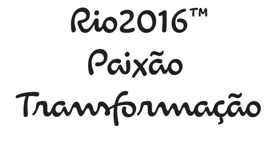
file name: Dalton Maag Rio2016 2012e
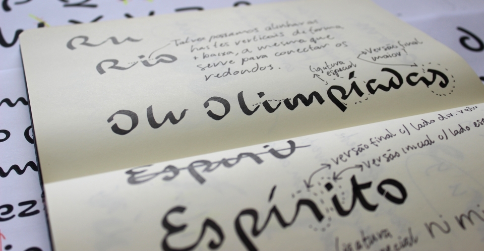
file name: Dalton Maag Rio2016 2012f
file name: Rio2016 Logo
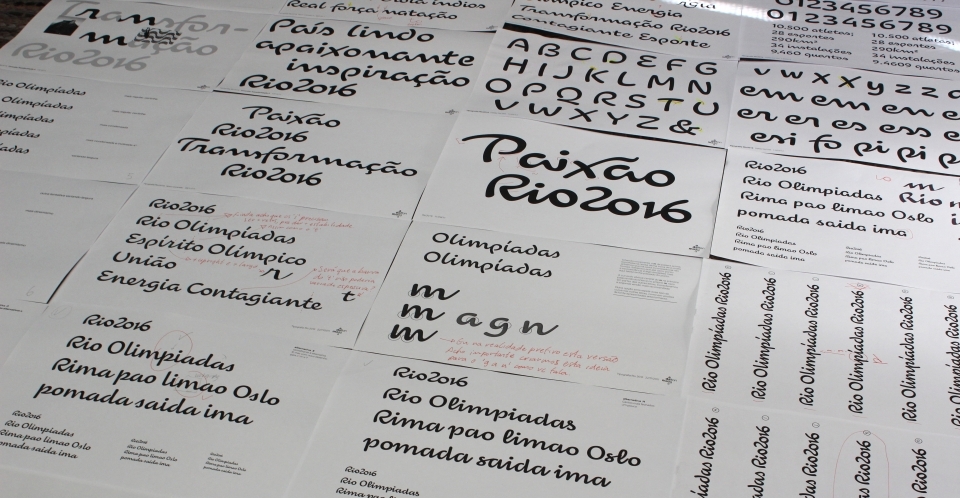
file name: Dalton Maag Rio2016 2012

file name: Dalton Maag Fernando Caro Rio2016 2012
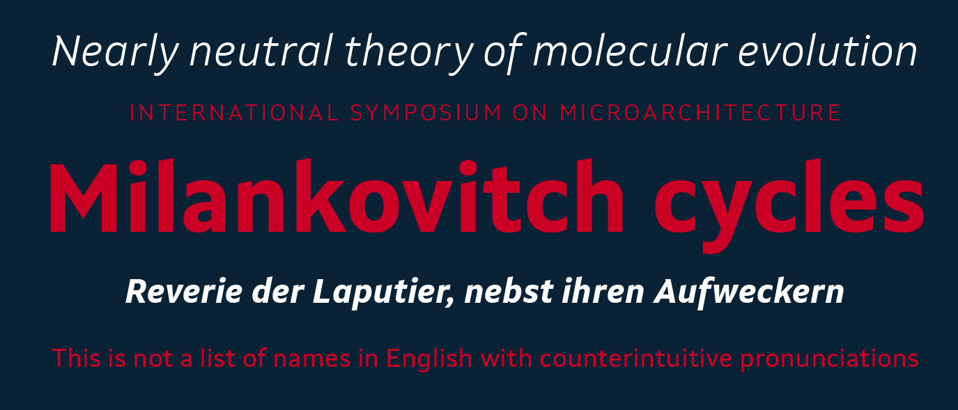
file name: Dalton Maag Setimo 2015 186503
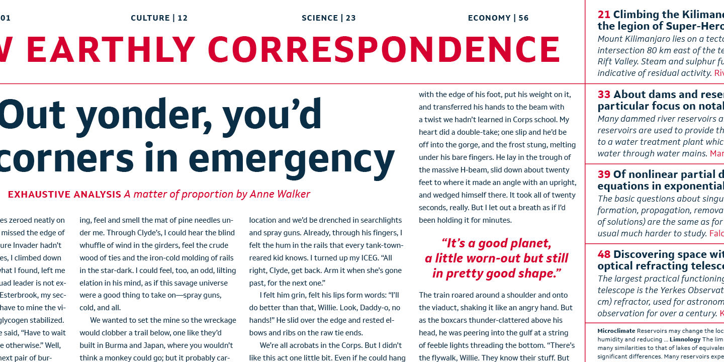
file name: Dalton Maag Setimo 2015 186504
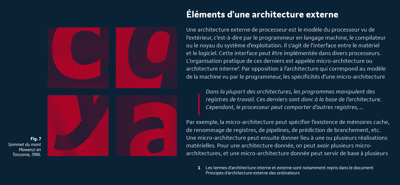
file name: Dalton Maag Setimo 2015 186505

file name: Dalton Maag Setimo 2015 186506
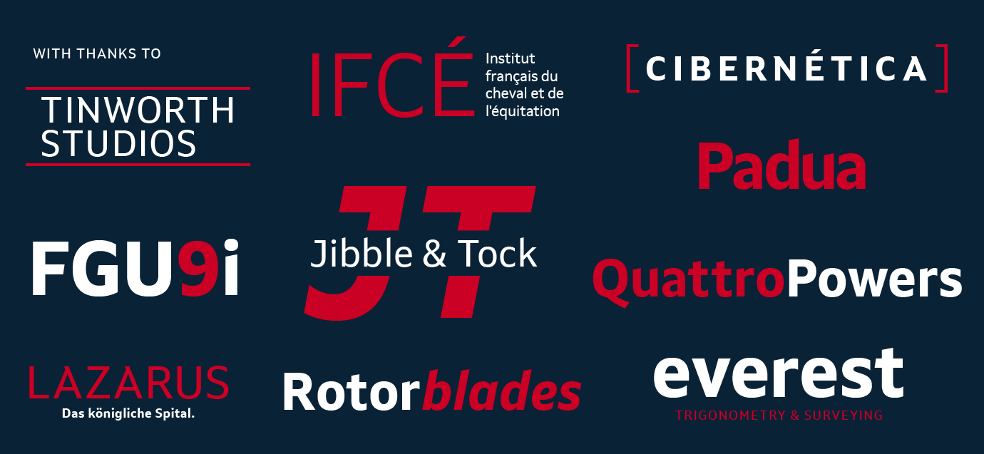
file name: Dalton Maag Setimo 2015 186507

file name: Dalton Maag Setimo 2015
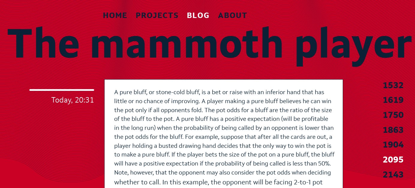
file name: Fernando Caro Setimo 2015 186508
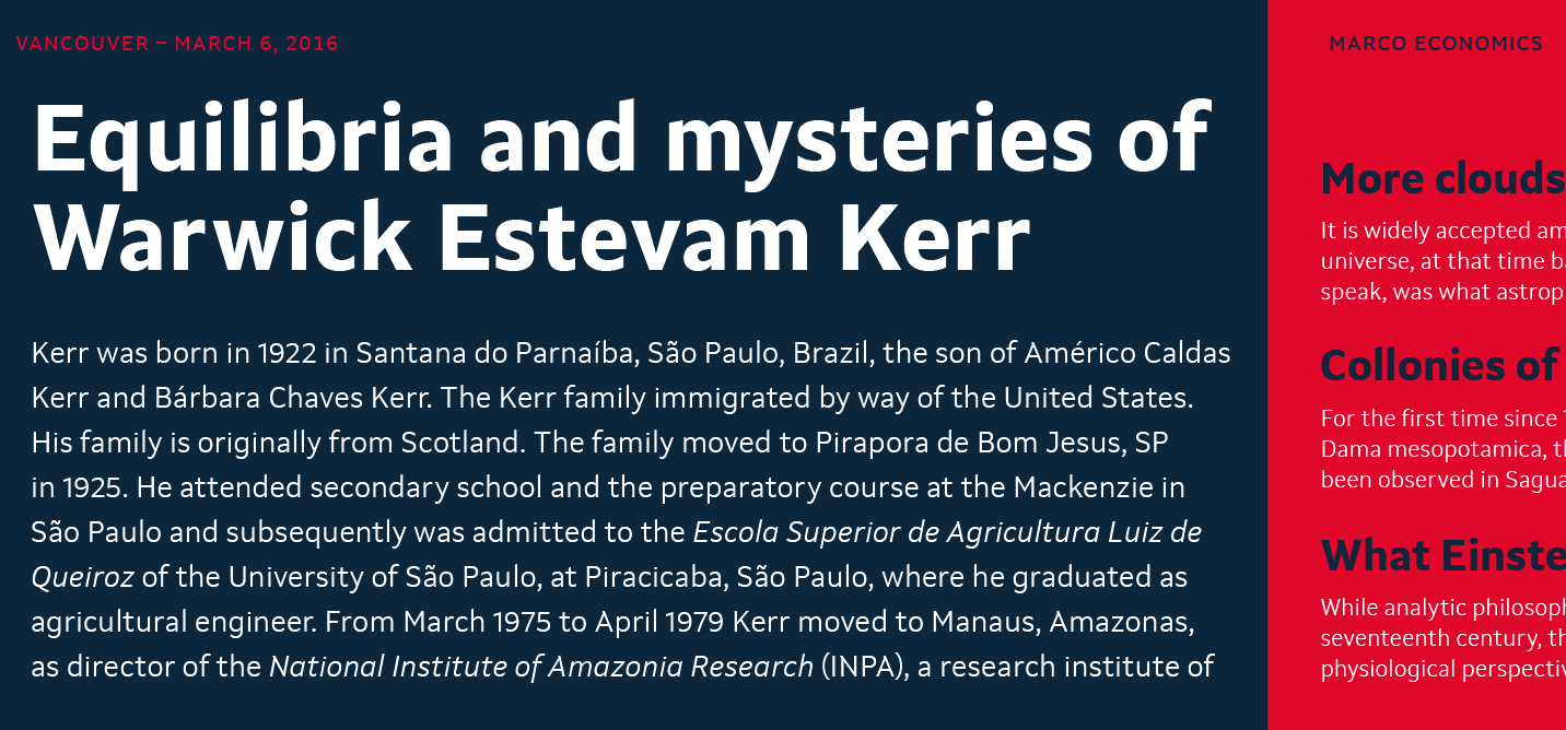
file name: Fernando Caro Setimo 2015 186509
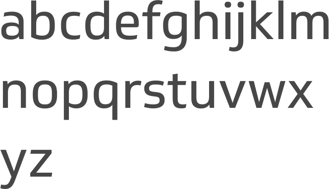
file name: Dalton Maag Soleto 2014
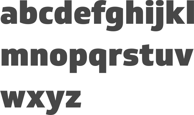
file name: Dalton Maag Soleto Black 2014
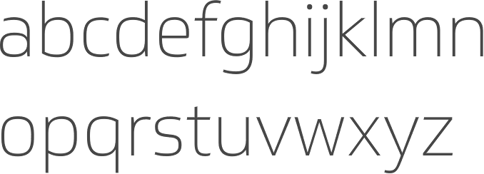
file name: Dalton Maag Soleto Thin 2014

file name: Bruno Maag Ron Carpenter Fernando Caro Rafael Saraiva Oscine 2014b

file name: Bruno Maag Ron Carpenter Fernando Caro Rafael Saraiva Oscine 2014b

file name: Bruno Maag Ron Carpenter Fernando Caro Rafael Saraiva Oscine 2014

file name: Bruno Maag Ron Carpenter Fernando Caro Rafael Saraiva Oscine Bold 2014b

file name: Bruno Maag Ron Carpenter Fernando Caro Rafael Saraiva Oscine Bold 2014c

file name: Bruno Maag Ron Carpenter Fernando Caro Rafael Saraiva Oscine Bold 2014
| | |
|
Luc Devroye ⦿ School of Computer Science ⦿ McGill University Montreal, Canada H3A 2K6 ⦿ lucdevroye@gmail.com ⦿ https://luc.devroye.org ⦿ https://luc.devroye.org/fonts.html |


