TYPE DESIGN INFORMATION PAGE last updated on Thu Apr 16 22:07:23 EDT 2026
FONT RECOGNITION VIA FONT MOOSE
|
|
|
|
Argentinian graphic and type designer, b. 1984. Director of Name Agency. Award winner at Tipos Latinos 2010 and selected in 2010 to be part of the Premios de Diseño Joven del Centro Cultural de España for his text typeface Latinité Roman and The Dot (2009-2012, a fashion mag ornamental didone typeface). Charlie writes: Latinité is a text typeface inspired by an French artistic movement called La Graphie Latine. The design of this typeface is based on the calligraphic gesture. The typeface proportions and low contrast make it suitable for small text sizes. The design was influenced by ITC Mendoza, all of Crous-Vidal's work, and even Bram de Does's Lexicon. For The Dot, inspiration came from the original fonts in Vogue and Harper's Bazaar, Herb Lubalin's take on contrasted typefaces, and François Boltana's Stilla. He writes: When I was in the final stages of the creative process I started to relate The Dot with the image of a soprano singer. Usually they are beautiful, neat and full bodied women. They have a sort of elegance which is transmitted by their voice and completed by their image, and I wanted something like that for The Dot. The Fat version was finished and it was impossible not to imagine how it might look if it become Extra Thin. So, if The Dot Fat was a Soprano The Dot Extra Light would be the Contralto. For the eight weights of The Dot, Ricardo Santos helped out. The Dot was part of an exhibition called Efervescente produced by CCEBA in Rosario, Argentina. |
EXTERNAL LINKS |
| | |

file name: Charlie Zinno Ricardo Santos The Dot 2013
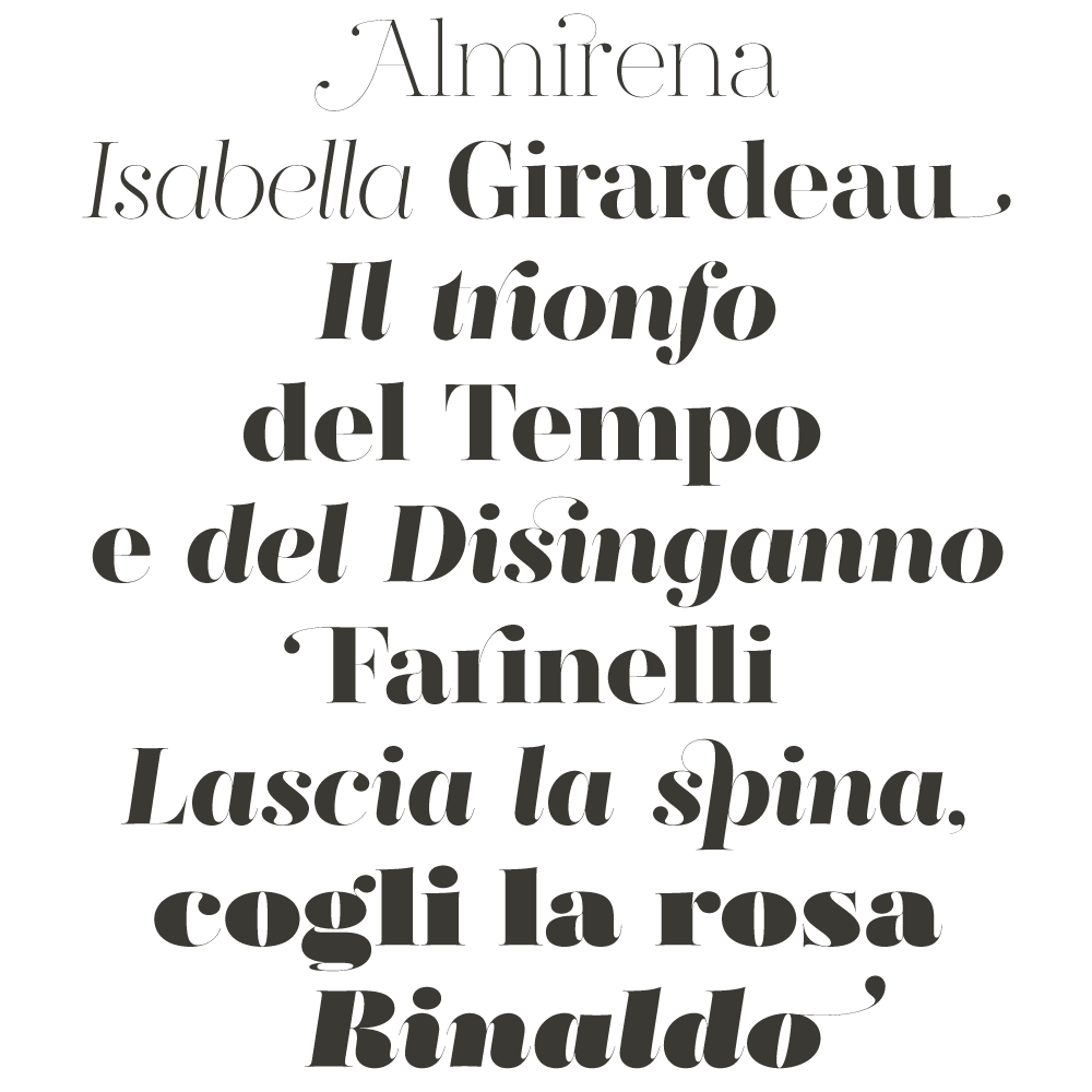
file name: Charlie Zinno Ricardo Santos The Dot 2013a
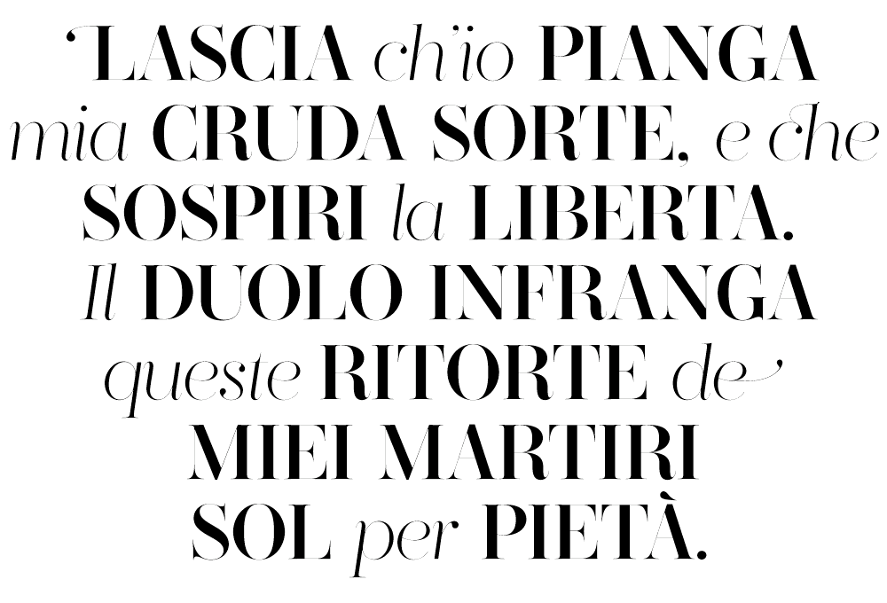
file name: Charlie Zinno Ricardo Santos The Dot 2013b
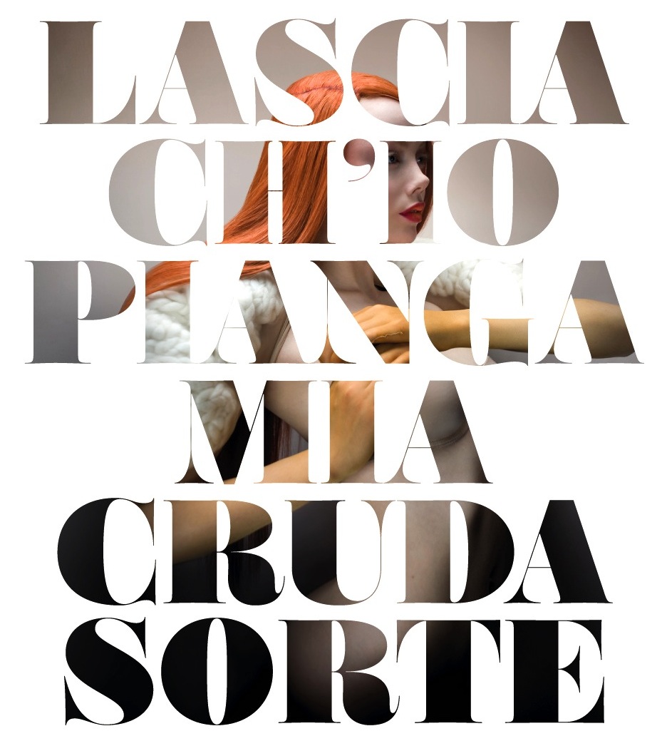
file name: Charlie Zinno Ricardo Santos The Dot 2013c
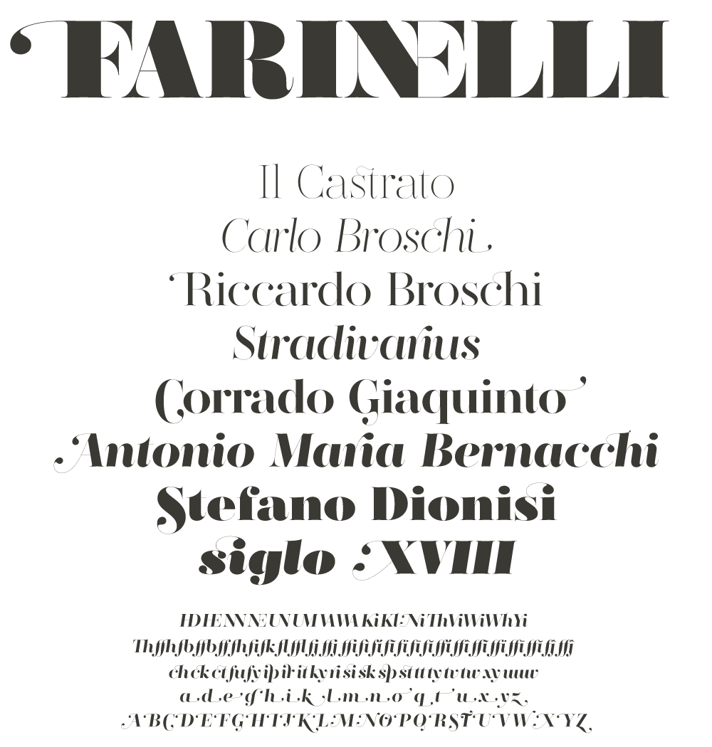
file name: Charlie Zinno Ricardo Santos The Dot 2013d

file name: Charlie Zinno Latinite 2010b

file name: Charlie Zinno Latinite 2010c

file name: Charlie Zinno Latinite 2010d
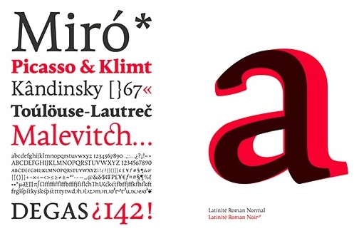
file name: Charlie Zinno Latinite 2010e
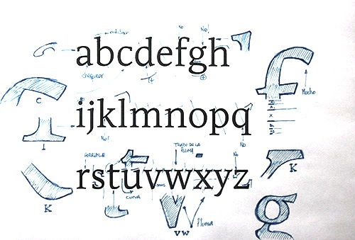
file name: Charlie Zinno Latinite 2010f
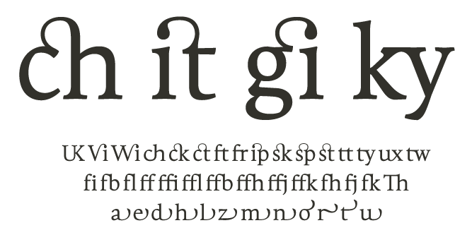
file name: Charlie Zinno Latinite 2010f
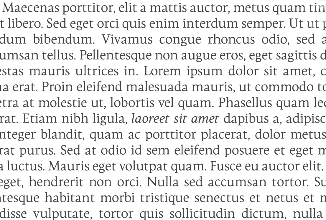
file name: Charlie Zinno Latinite 2010g
| | |
|
Luc Devroye ⦿ School of Computer Science ⦿ McGill University Montreal, Canada H3A 2K6 ⦿ lucdevroye@gmail.com ⦿ https://luc.devroye.org ⦿ https://luc.devroye.org/fonts.html |

