TYPE DESIGN INFORMATION PAGE last updated on Thu Apr 16 22:07:25 EDT 2026
FONT RECOGNITION VIA FONT MOOSE
|
|
|
|
Stephen Coles on Apple
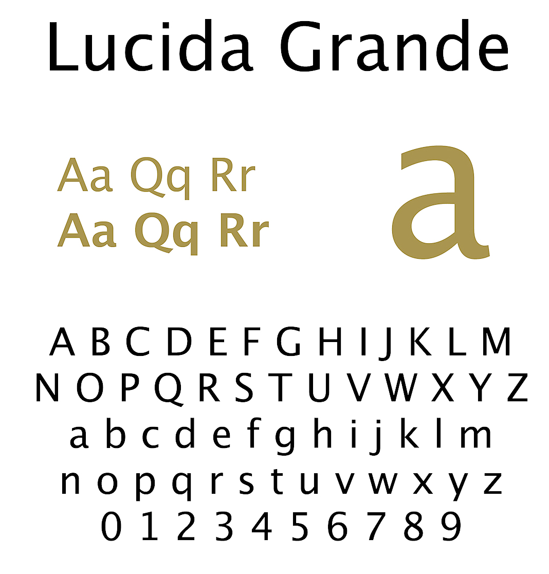
We are in April 2010, and Apple has just launched its iPad. Stephen Coles is not happy with Apple in general, and summarizes Apple's typographic disasters. Some passages: The string of odd missteps began with the release of Mac OS X. Amid a bunch bundled fonts not worth mentioning, the system came with Lucida Grande, an excellent screen font family based on Kris Holmes' Lucida Sans. The clean, readable face, contemporary but fairly neutral, was used throughout the OS X interface and embraced by web designers (along with its Windows equivalent Lucida Sans Unicode) as their go-to family for small text. Yet, to this day, there is no Lucida Grande italic. I can't explain why, and neither has anyone at Apple. This is the short and simple reason why sites like Facebook don't use italic. If you design with Lucida your options for emphasis and hierarchy are limited to size and weight. Meanwhile, Microsoft - the company that traditionally eats Apple's dust in design - worked with some of the world's best type designers to develop the ClearType fonts, six complete families designed specifically for the screen. A lack of Lucida Italic could be considered a mild irritant, but Apple's typographic neglect in OS X ran deeper. The system came with a font manager that was, until recently, the least reliable software bundled with a Mac. Even now it has has a reputation that belies Apple's high customer satisfaction. The words "Font Book" are often accompanied with "sucks" and "hate". Then came the iPhone, its fantastic display with a high pixel-density enabled legible type at small sizes. But Apple essentially erased that potential by choosing Helvetica as the iPhone's system font. Sure, Helvetica is a graphic designer's favorite, but its closed forms and tight spacing hinder reading, especially when small. It was a classic style-over-substance decision. The even more egregious spit in the typeface of readability was forcing Marker Felt users of the Notes app. More often than not, Apple's recent decisions about type either ignore its importance or value form over function. The iPad represents a new opportunity to reverse this trend. A device designed for media consumption could validate Apple's dedication to design by emphasizing design's most basic element: typography. But so far, it flops. [And he goes on with details about the iPad's flaws in the typography department.] |
EXTERNAL LINKS |
| | |

file name: Charles Bigelow Kris Holmes Lucida Grande 1994 304575

file name: Charles Bigelow Kris Holmes Lucida Grande 2019 304575 002

file name: Charles Bigelow Kris Holmes Lucida Grande 2019 304579 002

file name: Charles Bigelow Kris Holmes Lucida Grande 2019

file name: Charles Bigelow Kris Holmes Lucida Grande Mono 2019 304570 002

file name: Charles Bigelow Kris Holmes Lucida Grande Mono 2019 304571

file name: Charles Bigelow Kris Holmes Lucida Grande Mono 2019 304574

file name: Charles Bigelow Kris Holmes Lucida Grande Mono 2019

file name: Charles Bigelow Kris Holmes Lucida Grande 1994
| | |
|
Luc Devroye ⦿ School of Computer Science ⦿ McGill University Montreal, Canada H3A 2K6 ⦿ lucdevroye@gmail.com ⦿ https://luc.devroye.org ⦿ https://luc.devroye.org/fonts.html |
