TYPE DESIGN INFORMATION PAGE last updated on Wed May 6 16:17:55 EDT 2026
FONT RECOGNITION VIA FONT MOOSE
|
|
|
|
David Engelby Foundry
[David Engelby]
Copenhagen-based creator (b. Jutland, Denmark) of the four-style serif typeface Ingleby (2006-2008). In 2011, he added Engelberg (pixel face), OnO Display, ServusTextDisplay-Display, and ServusTextDisplayItalic-display (an angular text face). All of these typefaces were free. In 2013, he set up the commercial David Engelby Foundry. The first typeface there was the text family Ingleby II. This was followed by OnO Display Pro (2013, a calligraphic typeface) and Onward (2013). Ruth Pro (2014) is a magazine typeface family inspired by ITC Mendoza and Stone Serif. In 2015, Engelby published the free three-style Copenhagen Grotesk, which was influenced by the rich history of German grotesques. It was followed in 2019 by Copenhagen Grotesk Nova. Typefaces from 2016: Leducation (a didone family combined with a touch of European decadence). Typefaces from 2017: Verger (inspired by William Morris's Golden Type), Verger Sans. Typefaces from 2018: Space Show (an atractive rounded sans for clear and big display typography including wayfinding, infographics and posters), Comic Tantrum (free demo), Verger Book, Kiks, Gothic Tantrum, Jutlandia Slab (which was redesigned in 2020 as Jutlandia Pro). Typefaces from 2019: College Tantrum (an octagonal athletic shirt font). |
EXTERNAL LINKS |
| | |

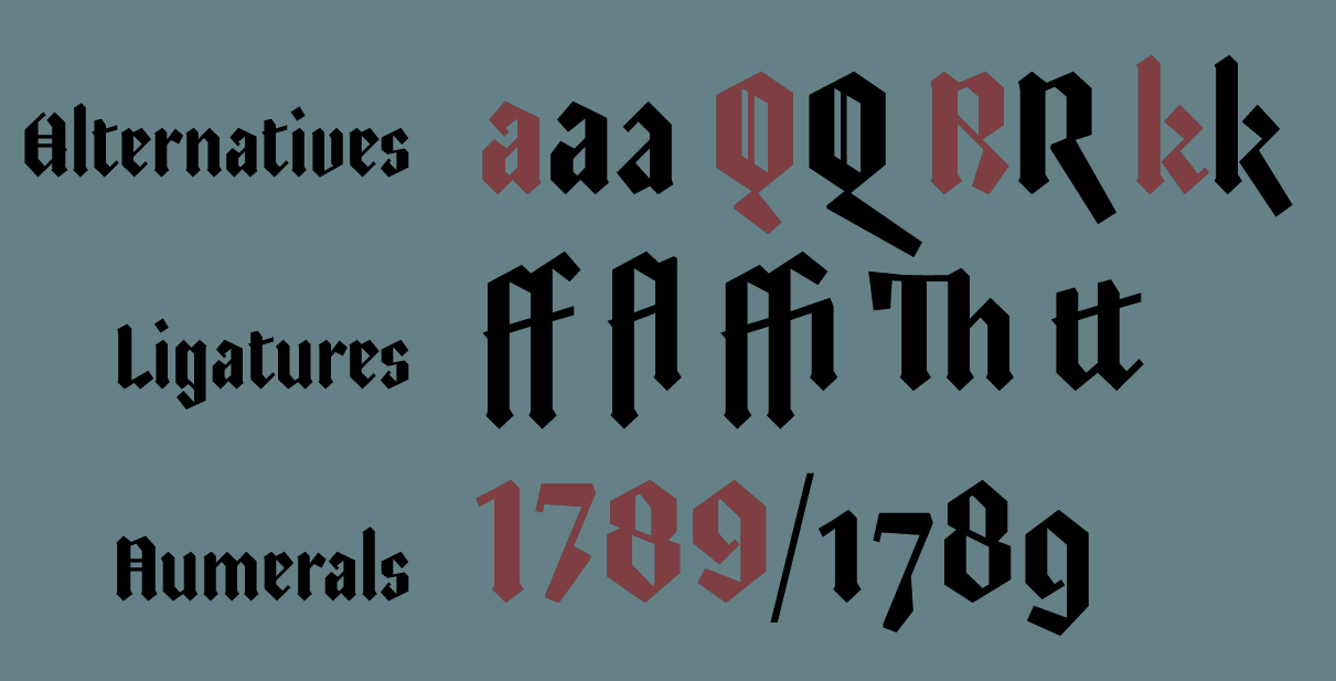
file name: David Engelby Foundry College Tantrum 2019 320640

file name: David Engelby Foundry College Tantrum 2019 320642

file name: David Engelby Foundry College Tantrum 2019

file name: David Engelby Foundry Copenhagen Grotesk Nova 2019 305521 002

file name: David Engelby Foundry Copenhagen Grotesk Nova 2019 305522

file name: David Engelby Foundry Copenhagen Grotesk Nova 2019 305523

file name: David Engelby Foundry Copenhagen Grotesk Nova 2019 305524

file name: David Engelby Foundry Copenhagen Grotesk Nova 2019 305525 002

file name: David Engelby Foundry Copenhagen Grotesk Nova 2019

file name: David Engelby Space Show 2018 285621

file name: David Engelby Space Show 2018 285622

file name: David Engelby Space Show 2018 285623

file name: David Engelby Space Show 2018 285624

file name: David Engelby Space Show 2018 285625

file name: David Engelby Foundry Space Show 2018

file name: David Engelby Comic Tantrum 2019

file name: David Engelby Comic Tantrum 2019 2

file name: David Engelby Comic Tantrum 2019 3

file name: David Engelby Comic Tantrum 2019 4

file name: David Engelby Comic Tantrum 2019 5

file name: David Engelby Comic Tantrum 2019 6

file name: David Engelby Foundry Comic Tantrum 2018 artwork

file name: David Engelby Foundry Comic Tantrum 2018 artwork 009

file name: David Engelby Foundry Comic Tantrum 2018 artwork 010

file name: David Engelby Foundry Comic Tantrum 2018 artwork 012

file name: David Engelby Foundry Comic Tantrum 2018

file name: David Engelby Foundry Verger Book 2018

file name: David Engelby Foundry Verger Book 2018 280533

file name: David Engelby Foundry Verger Book 2018 280534 002

file name: David Engelby Foundry Verger Book 2018 280535

file name: David Engelby Foundry Verger Book 2018 280536 002

file name: David Engelby Foundry Verger Book 2018 280537

file name: David Engelby Foundry Verger Book 2018

file name: David Engelby Gothic Tantrum 2018

file name: David Engelby Gothic Tantrum 2018b

file name: David Engelby Gothic Tantrum 2018c

file name: David Engelby Gothic Tantrum 2018d

file name: David Engelby Foundry Gothic Tantrum 2018

file name: David Engelby Foundry Kiks 2018 260122

file name: David Engelby Foundry Kiks 2018

file name: David Engelby Foundry Jutlandia Pro 2020 2

file name: David Engelby Foundry Jutlandia Pro 2020

file name: David Engelby Jutlandia Slab 2018 256620

file name: David Engelby Jutlandia Slab 2018 256621

file name: David Engelby Jutlandia Slab 2018 256622

file name: David Engelby Foundry Jutlandia Slab 2018

file name: David Engelby Jutlandia Slab 2018 256623

file name: David Engelby Jutlandia Slab 2018

file name: David Engelby Foundry Verger Sans 2017 248943

file name: David Engelby Foundry Verger Sans 2017 248944

file name: David Engelby Foundry Verger Sans 2017 248945

file name: David Engelby Foundry Verger Sans 2017

file name: David Engelby Verger 2017a

file name: David Engelby Foundry Verger 2017 238422

file name: David Engelby Foundry Verger 2017 238423

file name: David Engelby Foundry Verger 2017 238424

file name: David Engelby Foundry Verger 2017 238425

file name: David Engelby Foundry Verger 2017

file name: David Engelby Foundry Leducation 2015 200899

file name: David Engelby Foundry Leducation 2015 200900

file name: David Engelby Foundry Leducation 2015 200902

file name: David Engelby Foundry Leducation 2015 200903

file name: David Engelby Foundry Leducation 2015 200905

file name: David Engelby Foundry Leducation 2015

file name: David Engelby Foundry Leducation 2015a

file name: David Engelby Copenhagen Grotesk 2015

file name: David Engelby Copenhagen Grotesk 2015a

file name: David Engelby Copenhagen Grotesk 2015b

file name: David Engelby Copenhagen Grotesk 2015c

file name: David Engelby Copenhagen Grotesk 2015e

file name: David Engelby Copenhagen Grotesk Bold 2015

file name: David Engelby Copenhagen Grotesk Bold 2015b

file name: David Engelby Ruth Pro Bold 2014b

file name: David Engelby Ruth Pro Bold 2014c

file name: David Engelby Ruth Pro Bold 2014

file name: David Engelby Ingleby 2006 2008

file name: David Engelby Ingleby I I 2013

file name: David Engelby Ingleby I I 2013b

file name: David Engelby Onward Bold 2013

file name: David Engelby On O Display Pro 2013

file name: David Engelby On O Display Pro 2013b

file name: David Engelby On O Display Pro 2013c
| | |
|
Luc Devroye ⦿ School of Computer Science ⦿ McGill University Montreal, Canada H3A 2K6 ⦿ lucdevroye@gmail.com ⦿ https://luc.devroye.org ⦿ https://luc.devroye.org/fonts.html |


