TYPE DESIGN INFORMATION PAGE last updated on Thu Apr 16 22:08:16 EDT 2026
FONT RECOGNITION VIA FONT MOOSE
|
|
|
|
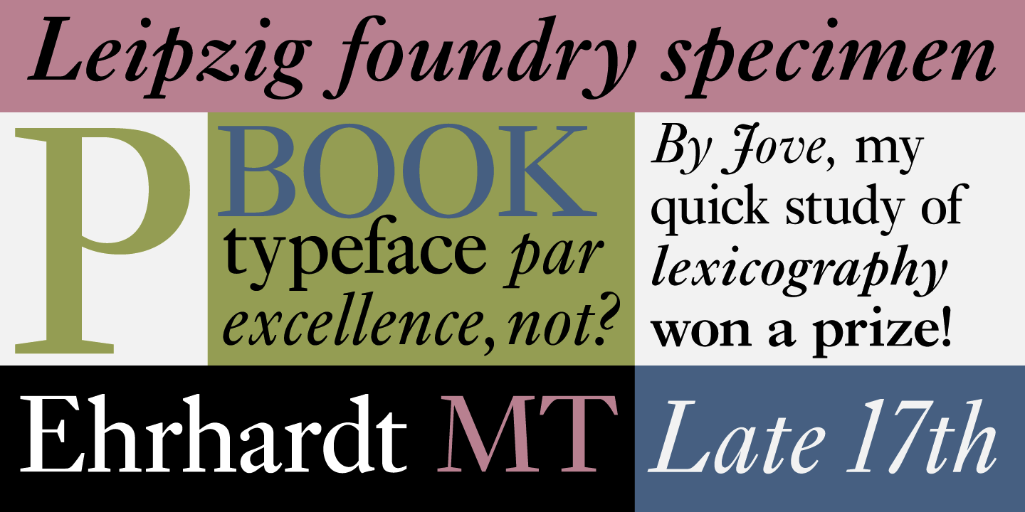
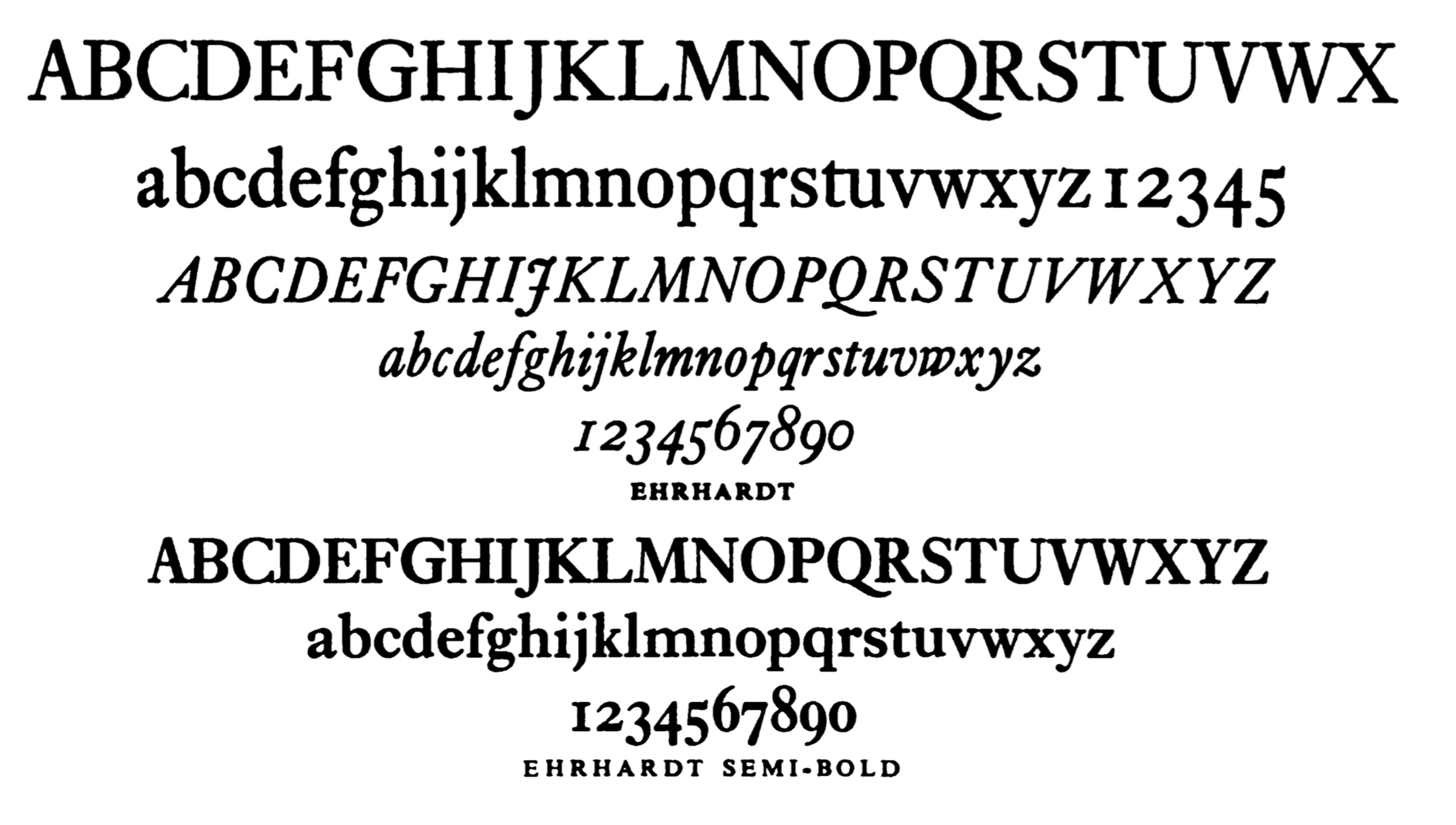
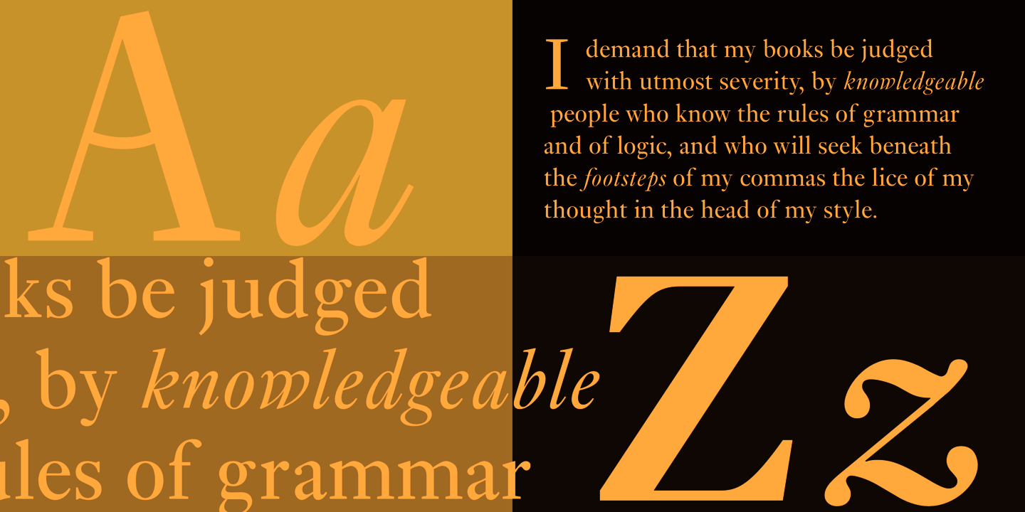
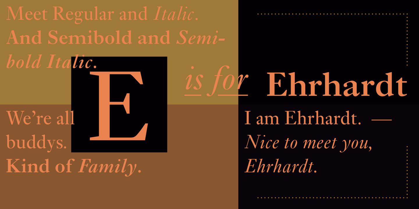
Monotype Ehrhardt
Historical discussion by the typophiles of Ehrhardt, a type attributed at Nicolas Kis, ca. 1700, and Wolfgang D. Ehrhardt of the Ehrhardtsche Gesserei in Leipzig, Germany. The discussion by the typophiles focuses on the Monotype version of Ehrhardt, 1936-1937. Caleffi writes: There's an interesting essay on Monotype Ehrhardt by Harry Carter in a reprint of Stanley Morison's "A Tally of Types"; there, Carter tells the story of that typeface revival, stating, among other things, that the "Nonesuch Press had a case or two of the 14-point (Didot) [Ehrhardt] in its cellar and set a few small books in it from 1927 onwards. Some of the Nonesuch fount eventually found its way to Cambridge [to Monotype] ... The type was favoured enough to make the American Linotype and Monotype companies cut it for their machines ... Both completed their series in 1937". Carter doesn't quote any specific designer or punch-cutters, but adds that in 1937 Morison started working on a "different treatment" of the type, named "Series 453", which in the end, in Carter's words, resulted in "an exercise in making a Fleischman out of a Kis". Again, there's no mention of any cutter. So it seems that the first Monotype version was faithfully based on the Nonesuch Press cut, while the second one was more an interpretation given by Morison? Anyway, I suggest to everyone to get copy of "A Tally of Types", it is a wonderfully written and beautifully typeset book, even if one doesn't agree with Morison's vision or statements. It seems Chauncey Griffith was involved in the Mergenthaler Linotype version in 1936-1937. And Morison seems to be the main guy for Monotype in 1937. Robin Nicolas, who has a long Monotype experience, writes: I am pretty sure that no other designer (outside of Monotype) was involved in the development of Ehrhardt. The account by Harry Carter in the 1973 'Tally of Types' seems pretty accurate to me. I think it was Morison's take on Janson---made a little heavier and narrower to give improved legibility and economy. The project started in 1936 and was originally called 'Old Hollandische' but Morison scrapped the first trial, which had been based on 'Janson Antiqua 12pt', and re-started the work in 1937, based on a different model. |
EXTERNAL LINKS |
| | |
file name: Adobe Ehrhardt 2000 88231

file name: Adobe Ehrhardt 2000

file name: Monotype Ehrhardt 1938
file name: Monotype Ehrhardt 1938
file name: Monotype Ehrhardt 2002 123156
file name: Monotype Ehrhardt 2002 123157

file name: Monotype Ehrhardt 2002
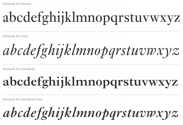
file name: Monotype Erhardt M T Pro 1991 2002
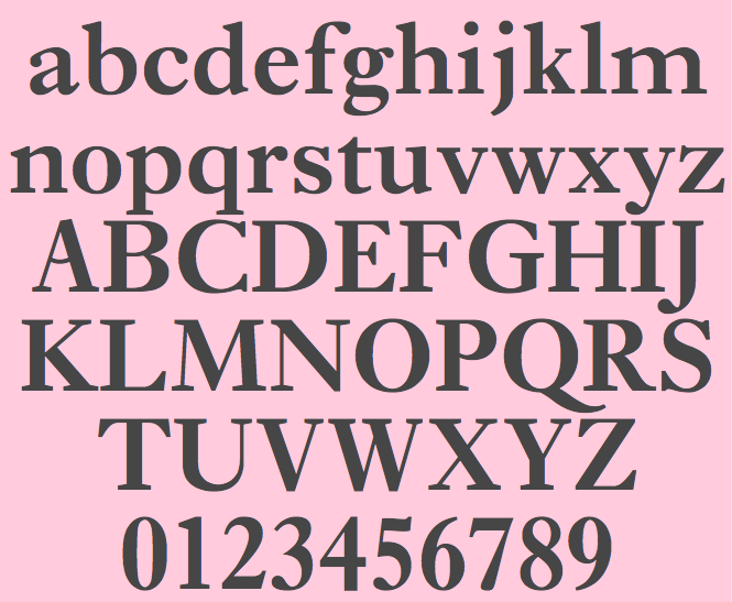
file name: Monotype Erhardt M T Semi Bold Pro 1991 2002
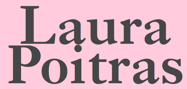
file name: Monotype Erhardt M T Semi Bold Pro 1991 2002b

file name: Monotype Erhardt M T Semi Bold Pro 1991 2002c
| | |
|
Luc Devroye ⦿ School of Computer Science ⦿ McGill University Montreal, Canada H3A 2K6 ⦿ lucdevroye@gmail.com ⦿ https://luc.devroye.org ⦿ https://luc.devroye.org/fonts.html |

