TYPE DESIGN INFORMATION PAGE last updated on Wed May 6 16:18:47 EDT 2026
FONT RECOGNITION VIA FONT MOOSE
|
|
|
|
Marc Rouault
French graphic and type designer based in Morlaix. Graduate of the Typemedia program at KABK, class of 2016. Since then, he has worked as an independent typeface designer, drawing letters for himself and custom type for clients, most notably Formula 1, Tour de France. He is currently an instructor at the graphic design school, ECV Paris, and at Type@Paris' summer program [since 2017]. His typefaces:
|
EXTERNAL LINKS |
| | |

file name: Lucas Sharp Salter Italic 2021

file name: Lucas Sharp Salter Roman Italic 2021

file name: Lucas Sharp Salter Roman Italic 2021

file name: Lucas Sharp Salter Roman Italic 2021

file name: Lucas Sharp Salter Roman Italic 2021

file name: Lucas Sharp Salter Roman Italic 2021

file name: Lucas Sharp Salter Roman 2021

file name: Lucas Sharp Salter Roman 2021

file name: Lucas Sharp Marc Rouault Doyle 2019

file name: Lucas Sharp Marc Rouault Doyle 2019

file name: Lucas Sharp Marc Rouault Doyle 2019

file name: Lucas Sharp Marc Rouault Doyle 2019

file name: Lucas Sharp Marc Rouault Doyle 2019

file name: Lucas Sharp Marc Rouault Doyle 2019

file name: Lucas Sharp Marc Rouault Doyle 2019

file name: Lucas Sharp Marc Rouault Doyle 2019

file name: Lucas Sharp Marc Rouault Doyle 2019

file name: Marc Rouault Trois Mille 2020
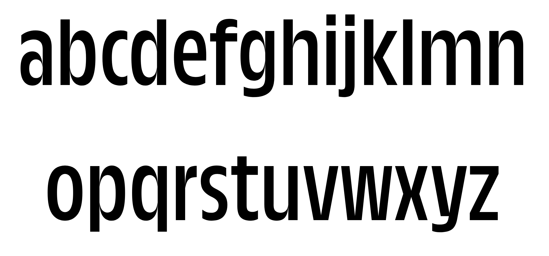
file name: Marc Rouault Trois Mille 2020

file name: Marc Rouault Trois Mille 2020
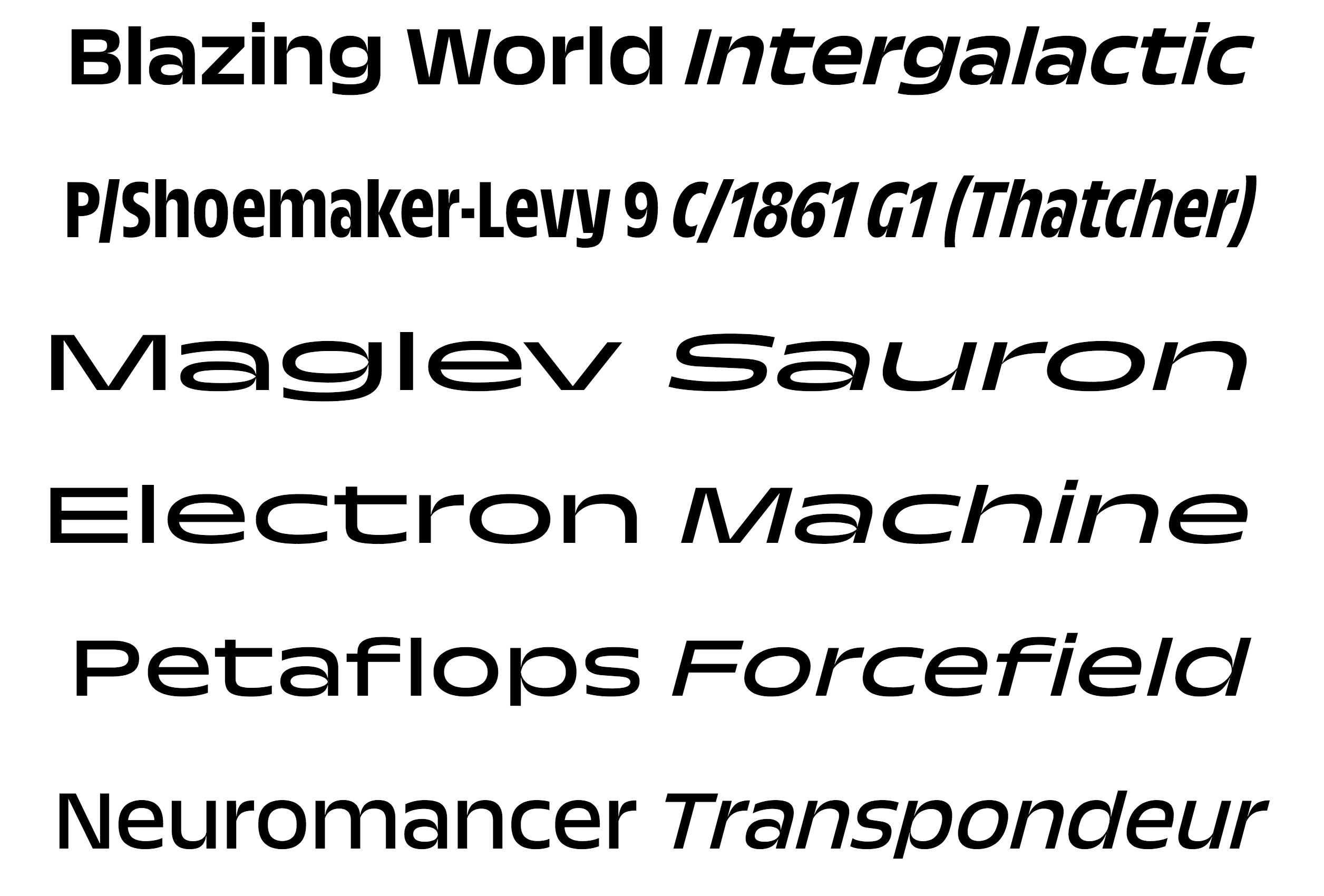
file name: Marc Rouault Trois Mille 2020
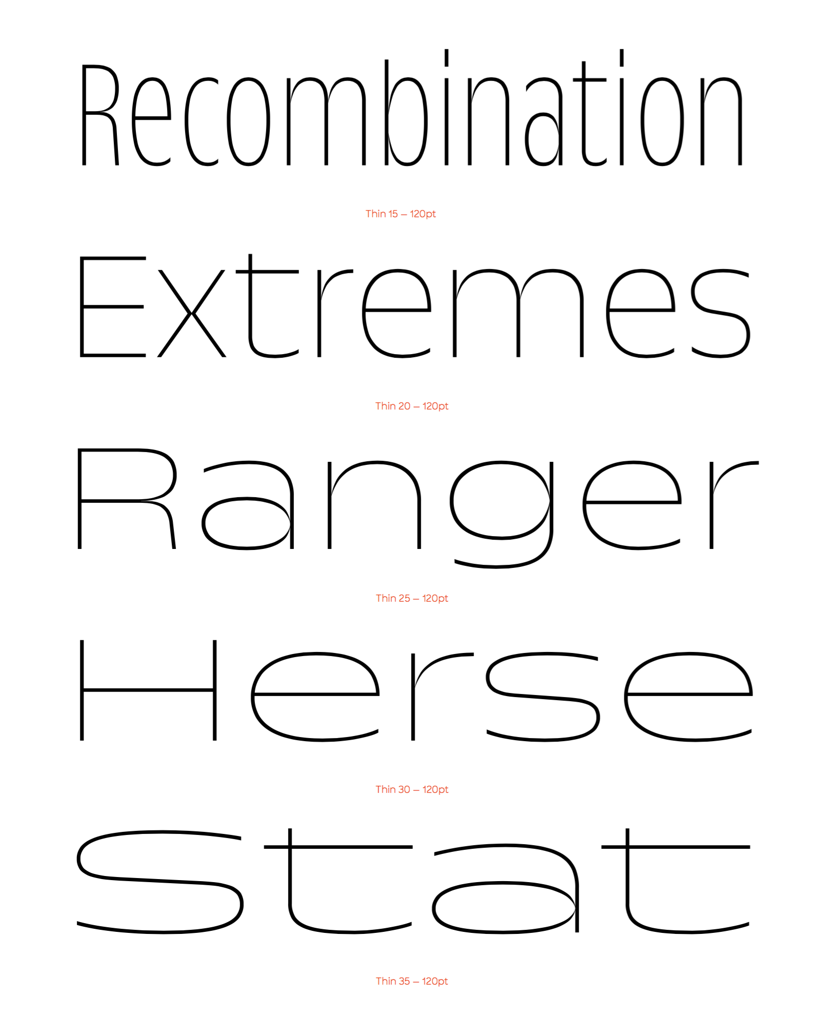
file name: Marc Rouault Trois Mille 2020
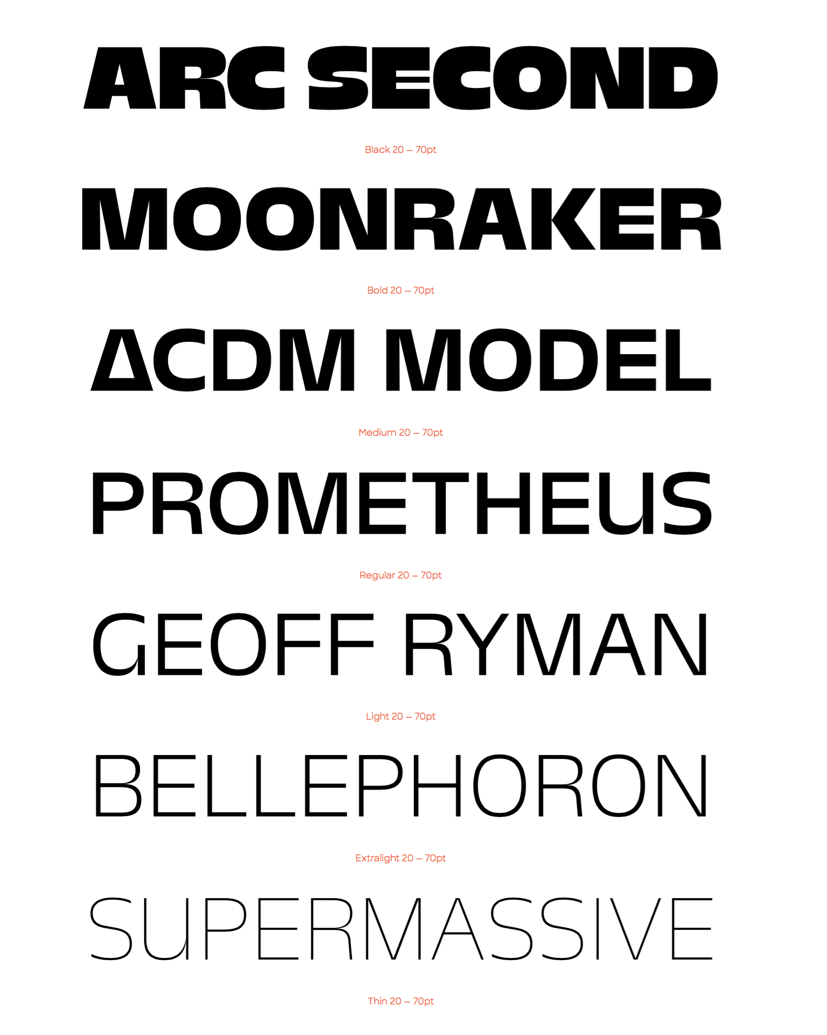
file name: Marc Rouault Trois Mille 2020

file name: Marc Rouault Trois Mille 2020
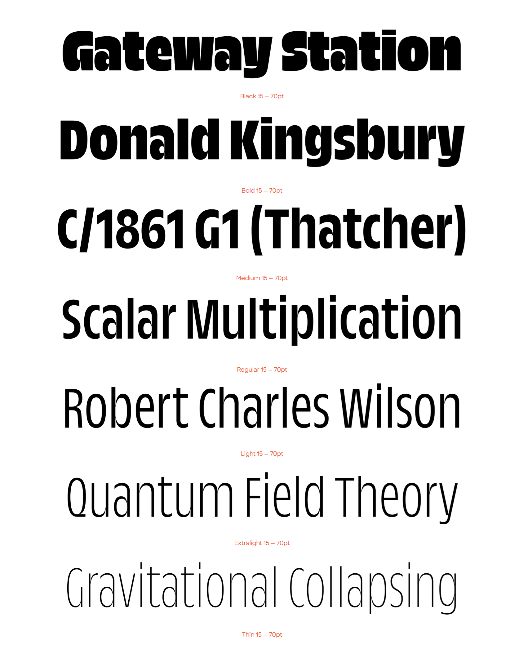
file name: Marc Rouault Trois Mille 2020
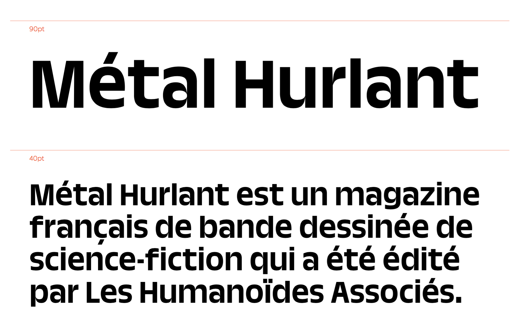
file name: Marc Rouault Trois Mille 2020
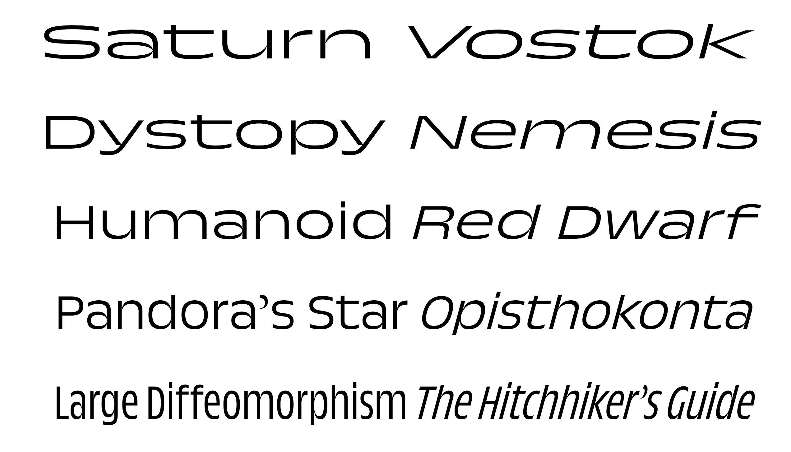
file name: Marc Rouault Trois Mille 2020
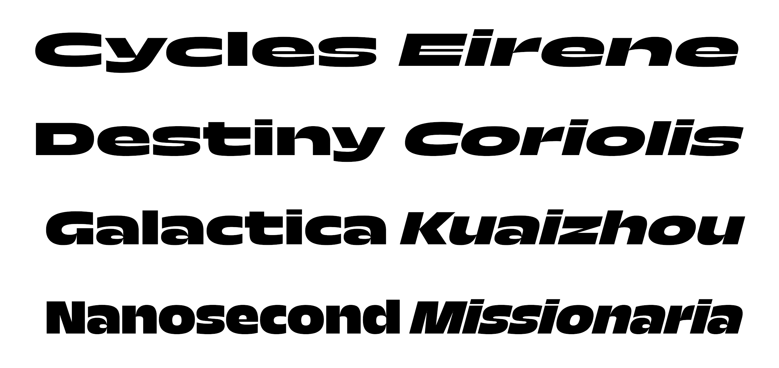
file name: Marc Rouault Trois Mille 2020
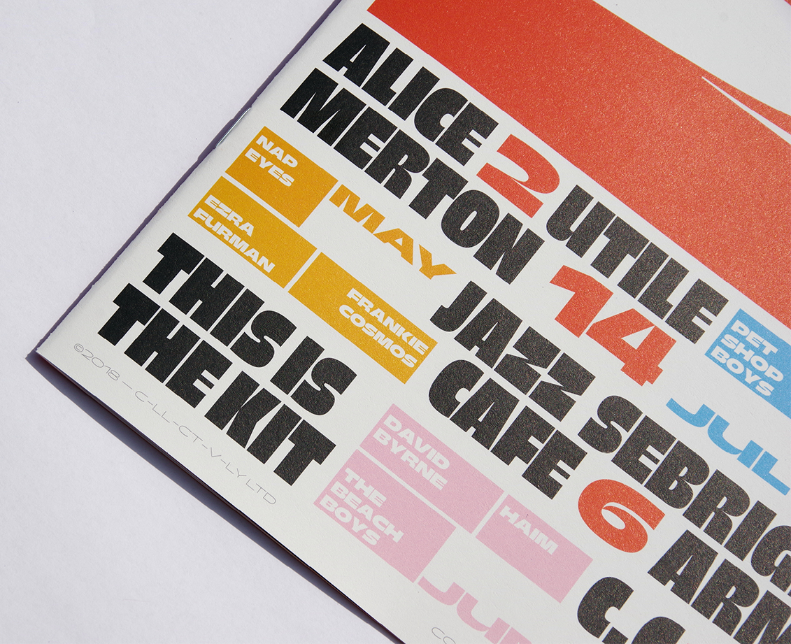
file name: Marc Rouault Trois Mille Banger 2020

file name: Marc Rouault Trois Mille Banger 2020
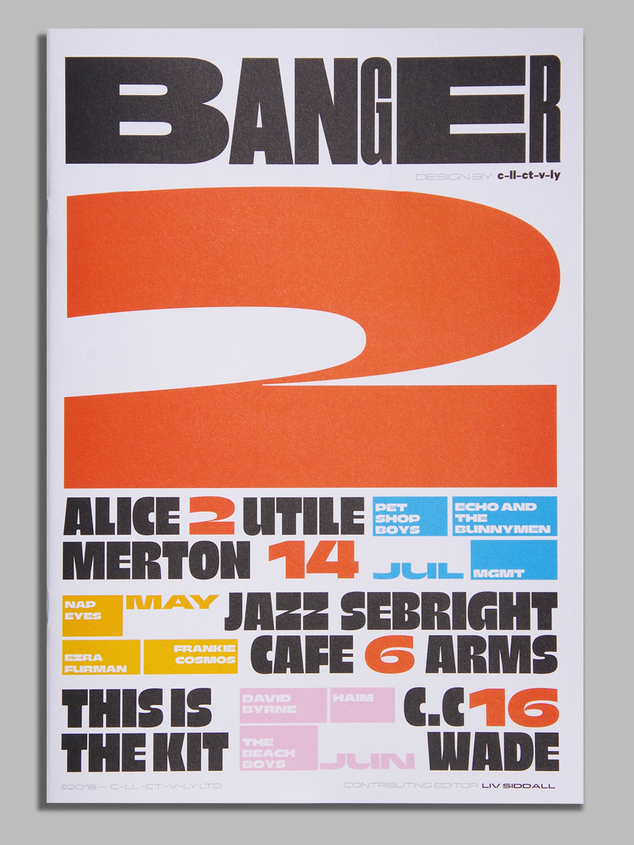
file name: Marc Rouault Trois Mille Banger 2020

file name: Marc Rouault Troismille 2016

file name: Marc Rouault Troismille 2016b

file name: Marc Rouault Troismille 2016c
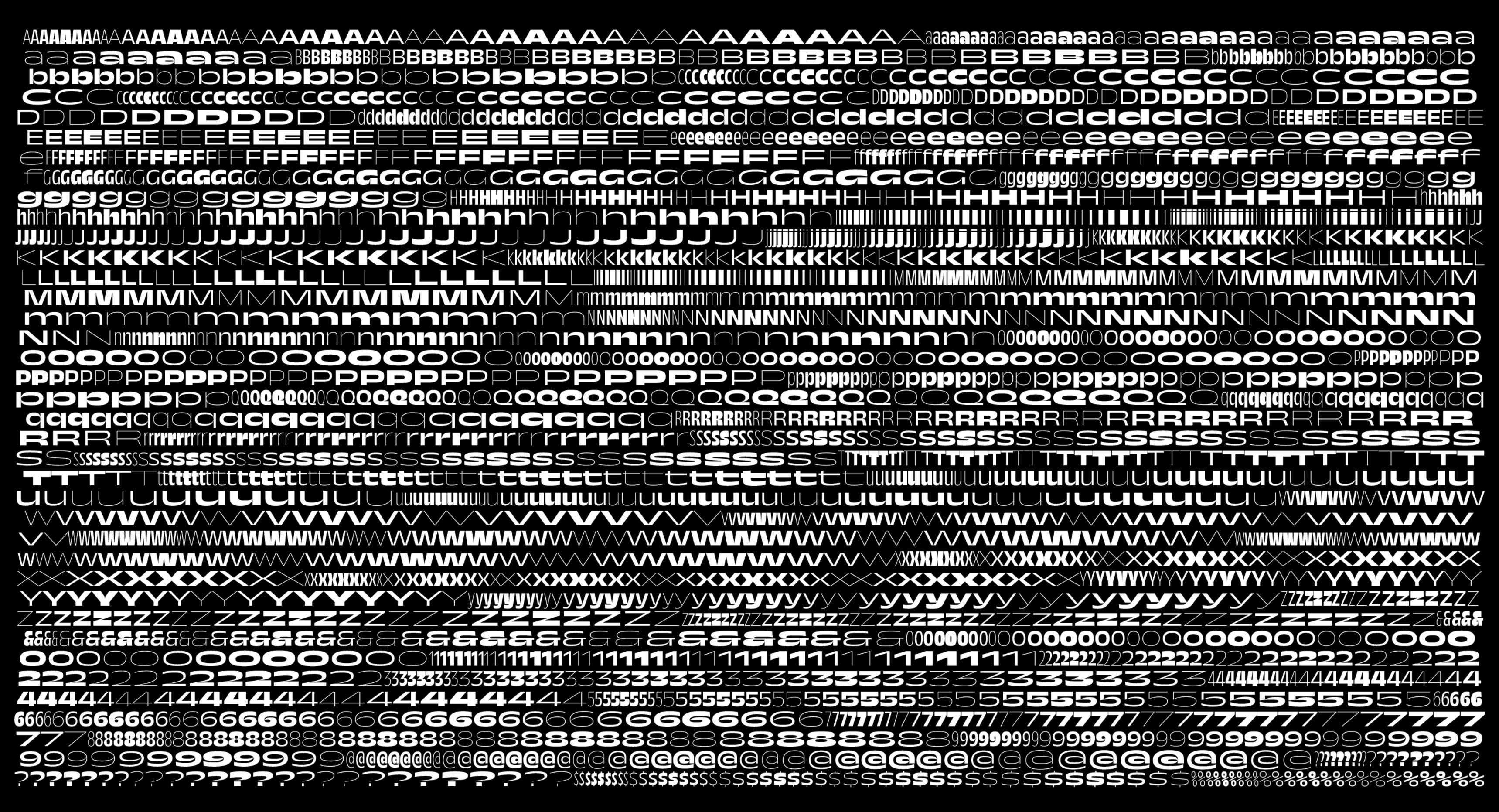
file name: Marc Rouault Troismille 2016d
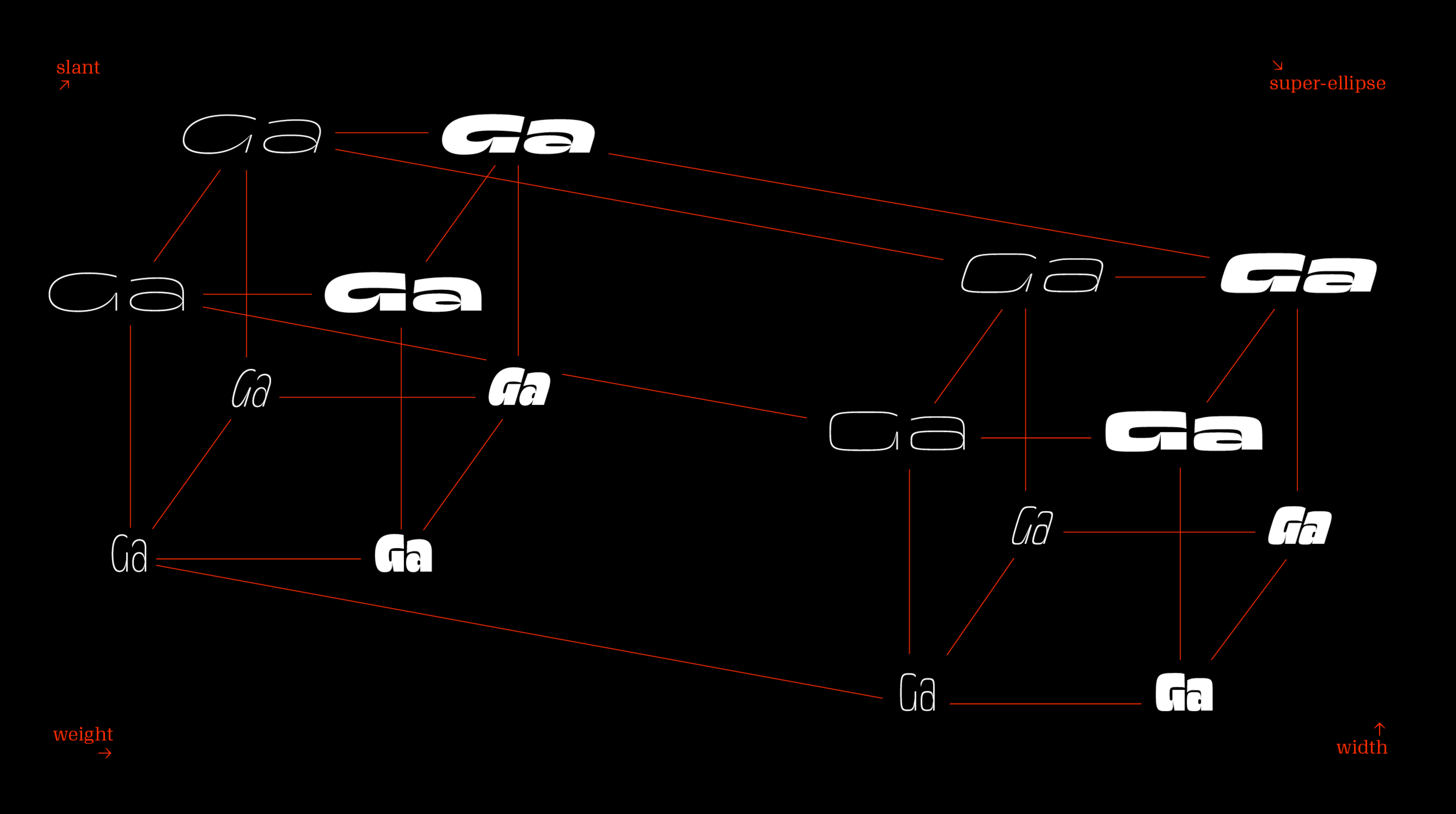
file name: Marc Rouault Troismille 2016e
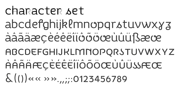
file name: Marc Rouault Pas Cap 2012
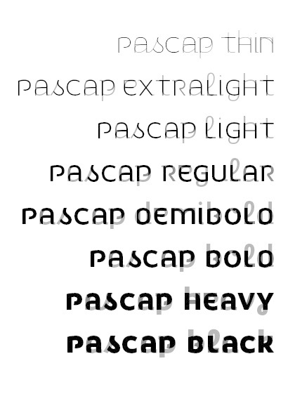
file name: Marc Rouault Pas Cap 2012b

file name: Marc Rouault Pas Cap 2012c

file name: Marc Rouault Vernet 2011

file name: Marc Rouault Vernet 2011c

file name: Marc Rouault Vernet 2011b

file name: Marc Rouault Vernet 2012

file name: Marc Rouault Vernet 2012b

file name: Marc Rouault Vernet 2012c

file name: Marc Rouault Pic
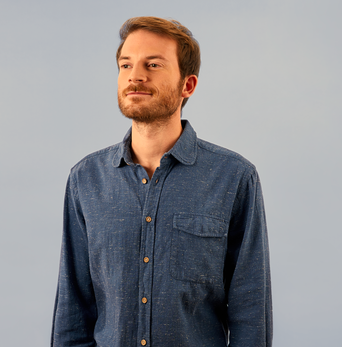
file name: Marc Rouault Pic
| | |
|
Luc Devroye ⦿ School of Computer Science ⦿ McGill University Montreal, Canada H3A 2K6 ⦿ lucdevroye@gmail.com ⦿ https://luc.devroye.org ⦿ https://luc.devroye.org/fonts.html |

