TYPE DESIGN INFORMATION PAGE last updated on Fri May 1 17:38:20 EDT 2026
FONT RECOGNITION VIA FONT MOOSE
|
|
|
|
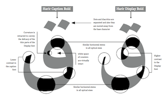
Type designer and kinetic graphic designer born in Tehran, Iran (1985). He holds a BA in graphic design with emphasis on typography from the University of Tehran. Since 2005 he has been working with advertising agencies and specializes in graphical animation. Winner at the Letter 2 competition with Harir (2010, Arabic typeface). This typeface was eventually published in 2013 by Typotheque. Peter Bilak blended Harir in with the Latin typeface Lava: Harir is a modern Arabic text typeface featuring three optical sizes, the first typeface of its kind. Harir is based on the Naskh calligraphy style, but is designed to work well with or without diacritics. Its letter proportions and stroke contrasts have been adjusted to create consistent word shapes, and dots have been carefully positioned to help balance the negative space between the letters. After Bahman Eslami completed Harir, Peter Bilak developed a special version of Lava to serve as Harir's Latin character set, perfectly matching its weight, rhythm and contrast. Designers of non-Latin typefaces are often forced to adapt Latin design principles when they want their fonts to work well in multilingual settings. This can result in distorted lettershapes that deviate from the script's tradition and heritage, impairing readability. Harir and Lava provide a unique combination that enables professional-quality multilingual (Arabic, Latin, Greek and Cyrillic) typesetting with no compromises. In the TypeMedia program at KABK in Den Haag, Bahman designed the graduation typeface Tajrish (2015) for Latin and Arabic. In 2016, he designed the low-contrast Naskh family Diodrum Arabic (Indian Type Foundry). The Latin letterforms in Diodrum are monolinear and of large x-height. Still in 2016, he published the Naskh style Kohinoor Arabic (Indian Type Foundry). Award winner at 25 TDC in 2022 for Amaala Arabic (published at Interval Type). The Arabic part of this custom family is designed to capture the impression of Latin which is an elegant high contrast typeface with round terminals, curly structure, and round counters. The type system comes in three type families, "Sans", "Open Eye" and "Closed Eye". Speaker at ATypI 2018 in Antwerp (on the topic of the symbiosis of Latin and Arabic). Typotheque link. |
EXTERNAL LINKS |
| | |

file name: Bahman Eslami Kohinoor Arabic 2016 221636

file name: Bahman Eslami Kohinoor Arabic 2016 221637

file name: Bahman Eslami Kohinoor Arabic 2016 221638

file name: Bahman Eslami Kohinoor Arabic 2016 221846

file name: Bahman Eslami Diodrum Arabic 2016 198340

file name: Bahman Eslami Diodrum Arabic 2016 198341

file name: Bahman Eslami Diodrum Arabic 2016 198382

file name: Bahman Eslami Diodrum Arabic 2016

file name: Bahmaneslami Diodrum Arabic 2016 198333

file name: Bahmaneslami Diodrum Arabic 2016 198334

file name: Bahmaneslami Diodrum Arabic 2016 198335

file name: Bahmaneslami Diodrum Arabic 2016 198337

file name: Bahmaneslami Diodrum Arabic 2016 198338

file name: Bahman Eslami Tajrish 2015

file name: Bahman Eslami Tajrish 2015 01

file name: Bahman Eslami Tajrish 2015 02

file name: Bahman Eslami Tajrish 2015 14

file name: Bahman Eslami Tajrish 2015 14b

file name: Bahman Eslami Tajrish 2015 15

file name: Bahman Eslami Tajrish 2015 15b

file name: Bahman Eslami Tajrish 2015 16

file name: Bahman Eslami Tajrish 2015 17

file name: Bahman Eslami Tajrish 2015 19

file name: Bahman Eslami Tajrish 2015 20

file name: Bahman Eslami Tajrish 2015 20b

file name: Bahman Eslami Harir 2010

file name: Bahman Eslami Harir 2010b

file name: Bahman Eslami Harir 2010c

file name: Bahman Eslami Harir 2010d

file name: Bahman Eslami Harir 2010e

file name: Bahman Eslami Harir 2010f

file name: Bahman Eslami Harir 2010g

file name: Bahman Eslami Harir 2010h

file name: Bahman Eslami Harir 2010i

file name: Bahman Eslami A Typ I2018 photo by Michael Bundscherer
| | |
|
Luc Devroye ⦿ School of Computer Science ⦿ McGill University Montreal, Canada H3A 2K6 ⦿ lucdevroye@gmail.com ⦿ https://luc.devroye.org ⦿ https://luc.devroye.org/fonts.html |


