TYPE DESIGN INFORMATION PAGE last updated on Wed May 6 16:19:57 EDT 2026
FONT RECOGNITION VIA FONT MOOSE
|
|
|
|
Contrast Type Foundry (or: CoFo)
[Maria Doreuli]
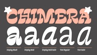
Contrast Type Foundry (London) was a joint venture of Maria Doreuli, Krista Radoeva and Lisa Rasskazova (Moscow). In 2019, now based in Moscow, the team members are Maria Doreuli, Lisa Rasskazova, Anna Khorash and Nikita Sapozhkov. They do custom and retail type design. Their client list includes Tretyakov Gallery, Strelka Institute, Théâtre de Belleville, The Art Newspaper, Mail.ru, Fader Magazine, Tsaritsino Museum, Weber Grills, Naked Heart Foundation, LaModa, Kaspersky, Rambler&Co, Gosha Rubchinsky, White Russian and Tsentsiper. Maria Doreuli (Moscow) earned her Masters degree in graphic design from Moscow State University of Printing. During that time she attended Alexander Tarbeev's type design workshop. During 2009-2012 she worked on RIA Novosti's corporate identity projects. Winner at the Letter 2 competition in 2011 with the serif text family William (2011), which was her graduation project. This contemporary interpretation of Caslon also won First Prize in the Cyrillic typeface category at Granshan 2011. William Headline won at New Cyrillic 2012. Finally, in 2016, William was published by Typotheque. It is available in three optical sizes, a Text version with a large x-height for smaller text from 7 to 12pt, a Subhead version for use at 14 to 30 points, and Display version for text larger than 36 points. In 2011 she was named a designer of the year by the Russian newspaper Akzia. In 2012, Maria started type design studies at the KABK in Den Haag. Her graduation typeface there was the reverse contrast display typeface Chimera (2013). Chimera won an award at TDC 2014. It won the Silver Prize in the Latin category at the Morisawa Type Design Competition 2014. In 2014, Maria Doreuli, Krista Radoeva, and Elizaveta Rasskazova co-designed Sputnik Display for Sputnik News. This organic sans typeface family covers Latin, and various brands of Cyrillic, including the ones used in Uzbekistan, Tajikistan, Abkhazia and Mongolia. It won a Special Mention at the 2015 Granshan competition. Speaker at ATypI 2013 in Amsterdam: The contrast between Russian and Bulgarian Cyrillic. Fit (2017, by David Jonathan Ross and Maria Doreuli) is a tall black display family that runs from ultra-compressed to very wide. It screams Use me for the Oscars! Fit was first developed as a variable font. It won an award at Granshan 2017. CoFo Sans was designed by Maria Doreuli between 2016 and 2018. Lisa Rasskazova designed CoFo Robert between 2012 and 2018. Named after Robert Beasley, it is inspired by Clarendon. In 2019, Maria Doreuli and Anna Khorash released the variable font CoFo Peshka at Future Fonts. Inspired by the industrial and military lettering in the Soviet era, it is named after the Pe-2 aircraft also called the Peshka. CoFo Peshka features weight and width axes. CoFo Plusha (2020) is a creamy super-fat typeface for Latin and Cyrillic. In 2021, she published CoFo Kak, a Latin / Cyrillic sans family with a name that raises eyebrows in Belgium, South Africa and the Netherlands. |
EXTERNAL LINKS |
| | |

file name: Maria Doreuli Co Fo Kak 2021

file name: Maria Doreuli Co Fo Kak 2021

file name: Maria Doreuli Co Fo Kak 2021

file name: Maria Doreuli Co Fo Kak 2021

file name: Maria Doreuli Co Fo Kak 2021

file name: Maria Doreuli Co Fo Kak 2021

file name: Maria Doreuli Co Fo Kak 2021

file name: Maria Doreuli Co Fo Kak 2021

file name: Maria Doreuli Co Fo Kak 2021

file name: Maria Doreuli Co Fo Kak 2021

file name: Maria Doreuli Co Fo Kak 2021

file name: Maria Doreuli Co Fo Kak 2021

file name: Maria Doreuli Co Fo Kak 2021

file name: Maria Doreuli Co Fo Kak 2021

file name: Maria Doreuli Co Fo Plusha 2020

file name: Maria Doreuli Co Fo Plusha 2020

file name: Maria Doreuli Co Fo Plusha 2020

file name: Maria Doreuli Co Fo Plusha 2020

file name: Maria Doreuli Anna Khorash Co Fo Peshka 2019

file name: Maria Doreuli Anna Khorash Co Fo Peshka 2019

file name: Maria Doreuli Anna Khorash Co Fo Peshka 2019

file name: Maria Doreuli Anna Khorash Co Fo Peshka 2019.

file name: Maria Doreuli Anna Khorash Co Fo Peshka 2019

file name: Maria Doreuli Anna Khorash Co Fo Peshka 2019

file name: Maria Doreuli Anna Khorash Co Fo Peshka 2019

file name: Maria Doreuli Anna Khorash Co Fo Peshka 2019

file name: Maria Doreuli Anna Khorash Co Fo Peshka 2019

file name: Maria Doreuli Anna Khorash Co Fo Peshka 2019

file name: Maria Doreuli Anna Khorash Co Fo Peshka 2019

file name: Maria Doreuli Anna Khorash Co Fo Peshka 2019

file name: Maria Doreuli Anna Khorash Co Fo Peshka 2019

file name: Maria Doreuli Co Fo Sans 2018

file name: Maria Doreuli Co Fo Sans 2018

file name: Maria Doreuli Co Fo Sans 2018

file name: Maria Doreuli Co Fo Sans 2018

file name: Maria Doreuli Co Fo Sans 2018
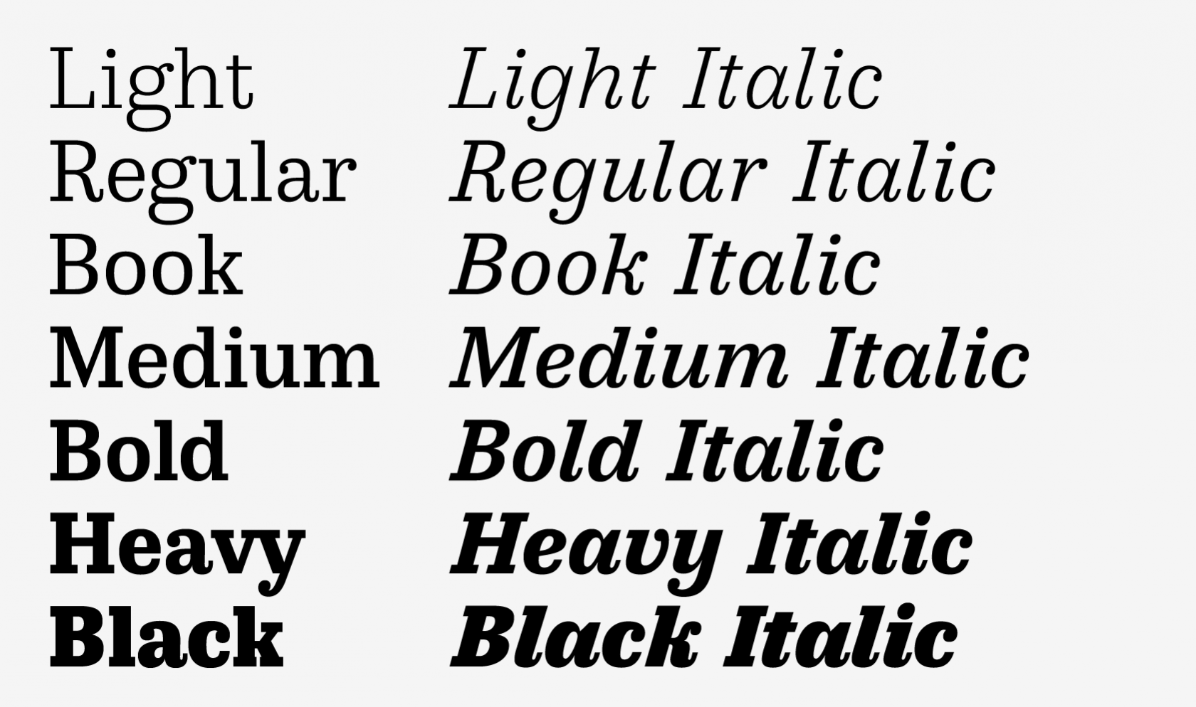
file name: Liza Rasskazova Co Fo Robert 2018
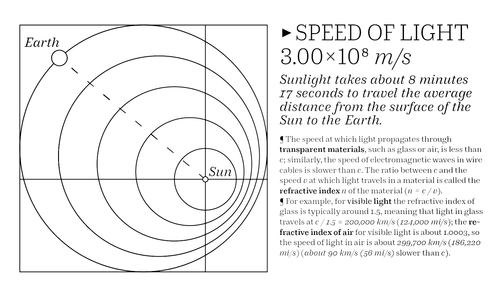
file name: Liza Rasskazova Co Fo Robert 2018
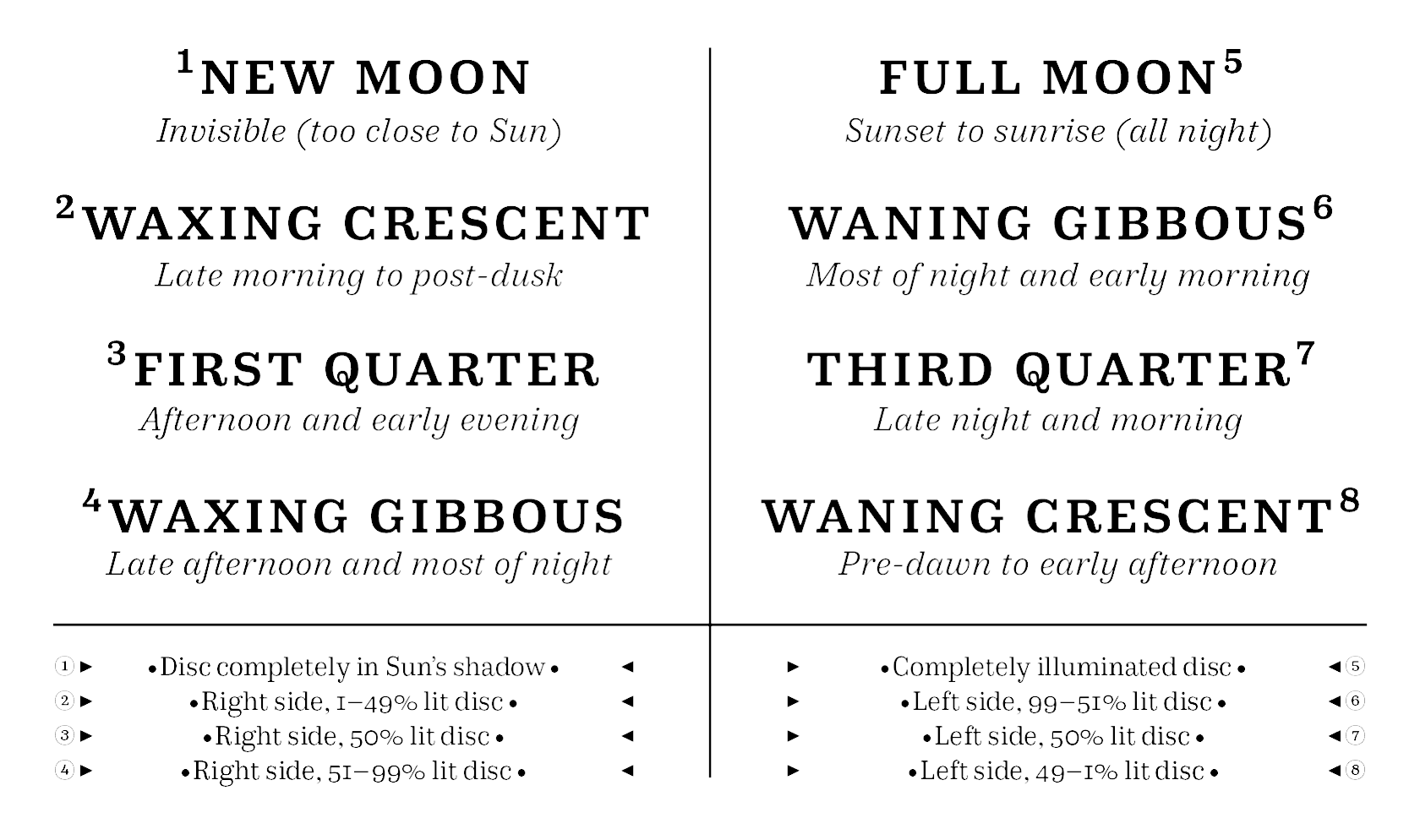
file name: Liza Rasskazova Co Fo Robert 2018
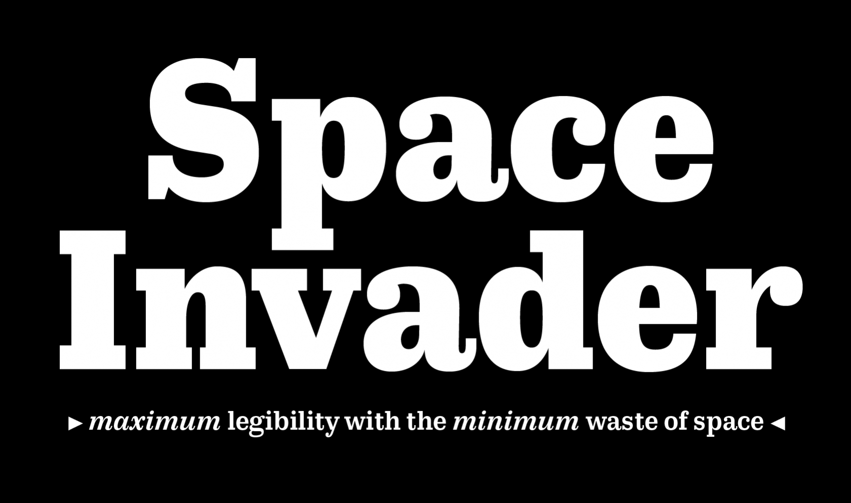
file name: Liza Rasskazova Co Fo Robert 2018
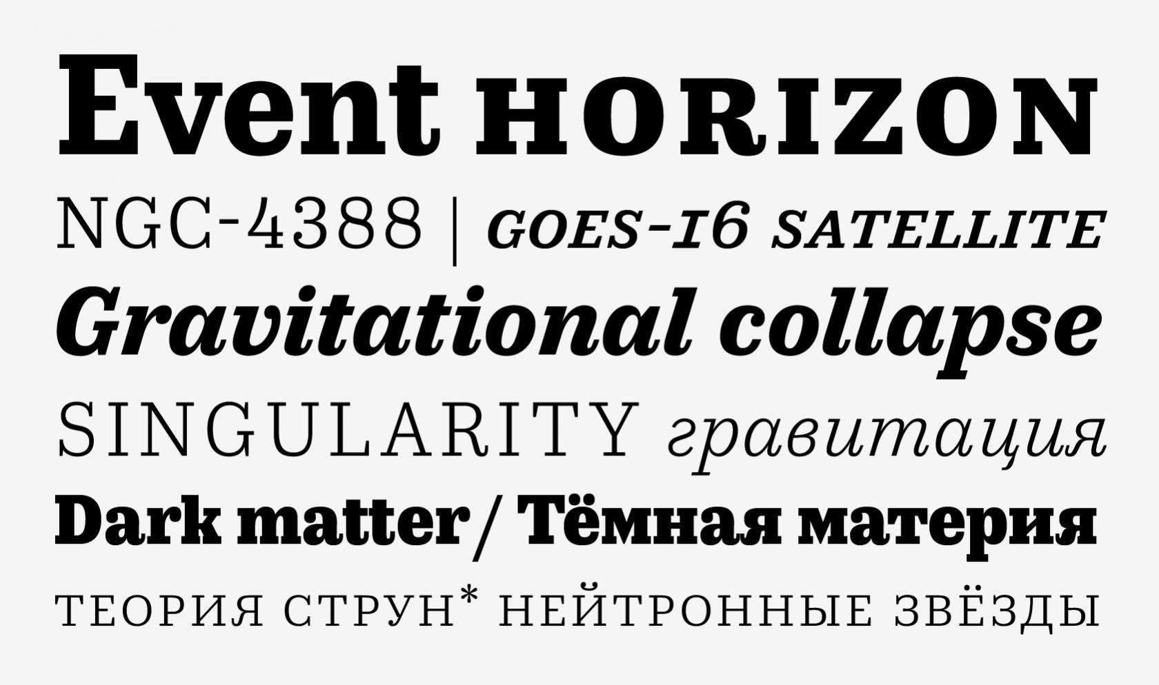
file name: Liza Rasskazova Co Fo Robert 2018

file name: Maria Doreuli Krista Radoeva Elizaveta Rasskazova Sputnik 2014

file name: Maria Doreuli Krista Radoeva Elizaveta Rasskazova Sputnik 2014b

file name: Maria Doreuli Krista Radoeva Elizaveta Rasskazova Sputnik 2014c

file name: Maria Doreuli Krista Radoeva Elizaveta Rasskazova Sputnik 2014d

file name: Maria Doreuli Krista Radoeva Elizaveta Rasskazova Sputnik 2014e

file name: Maria Doreuli Krista Radoeva Elizaveta Rasskazova Sputnik 2014f

file name: Maria Doreuli Krista Radoeva Elizaveta Rasskazova Sputnik 2014g

file name: Maria Doreuli Krista Radoeva Elizaveta Rasskazova Sputnik 2014h

file name: Maria Doreuli Krista Radoeva Elizaveta Rasskazova Sputnik 2014i

file name: Maria Doreuli Krista Radoeva Elizaveta Rasskazova Sputnik 2014j

file name: Maria Doreuli Krista Radoeva Elizaveta Rasskazova Sputnik 2014k

file name: Maria Doreuli Krista Radoeva Elizaveta Rasskazova Sputnik 2014l

file name: Maria Doreuli Krista Radoeva Elizaveta Rasskazova Sputnik 2014m

file name: Maria Doreuli William Text Std Bold 2016

file name: Maria Doreuli William 2011

file name: Maria Doreuli Chimera 2013

file name: Maria Doreuli Chimera 2013b

file name: Maria Doreuli Chimera 2013c

file name: Maria Doreuli Chimera 2013d

file name: Maria Doreuli Chimera 2013e

file name: Maria Doreuli Chimera 2013f

file name: Maria Doreuli Chimera 2013g

file name: Maria Doreuli Chimera 2013a

file name: Maria Doreuli Chimera 2013h

file name: Maria Doreuli Chimera 2013j

file name: Maria Doreuli Chimera T D C Award 2014

file name: Maria Doreuli Krista Radoeva Uv A Collections A Typ I2013

file name: Maria Doreuli Portrait

file name: Maria Doreuli Pic
| | |
|
Luc Devroye ⦿ School of Computer Science ⦿ McGill University Montreal, Canada H3A 2K6 ⦿ lucdevroye@gmail.com ⦿ https://luc.devroye.org ⦿ https://luc.devroye.org/fonts.html |

