TYPE DESIGN INFORMATION PAGE last updated on Tue May 5 11:50:42 EDT 2026
FONT RECOGNITION VIA FONT MOOSE
|
|
|
|
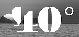
Naipe Foundry is the type design, lettering & font production company set up in 2018 by Alvaro Franca and Felipe Casaprima (and before that, Leandro Assis as well). Alvaro Franca is a graphic designer from Rio de Janeiro who studied at ESDI in Rio and EINA in Barcelona. He teaches at Domestika and ELISAVA in Barcelona. He created Aladdin Sans (2011) when he was studying at ESDI in Rio. Other early typefaces by him include the wedge serif text typeface Selsdon (2015) and the didone numerals typeface Baleia Heavy (2015), which was influenced by Herb Lubalin's style. In 2016, he created the 9-width titling or poster typeface family Bonde and wrote: It is the result of a year long research project on the hand painted lettering used in Rio de Janeiro tramways between 1868 and 1966. The carioca engineers who lettered the original signs used compression and expansion of letters so that station names of all sizes would occupy the same horizontal space. Because they didn't have lettering training or a model to follow, they had to come up with their own unique solutions for the problem of width variation in letterforms. Bonde applies these quirky and ingenious designs to a multi width type family, but adapts letterforms for contemporary use in their original function: signage and wayfinding. In 2016, he designed the informal typeface Noturna. In 2017-2018, he participated in the Type Expert program at the Plantin-Moretus Institute in Antwerp. He won an award at Tipos Latinos 2018 for Discordia (Naipe Foundry and Future Fonts): Developed originally for use in magazines, the goal was to create a concise text family that blurred the lines of type classification, mixing things that normally don't go together but which could be persuaded to play nice this one time. In 2020, Hebrew support was added thanks to Ben Nathan. In 2021, MyFonts published Discordia and credited Felipe Casaprima and Alvaro Franca. In 2020, Naipe released Pacaembu. Advertized as a tropical art deco sans, this seven-style sans serif typeface by Alvaro Franca and Felipe Casaprima finds its roots in Brazilian soccer. In particular, it took inspiration from the stone lettering found in the 1940 art deco style Sao Paulo Municipal Stadium, also known as Estadio Pacaembu. A variable style is included. Future Fonts link. https://fonts.ilovetypography.com/fonts/naipe-foundry">I Love Typography link. |
EXTERNAL LINKS |
| | |

file name: Naipe Foundry Logo

file name: Alvaro Franca Felipe Casaprima Pacaembu 2020

file name: Alvaro Franca Felipe Casaprima Pacaembu 2020

file name: Alvaro Franca Felipe Casaprima Pacaembu 2020

file name: Alvaro Franca Felipe Casaprima Pacaembu 2020

file name: Naipe Foundry Pacaembu 2021 1

file name: Alvaro Franca Felipe Casaprima Pacaembu 2021

file name: Alvaro Franca Felipe Casaprima Pacaembu 2021

file name: Alvaro Franca Felipe Casaprima Pacaembu 2021

file name: Alvaro Franca Felipe Casaprima Pacaembu 2021

file name: Alvaro Franca Felipe Casaprima Pacaembu 2021

file name: Naipe Foundry Pacaembu 2021 2

file name: Naipe Foundry Pacaembu 2021 3

file name: Naipe Foundry Pacaembu 2021 4

file name: Naipe Foundry Pacaembu 2021 5

file name: Naipe Foundry Pacaembu 2021

file name: Naipe Pacaembu 2020

file name: Naipe Pacaembu 2020

file name: Naipe Pacaembu 2020

file name: Naipe Pacaembu 2020

file name: Naipe Pacaembu 2020

file name: Naipe Pacaembu 2020

file name: Naipe Pacaembu 2020

file name: Naipe Pacaembu 2020

file name: Naipe Pacaembu 2020

file name: Naipe Foundry Discordia 2021 1

file name: Naipe Foundry Discordia 2021 2

file name: Naipe Foundry Discordia 2021 3

file name: Naipe Foundry Discordia 2021 4

file name: Naipe Foundry Discordia 2021 5

file name: Naipe Foundry Discordia 2021

file name: Alvaro Franca Discordia 2018

file name: Alvaro Franca Discordia 2018b

file name: Alvaro Franca Discordia 2018c

file name: Alvaro Franca Discordia 2018d

file name: Alvaro Franca Discordia 2018e

file name: Alvaro Franca Discordia 2018f

file name: Alvaro Franca Discordia 2018g

file name: Alvaro Franca Discordia 2018h

file name: Naipe Discordia Hebrew 2020

file name: Naipe Discordia Hebrew 2020

file name: Alvaro Franca Noturna 2016

file name: Alvaro Franca Noturna 2016b

file name: Alvaro Franca Noturna 2016c

file name: Alvaro Franca Noturna 2016d

file name: Alvaro Franca Noturna 2016e

file name: Alvaro Franca Noturna 2016g

file name: Alvaro Franca Noturna 2016h

file name: Alvaro Franca Noturna 2016i

file name: Alvaro Franca Noturna 2016j

file name: Alvaro Franca Noturna 2016l

file name: Alvaro Franca Noturna 2016m

file name: Alvaro Franca Pic

file name: Alvaro Franca Bonde 2016

file name: Alvaro Franca Bonde 2016a

file name: Alvaro Franca Bonde 2016c

file name: Alvaro Franca Bonde 2016d

file name: Alvaro Franca Bonde 2016e

file name: Alvaro Franca Bonde 2016g

file name: Alvaro Franca Bonde 2016h

file name: Alvaro Franca Bonde 2016i

file name: Alvaro Franca Bonde 2016j

file name: Alvaro Franca Bonde 2016k

file name: Alvaro Franca Bonde 2016l

file name: Alvaro Franca Selsdon 2015

file name: Alvaro Franca Selsdon 2015b

file name: Alvaro Franca Baleia Heavy 2015

file name: Alvaro Franca Baleia Heavy 2015b

file name: Alvaro Franca Baleia Heavy 2015c

file name: Alvaro Franca Baleia Heavy 2015d

file name: Alvaro Franca Baleia Heavy 2015e

file name: Alvaro Franca Baleia Heavy 2015f

file name: Alvaro Franca Type Con 2016
| | |
|
Luc Devroye ⦿ School of Computer Science ⦿ McGill University Montreal, Canada H3A 2K6 ⦿ lucdevroye@gmail.com ⦿ https://luc.devroye.org ⦿ https://luc.devroye.org/fonts.html |


