TYPE DESIGN INFORMATION PAGE last updated on Wed May 6 16:20:06 EDT 2026
FONT RECOGNITION VIA FONT MOOSE
|
|
|
|
Mary Faber
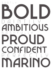
Mary Faber (b. 1987) from Hamilton, New Zealand, writes about Mainline, a copperplate creation in 2011: Mainline's style was formed through an amalgamation of two historical typefaces titled Copperplate and Glyptic; research proved these the most popular metal display typefaces in New Zealand letterpress printing during the period of 1880 to 1900. Despite the lack of typeface designers in New Zealand in the late 1800s, this hybrid typeface design could be considered a national reflection of historic typefaces seen in New Zealand during that time. It should be noted that the selected parent typefaces were both Victorian typefaces by Hermann Ihlenburg. She also created Marino (2011): Marino is a contemporary typeface design influenced by a period of New Zealand's typographic history. Its letterforms were created based on research into typeface trends within newspaper advertising from 1920 until 1940, reflecting the increasing popularity of geometric modernity, and the peak of typographic Art Deco in 1930. In particular, Marino is based on an ad for Mencken from ca. 1930. Speaker at AtypI 2012 in Hong Kong: New Zealand Type on Display. In this talk, she introduced her typefaces. Dalton Maag, Tom Foley, Mary Faber, Stuart Brown and Hanna Donker won a Granshan 2014 award for Intel Clear Cyrillic. |
EXTERNAL LINKS |
| | |

file name: Dalton Maag Intel Clear Cyrillic

file name: Mary Faber Marino 2011

file name: Mary Faber Marino 2011b

file name: Mary Faber Mainline 2011

file name: Mary Faber Mainline 2011b

file name: Mary Faber Mainline 2011c
| | |
|
Luc Devroye ⦿ School of Computer Science ⦿ McGill University Montreal, Canada H3A 2K6 ⦿ lucdevroye@gmail.com ⦿ https://luc.devroye.org ⦿ https://luc.devroye.org/fonts.html |

