TYPE DESIGN INFORMATION PAGE last updated on Wed May 6 16:20:17 EDT 2026
FONT RECOGNITION VIA FONT MOOSE
|
|
|
|
Calligrapher and type designer in Berlin, b. 1956, who headed the type department at FontShop International and then became Head of the Tech Department at Monotype in Berlin. He cooperated with Axel Betram on the text family Rabenau (2011, Linotype), which was earlier called Lucinde. Images: i, ii, iii. In 2012, Frohloff and Bertram published the friendly typeface FF Videtur: The concept for FF Videtur is based on bitmap fonts Axel Bertram created for the state television broadcaster in East Germany (GDR Television) during the 1980s. Thorough research and testing led to the creation of an open, functional serif typeface with alternating contrast. Freed from yesteryear's technical restrictions, the new FF Videtur was entirely redrawn while keeping the best characteristics of the earlier forms. Despite its workmanlike appearance at first glance, its warm character is undeniable. The reasons for this are its modest stroke contrast; the open, clearly differentiated letterforms; the relatively short and rounded wedge-shaped serifs; and the consistent rhythm it sets in lines of text. |
EXTERNAL LINKS |
| | |
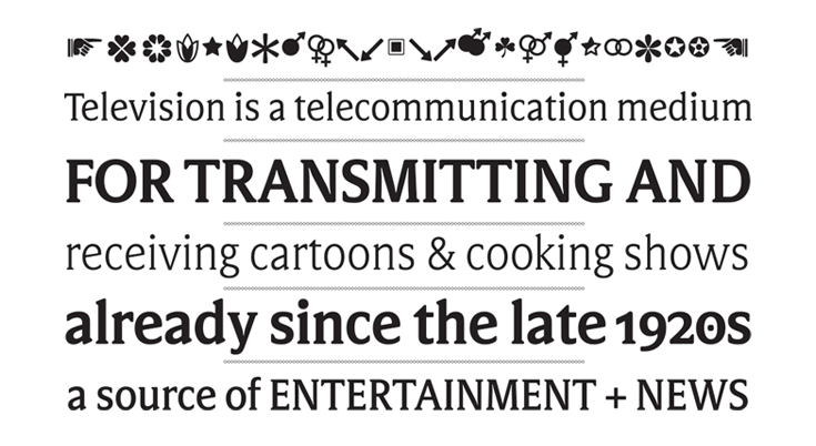
file name: Axel Bertram Andreas Frohloff F F Videtur 2012

file name: Axel Bertram Andreas Frohloff F F Videtur 2012b

file name: Axel Bertram Andreas Frohloff Rabenau 2011c

file name: Axel Bertram Andreas Frohloff Rabenau 2011
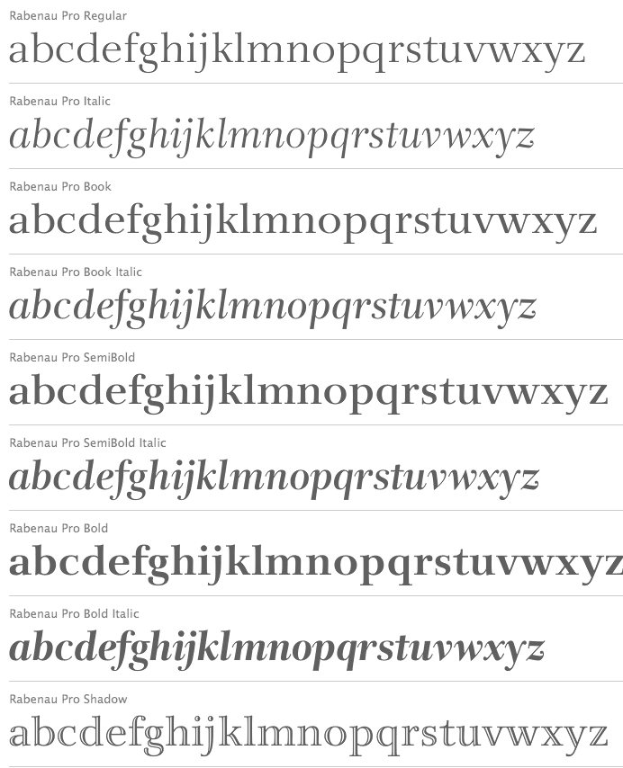
file name: Axel Bertram Andreas Frohloff Rabenau 2011d
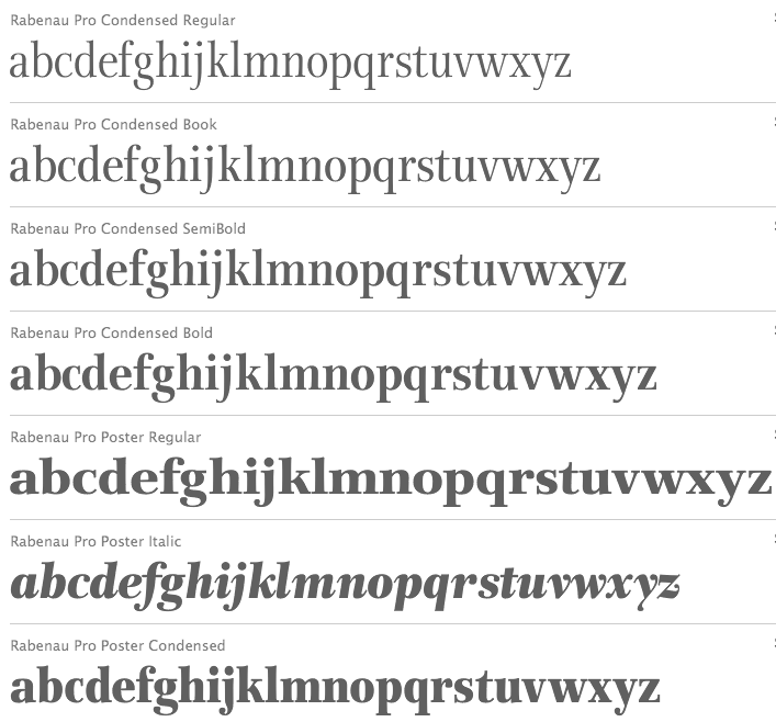
file name: Axel Bertram Andreas Frohloff Rabenau 2011e
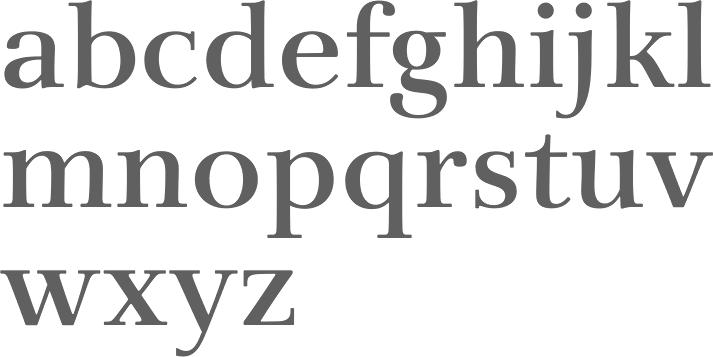
file name: Axel Bertram Andreas Frohloff Rabenau Semibold 2011
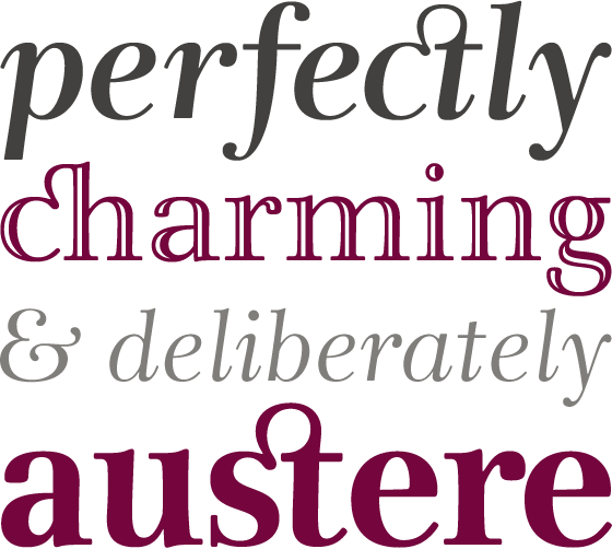
file name: Axel Bertram Andreas Frohloff Rabenau 2011b
| | |
|
Luc Devroye ⦿ School of Computer Science ⦿ McGill University Montreal, Canada H3A 2K6 ⦿ lucdevroye@gmail.com ⦿ https://luc.devroye.org ⦿ https://luc.devroye.org/fonts.html |


