TYPE DESIGN INFORMATION PAGE last updated on Tue May 5 11:51:03 EDT 2026
FONT RECOGNITION VIA FONT MOOSE
|
|
|
|
One of the great type designers of the twentieth century, 1865-1947. Born in Bloomington, IL, he made over 125 typefaces. He founded the Village Press with Will H. Ransom at Park Ridge, IL, in 1903. From 1904 until 1906, it was in Hingham, MA, and from 1906-1913 at 225 Fourth Avenue, New York City, where a fire destroyed everything except the matrices on January 10, 1908. From 1913 until 1923, it was located in Forest Hill Gardens, Long Island, and from 1923 until his death in 1947 at Deepdene, in Marlborough-on-Hudson, NY. He was an art consultant for Lanston Monotype from 1920-1940. His life's work and his ideas on typography can be found in his great book, Typologia, Studies in Type Design \& Type Making (1940, University of California Press, Berkeley), but his views are already present in Elements of Lettering (1922, The Village Press, Forest Hill Gardens, New York). His own work is summarized, shown and explained in his last book, A Half-Century of Type Design and Typography 1895-1945, Volume One (1946, The Typophiles, New York). See also Frederic Goudy by D.J.R. Bruckner for Harry N. Abrams Publishers, New York. In 1936, Frederic Goudy received a certificate of excellence that was handlettered in blackletter and immediately stated, Anyone who would letterspace blackletter would steal sheep. He also wrote: All the old fellows stole our best ideas, and Someday I'll design a typeface without a K in it, and then let's see the bastards misspell my name. His 116 fonts include
Several foundries specialize in Goudy's types. These include P22/Lanston, which has an almost complete digital collection, Ascender Monotype, and Castle Type, which offers Goudy Trajan (2003), Goudy Text, Goudy Stout and Goudy Lombardy. WTC Goudy was digitized ca. 1986 by WTC. Links: Bio by Nicolas Fabian. Alternate URL. Andrew R. Boone's article on Goudy in Popular Science, 1942. Goudy's typefaces listed by Paulo W. Obituary, May 13, 1947, New York Times, Time Magazine, November 6. 1933, Amy Duncan's thesis at BSU entitled "Howdy Goudy: Frederic W. Goudy and the Private Press in the Midwest", A 2009 lecture on Goudy by Steve Matteson (TypeCon 2009, Atlanta), Melbert B. Cary Jr. collection of Goudyana. Wikipedia: List of typefaces designed by Frederic Goudy. Linotype link. FontShop link. |
EXTERNAL LINKS |
| | |
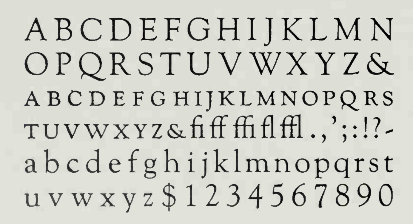
file name: Frederic Goudy Goudy Old Style 1915

file name: Frederic Goudy Goudy Old Style 1915
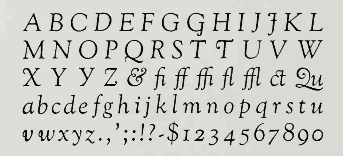
file name: Frederic Goudy Goudy Old Style Italic 1916
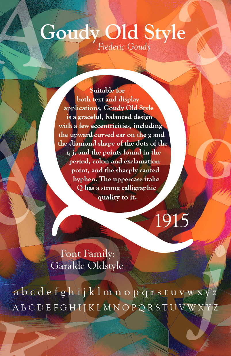
file name: Frederic Goudy Goudy Old Style 1915 Poster by Carrie Gilbert 2017
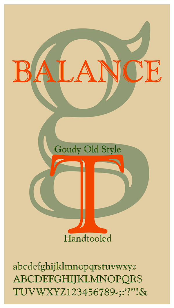
file name: Frederic Goudy Goudy Old Style 1915 Poster by Elizabeth Craven 2017

file name: Frederic Goudy Garamont Proofs

file name: Frederic Goudy Nabisco 1921

file name: Berthold Deepdene F Goudy 1927 1934 G G Lange 1982 1983

file name: Berthold Deepdene Bold F Goudy 1927 1934 G G Lange 1982 1983

file name: Berthold Frederick W Goudy Kennerley 1911 1924

file name: Berthold Frederick W Goudy Kennerley Medium 1911 1924

file name: Bertha M Goudy Portrait

file name: Frederic Goudy Kennerly Old Style 1991h

file name: Frederic Goudy Portrait by Alexander Stern 1938

file name: Frederic Goudy Goudy Catalogue

file name: Goudy Catalog1

file name: Goudy Catalog2

file name: Frederic Goudy Goudy Modern 1918

file name: Frederic Goudy Kaatskill

file name: Frederic Goudy Cat

file name: Frederic Goudy Pic

file name: Frederic Goudy Pic 1937

file name: Frederic Goudy at Deepdene 1932

file name: Frederic Goudy 1947 Obituary New York Times

file name: Matteson Typographics Newstyle 2018 258048

file name: Matteson Typographics Newstyle 2018 258049

file name: Matteson Typographics Newstyle 2018 258050
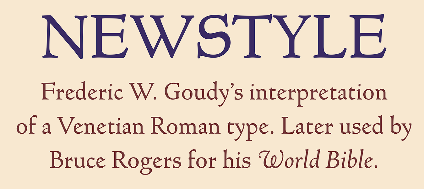
file name: Matteson Typographics Newstyle 2018 258051

file name: Matteson Typographics Newstyle 2018

file name: Frederic W Goudy Camelot Oldstyle 1896

file name: Frederic W Goudy Camelot Oldstyle 1896b

file name: Frederic Goudy Deepdene

file name: Frederic Goudy Deepdene

file name: Frederic Goudy Kennerley Open Caps

file name: Frederic W Goudy L T C Goudy Initials

file name: Frederic Goudy Bertham 1936
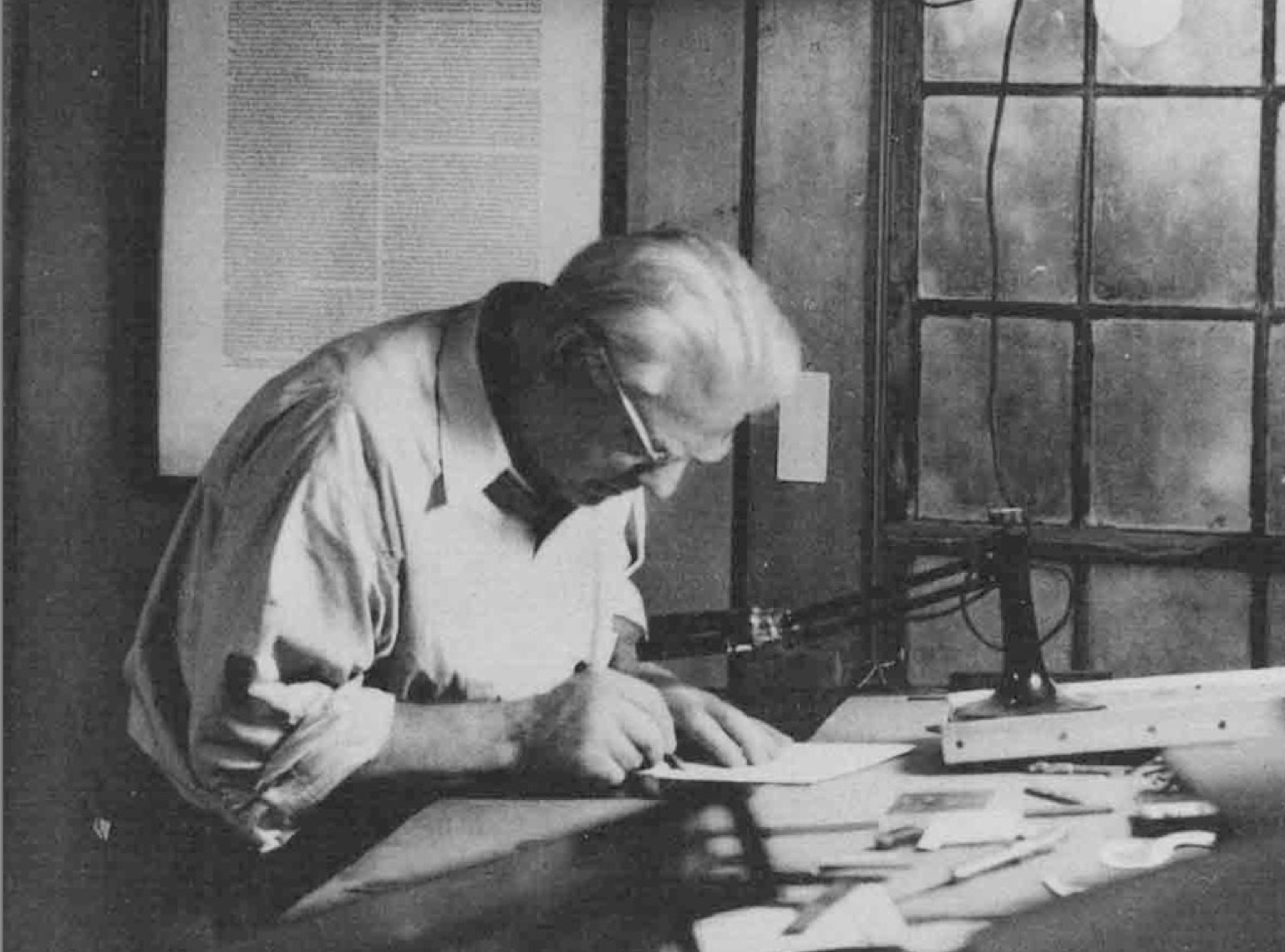
file name: Frederic Goudy Working

file name: Frederic Goudy Working

file name: Pic fredericgoudy

file name: Frederic Goudy I T C Goudy Sans Black 1929 1986

file name: Frederic Goudy I T C Goudy Sans Medium 1929 1986

file name: I T C after Frederic Goudy I T C Goudy Sans Black 1986

file name: I T C after Frederic Goudy I T C Goudy Sans Black 1986

file name: I T C after Frederic Goudy I T C Goudy Sans Black 1986

file name: I T C after Frederic Goudy I T C Goudy Sans Black 1986

file name: Raylarabie Chikako Larabie Moon Cresta 2012

file name: U R W Goudy Catalogue after Frederic Goudy

file name: Goudy L T C Goudy Ornate

file name: Frederic Goudy Tory Text 1935

file name: Steve Matteson Tory 2018 after Frederic Goudy Tory Text 1935 257272
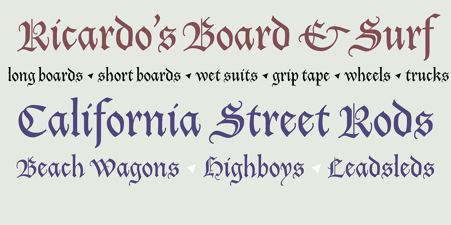
file name: Steve Matteson Tory 2018 after Frederic Goudy Tory Text 1935 257273
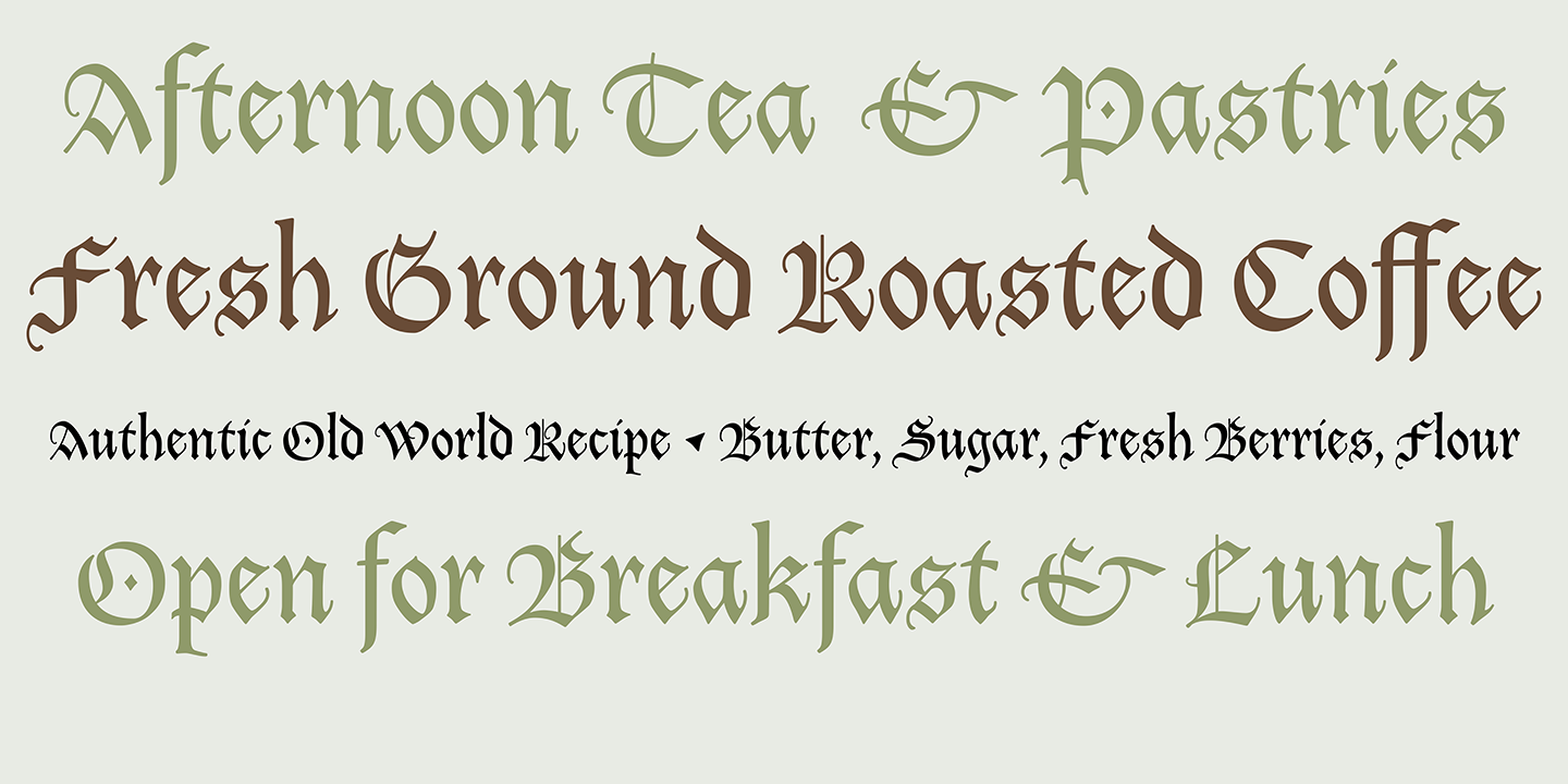
file name: Steve Matteson Tory 2018 after Frederic Goudy Tory Text 1935 257274
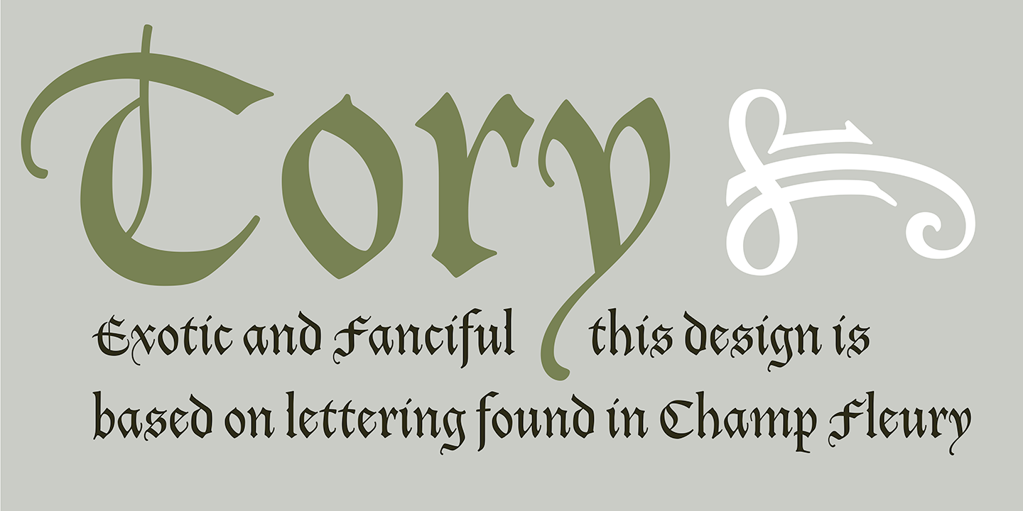
file name: Steve Matteson Tory 2018 after Frederic Goudy Tory Text 1935 257295

file name: Steve Matteson Tory 2018 after Frederic Goudy Tory Text 1935

file name: Steve Matteson Goudy Ornate

file name: Village Press Mark of Fred Goudy Will Ransom 1903

file name: Frederic Goudy Goudy Village 1903c

file name: Frederic Goudy Village Type 1903 Text by William Morris Printing

file name: Fred Goudy Village 1902

file name: Fred Goudy Village 1902b

file name: Paul D Hunt L T C Village 2007

file name: Lanston Type Company L T C Village 2020 353382

file name: Lanston Type Company L T C Village 2020 353384

file name: Lanston Type Company L T C Village 2020

file name: Jose Alberto Mauricio Initials A T F Missal Caxton 2012 Missal

file name: Lanston Italian Old Style 1924

file name: Paul Hunt James Grieshaber L T C Italian Old Style Pro 2007 2011 after Frederic Goudy Italian Old Style 1924

file name: Paul Hunt James Grieshaber L T C Italian Old Style Pro 2007 2011 after Frederic Goudy Italian Old Style 1924b

file name: Paul Hunt James Grieshaber L T C Italian Old Style Pro 2007 2011 after Frederic Goudy Italian Old Style 1924c

file name: Paul Hunt James Grieshaber L T C Italian Old Style Pro 2007 2011 after Frederic Goudy Italian Old Style 1924d

file name: Frederic Goudy Italian Old Style 1924 Poster by Bruce Rogers

file name: Infinitype Goudy Old Style

file name: Frederic Goudy Goudy Old Style 1915

file name: Frederic Goudy Goudy Old Style 1915 Poster by Jerry Joseph P 2016

file name: Frederic Goudy Goudy Old Style 1915 Poster by Jerry Joseph P 2016b

file name: Frederic Goudy Goudy Old Style 1915 Poster by Jerry Joseph P 2016c

file name: Frederic Goudy Goudy Old Style 1915 Poster by Jerry Joseph P 2016d

file name: A T F1923 Goudy Oldstyle

file name: Scangraphic Goudy Old Style S B 2004

file name: Frederic W Goudy Goudy Old Style 1915 Bitstream Version

file name: Goudy Old Style

file name: Frederic Goudy Monotype Goudy Old Style 1915
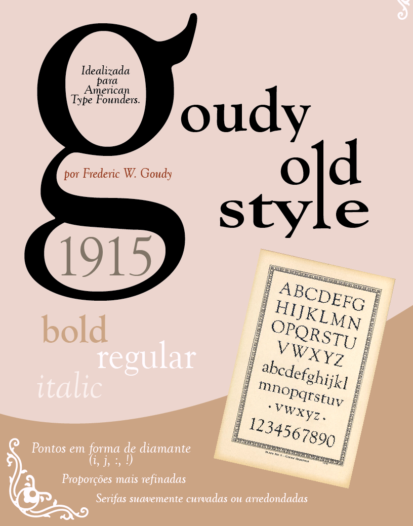
file name: Frederic Goudy Goudy Old Style 1915 Poster by Camila Rodrigues 2019

file name: Frederic Goudy Goudy Old Style 1915 Poster by Maddie Simon 2013

file name: Frederic Goudy Goudy Old Style 1915 Poster by Taylor Jez 2014

file name: Frederic W Goudy Goudy Old Style 1915

file name: Tony Stan I T C Berkeley Oldstyle 1983 198019

file name: Tony Stan I T C Berkeley Oldstyle 1983 198019b

file name: Tony Stan I T C Berkeley Oldstyle 1983 199042

file name: Tony Stan I T C Berkeley Oldstyle 1983 199042

file name: Frederic Goudy Portrait

file name: Frederic Goudy Portrait

file name: Frederic Goudy Copperplate

file name: Frederic Goudy Copperplate

file name: Frederic W Goudy Copperplate U R W after A T F original

file name: Bitstream after Frederic Goudy Goudy Handtooled 1932

file name: Group Type Cloister Initials 2006

file name: Group Type Cloister Initials 2006 after Frederic W Goudy

file name: Alter Littera Initials A T F Cloister 2012 after Frederic Goudy 1917

file name: Frederic Goudy Goudy Thirty 1942

file name: Lanston L T C Goudy Thirty

file name: Dieter Steffmann goudy30

file name: Goudy Goudy Thirty

file name: Jason Castle Goudy Lombardy

file name: L T C Goudy Text Catalog

file name: Lanston Type Company L T C Goudy Text 2006

file name: Lanston Type Company L T C Goudy Text Lombardic Caps 2006

file name: Lanston Type Company L T C Goudy Text Shaded Pro 2006

file name: L T C Goudy Text Lombardic Caps 2005 after Goudy 1928

file name: Jason Castle Goudy Text C T Caps

file name: Jason Castle Goudy Text C T

file name: Jason Castle Goudy Text C T 2003 171029

file name: Jason Castle Goudy Text C T 2003 182162

file name: Jason Castle Goudy Text C T 2003

file name: Frederic Goudy Californian Display

file name: Frederic Goudy Son Frederic Pic

file name: Frederic Goudy Bodleian Library Pic 1929

file name: Frederic Goudy Pic

file name: Frederic Goudy Pic

file name: Frederic Goudy Pic

file name: Frederic Goudy Pic
| | |
|
Luc Devroye ⦿ School of Computer Science ⦿ McGill University Montreal, Canada H3A 2K6 ⦿ lucdevroye@gmail.com ⦿ https://luc.devroye.org ⦿ https://luc.devroye.org/fonts.html |


