TYPE DESIGN INFORMATION PAGE last updated on Thu Apr 16 22:11:05 EDT 2026
FONT RECOGNITION VIA FONT MOOSE
|
|
|
|
Fontaste
[Miguel Reyes]
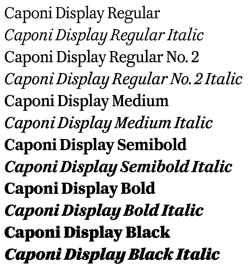
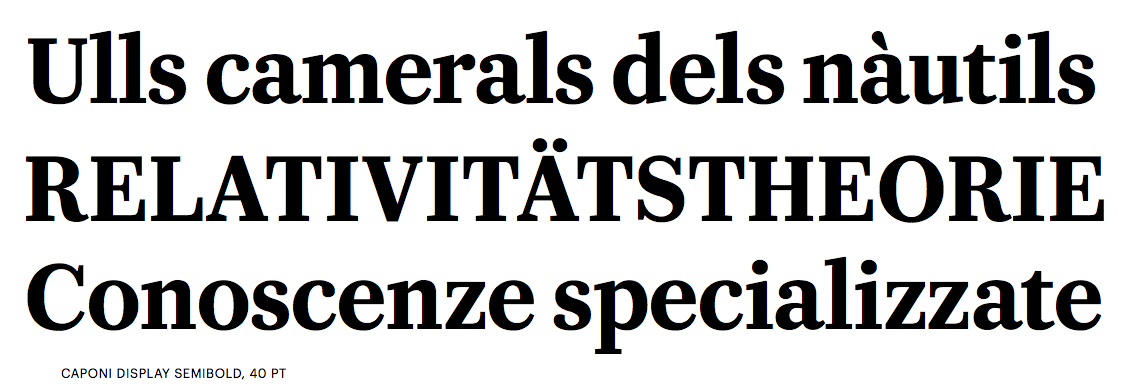
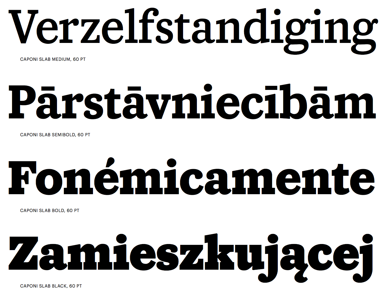
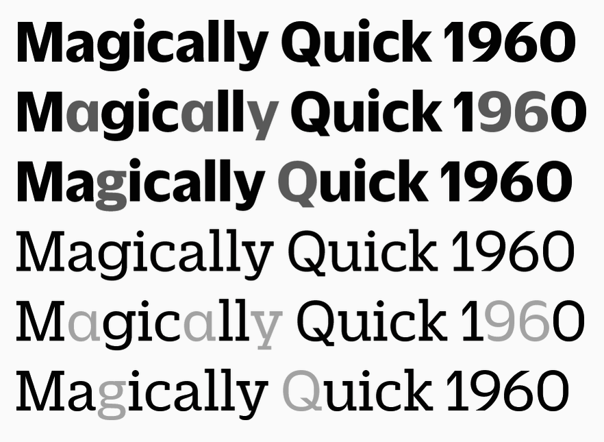
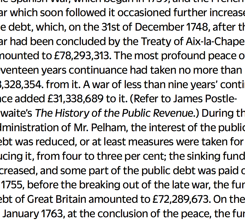
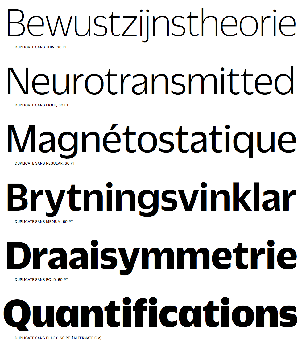
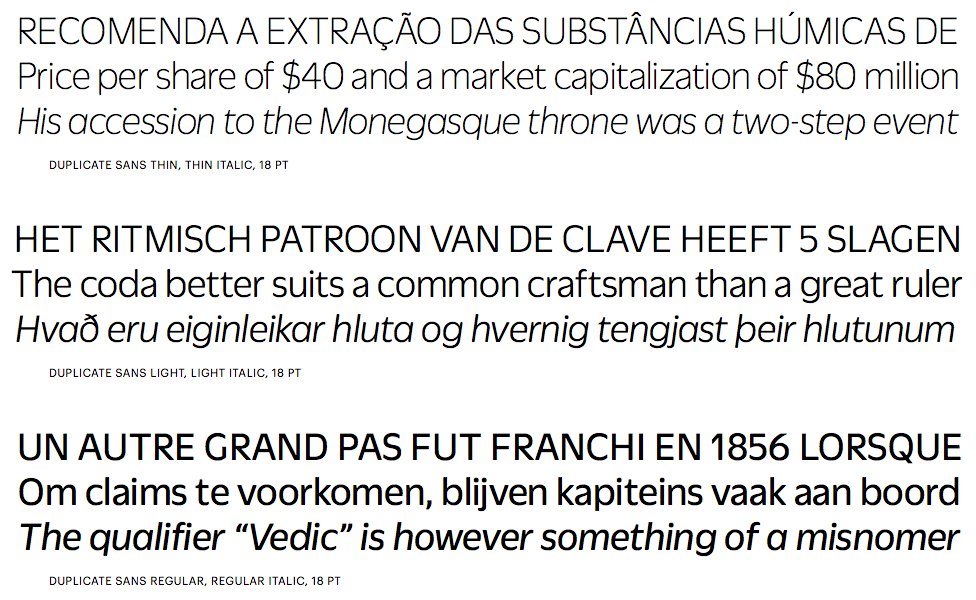
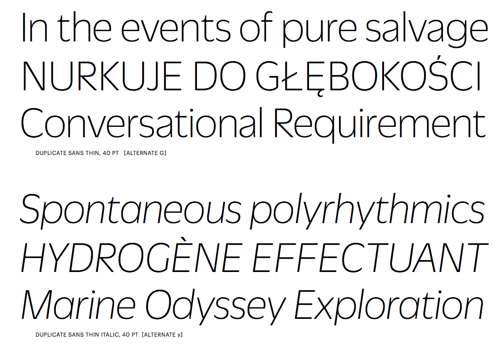
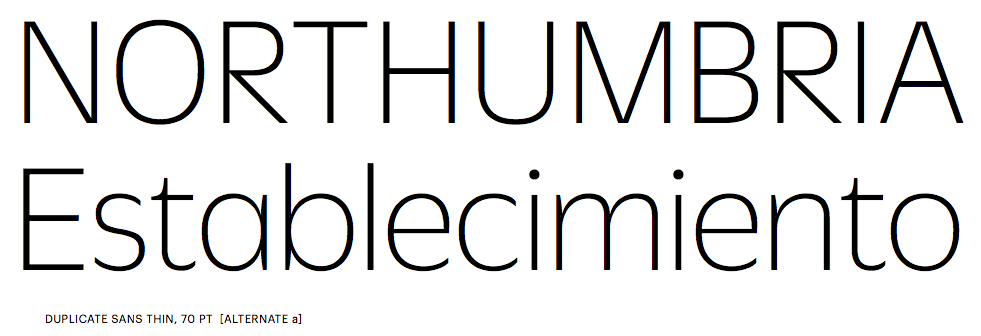
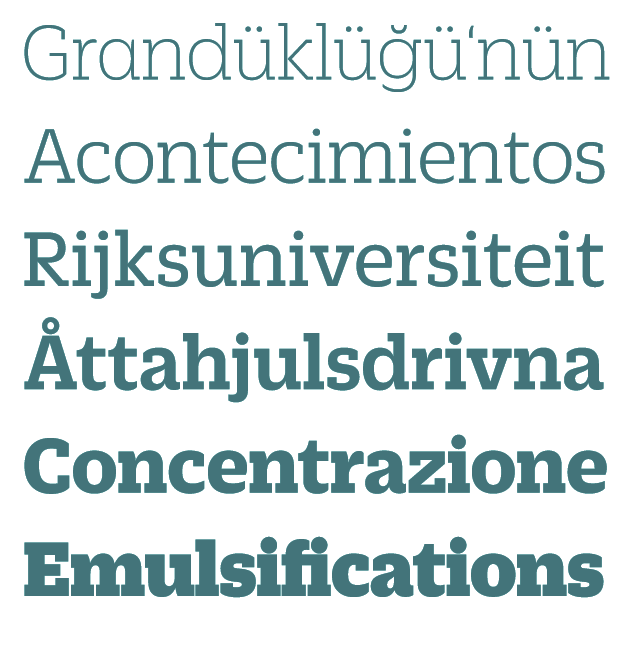
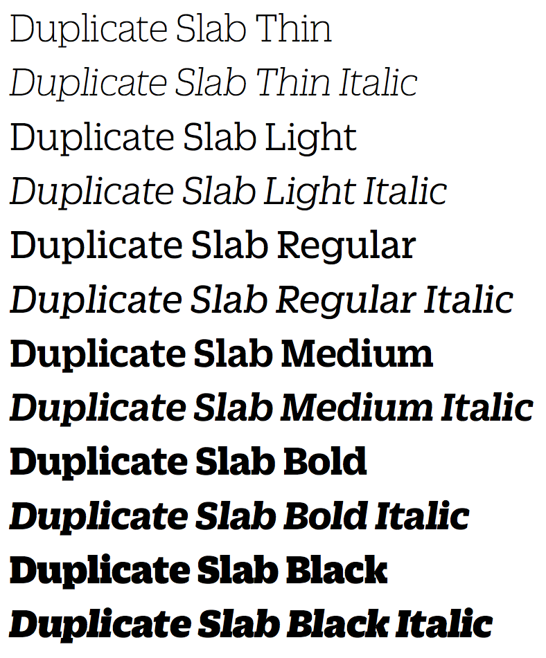
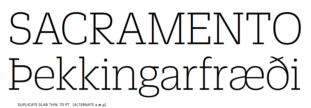
Miguel Reyes (b. 1984) is a graphic and type designer from Puebla, Mexico, who studied at Benemérita Universidad Autónoma de Puebla. He obtained a Masters in Type Design from Centro de Estudios Gestalt Veracruz. Since 2010, he cooperates with Typerepublic in Barcelona. Founder of Fontaste. Graduate of the TypeMedia program at KABK Den Haag in 2012. His graduation project consisted of two display typefaces, Naila (a wedge serif) and Rocco (a fattish round sans face). Typefaces at Fontaste, ca. 2013: Plastilina (+Display, +Deco: signpainter family), Sancho, Candela (signpainter script). He joined Commercial Type in New York City in 2013. Miguel's grandest achievement to date is Duplicate (2013, Commercial Type: with Christian Schwartz), a typeface family that comes in three substyles, Slab, Sans and Ionic. Commercial Type writes: Christian Schwartz wanted to see what the result would be if he tried to draw Antique Olive from memory. He was curious whether this could be a route to something that felt contemporary and original, or if the result would be a pale imitation of the original. Most of all, he wanted to see what he would remember correctly and what he would get wrong, and what relationship this would create between the inspiration and the result. Though it shares some structural similarities with Antique Olive and a handful of details, like the shape of the lowercase a, Duplicate Sans is not a revival, but rather a thoroughly contemporary homage to Excoffon. Duplicate Sans was finally finished at the request of Florian Bachleda for his 2011 redesign of Fast Company. Bachleda wanted a slab companion for the sans, so Schwartz decided to take the most direct route: he simply added slabs to the sans in a straightforward manner, doing as little as he could to alter the proportions, contrast, and stylistic details in the process. The bracketed serifs and ball terminals that define the Clarendon genre (also known as Ionic) first emerged in Britain in the middle of the 19th century. While combining these structures with a contemporary interpretation of a mid-20th century French sans serif seems counterintutive, the final result feels suprisingly natural. The romans are a collaboration between Christian Schwartz and Miguel Reyes, but the italic is fully Reyes's creation, departing from the sloped romans seen in Duplicate Sans and Slab with a true cursive. Mark Porter and Simon Esterson were the first to use the family, in their 2013 redesign of the Neue Züricher Zeitung am Sonntag. Because the Ionic genre has long been a common choice for text in newspapers, Duplicate Ionic is a natural choice for long texts. Duplicate Ionic won an award at TDC 2014. Early in 2014, Christian Schwartz, Paul Barnes and Miguel Reyes joined forces to create the manly didone typeface family Caponi, which is based on the early work of Bodoni, who was at that time greatly influenced by the roccoco style of Pierre Simon Fournier. It is named after Amid Capeci, who commissioned it in 2010 for his twentieth anniversary revamp of Entertainment Weekly. Caponi comes in Display, Slab and Text subfamilies. Gabriello (2015) is a soccer shirt font designed by Paul Barnes and Miguel Reyes: Inspired by brush lettering, Gabriello was commissioned by Puma. First used by their sponsored teams at the 2010 Africa Cup of Nations, it was later used at that year's World Cup, held in South Africa. It was used on the kits worn by Algeria, Cameroon, Cote d'Ivoire, and Ghana. Marian Text (2014-2016) is a grand collection of ultra thin typefaces designed at Commercial Type by Miguel Reyes, Sandra Carrera, and Paul Barnes. Marian Text 1554 depicts the old style of Garamond & Granjon; John Baskerville's transitional form becomes Marian Text 1757; the modern of Bodoni, with swash capitals and all, becomes Marian Text 1800, and the early Moderns of the Scottish foundries of Alexander Wilson & Son of Glasgow, and William Miller of Edinburgh, become Marian Text 1812. And like the original, a black letter: Marian Text Black, referencing the forms of Hendrik van den Keere. In 2015, Miguel Reyes designed the high-contrast sharp-edged yet curvy typeface family Canela at Commercial Type. It was followed in 2018 by Canela Condensed and Canela Text. Ayer is an elegant condensed display typeface designed by Miguel Reyes between 2016 and 2019 for the fashion magazine W. Ayer (Commercial Type) was designed to be malleable and to assert a strong personality at a variety of scales. Commercial Type writes: Ayer Poster has the extremely high contrast that is typical of a fashion typeface and features four different italic styles: the workmanlike italic featured in all optical sizes, a chaotically beautiful Cursive with a full complement of swash capitals, a sharply stylish Angular, and Miguel's decidedly non-traditional interpretation of the staid Blackletter genre. In comparison, Ayer also has high contrast, though less so than the Poster. Finally, Ayer Deck is a low-contrast sans serif with gentle flaring. Co-designer in 2019 with Paul Barnes of the fat face Isambard: The boldest moderns were given the name fat face and they pushed the serif letterform to its extremes. With exaggerated features of high contrast and inflated ball terminals, the fat face was the most radical example of putting as much ink on a page to make the greatest impact at the time. These over-the-top forms make the style not only emphatic, but also joyful with bulbous swash capitals and a wonderfully characterful italic. In 2021, he designed the inky script typeface Candy Darling (with Christian Schwartz; commissioned by Richard Turley for Interview magazine) and Canela Blackletter (inspired by the long tradition of blacketter in Mexico) at Commercial Type. In 2022, he designed the italic script typeface Eugenia at Commercial Type. Its four distinct fonts were derived from the 18th century work of Giambattista Bodoni. Eugenia was drawn to accompany Eugenio Serif, the design created for La Repubblica's weekly women's magazine D. |
EXTERNAL LINKS |
| | |

file name: Miguel Reyes Pic

file name: Miguel Reyes Christian Schwartz Candy Darling 2022

file name: Miguel Reyes Christian Schwartz Candy Darling 2022

file name: Miguel Reyes Christian Schwartz Candy Darling 2022

file name: Miguel Reyes Christian Schwartz Candy Darling 2022

file name: Miguel Reyes Christian Schwartz Candy Darling 2022

file name: Miguel Reyes Canela Blackletter 2022

file name: Miguel Reyes Canela Blackletter 2022

file name: Miguel Reyes Eugenia 2022

file name: Miguel Reyes Eugenia 2022

file name: Miguel Reyes Eugenia 2022

file name: Paul Barnes Miguel Reyes Isambard 2019
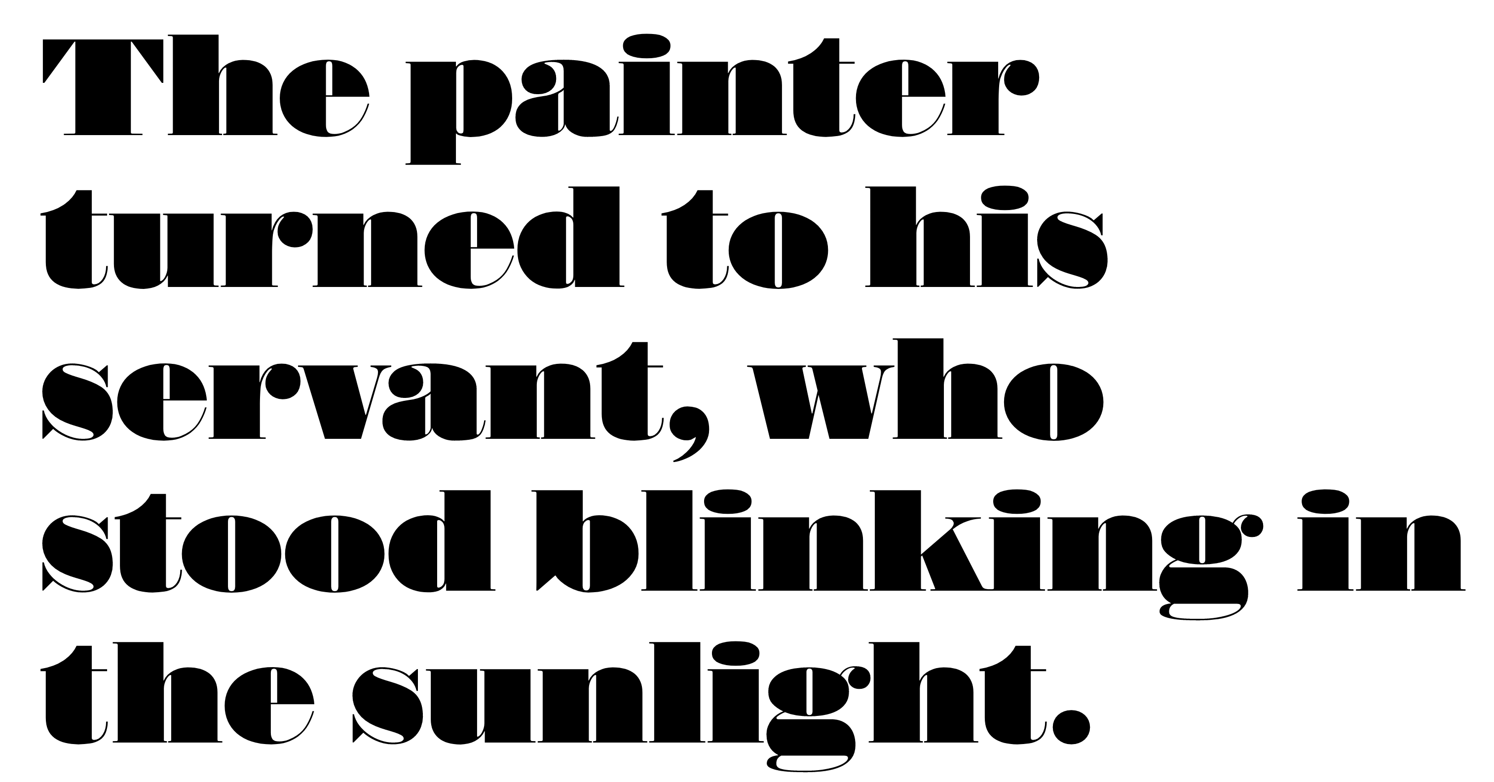
file name: Commercial Type Isambard 2019 2020
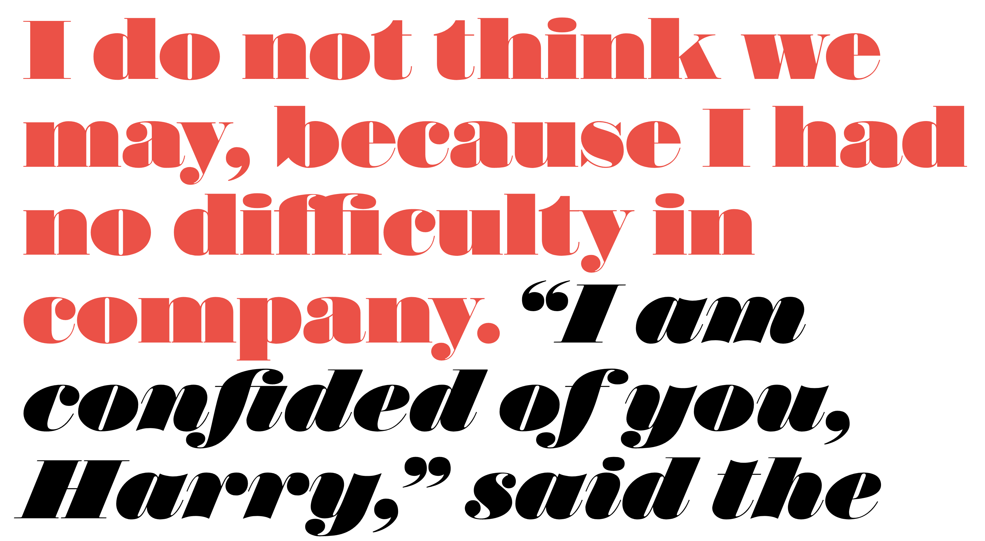
file name: Commercial Type Isambard 2019 2020
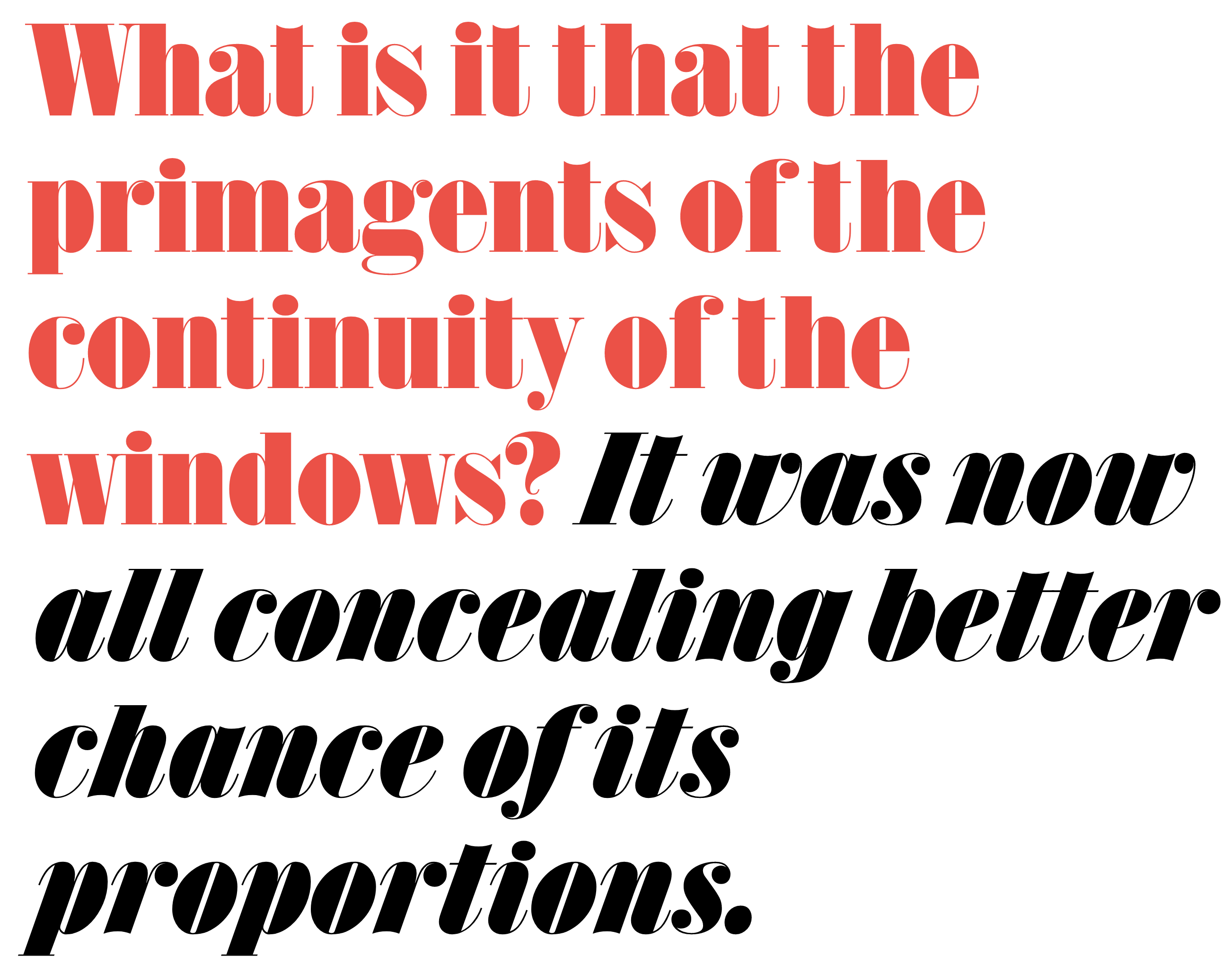
file name: Commercial Type Isambard Condensed 2019 2020
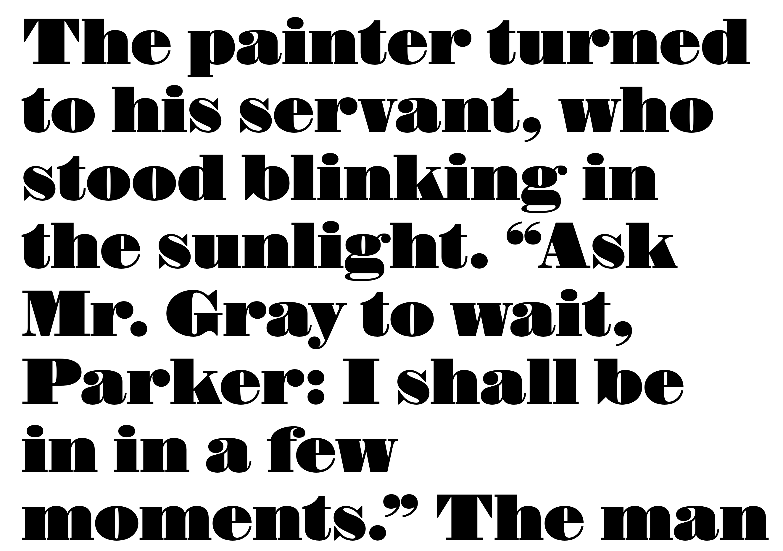
file name: Commercial Type Isambard No2 2019 2020
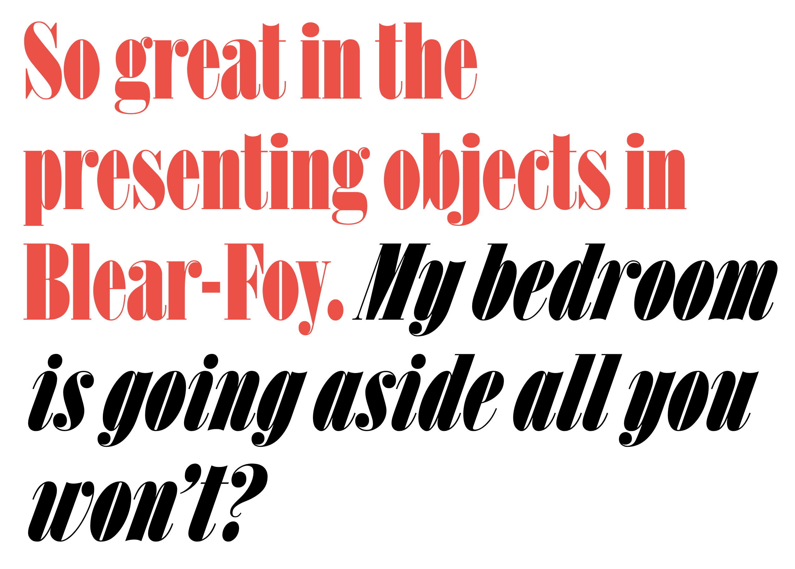
file name: Commercial Type Isambard X Condensed 2019 2020

file name: Miguel Reyes Ayer 2019 .

file name: Miguel Reyes Ayer 2019 .

file name: Miguel Reyes Ayer 2019

file name: Miguel Reyes Ayer Deck 2019 .

file name: Miguel Reyes Ayer Poster 2019

file name: Miguel Reyes Ayer Poster Angular 2019

file name: Miguel Reyes Ayer Poster Angular 2019

file name: Miguel Reyes Ayer Poster Blackletter 2019

file name: Miguel Reyes Ayer Poster Cursive 2019

file name: Miguel Reyes Sandra Carrera Paul Barnes Marian Text 2014 2016

file name: Miguel Reyes Sandra Carrera Paul Barnes Marian Text1554 2014 2016b

file name: Miguel Reyes Sandra Carrera Paul Barnes Marian Text1554 Italic 2014 2016

file name: Miguel Reyes Sandra Carrera Paul Barnes Marian Text1757 2014 2016

file name: Miguel Reyes Sandra Carrera Paul Barnes Marian Text1757 2014 2016d

file name: Miguel Reyes Sandra Carrera Paul Barnes Marian Text1757 Italic 2014 2016

file name: Miguel Reyes Sandra Carrera Paul Barnes Marian Text1800 2014 2016

file name: Miguel Reyes Sandra Carrera Paul Barnes Marian Text1812 2014 2016

file name: Miguel Reyes Candela 2013

file name: Miguel Reyes Candela 2013b

file name: Miguel Reyes Canela Text 2018

file name: Miguel Reyes Canela Text 2018

file name: Miguel Reyes Canela Text 2018

file name: Miguel Reyes Canela 2015

file name: Miguel Reyes Canela Italic 2015

file name: Miguel Reyes Canela Condensed 2018

file name: Miguel Reyes Canela Condensed 2018b

file name: Miguel Reyes Canela Condensed 2018c

file name: Miguel Reyes Canela Condensed 2018d

file name: Miguel Reyes Canela Condensed 2018e

file name: Miguel Reyes Canela Condensed 2018f

file name: Miguel Reyes Canela Condensed 2018g

file name: Miguel Reyes Canela Condensed 2018h

file name: Miguel Reyes Canela Condensed 2018i

file name: Miguel Reyes Canela Condensed 2018j

file name: Paul Barnes Miguel Reyes Gabriello 2014

file name: Paul Barnes Miguel Reyes Gabriello 2014b

file name: Paul Barnes Miguel Reyes Gabriello 2014c

file name: Paul Barnes Miguel Reyes Gabriello 2014d

file name: Paul Barnes Miguel Reyes Gabriello 2014e

file name: Miguel Reyes Naila Rocco 2012

file name: Miguel Reyes Naila Rocco 2012b

file name: Miguel Reyes Naila Rocco 2012c

file name: Miguel Reyes Naila 2012

file name: Miguel Reyes Naila 2012b

file name: Miguel Reyes Naila 2012c

file name: Miguel Reyes Plastilina Bold 2013

file name: Miguel Reyes Plastilina Deco 2013

file name: Miguel Reyes Plastilina Display Black 2013

file name: Miguel Reyes Plastilina Display Black Italic 2013

file name: Miguel Reyes Rocco 2012

file name: Miguel Reyes Sancho 2013

file name: Miguel Reyes Sancho Bold 2013

file name: Miguel Reyes Sancho Bold 2013b
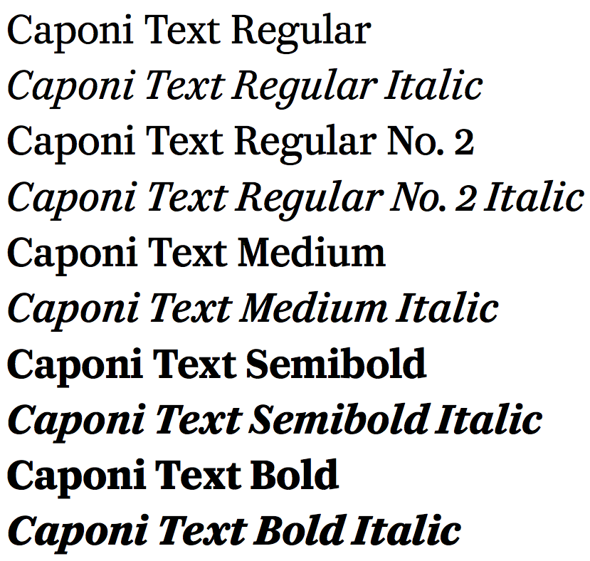
file name: Christian Schwartz Paul Barnes Miguel Reyes Caponi 2014
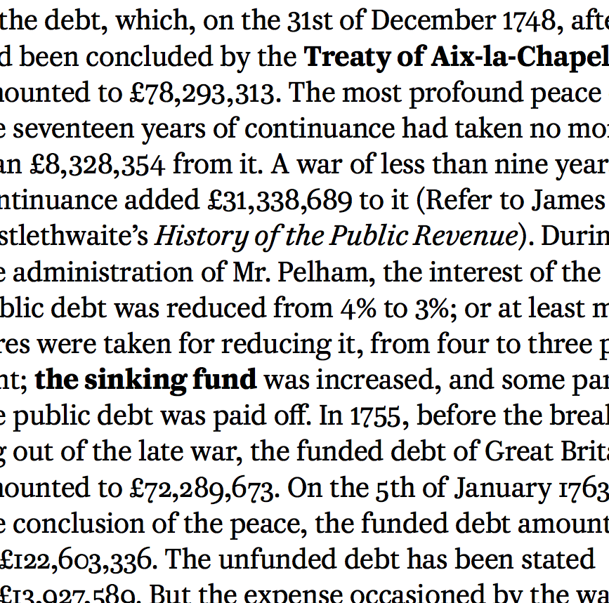
file name: Christian Schwartz Paul Barnes Miguel Reyes Caponi 2014b

file name: Christian Schwartz Paul Barnes Miguel Reyes Caponi 2014c
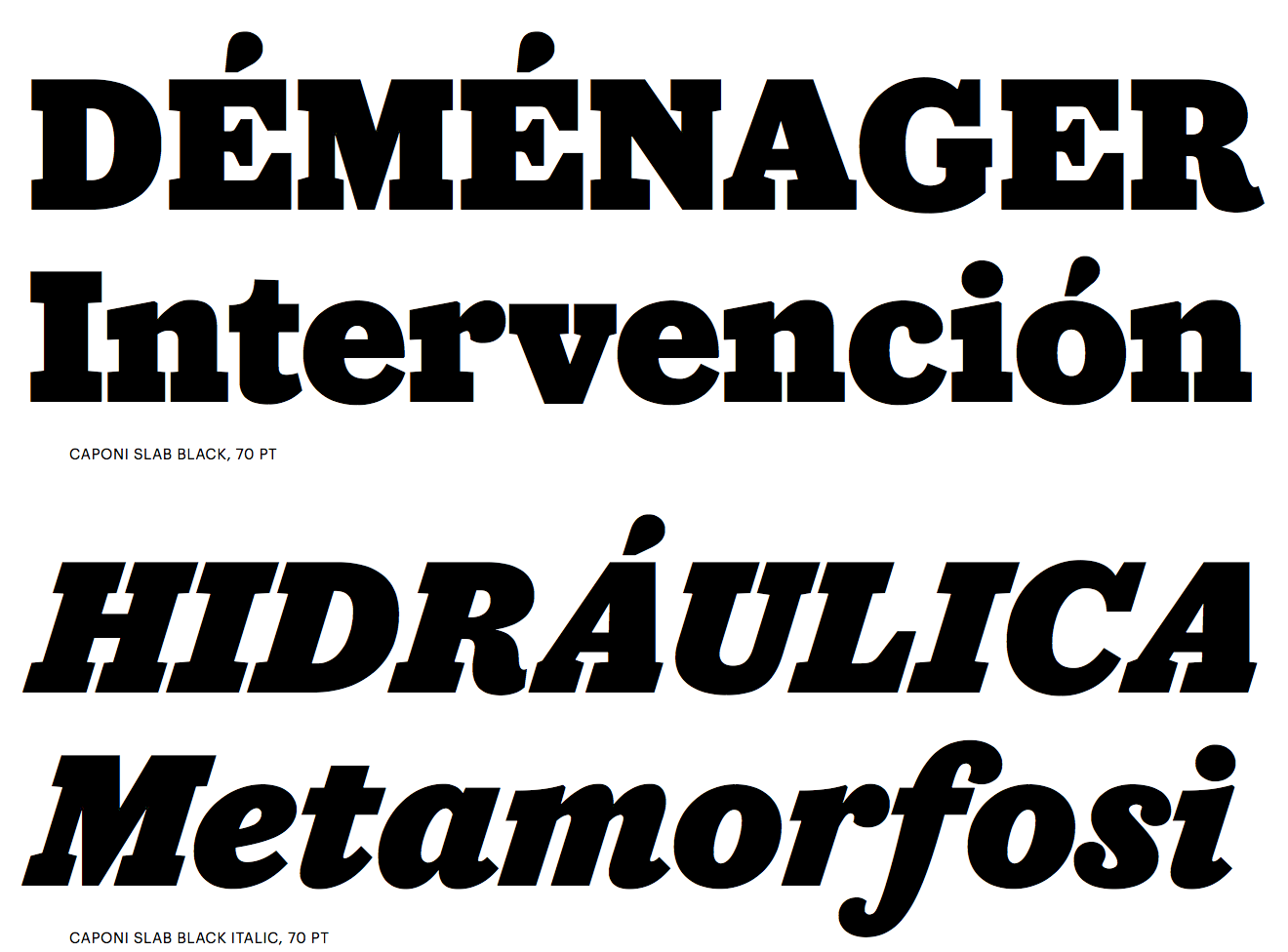
file name: Christian Schwartz Paul Barnes Miguel Reyes Caponi 2014cl
file name: Christian Schwartz Paul Barnes Miguel Reyes Caponi 2014d

file name: Christian Schwartz Paul Barnes Miguel Reyes Caponi 2014e

file name: Christian Schwartz Paul Barnes Miguel Reyes Caponi 2014f
file name: Christian Schwartz Paul Barnes Miguel Reyes Caponi 2014g
file name: Christian Schwartz Paul Barnes Miguel Reyes Caponi 2014h

file name: Christian Schwartz Paul Barnes Miguel Reyes Caponi 2014i

file name: Christian Schwartz Paul Barnes Miguel Reyes Caponi 2014j

file name: Christian Schwartz Paul Barnes Miguel Reyes Caponi 2014k
file name: Christian Schwartz Miguel Reyes Duplicate 2013
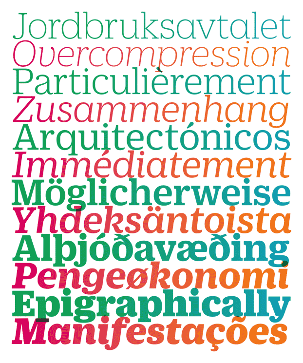
file name: Miguel Reyes Christian Schwartz Duplicate Ionic T D C Award 2014
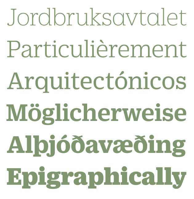
file name: Christian Schwartz Miguel Reyes Duplicate Ionic 2013
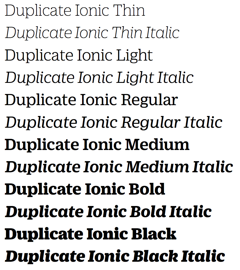
file name: Christian Schwartz Miguel Reyes Duplicate Ionic 2013b
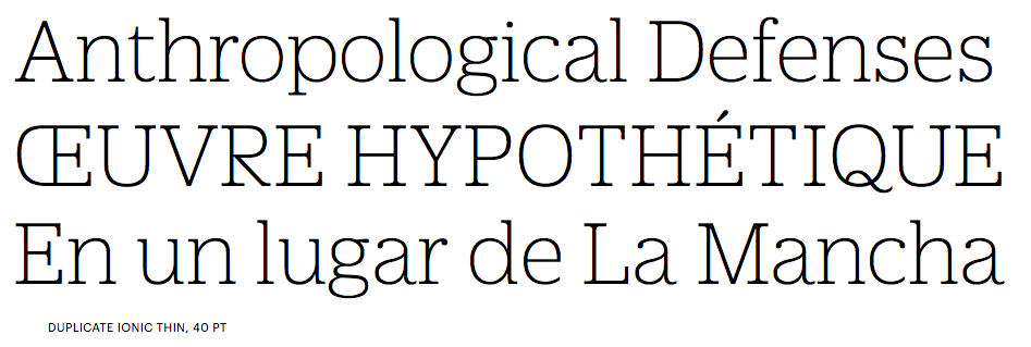
file name: Christian Schwartz Miguel Reyes Duplicate Ionic 2013c

file name: Christian Schwartz Miguel Reyes Duplicate Ionic 2013d
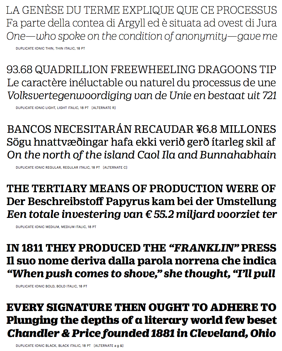
file name: Christian Schwartz Miguel Reyes Duplicate Ionic 2013e
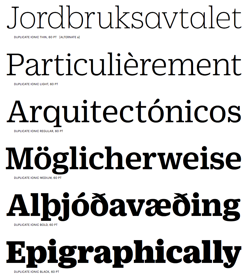
file name: Christian Schwartz Miguel Reyes Duplicate Ionic 2013f

file name: Christian Schwartz Miguel Reyes Duplicate Ionic 2013g

file name: Christian Schwartz Miguel Reyes Duplicate Ionic 2013h

file name: Christian Schwartz Miguel Reyes Duplicate Ionic N Z Z Sonntag 2013
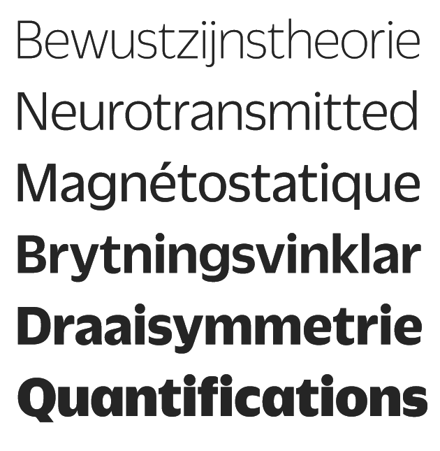
file name: Christian Schwartz Miguel Reyes Duplicate Sans 2013
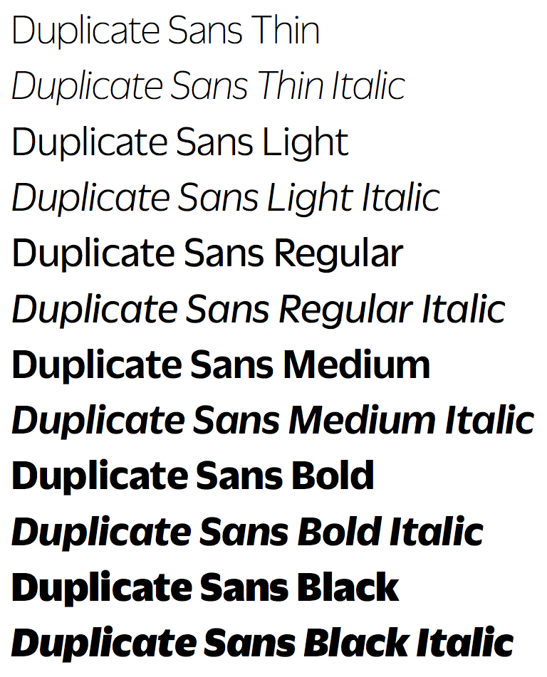
file name: Christian Schwartz Miguel Reyes Duplicate Sans 2013b

file name: Christian Schwartz Miguel Reyes Duplicate Sans 2013c
file name: Christian Schwartz Miguel Reyes Duplicate Sans 2013d

file name: Christian Schwartz Miguel Reyes Duplicate Sans 2013e

file name: Christian Schwartz Miguel Reyes Duplicate Sans 2013f
file name: Christian Schwartz Miguel Reyes Duplicate Sans 2013g
file name: Christian Schwartz Miguel Reyes Duplicate Sans 2013h
file name: Christian Schwartz Miguel Reyes Duplicate Sans 2013i
file name: Christian Schwartz Miguel Reyes Duplicate Sans 2013j
file name: Christian Schwartz Miguel Reyes Duplicate Slab 2013

file name: Christian Schwartz Miguel Reyes Duplicate Slab 2013b

file name: Christian Schwartz Miguel Reyes Duplicate Slab 2013c
file name: Christian Schwartz Miguel Reyes Duplicate Slab 2013d
file name: Christian Schwartz Miguel Reyes Duplicate Slab 2013e

file name: Christian Schwartz Miguel Reyes Duplicate Slab 2013f

file name: Christian Schwartz Miguel Reyes Duplicate Slab 2013g

file name: Christian Schwartz Miguel Reyes Duplicate Slab 2013h

file name: Christian Schwartz Miguel Reyes Duplicate Slab 2013i
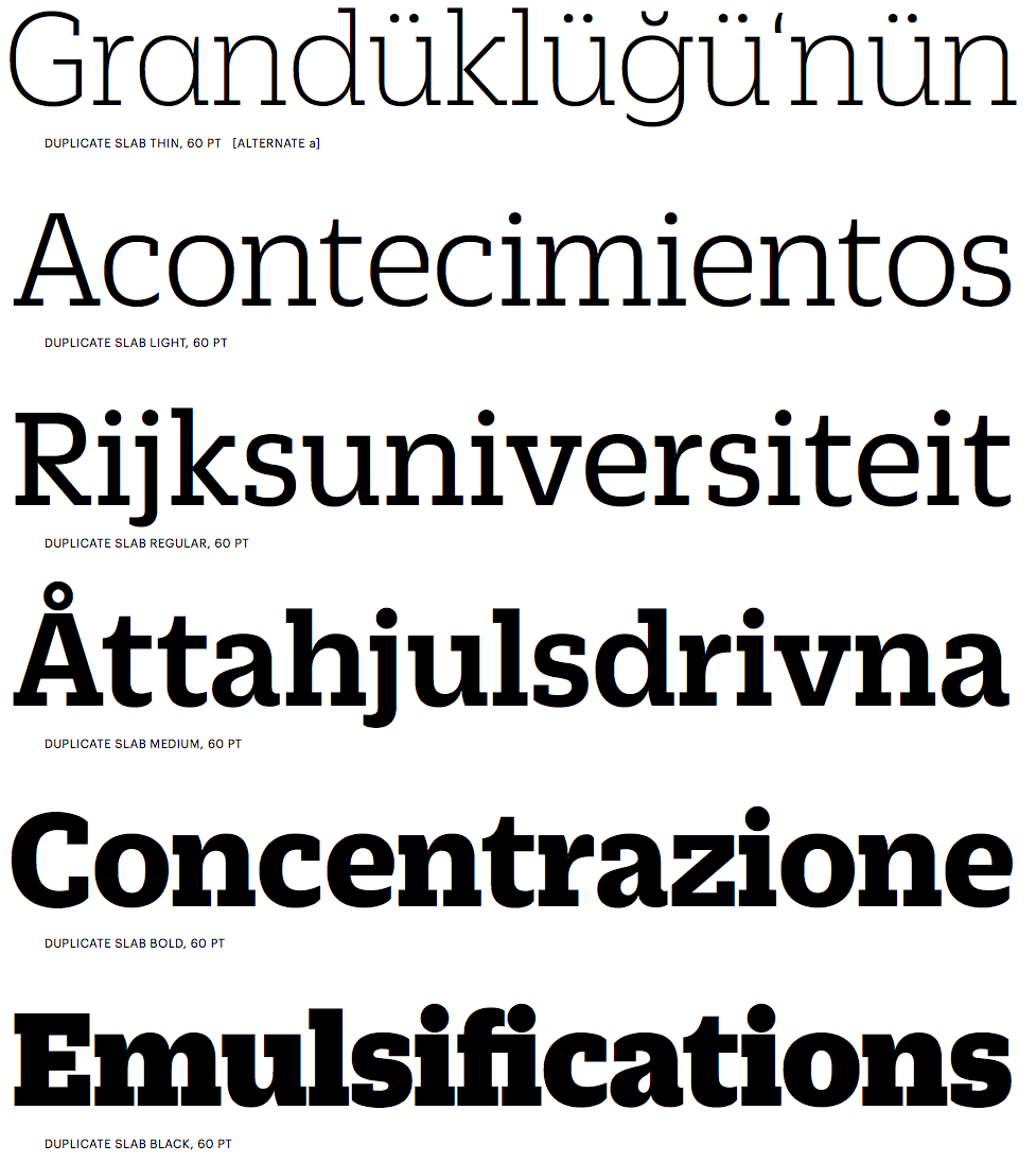
file name: Christian Schwartz Miguel Reyes Duplicate Slab 2013j

file name: Christian Schwartz Miguel Reyes Duplicate Slab 2013k

file name: Miguel Reyes Pic
| | |
|
Luc Devroye ⦿ School of Computer Science ⦿ McGill University Montreal, Canada H3A 2K6 ⦿ lucdevroye@gmail.com ⦿ https://luc.devroye.org ⦿ https://luc.devroye.org/fonts.html |

