TYPE DESIGN INFORMATION PAGE last updated on Wed May 6 16:21:42 EDT 2026
FONT RECOGNITION VIA FONT MOOSE
|
|
|
|
Anja Meiners
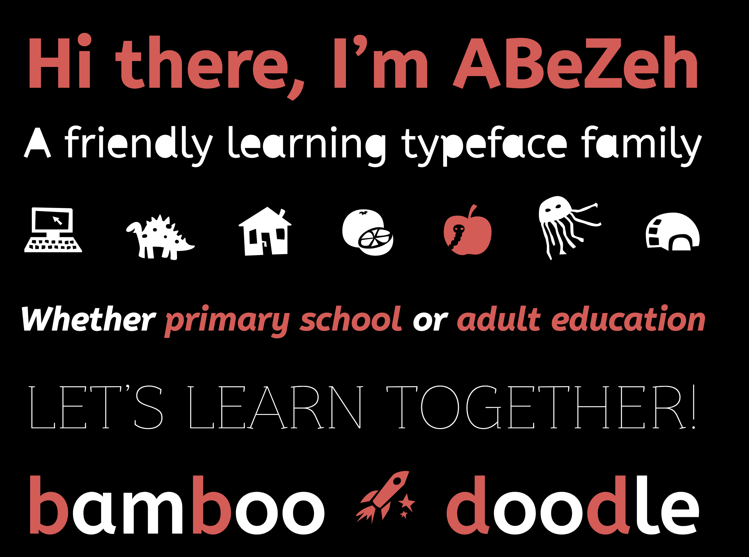
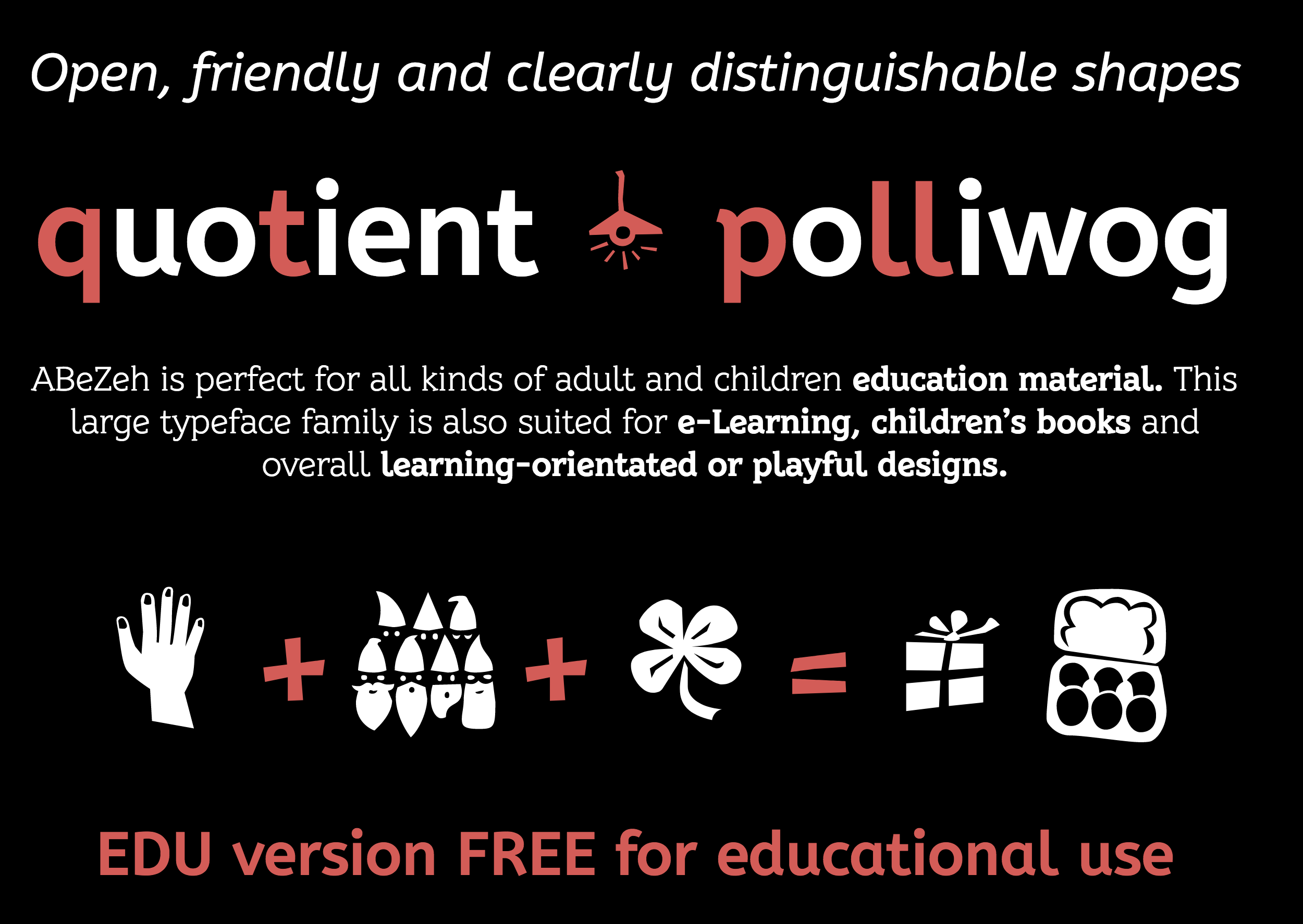
Cofounder, with Ralph du Carrois, of bBox Type. Creator of the free Google Web Font ABeeZee (2012), a sans typeface created to help children. The font was published by Carrois Type Design and extended to include ABeZeh Icons (2016), ABeZeh Slab (2016) and ABeZeh Konfetti (2016). She also designed the rounded sans typeface Gute (2018, with Ralph du Carrois at bBox Type) and the rough handwriting typeface Mamotschka (2017). In 2015, Fontfont finally published the full family FF Real, in 13 weights each for FF Real Head and FF Real Text. The typeface family is influenced by the German grotesques from ca. 1900 by foundries such as Theinhardt and H. Berthold AG. In 2017-2018, that family was extended to 52 styles in all thanks to a new set of italics. The designers are listed as Erik Spiekermann, Ralph du Carrois and Anja Meiners. They write: The design of FF Real is rooted in early static grotesques from the turn of the century. Several German type foundries---among them the Berlin-based foundries Theinhardt and H. Berthold AG---released such designs between 1898 and 1908. The semi-bold weight of a poster-size typeface that was lighter than most of the according semi-bolds in metal type at the time, gave the impetus to FF Real's regular weight. In the words of Spiekermann, the historical example is "the real, non-fake version, as it were, the royal sans serif face", thus giving his new typeface the name Real (which is also in keeping with his four-letter names, i.e. FF Meta, FF Unit). FF Real is a convincing re-interpretation of the German grotesque style, but with much more warmth and improved legibility. With a hint towards the warmer American grotesques, Spiekermann added those typical Anglo-American features such as a three-story g and an 8 with a more defined loop. To better distinguish characters in small text sizes, FF Real Text comes in old style figures, f and t are wider, the capital I is equipped with serifs, as is the lowercase l. What's more, i-dots and all punctuation are round. In 2022, Erik Spiekermann, Anja Meiners, and Ralph du Carrois published the neo-grotesque superfamily Case at Fontwerk. It includes Micro and Text subfamilies. |
EXTERNAL LINKS |
| | |

file name: Erik Spiekermann Anja Meiners Ralph Du Carrois Case 2022

file name: Erik Spiekermann Anja Meiners Ralph Du Carrois Case 2022

file name: Erik Spiekermann Anja Meiners Ralph Du Carrois Case 2022

file name: Erik Spiekermann Anja Meiners Ralph Du Carrois Case 2022

file name: Erik Spiekermann Anja Meiners Ralph Du Carrois Case Text 2022

file name: Erik Spiekermann Anja Meiners Ralph Du Carrois Case Text 2022

file name: Erik Spiekermann Anja Meiners Ralph Du Carrois Case Text 2022

file name: Erik Spiekermann Anja Meiners Ralph Du Carrois Case Text 2022
file name: Anja Meiners A Be Zeh Icons 2016

file name: Anja Meiners A Bee Zee 2012

file name: Anja Meiners A Be Zeh 2016

file name: Anja Meiners A Be Zeh 2016b
file name: Anja Meiners A Be Zeh Icons 2016b

file name: Anja Meiners Mamotschka 2017

file name: Ralph Du Carrois Anja Meiners Gute 2018

file name: Ralph Du Carrois Anja Meiners Gute 2018b

file name: Ralph Du Carrois Anja Meiners Gute 2018c
| | |
|
Luc Devroye ⦿ School of Computer Science ⦿ McGill University Montreal, Canada H3A 2K6 ⦿ lucdevroye@gmail.com ⦿ https://luc.devroye.org ⦿ https://luc.devroye.org/fonts.html |

