TYPE DESIGN INFORMATION PAGE last updated on Fri May 1 17:40:08 EDT 2026
FONT RECOGNITION VIA FONT MOOSE
|
|
|
|
NEN 3225
In 1962, NEN (the Dutch Institute for Normalization) published a guide for a sans and a serif design. It is rumoured that Visualogik has digitized this, but no one can confirm this. The typeface has been used on signage in Amsterdam. The committee that decided on the details of the design, according to Kuitenbrouwer:
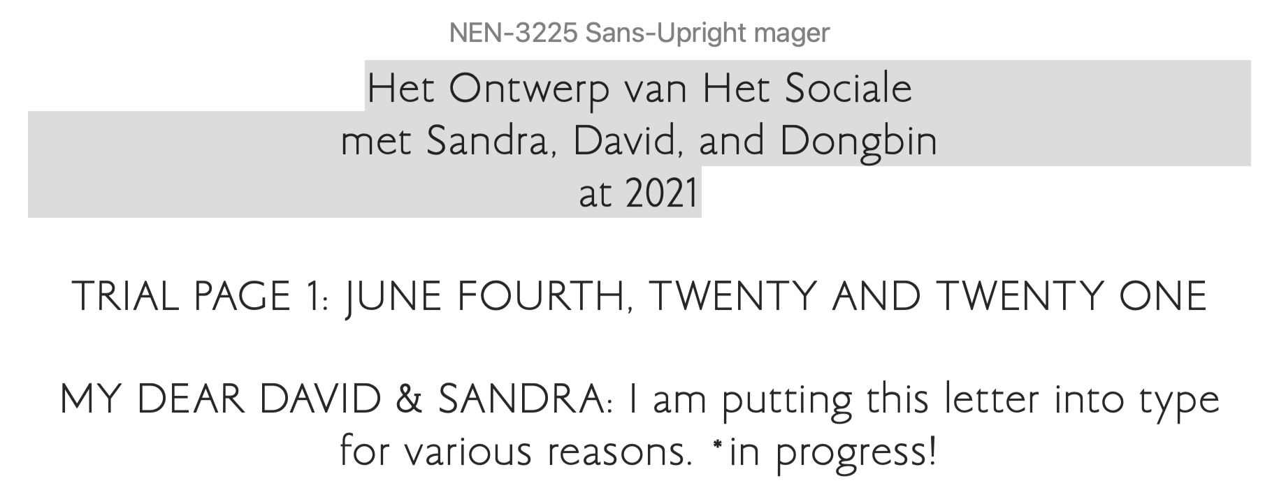
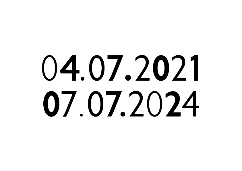
NEN 3225 is often referred to as the Dutch DIN. It is defined and described in SWOV-Rapport_1970-7 entitled Verkeertekens op borden (1970, D.J. Griep and A. Kranenburg, Stichting Wetenschappelijk Onderzoek Verkeersveiligheid, Voorburg, The Netherlands). There are four sets of capitals in NEN 3225, called Alfabet Serie C, D, E, and F, which vary from narrow (C) to wide (F). In addition, there is one set of lowercase glyphs, called series "e", which is adapted to Series E in width. The SWOV document mentions that these letter types were developed after consultation with Ovink. Local download of that report from 1970 (in Dutch). Letter proofs at Lettergieterij Tetterode (at the University of Amsterdam). Visualogik produced a related digital font called Ovink D VL, dated 1995, after the D series. A later date, 2004, was added that refers to copyright by Novatype, a subsidiary of Visinova. Ovink D VL appears to match the font used on many of Amsterdam's street name plates (in 2020). HR Groep in the Netherlands is using a digital font called Ovink Ee, which matches the NEN 3225 Series E and e. That font is used on some street and traffic signs in the country. Dongbin Han, a Korean graphic designer based in the Netherlands and South Korea, was commissioned in 2021 by Het Nieuwe Instituut Rotterdam to develop a set of NEN 3225 digital fonts. These free fonts are called NEN 3225 Schreefloze Mager and NEN 3225 Schreefloze Vet. |
EXTERNAL LINKS |
| | |

file name: Visualogik Design Studio Ovink D V L 1995 2004

file name: N E N3225

file name: N E N3225 Alfabet Serie C 1970

file name: N E N3225 Alfabet Serie C 1970

file name: N E N3225 Alfabet Serie C 1970

file name: N E N3225 Alfabet Serie C 1970

file name: N E N3225 Alfabet Serie D 1970

file name: N E N3225 Alfabet Serie D 1970

file name: N E N3225 Alfabet Serie D 1970

file name: N E N3225 Alfabet Serie D 1970

file name: N E N3225 Alfabet Serie E 1970

file name: N E N3225 Alfabet Serie E 1970

file name: N E N3225 Alfabet Serie E 1970

file name: N E N3225 Alfabet Serie E 1970

file name: N E N3225 Alfabet Serie E 1970

file name: N E N3225 Alfabet Serie F 1970

file name: N E N3225 Alfabet Serie F 1970

file name: N E N3225 Alfabet Serie F 1970

file name: N E N3225 Alfabet Serie F 1970

file name: N E N3225 Alfabet Serie F 1970

file name: N E N3225 Alfabet Seriee 1970

file name: N E N3225 Alfabet Seriee 1970

file name: N E N3225 Alfabet Seriee 1970

file name: N E N3225 Alfabet Seriee 1970

file name: N E N3225 Alfabet Seriee 1970
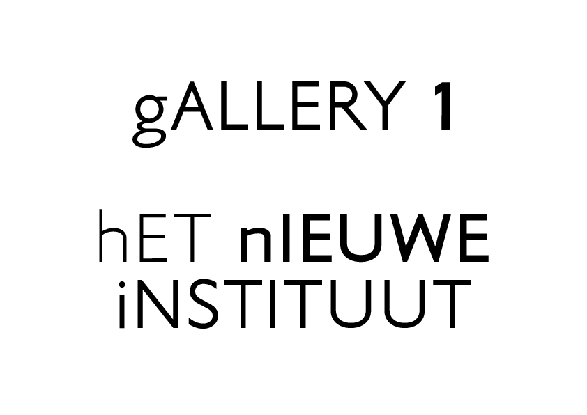
file name: Dongbin Han N E N3225 Schreefloze 2021 a
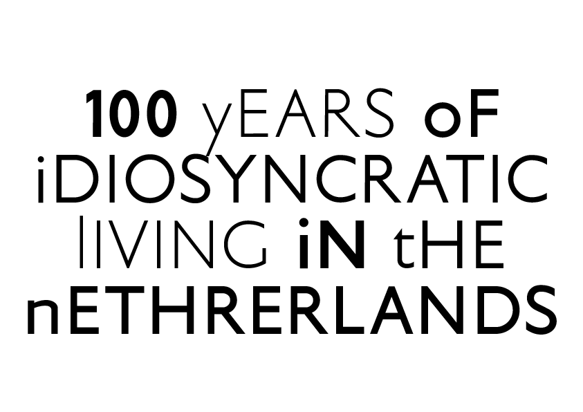
file name: Dongbin Han N E N3225 Schreefloze 2021 c
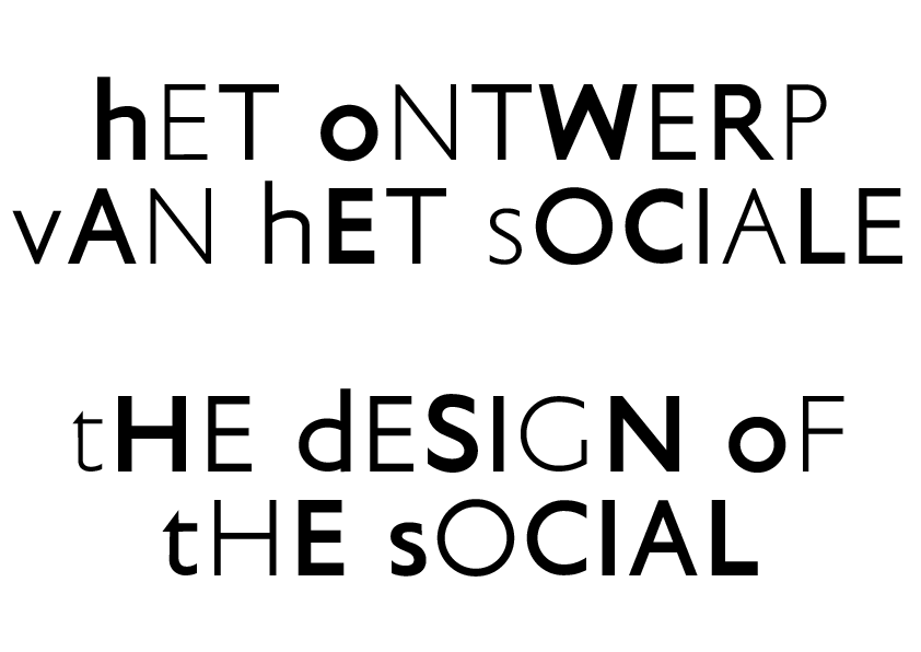
file name: Dongbin Han N E N3225 Schreefloze 2021 d
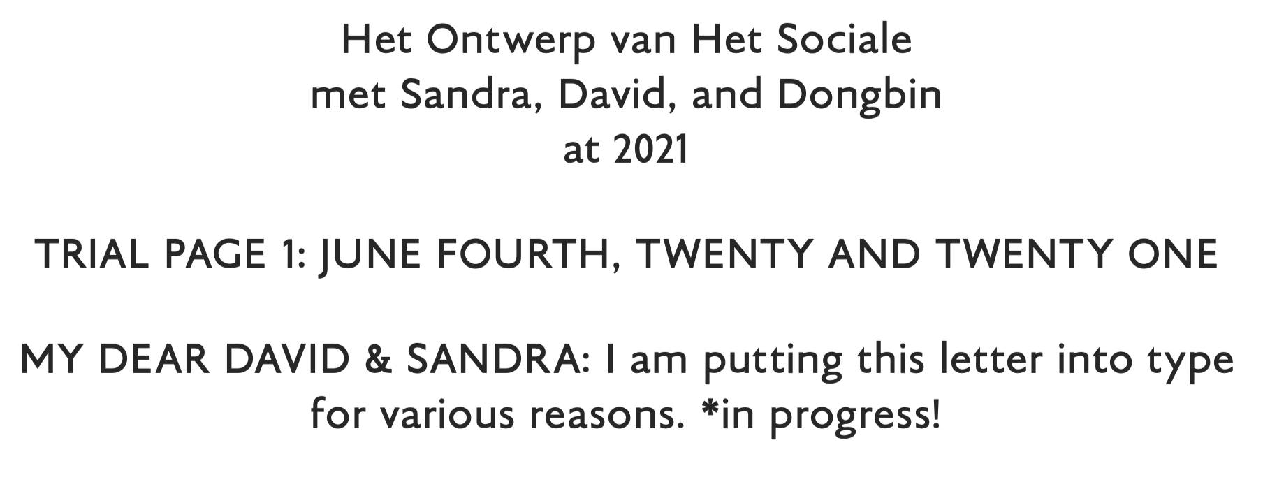
file name: Dongbin Han N E N3225 Schreefloze 2021 e
file name: Dongbin Han N E N3225 Schreefloze 2021 f
file name: Dongbin Han N E N3225 Schreefloze 2021 b

file name: Amsterdam Ovink D 1995
| | |
|
Luc Devroye ⦿ School of Computer Science ⦿ McGill University Montreal, Canada H3A 2K6 ⦿ lucdevroye@gmail.com ⦿ https://luc.devroye.org ⦿ https://luc.devroye.org/fonts.html |
