TYPE DESIGN INFORMATION PAGE last updated on Tue May 5 11:52:54 EDT 2026
FONT RECOGNITION VIA FONT MOOSE
|
|
|
|
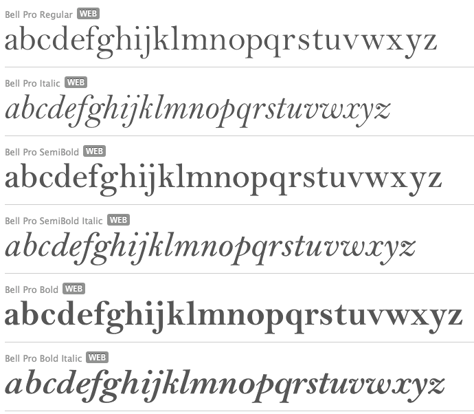
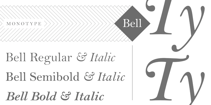
This is the in-house staff at Monotype, credited with typefaces such as Bell and CG Times. Bell, which was cast in 1931 by Monotype, goes back to Richard Austin, 1788: Monotype's hot metal Bell series from 1931 was based on original types made by the punchcutter Richard Austin for the foundry of John Bell in the 1780s. The different sizes of Monotype's series were not all based on the same model. As type historian James Mosley wrote on Typophile, "For 18 point and above (the metal type was cut in sizes up to 36 point) Monotype's model was a larger type [than the model used for the text sizes], the Great Primer cut by Austin. This has greater contrast in the capitals and a flat foot to letter a." The digital Bell closely follows the design of the hot metal 18pt version, and is therefore somewhat lighter in color than the text sizes of Monotype's original metal face. |
EXTERNAL LINKS |
| | |

file name: Monotype Compugraphic C G Times

file name: Monotype Compugraphic C G Times

file name: Monotype Compugraphic C G Times Bold

file name: Monotype Bell 1931 after Richard Austin

file name: Monotype Bell 1931 after Richard Austin
| | |
|
Luc Devroye ⦿ School of Computer Science ⦿ McGill University Montreal, Canada H3A 2K6 ⦿ lucdevroye@gmail.com ⦿ https://luc.devroye.org ⦿ https://luc.devroye.org/fonts.html |

