TYPE DESIGN INFORMATION PAGE last updated on Wed May 6 16:23:33 EDT 2026
FONT RECOGNITION VIA FONT MOOSE
|
|
|
|
Dutch experimental nutty (in the good sense!) and prolific type designer (b. Haarlem, 1966) who created famous fonts such as Beowolf, Brokenscript, BeoSans, Trixie, Flixel (FUSE 2), and Schulbuch. He is also a font software expert who has initiated many ideas in the areas of type software. He teaches type design and programming at the Royal Academy of Fine Arts (KABK) in Den Haag, The Netherlands, both in the bachelor graphic design program as well as in the Type and Media master course. Just graduated in 1989 from the Royal Academy of Fine Arts (KABK), where he studied under Gerrit Noordzij. After stints at Monotype in the UK and MetaDesign in Berlin he became an independent type designer, focusing on software design for type. He collaborated with Erik van Blokland under the name LettError. It is at that time that he published FF Beowolf has been included in the permanent collection of the MoMa in New York. He co-wrote RoboFog with Petr van Blokland in the mid-nineties, which can be regarded as a forerunner of RoboFont, and has been a very influential scripting type design tool in Python. His TTX/FontTools library is a crucial building block for lots of font software. He also wrote the original version of the DrawBot application. He designed Phaistos (1990-1991, the Font Bureau, with David Berlow), which was inspired by the flared angular designs of Rudolf Koch such as Locarno). Designer or co-designer at LettError of LettErrorRobot-Chrome (2001), FFTrixie (X-files original), FF Advert (1991, a flared sans family), FF Justlefthand, FF Schulschrift (1991; in versions A, B and C following the German school script recommendations), FF StampGothic (1992), FF Confidential (1992, grunge), FF Karton (1992, a grungy stencil face), FF Flightcase (1992, a grungy didone stencil), FF Dynamoe (1992, a dymo label font, white on black), FF Hands, FF Brokenscript (1990, blackletter), Federal, and the random font Beowolf (1990, with Erik van Blokland). FF Schulbuch (1991-1992) is a series of fonts based on the historical textbook types used in Northern and Southern Germany, and Bavaria. The Nord (North) variant is the closest relative of Helvetica. At FUSE 11, he designed What You See/What You Get (with Erik van Blokland). Speaker at ATypI 2016 in Warsaw on The Sound of Shapes & Shape of Sounds. Bio at Emigre. FontShop link. Klingspor link. FontFont link. |
EXTERNAL LINKS |
| | |

file name: Typorno2008 Erik Just

file name: Just Van Rossum F F Schulschrift A O T Linien Eins 1991

file name: Just Van Rossum F F Schulschrift B O T Erstes Normal 1991

file name: Just Van Rossum F F Schulschrift C O T Linien Eins 1991

file name: Just Van Rossum F F Schulschrift 1991

file name: Just Van Rossum F F Schulbuch 1991 1992

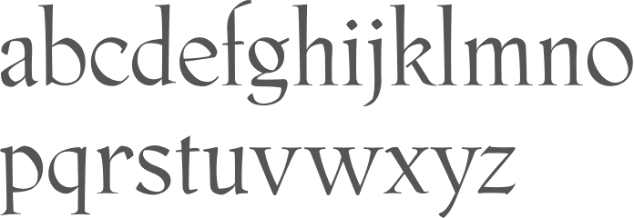
file name: Just Van Rossum David Berlow Phaistos 1990 1991

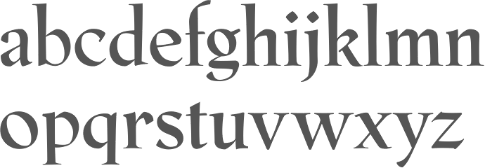
file name: Just Van Rossum David Berlow Phaistos Bold 1990 1991

file name: Just Van Rossum Erik Van Blokland F F Beowolf 1990

file name: Just Van Rossum Erik Van Blokland F F Beowolf 1990b

file name: Just Van Rossum F F Confidential 1992

file name: Erik Van Blokland Trixie 1991 Poster By Sol Kazin 2014

file name: Erik Van Blokland Trixie 1991 Poster By Chengyu Liu 2016

file name: Erik Van Blokland Trixie 1991 Poster By Chengyu Liu 2016b

file name: Erik Van Blokland Trixie 1991 Poster By Chengyu Liu 2016c

file name: Just Van Rossum F F Advert Offc Pro Light 1991

file name: Just Van Rossum F F Advert Pro Black 1991

file name: Just Van Rossum F F Brokenscript 1990

file name: Just Van Rossum F F Brokenscript 1990d

file name: Just Van Rossum F F Brokenscript 1990e

file name: Just Van Rossum F F Brokenscript 1990f

file name: Just Van Rossum Catalog

file name: Just Van Rossum Catalog

file name: Just Van Rossum Catalog

file name: Just Van Rossum F F Dynamoe 1992

file name: Just Van Rossum F F Flightcase 1992

file name: Just Van Rossum F F Karton 1992b

file name: Just Van Rossum Pic

file name: Pic atypi2002 Just Van Rossum
| | |
|
Luc Devroye ⦿ School of Computer Science ⦿ McGill University Montreal, Canada H3A 2K6 ⦿ lucdevroye@gmail.com ⦿ https://luc.devroye.org ⦿ https://luc.devroye.org/fonts.html |


