TYPE DESIGN INFORMATION PAGE last updated on Wed May 6 16:23:40 EDT 2026
FONT RECOGNITION VIA FONT MOOSE
|
|
|
|
ATF 1923 Catalog: Cloister Series
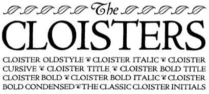
Showcasing the best pages from the Cloister Series in the ATF 1923 Catalog. These Venetian typefaces are based on Eusebius (1470, Nicolas Jenson). Included are Cloister Oldstyle, Cloister, Cloister Bold, Cloister Bold Condensed, Cloister Bold Italic, Cloister Bold Title, Cloister Cursive, Cloister Italic, Cloister Ornaments and Cloister Title. The text below is quoted from Mac McGrew, who explains the historical background: Cloister Oldstyle was designed by Morris Benton in 1913 and released by ATF early the next year. It follows quite closely the noted roman typeface used by Nicolas Jenson in 1470, but is slightly heavier to compensate for the improved printing conditions and smoother papers of the present time. Cloister Italic, released later in 1914, is based on an italic cast by Aldus Manutius in 1501, but does not follow this as closely as the roman does its source. Cloister Bold was designed in 1913; it and Cloister Bold Italic were cut in 1915. Cloister Title and Bold Title were cut in 1914-15; they are essentially the same as the regular Cloisters, but without lowercase, and cast full on the body. Cap J and Q were redesigned and the comma and semicolon shortened. In the specimens shown here, the complete font of Cloister Oldstyle is shown, including two styles of figures, alternate Rand T, and the array of quotation marks. Cloister Title shows the essential J and Q revisions; Cloister Bold Title is comparable. Cloister Lightface was designed in 1919 but not cut until 1924, with Italic the following year. It is considered the most faithful reproduction of Jenson's original type; substantially the same as Cloister Oldstyle but cut lighter to allow for the heavying which results from printing on rough or dampened papers with a strong impression, as was done in the fifteenth century. Cloister Cursive was cut in 1922. It has the same lowercase and figures as Cloister Italic, but a more freely designed set of capitals. Cloister Bold Condensed was designed in 1915 and cut in 1917. All these versions of Cloister were designed by Morris F. Benton, who considered this the ideal typeface. For this assignment he thoroughly studied the life and times of Nicolas Jenson of Venice, the first great designer of a roman typeface. Jenson's type was the inspiration for numerous typefaces in this century, including the comparatively crude Jenson Oldstyle. Benton's design was probably the first to accurately recapture the spirit of the fifteenth-century type. In 1992, ten characters of Cloister Oldstyle were redesigned with diamond-shaped dots for greater authenticity, and a long s added, in the 16-point size for private use. These new characters were contrived from existing patterns by Theo Rehak, New Jersey typefounder, and the result designated Cloister Oldstyle No.2. Cloister Cursive Handtooled was designed by Benton and Charles H. Becker in 1923, but not completed until 1926; it is derived from Cloister Bold Italic. Curiously, what might be called a companion typeface was not made by ATF but by Intertype, as Cloister Bold Tooled, which had been issued by that company in 1920. Cloister Wide was introduced by Linotype in 1926; it was designed to match the width of Cloister Bold for duplexing on the same matrices. Compare Centaur, Eusebius, Italian Old Style; also Cromwell. |
EXTERNAL LINKS |
| | |

file name: A T F1923 Cloister d

file name: A T F1923 Cloister e

file name: A T F1923 Cloister f

file name: A T F1923 Cloister Bold

file name: Cloister Bold 36pt

file name: A T F1923 Cloister Bold Condensed

file name: A T F1923 Cloister Bold Italic

file name: A T F1923 Cloister Bold Title

file name: A T F1923 Cloister Cursive Ornament

file name: A T F1923 Cloister Cursive b

file name: A T F1923 Cloister Cursive c

file name: A T F1923 Cloister Cursive

file name: A T F1923 Cloister Italic

file name: A T F1923 Cloister Ornaments

file name: A T F1923 Cloister Title

file name: A T F1923 Cloister Oldstyle
| | |
|
Luc Devroye ⦿ School of Computer Science ⦿ McGill University Montreal, Canada H3A 2K6 ⦿ lucdevroye@gmail.com ⦿ https://luc.devroye.org ⦿ https://luc.devroye.org/fonts.html |

