TYPE DESIGN INFORMATION PAGE last updated on Fri Dec 13 00:57:41 EST 2024

SEARCH THIS SITE:

IMAGE SEARCH:

FONT RECOGNITION VIA FONT MOOSE

LUC DEVROYE


ABOUT


Litho Roman

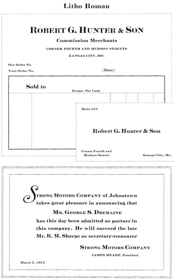
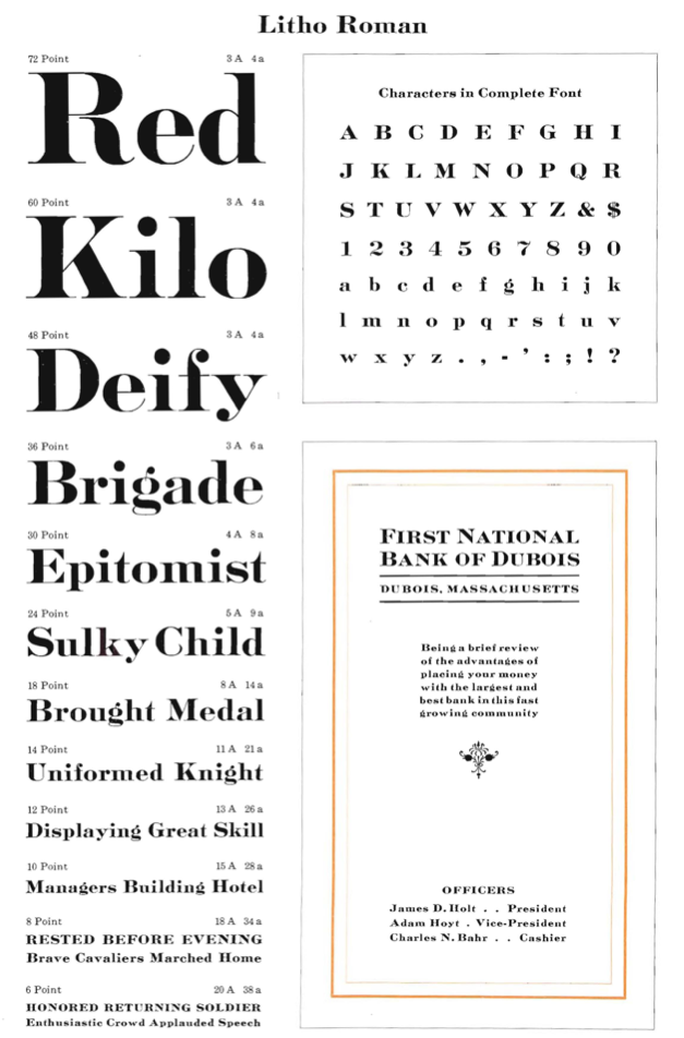
Litho Roman (1907, Inland) has a long story and many descendants. Characterized by a C with inward curling tail, Mac McGrew helps us to decipher it:

  • Litho Roman was designed by Inland Type Foundry in 1907, and a number of variations followed during the next four years. When Inland merged with ATF in 1912, all these typefaces went along and were shown in the ATF book of that year. They are intended to imitate a style of lettering popular with lithographers in the days when lettering and designs were carefully drawn on lithographic stones. This process was especially in demand for high-quality stationery and announcements. The original Litho Roman is rather heavy, with fine hairlines. Serifs on heavy strokes are slightly filleted, while those on hairlines are heavy triangles. The ear of the g starts straight up from within the bowl, and in some series the tail of the cap R is not quite connected to the bowl.
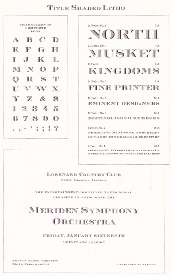
  • Title Shaded Litho, introduced by Inland in 1911, features horizontal shading, rather than the diagonal shading of almost all other such typefaces. Several versions have a title series, lacking lowercase and otherwise larger on the body, except in 6-point where caps are identical in the larger sizes but with additional smaller sizes.
  • In 1917 two of these title series were modified by Morris F. Benton and reissued as Card Litho and Card Light Litho. The latter became the last survivor of the family, being shown by ATF as late as 1979 specimens.
  • McGrew mentions that Monotype has its own copy of Light Litho.
  • Litho Light and Litho Bold were issued by Ludlow in 1941. They are essentially the same as Title Light Litho and Title Litho Roman (no lower-case), but the tail of the R connects and the lower end of the C does not turn inward, although an alternate C matches the foundry letter.
  • Rimmed Litho is basically the same design, including lowercase, but with a fine line surrounding each character. Rimmed Litho can be seen in the 1923 catalog of ATF.
  • Compare Engravers Roman series; Masterman.

For a digital revival of Card Litho by Morris Fuller Benton, see Caston (2015, Yusof Mining) and Caston Inked (2015, Yusof Mining).

EXTERNAL LINKS
Creative Market page
MyFonts search
Monotype search
Fontspring search
Google search

INTERNAL LINKS
Morris Fuller Benton ⦿


file name: A T F1923 Bold Litho


file name: A T F1923 Card Litho


file name: A T F1923 Condensed Litho


file name: A T F1923 Light Litho

file name: A T F1923 Litho Roman b

file name: A T F1923 Litho Roman

file name: Inland Title Shaded Litho 1911


file name: A T F1923 Catalog Rimmed Litho


file name: Jordan Davies Masterman 2017 252973 after H C Hansen 1872


file name: Jordan Davies Masterman 2017 after H C Hansen 1872


file name: Yusof Mining Caston 2015 after Morris Fuller Benton Card Litho 1917


file name: Yusof Mining Caston 2015 after Morris Fuller Benton Card Litho 1917b


file name: Yusof Mining Caston 2015 after Morris Fuller Benton Card Litho 1917c


file name: Yusof Mining Caston 2015 after Morris Fuller Benton Card Litho 1917d


file name: Yusof Mining Caston 2015 after Morris Fuller Benton Card Litho 1917e


Luc Devroye ⦿ School of Computer Science ⦿ McGill University Montreal, Canada H3A 2K6 ⦿ lucdevroye@gmail.com ⦿ https://luc.devroye.org ⦿ https://luc.devroye.org/fonts.html