TYPE DESIGN INFORMATION PAGE last updated on Sun Jan 25 03:11:21 EST 2026
FONT RECOGNITION VIA FONT MOOSE
|
|
|
|
News Gothic
News Gothic was designed by Morris F. Benton for ATF in 1908, in regular, condensed, and extra condensed widths, as part of his assignment to modernize the nineteenth-century gothics inherited from the foundry's predecessors. Mac McGrew writes: News Gothic, with its much finer rendering, is part of what might be called a family of basic American gothics, for it is essentially a light version of Franklin Gothic. Lightline Gothic is still lighter and Monotone Gothic is wider, but all of them, with the variations of News and Franklin Gothics, are as closely related as are members of most other type families. However, the flat-sided extra condensed is more similar to the style of the Alternate Gothics. These American gothics were pushed into obsolescence by the popularity of the German sans serifs, such as Futura and Kabel, in the 1930s. But they were rediscovered in the late 1940s, and made a strong come-back:
So far for the metal typefaces. McGrew ends with this note: Compare Franklin Gothic, Lightline Gothic, Monotone Gothic, also Trade Gothic, Record Gothic. Also see Phenix, Jefferson Gothic. A solid digital typeface family based on News Gothic is Font Bureau's Benton Sans (1993-2012, Cyrus Highsmith). See also News Gothic BT (Bitstream), News Gothic Bold (2017, Jordan Davies), and the one-weight Columnist JNL (2020, Jeff Levine). A listing of various digital versions of News Gothic. More News Gothic-like typefaces. |
EXTERNAL LINKS |
| | |
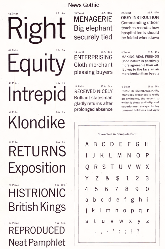
file name: Morris Fuller Benton News Gothic 1908
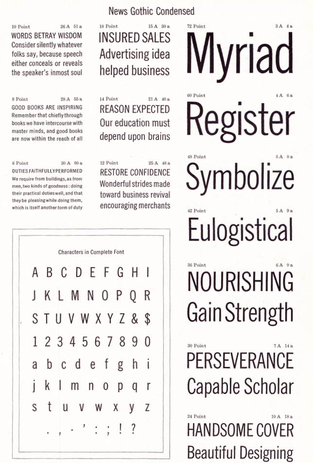
file name: Morris Fuller Benton News Gothic Condensed 1908
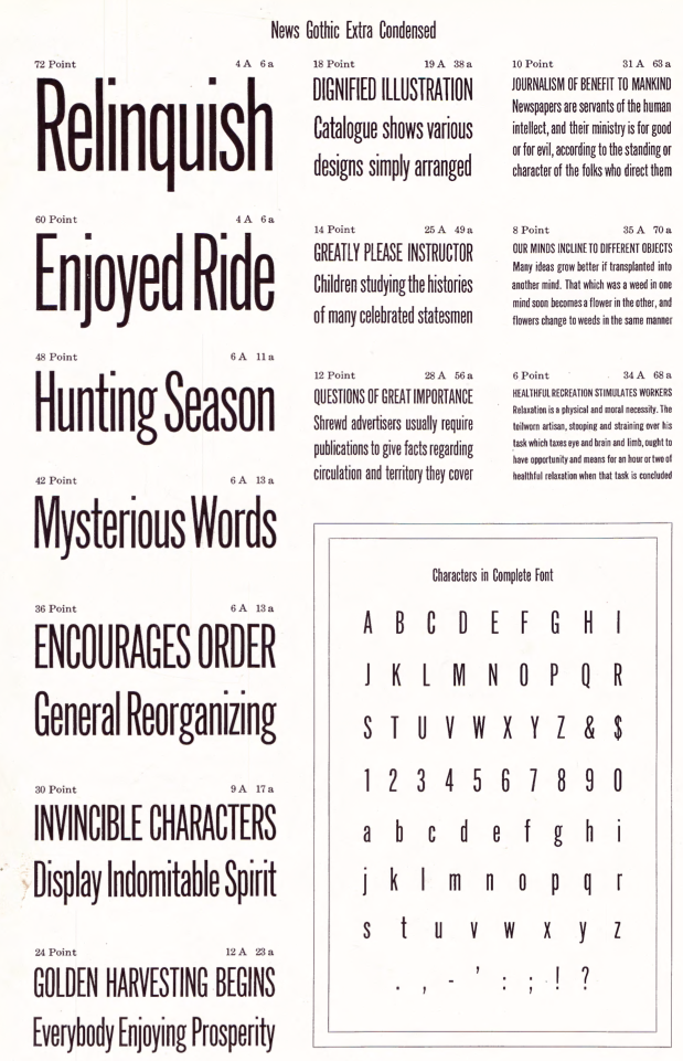
file name: Morris Fuller Benton News Gothic Extra Condensed 1908
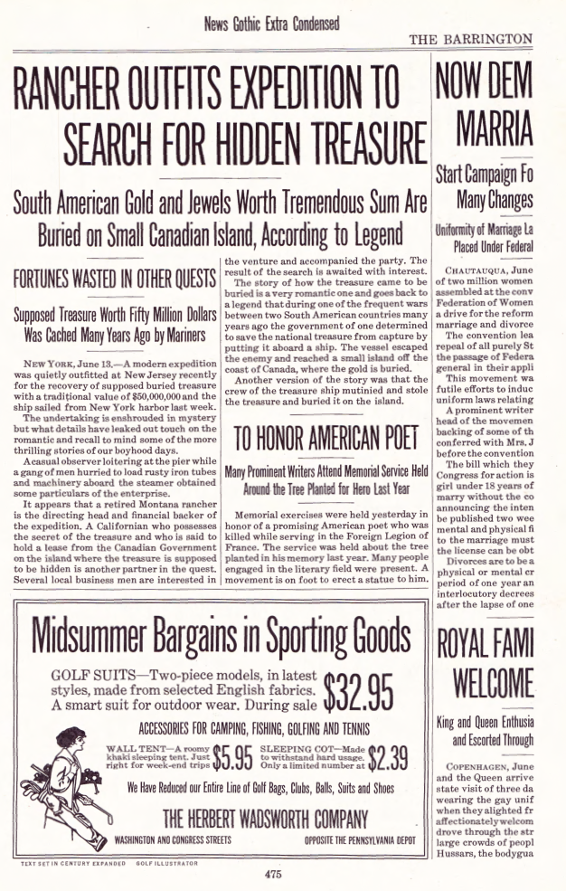
file name: Morris Fuller Benton News Gothic Extra Condensed 1908c
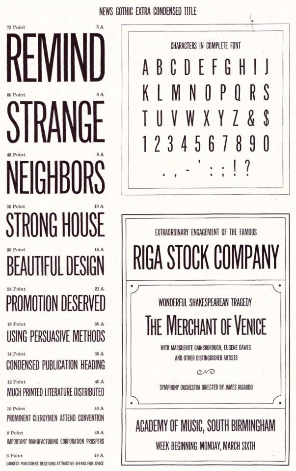
file name: Morris Fuller Benton News Gothic Extra Condensed Title 1908
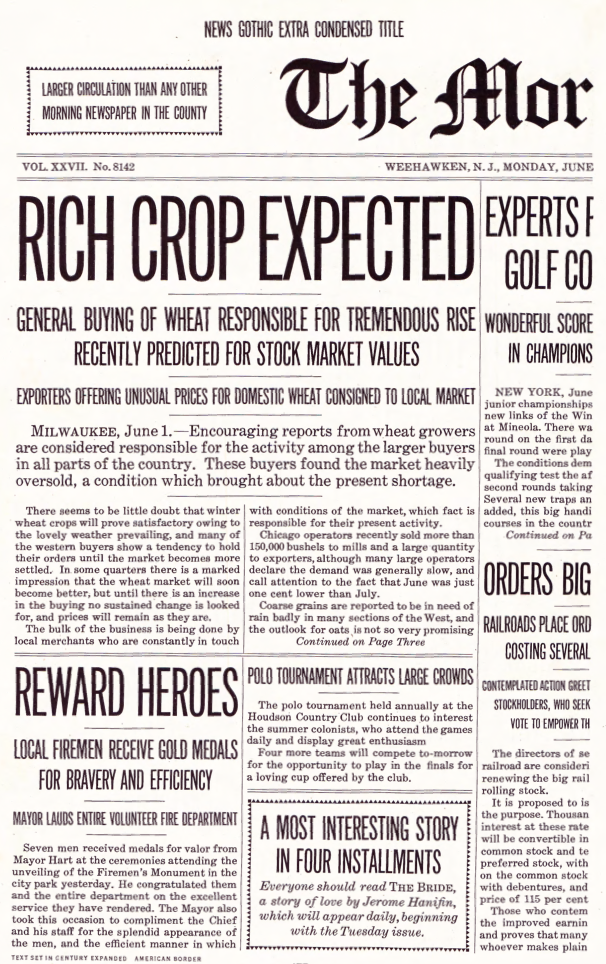
file name: Morris Fuller Benton News Gothic Extra Condensed Title 1908b

file name: Morris Fuller Benton News Gothic 1908
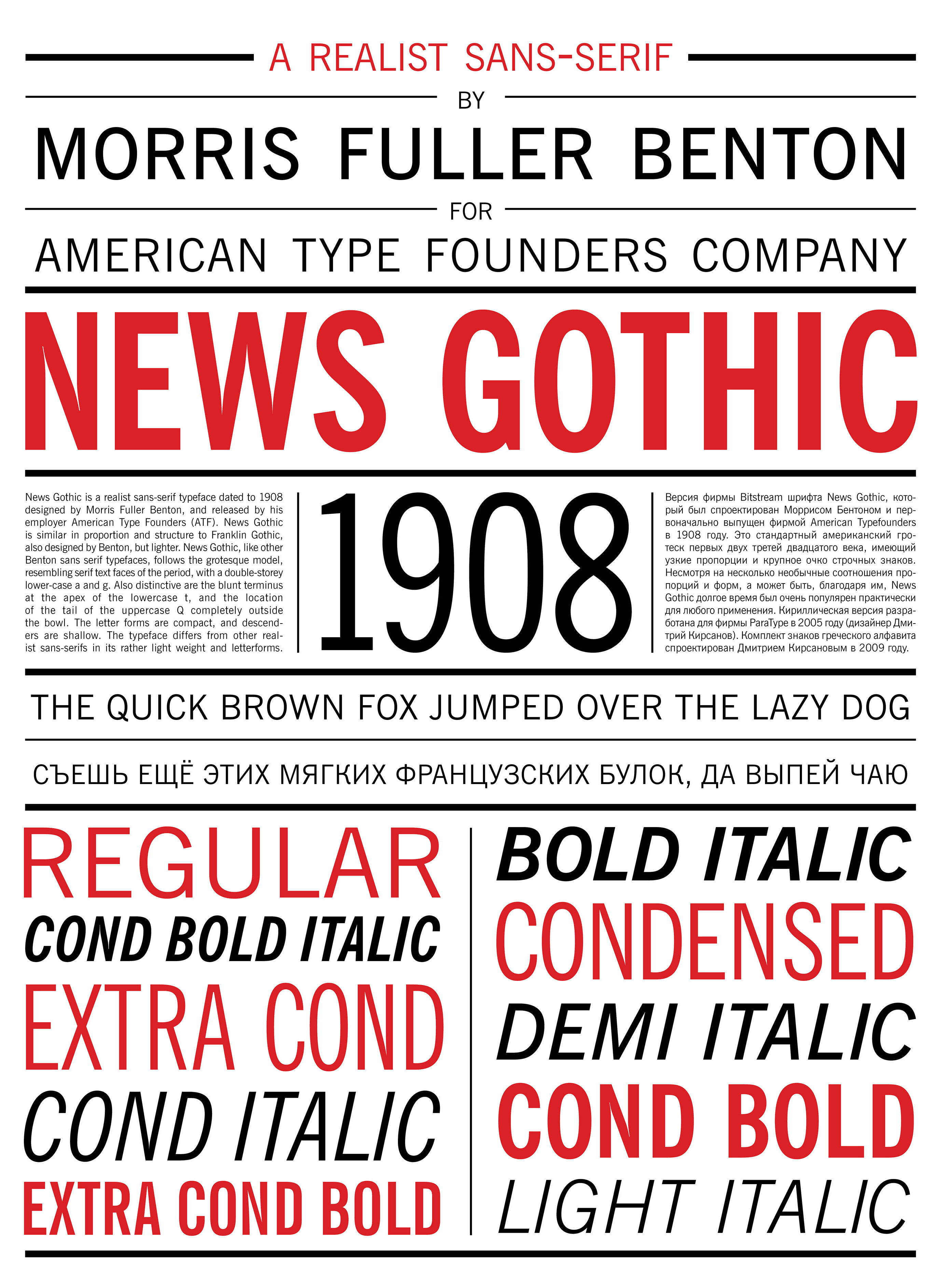
file name: Morris Fuller Benton News Gothic 1908 Poster by Karina Grigoryan 2019

file name: Morris Fuller Benton News Gothic Condensed 1908

file name: Morris Fuller Benton News Gothic Extra Condensed 1908

file name: Morris Fuller Benton News Gothic Extra Condensed 1908c

file name: Morris Fuller Benton News Gothic Extra Condensed Title 1908

file name: Morris Fuller Benton News Gothic Extra Condensed Title 1908b

file name: Morris Fuller Benton News Gothic 1908 Poster by Chandler Rose 2016
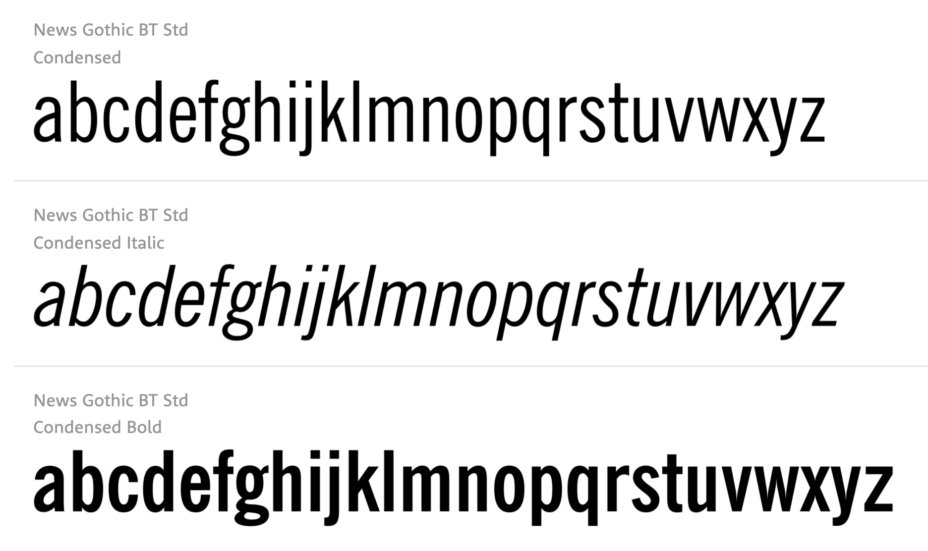
file name: Bitstream News Gothic B T
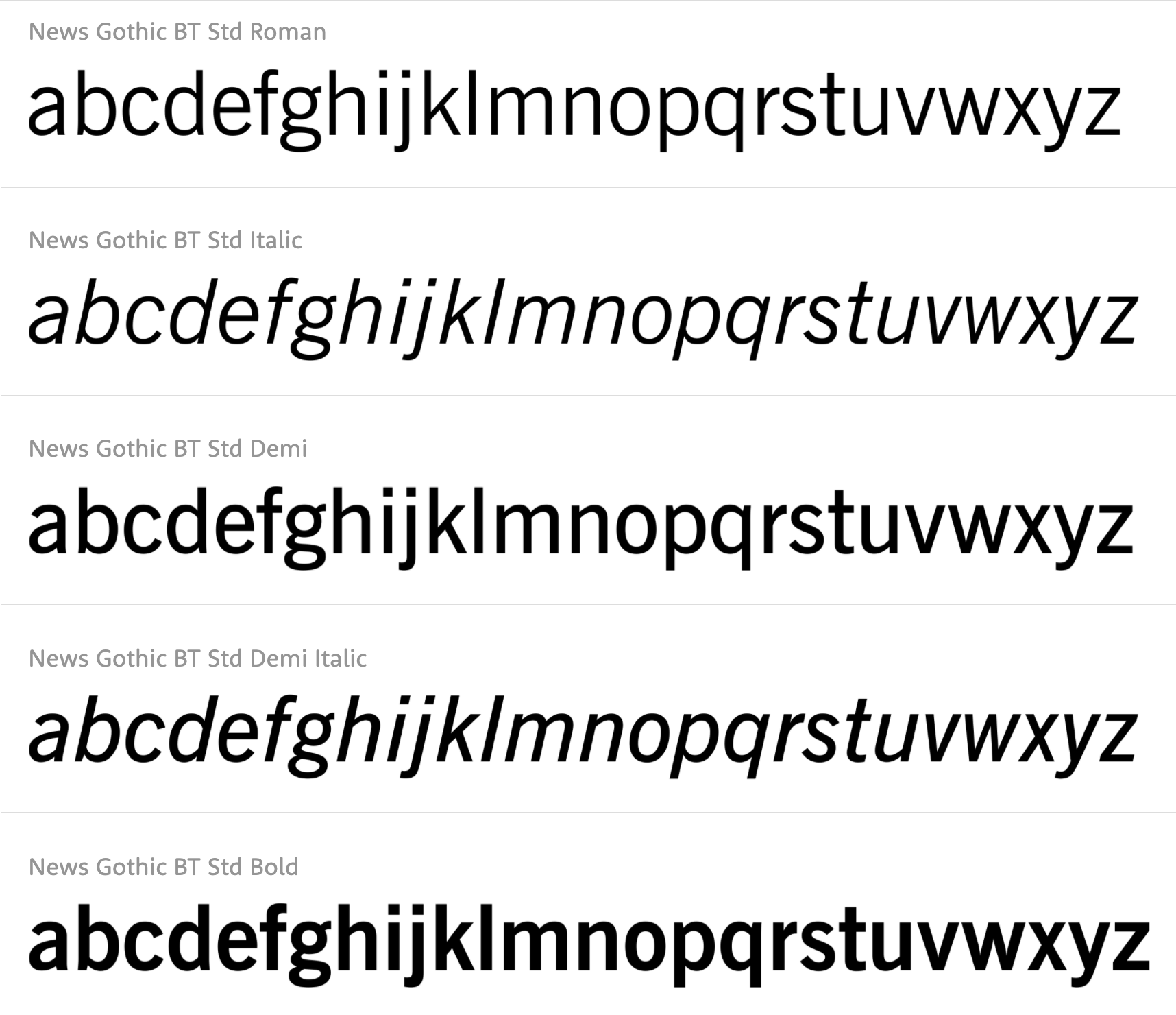
file name: Bitstream News Gothic B T
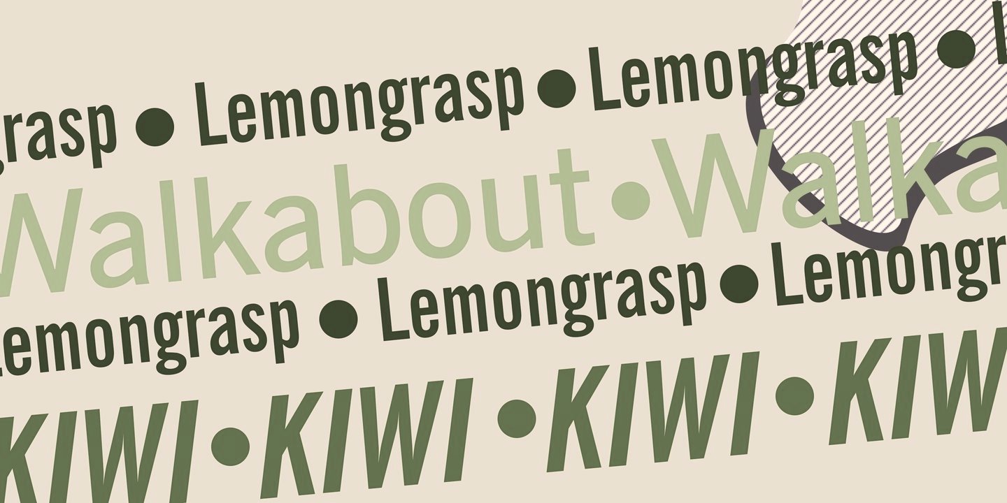
file name: Bitstream News Gothic B T

file name: Steve Jackaman Ashley Muir Franklin Gothic Pro 2011f

file name: Steve Jackaman Ashley Muir Franklin Gothic Pro 2011g

file name: Steve Jackaman Ashley Muir Franklin Gothic Pro 2011h
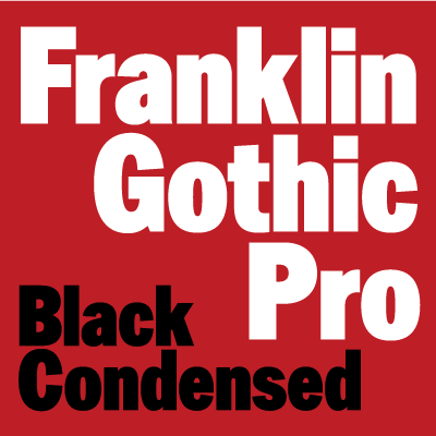
file name: Steve Jackaman Ashley Muir Franklin Gothic Pro 2011b

file name: Steve Jackaman Ashley Muir Franklin Gothic Pro 2011c

file name: Steve Jackaman Ashley Muir Franklin Gothic Pro 2011d

file name: Steve Jackaman Ashley Muir Franklin Gothic Pro 2011e
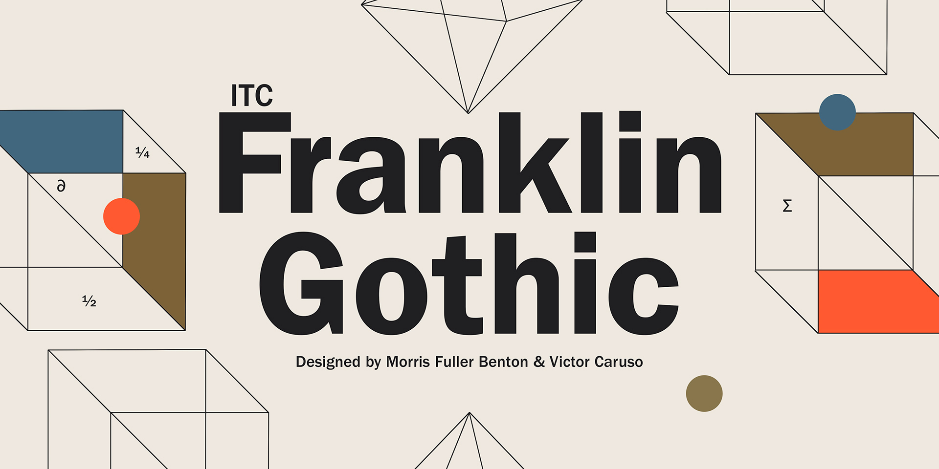
file name: Morris Fuller Benton Franklin Gothic 1902 Poster by Michael Sallit 2017

file name: Morris Fuller Benton Franklin Gothic 1902 Poster by Michael Sallit 2017b
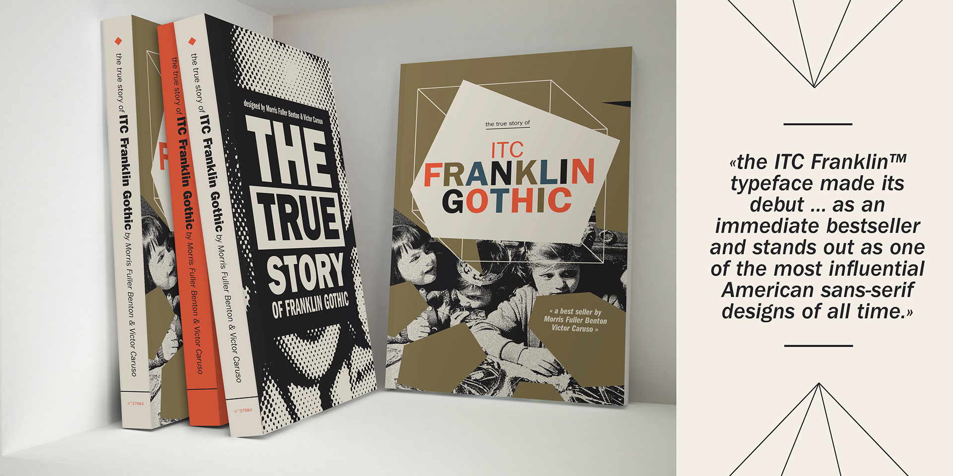
file name: Morris Fuller Benton Franklin Gothic 1902 Poster by Michael Sallit 2017c

file name: Morris Fuller Benton Franklin Gothic 1902 Poster by Michael Sallit 2017d
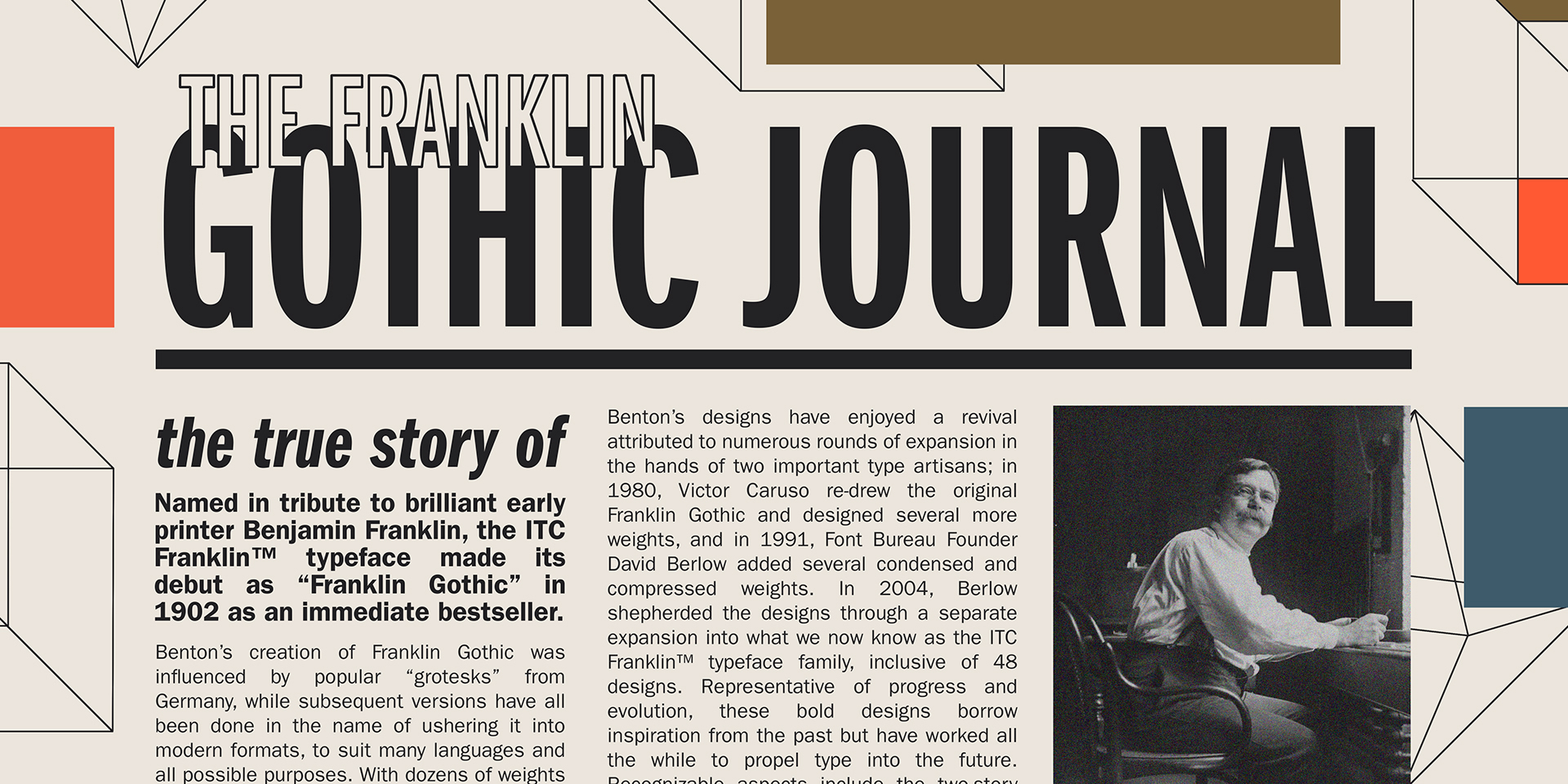
file name: Morris Fuller Benton Franklin Gothic 1902 Poster by Michael Sallit 2017e
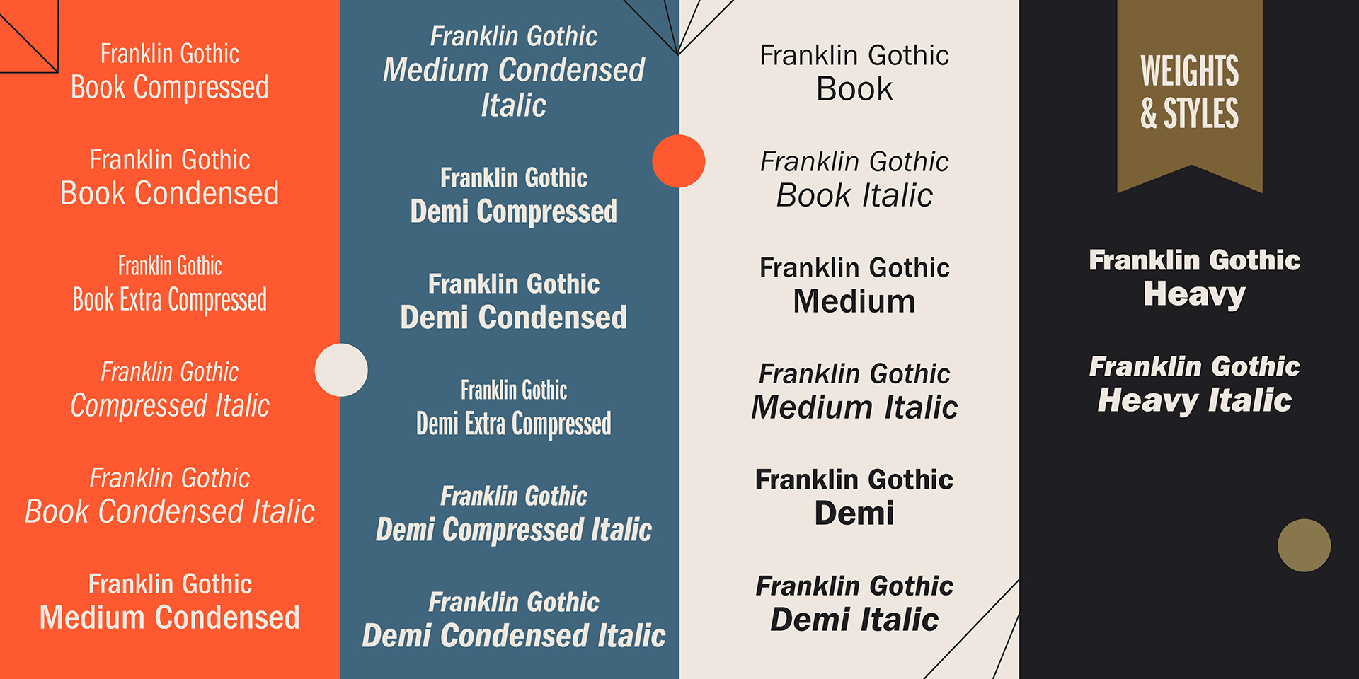
file name: Morris Fuller Benton Franklin Gothic 1902 Poster by Michael Sallit 2017f

file name: Morris Fuller Benton Franklin Gothic 1902 Poster by Michael Sallit 2017g
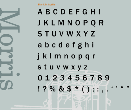
file name: Morris Fuller Benton Franklin Gothic Poster by Tina Kim 2014

file name: Morris Fuller Benton Franklin Gothic Poster by De Art Lab Studio 2016
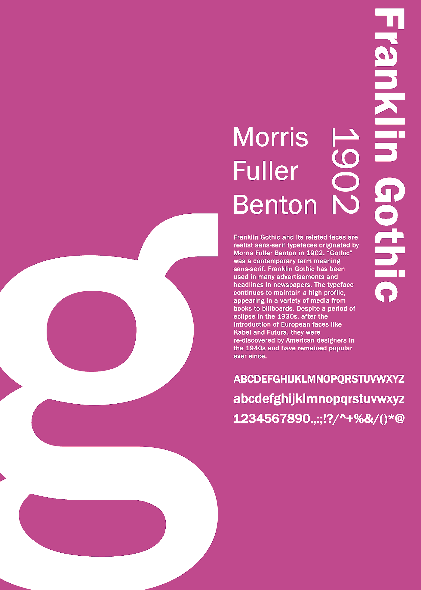
file name: Morris Fuller Benton Franklin Gothic 1902 Poster by Zekai Saltoglu 2016
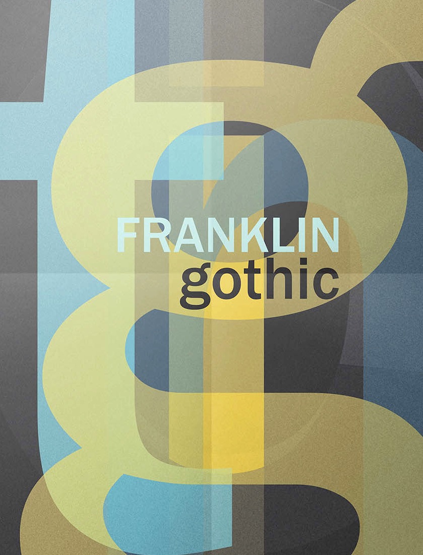
file name: Morris Fuller Benton Franklin Gothic 1902 poster by Daniela Carusone 2016
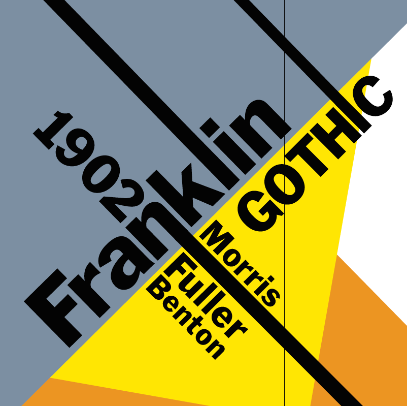
file name: Morris Fuller Benton Franklin Gothic 1902 poster by Carolina Steele 2015
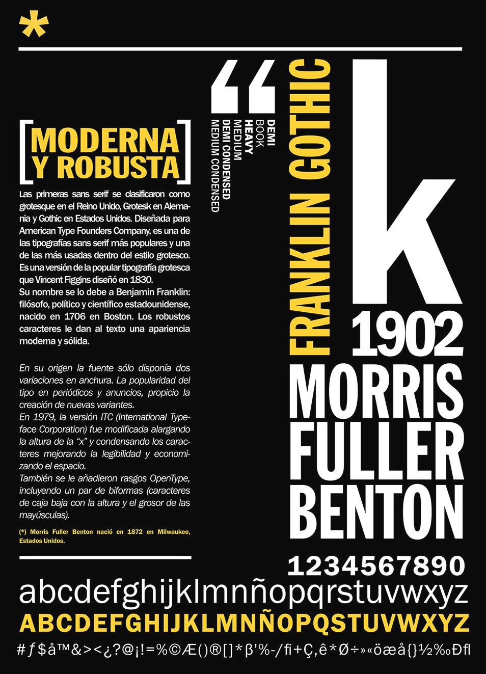
file name: Morris Fuller Benton Franklin Gothic 1902 Poster by Juana Caudal 2014
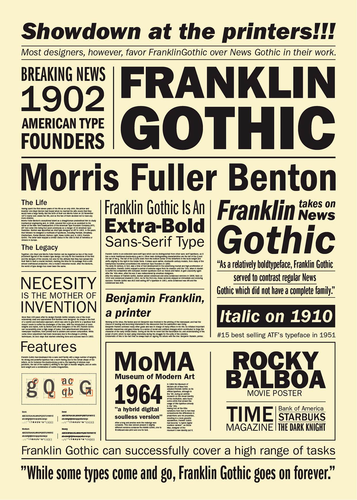
file name: Morris Fuller Benton Franklin Gothic 1902 Poster by Lica Eugen 2015
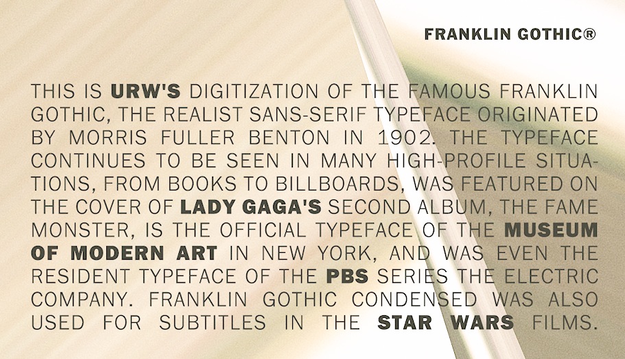
file name: U R W Franklin Gothic after Morris Fuller Benton 1902b

file name: U R W Franklin Gothic after Morris Fuller Benton 1902c

file name: U R W Franklin Gothic after Morris Fuller Benton 1902d

file name: U R W Franklin Gothic after Morris Fuller Benton 1902e
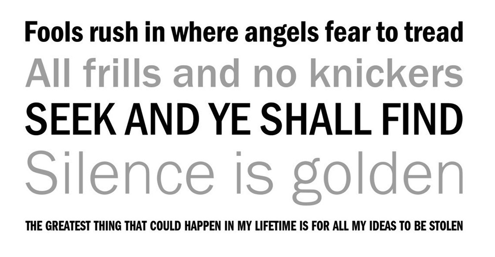
file name: U R W Franklin Gothic after Morris Fuller Benton 1902f

file name: U R W Franklin Gothic after Morris Fuller Benton 1902g
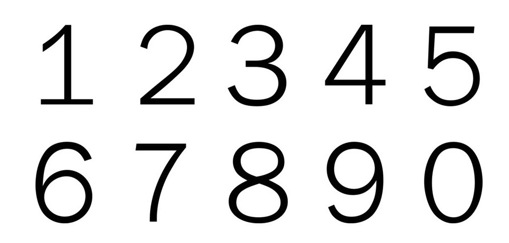
file name: U R W Franklin Gothic after Morris Fuller Benton 1902h
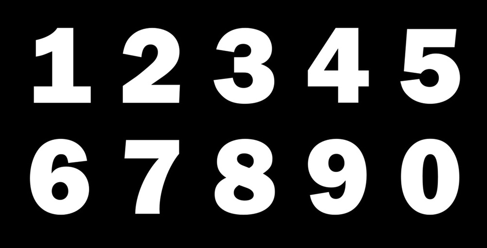
file name: U R W Franklin Gothic after Morris Fuller Benton 1902i

file name: U R W Franklin Gothic after Morris Fuller Benton 1902j

file name: U R W Franklin Gothic after Morris Fuller Benton 1902k
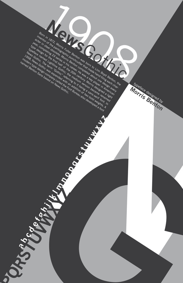
file name: Morris Fuller Benton News Gothic 1908 Poster by Sean Mc Cormick 2014

file name: Morris Fuller Benton News Gothic 1908 Poster by Benny Sorrell 2016
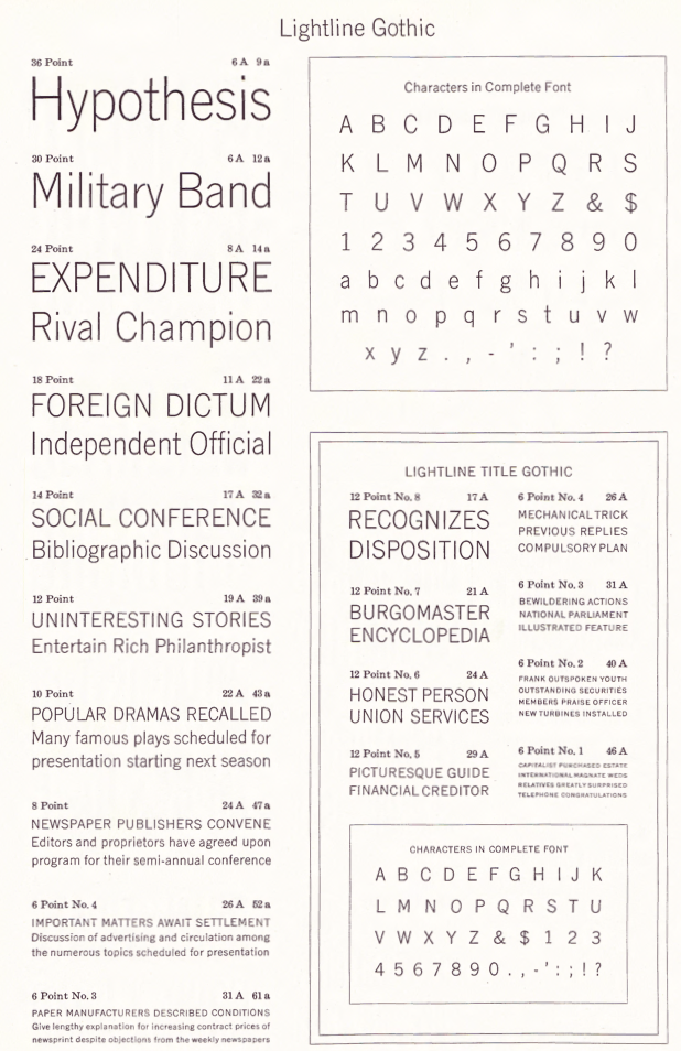
file name: Morris Fuller Benton Lightline Gothic 1908
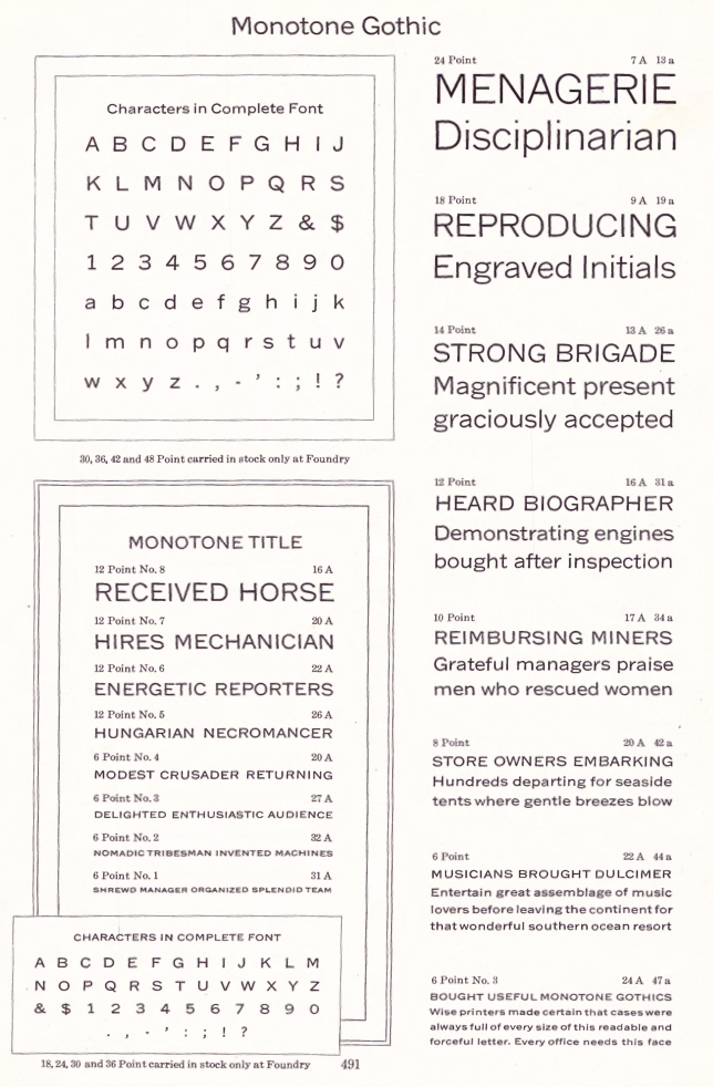
file name: Morris Fuller Benton Monotone Gothic 1907

file name: Jeff Levine Columnist J N L 2020
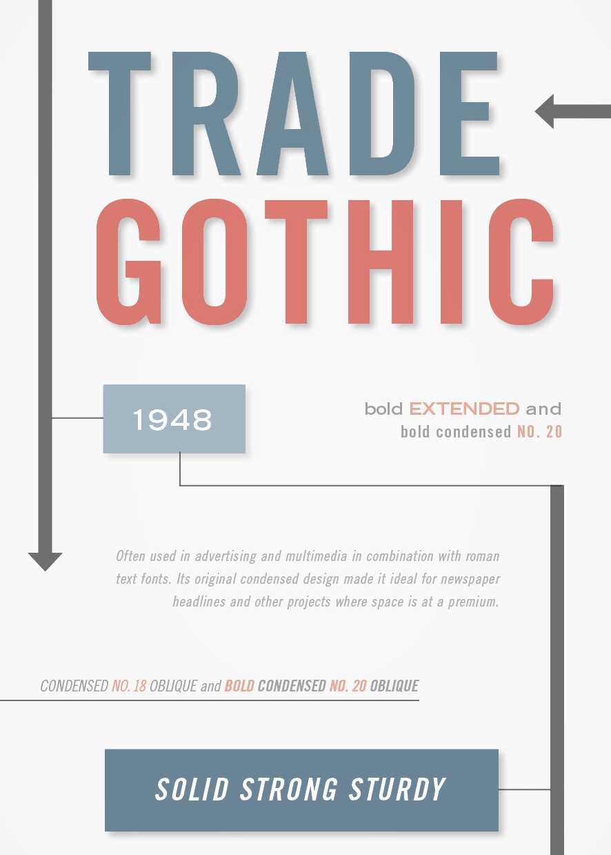
file name: Jackson Burke Trade Gothic 1948 Poster by Michelle Uyeda 2015
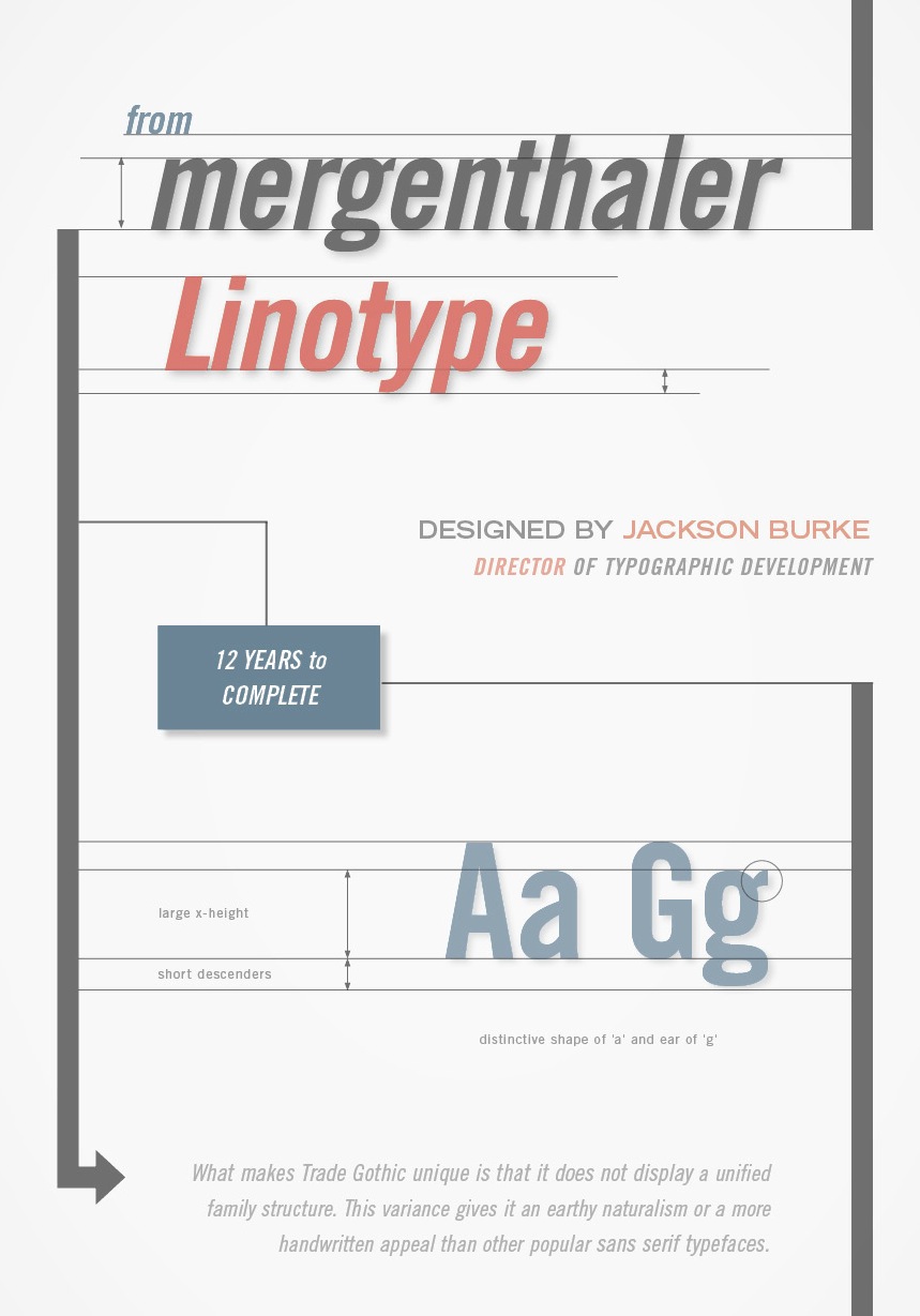
file name: Jackson Burke Trade Gothic 1948 Poster by Michelle Uyeda 2015b

file name: Tobias Frere Jones Cyrus Highsmith Benton Sans Black 2000
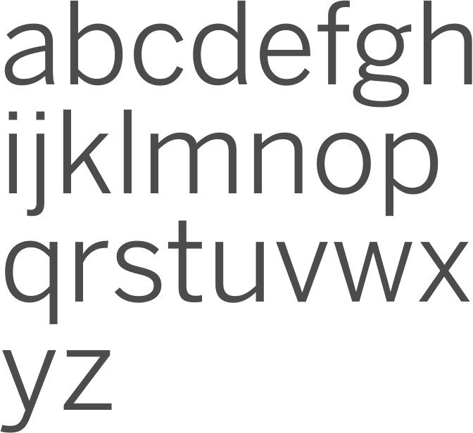
file name: Tobias Frere Jones Cyrus Highsmith Benton Sans Book 2000

file name: Tobias Frere Jones Cyrus Highsmith Benton Sans Cond Black S C 2000
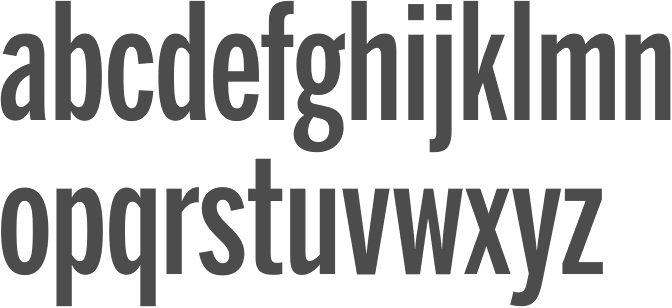
file name: Tobias Frere Jones Cyrus Highsmith Benton Sans Extra Comp Medium 2000
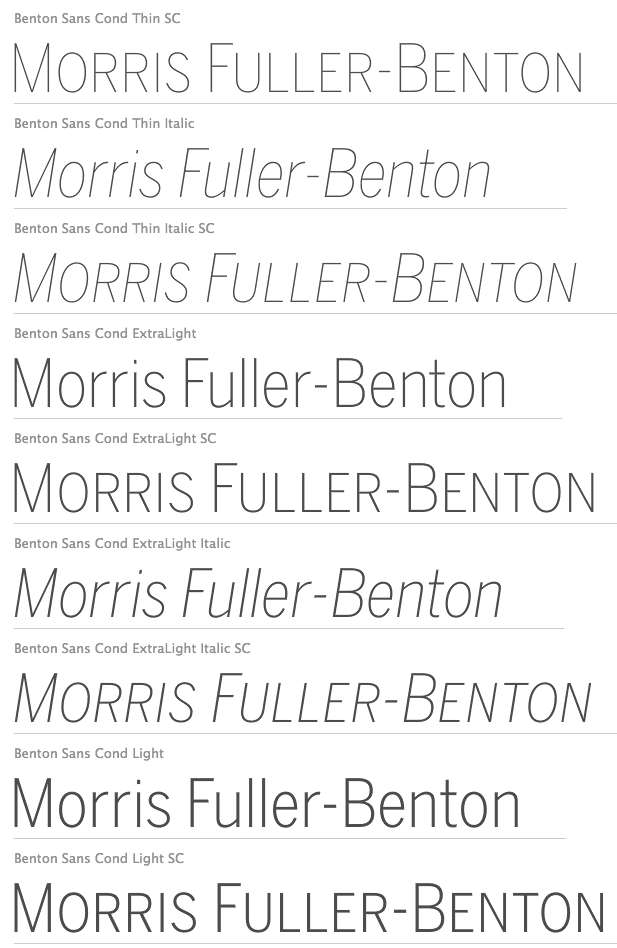
file name: Tobias Frere Jones Cyrus Highsmith Benton Sans T Cond Thin Light 2000
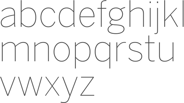
file name: Tobias Frere Jones Cyrus Highsmith Benton Sans Thin 2000
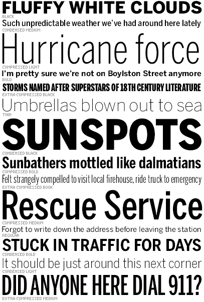
file name: Cyrus Highsmith Benton Sans 1995 2003
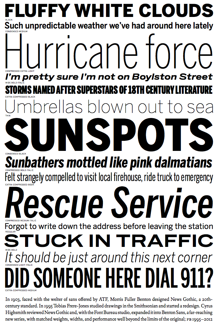
file name: Cyrus Highsmith Benton Sans 1995 2012

file name: Cyrus Highsmith Benton Sans 1995 2012b

file name: Cyrus Highsmith Benton Sans 1995 2012c

file name: Cyrus Highsmith Benton Sans 1995 2012d

file name: Cyrus Highsmith Benton Sans 1995 2012e

file name: Cyrus Highsmith Benton Sans 1995 2012f

file name: Cyrus Highsmith Benton Sans Wide 2013
| | |
|
Luc Devroye ⦿ School of Computer Science ⦿ McGill University Montreal, Canada H3A 2K6 ⦿ lucdevroye@gmail.com ⦿ https://luc.devroye.org ⦿ https://luc.devroye.org/fonts.html |

