TYPE DESIGN INFORMATION PAGE last updated on Thu Apr 16 22:13:27 EDT 2026
FONT RECOGNITION VIA FONT MOOSE
|
|
|
|
ATF: Typo Script and Typo Gothic
Typo Script is a Spencerian script in the ATF library, cut by them in 1902. However, many similar scripts existed around that time. Mac McGrew explains: Typo Script is a group of ATF typefaces, most of which have little or no relation to each other except that all are intended for use on stationery, invitations, and other social printing, and are imitative of the work of copperplate and steelplate engravers. Several members of the group were originally named Tiffany; the name apparently was changed late in 1906, although a few typefaces were still shown with the earlier name as late as 1909. Typo Gothic is the oldest of the group, and has been made by many founders. It is a plain, square, monotone gothic with very small serifs, cast in several sizes of caps and figures on each of several point sizes. He continues about the origins of Typo Gothic: The earliest showing seems to have been offered as Lining Antique by Illinois Type Foundry in 1889; Keystone Type Foundry later used the same name. Subsequently it was shown as Cleveland by Standard Type Foundry, as Standard Lining Antique by Marder, Luse, and as Olympia by Inland, all before 1900. ATF showed it as Tiffany Gothic from 1901 to 1909 and later as Typo Gothic. BB&S took over Olympia and renamed it Engravers Gothic. Damon&Peets called it Franklin Card Gothic, which is the cap alphabet shown in the specimen here. Hansen called it Steel plate Gothic. From all sources it is essentially the same design, although there are some slight differences. Some versions have a horizontal crossbar on the G " some lack this on certain sizes. Now back to ATF. McGrew: Typo Roman was designed by Morris F. Benton for ATF in 1926; it is a narrow modern roman with small lowercase and very long ascenders. The M is splayed with a short vertex. Figures are much the same as Bodoni. Typo Roman Light was cut by Intertype in 1939. Typo Roman Shaded was the first of this group; it is said to have been designed by Morris F. Benton in 1921, adapted from engravings, but was not released by ATF until 1924. Typo Script and Typo Script Extended were designed by Benton and cut by ATF in 1902, originally as Tiffany Script and Extended, when they were called "as close a copy as possible to reproduce in type the work of the artist who did much of the copperplate engraving for the Pan-American exposition." But Middleton says Tiffany Script was the "first typeface engraved by Wiebking (and Harding) on their engraving machine brought from Germany." They are a refinement of popular nineteenth-century scripts; like some of them, these two typefaces share the same capitals, figures, and punctuation marks-only the lowercase differs. They are similar to Bank Script and Commercial Script, but lighter and more delicate. Inland's Invitation Script was very similar to Typo Script Extended. Also see American Script, Formal Script, Plate Script. Typo Text is a shaded Old English design, first shown by ATF as Tiffany Text in 1901, although this may be the same typeface shown by Bruce Type Foundry as Invitation Text a short time earlier, just before that foundry merged with ATF. Hansen copied it as Card Text. Also see Plate Text, Inland Copperplate. For a digital revival of Tiffany Gothic, see Tiffany Gothic CC (2020, Owen Earl). |
EXTERNAL LINKS |
| | |
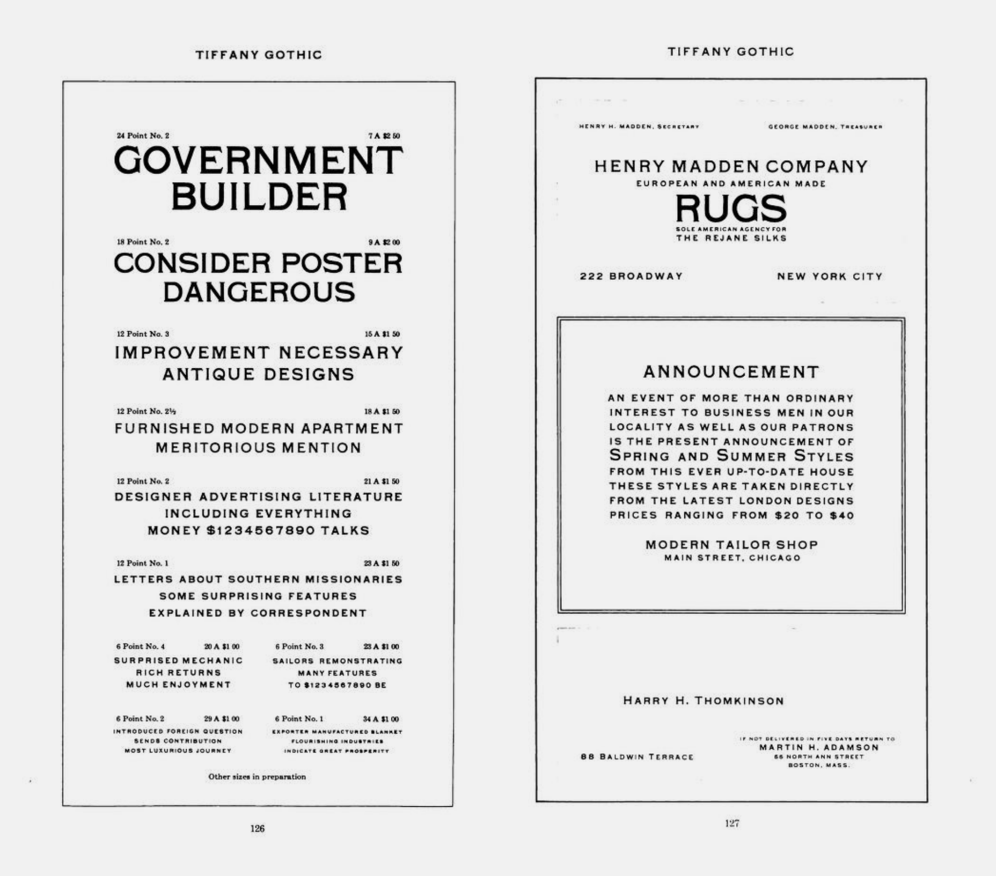
file name: A T F Tiffany Gothic 1909
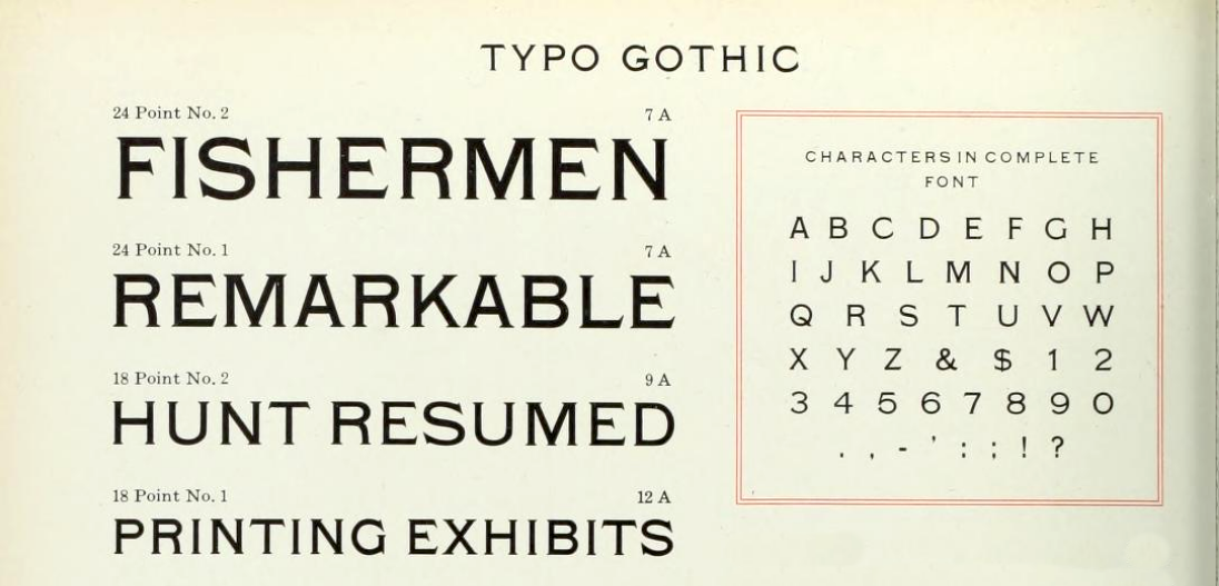
file name: A T F Typo Gothic 1923
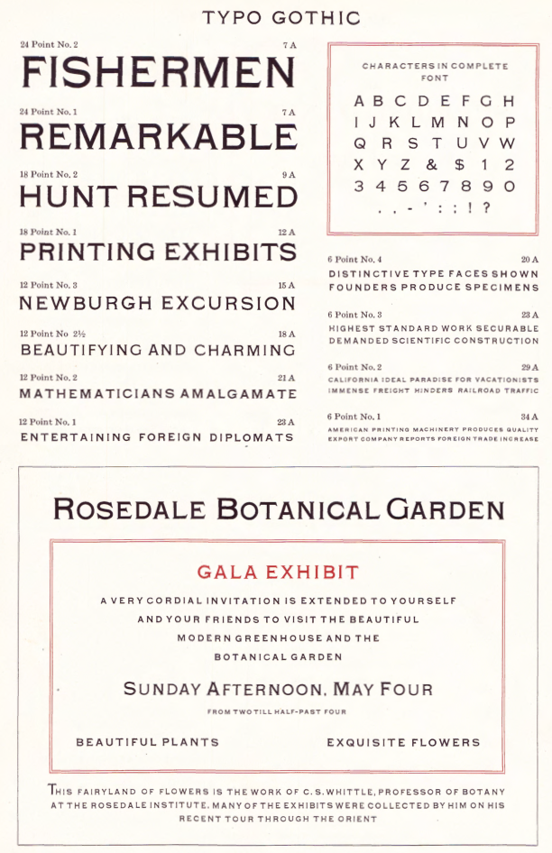
file name: A T F1923 Catalog Typo Gothic
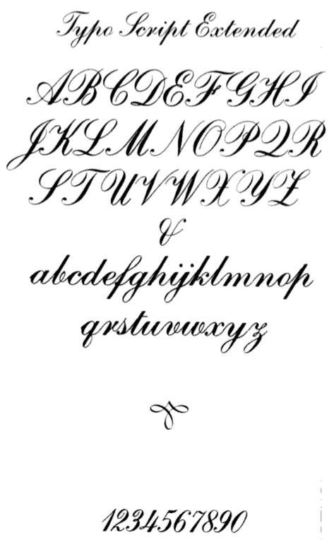
file name: Typo Script Extended
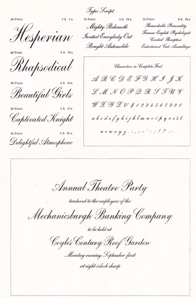
file name: Morris Fuller Benton Typo Script 1902
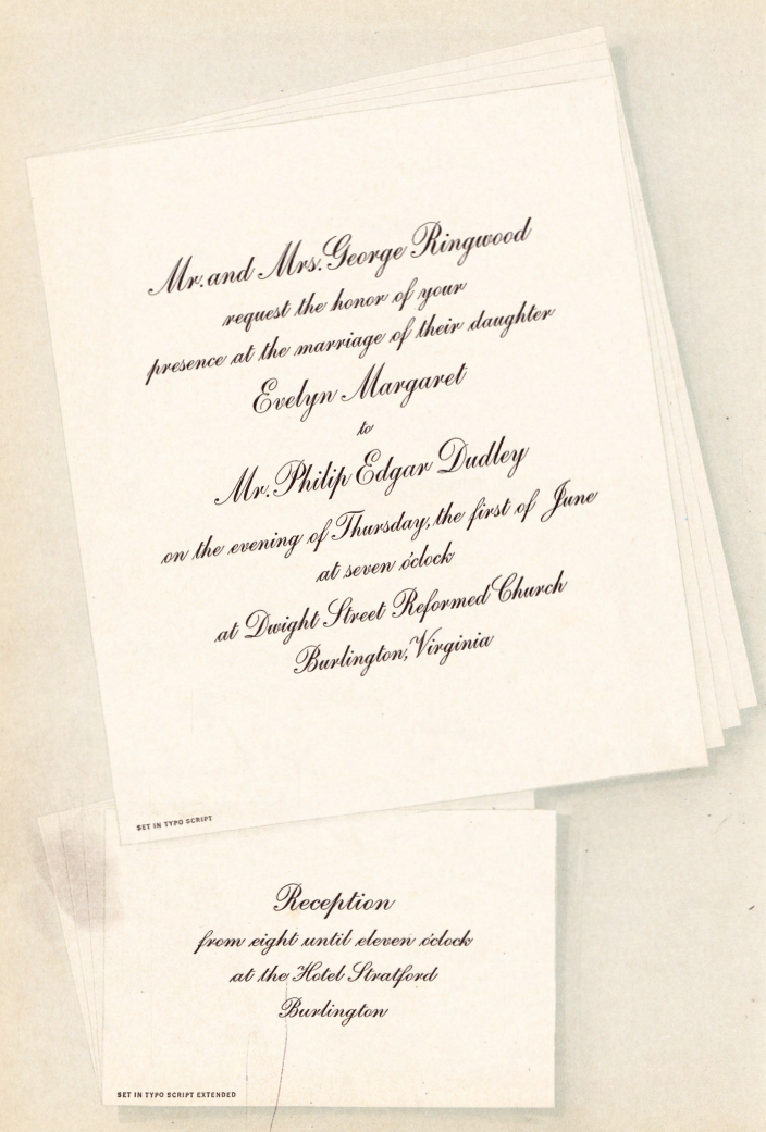
file name: Morris Fuller Benton Typo Script 1902c
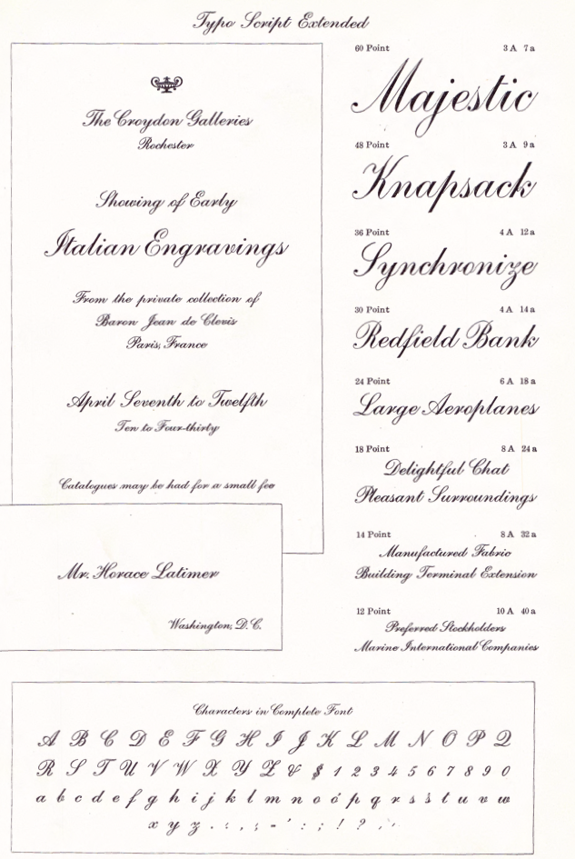
file name: Morris Fuller Benton Typo Script Extended 1902
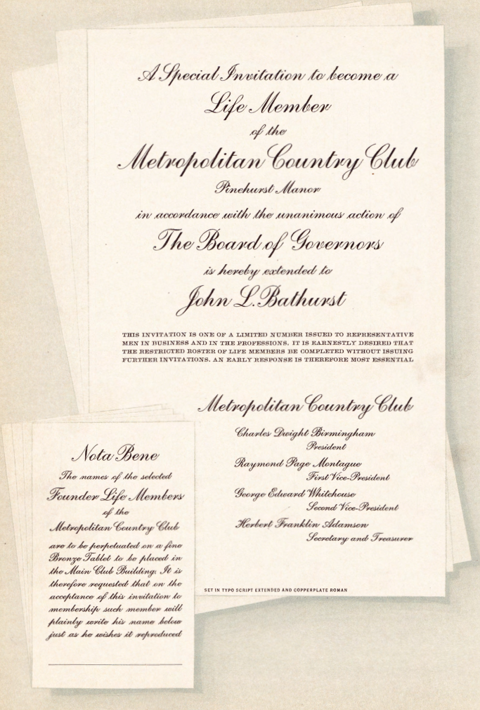
file name: Morris Fuller Benton Typo Script Extended 1902b
| | |
|
Luc Devroye ⦿ School of Computer Science ⦿ McGill University Montreal, Canada H3A 2K6 ⦿ lucdevroye@gmail.com ⦿ https://luc.devroye.org ⦿ https://luc.devroye.org/fonts.html |
