TYPE DESIGN INFORMATION PAGE last updated on Wed May 6 16:24:15 EDT 2026
FONT RECOGNITION VIA FONT MOOSE
|
|
|
|
Monotype Bell
Monotype's hot metal Bell series from 1931 is based on original types made by the punchcutter Richard Austin for the foundry of John Bell in the 1780s. The different sizes of Monotype's series were not all based on the same model. Type historian James Mosley writes on Typophile in 2009 about this transitional typeface family: For the metal type they called Bell, Monotype were working from types that had been newly cast by Stephenson Blake from original matrices that were made from punches cut by Richard Austin for the foundry of John Bell in the 1780s. They were used by the University Press at Cambridge in 1930 to print Stanley Morison's monograph on John Bell. Their text size seems to be based on the original English (about 14 point) type, which they scaled down to make the smaller sizes. For the 8 point the descenders were greatly reduced, but the design does not seem to have been radically redrawn. For 18 point and above (the metal type was cut in sizes up to 36 point) Monotype's model was a larger type, the Great Primer cut by Austin. This has greater contrast in the capitals and a flat footed letter a. There is also a digital version by URW. Mosley comments: [...] URW's model seems to have been Monotype's smaller sizes, whereas for their own digital Bell Monotype appears to have used a single model, their 18-point cut for metal. The metal type of 1931 had been excellently made, since by then Monotype were past masters in adapting historical models to the demands of machine setting. Their Caslon of 1915 was a good example of this, in which every single size was as near as possible a facsimile of the metal types (in which all the sizes were different) cast by the Caslon foundry. Their Series 146 of 1921, called Old Roman and later known by the US name Scotch Roman, was a similar near-facsimile, size by size, of the revived early-19th-century type (possibly also the work of Richard Austin) of the Edinburgh foundry Miller & Richard. These types have to be called near-facsimiles since some characters needed to be slightly redrawn to fit the 18-unit system on which the Monotype line justification system depended, which sometimes meant stretching or compressing them slightly---a compromise that was rarely mentioned at the time. |
EXTERNAL LINKS |
| | |
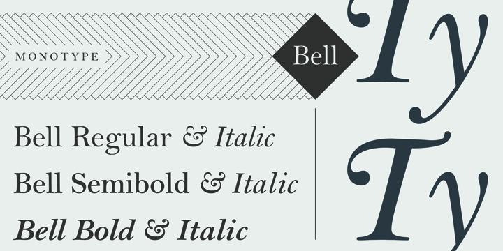
file name: Monotype Bell 1931 after Richard Austin 1780s
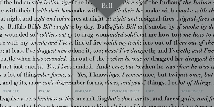
file name: Monotype Bell 1931 after Richard Austin 1780sb
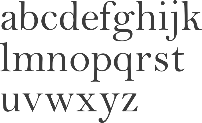
file name: Monotype Bell 1931 after Richard Austin 1780sc
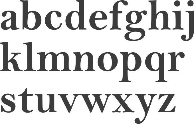
file name: Monotype Bell 1931 after Richard Austin 1780sd
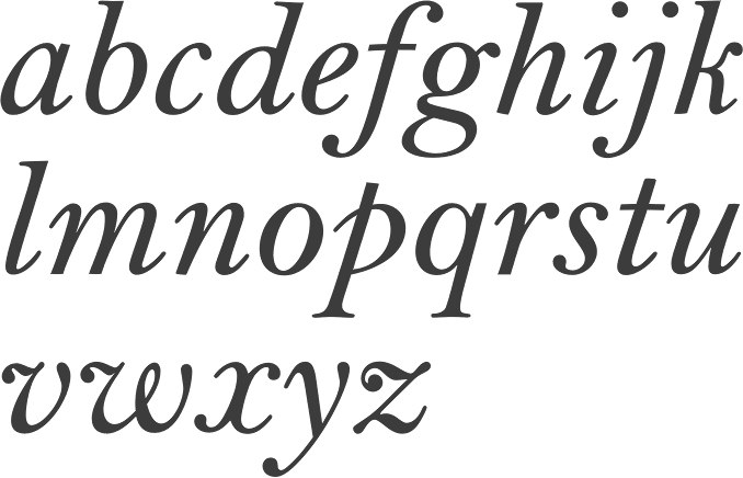
file name: Monotype Bell 1931 after Richard Austin 1780se
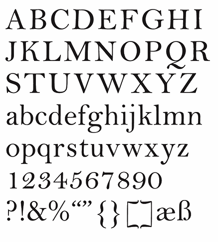
file name: Monotype Bell 1931 after Richard Austin 1780s Poster by Renee La Plante 2015
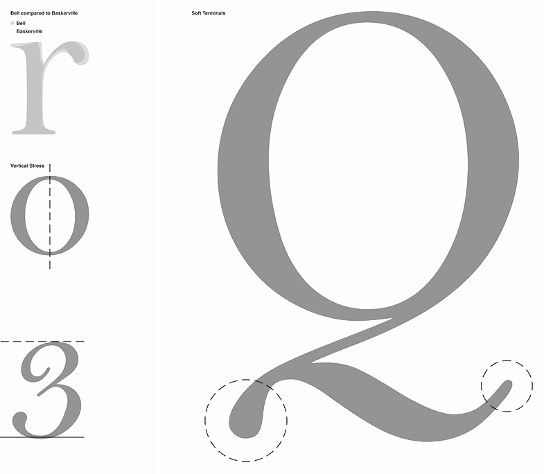
file name: Monotype Bell 1931 after Richard Austin 1780s Poster by Renee La Plante 2015b
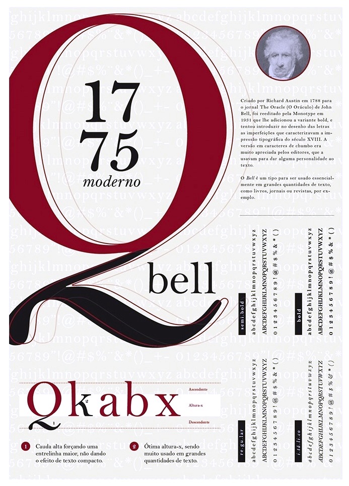
file name: Richard Austin Bell 1788 Poster by Gabriel Bulhoes 2015d

file name: Austin Bell English
| | |
|
Luc Devroye ⦿ School of Computer Science ⦿ McGill University Montreal, Canada H3A 2K6 ⦿ lucdevroye@gmail.com ⦿ https://luc.devroye.org ⦿ https://luc.devroye.org/fonts.html |

