TYPE DESIGN INFORMATION PAGE last updated on Fri May 1 17:42:45 EDT 2026
FONT RECOGNITION VIA FONT MOOSE
|
|
|
|
Fabula
[Sue Walker]
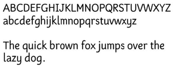
The Fabula typeface was originally designed as a screen font as part of a project that produced software to enable children and teachers to produce bilingual story books. Since then, changes have been made to its design and it is now, additionally, a font suitable for titling and text setting in large sizes. Fabula was designed by a team led by Sue Walker that included Conrad Taylor, Vincent Connare, Gerry Leonidas and José Scaglione. Sue writes: It has been used in a series of tests designed to find out what children in year 2 think about typefaces in the books they read. They descibed Fabula as 'clear, so you can see it properly'; 'normal'; 'like an ordinary book'. Stylistically, Fabula has long ascenders and descenders (to help identify the word shapes), an informal feel, rounded terminals, a rounded e, a clear distinction between characters that might be easily confused, such as the (a, o) pair and the (l, 1) pair. Fabula 1 has a double storey a. Fabula 2 has a single storey a. |
EXTERNAL LINKS |
| | |

file name: Sue Walker Vince Connare Jose Scaglione Conrad Taylor Gerry Leonidas Fabula1
| | |
|
Luc Devroye ⦿ School of Computer Science ⦿ McGill University Montreal, Canada H3A 2K6 ⦿ lucdevroye@gmail.com ⦿ https://luc.devroye.org ⦿ https://luc.devroye.org/fonts.html |
