TYPE DESIGN INFORMATION PAGE last updated on Thu Apr 16 22:14:08 EDT 2026
FONT RECOGNITION VIA FONT MOOSE
|
|
|
|
Futura: Choice
A frequently asked question---which version of Futura should one buy? My personal favorite is the Neufville version, Futura ND. The answers by some type experts include:
|
EXTERNAL LINKS |
| | |

file name: Futura Comparison

file name: Futura Comparison

file name: Futura Comparison by Adam Fathony 2021

file name: Hannes Famira Sonar Sans 2011

file name: Hannes Famira Sonar Sans 2011b

file name: Hannes Famira Sonar Sans 2011c

file name: Paul Renner Futura 1927 poster by Jiayin Song 2019

file name: Richard Neutra Neutraface

file name: Richard Neutra Neutraface

file name: Richard Neutra Neutraface poster by Michelle Regna
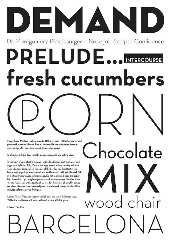
file name: Richard Neutra Neutraface poster by Ioana Dumitrescu

file name: Sol Hess L T C Twentieth Century Medium
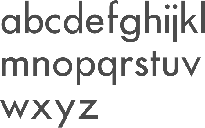
file name: Sol Hess L T C Twentieth Century Medium

file name: Sol Hess Twentieth Century 1959b

file name: Sol Hess Twentieth Century 1959c

file name: Sol Hess Twentieth Century 1959d
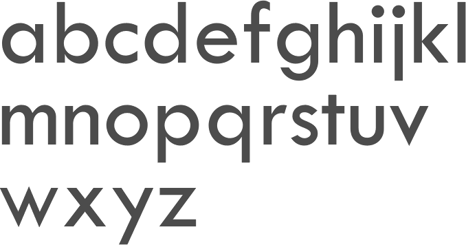
file name: Sol Hess Twentieth Century Medium 1959 Sol Hess Twentieth Century Semi Medium 1959b
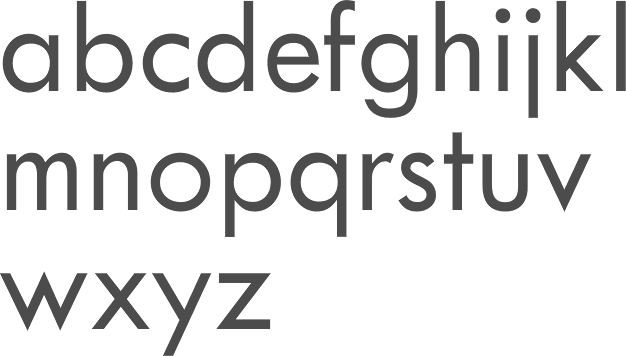
file name: Sol Hess Twentieth Century Semi Medium 1959

file name: Neufville Futura N D Demibold 1999

file name: Neufville Futura N D Light 1999

file name: U R W Futura

file name: U R W Futura Round Medium 2013

file name: U R W Futura Cond Ext Bold 2014

file name: U R W Futura Round 2013

file name: U R W Futura Round Demi 2013 after Paul Renner 1927

file name: U R W Futura Round Light 2013 after Paul Renner 1927

file name: U R W Futura Round Round Cond Extra Bold 2013 after Paul Renner 1927

file name: U R W Futura Round Round Cond Extra Bold 2013 after Paul Renner 1927b

file name: U R W Futura Round Round Cond Extra Bold 2013 after Paul Renner 1927c

file name: Paul Renner Futura 1929 Poster by Umaima Lakhani 2016

file name: Paul Renner Futura 1929 Poster by Umaima Lakhani 2016b

file name: Paul Renner Futura 1929 Poster by Paige Drummond 2015

file name: Paul Renner Futura 1929 Poster by Paige Drummond 2015b

file name: Paul Renner Futura 1927 Poster by T J Hahn 2015

file name: Paul Renner Futura 1927 Poster by Emalie Mooren 2015

file name: Paul Renner Futura 1927z

file name: Paul Renner Futura 1927 Poster by Michelle Parrish 2017

file name: Paul Renner Futura 1929 Poster by Sevki Yeke 2016

file name: Paul Renner Futura 1927 Poster by Victoria Costa Paz 2016

file name: Scangraphic Futura S H Bold 2004

file name: Scangraphic Futura S H X Light 2004

file name: U R W Futura No2 2002

file name: U R W Futura No2 Cond Extra Bold 2002

file name: U R W Futura No2 Medium 2002
| | |
|
Luc Devroye ⦿ School of Computer Science ⦿ McGill University Montreal, Canada H3A 2K6 ⦿ lucdevroye@gmail.com ⦿ https://luc.devroye.org ⦿ https://luc.devroye.org/fonts.html |

