TYPE DESIGN INFORMATION PAGE last updated on Wed May 6 16:25:02 EDT 2026
FONT RECOGNITION VIA FONT MOOSE
|
|
|
|
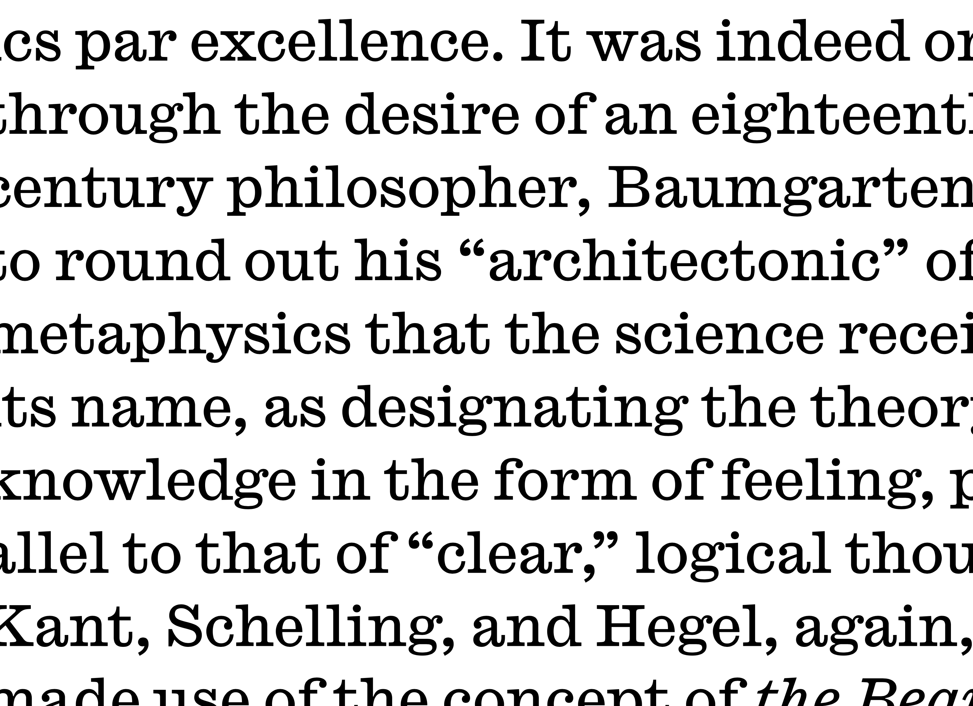
Born in 1988 in Gaithersburg, MD, Greg Gazdowicz studied at the Maryland Institute College of Art. He completed the Type@Cooper Extended program in 2014. After graduation, he joined Commercial Type. Codesigner with Lucas Sharp of the bubblegum and bubble bath typeface Doughboy Pro (2013, published by Pagan & Sharp). In 2016, he published Robinson at Commercial Type, which writes: Inspired by calligraphic sans serifs like Warren Chappell's Lydian and R. Hunter Middleton's Samson, Greg Gazdowicz aimed to make a contemporary sans that used the hallmarks of calligraphic construction to add visual interest without being explicitly calligraphic. The result is a crisp, refreshing sans with a kinetic personality. Robinson is evocative of American book cover lettering from the middle of the 20th century while feeling cleanly contemporary. He drew the italics of Publico Text Mono (Christian Schwartz and Paul Barnes) in 2014. Le Jeune (2016, Greg Gazdowicz, Christian Schwartz and Paul Barnes) is a crisp high-contrast fashion mag didone typeface family in Poster, Deck, Text and Hairline sub-styles, with stencils drawn by Gazdowicz. This large typeface family comes in four optical sizes, and was originally developed for Chris Dixon's refresh of Vanity Fair. In 2019, Commercial Type released Caslon Ionic by Paul Barnes and Greg Gazdowicz. They write: Bolder and more robust than the modern, yet lighter and more refined than the Egyptian, the Ionic with its bracketed serif was another innovation of the nineteenth century. Lesser known than Thorowgood's Clarendon, Caslon's Ionic No. 2 is a superb example of the form and greatly influenced the newspaper fonts of the next century. With additional weights and a matching Egyptian companion, Antique No. 6, it is a masterpiece of type designed to be robust and legible. Antique No. 6 was designed by Paul Barnes in 2019. In 2019, Commercial Type released the Thorowgood Grotesque collection by Paul Barnes and Greg Gazdowicz. It is accompanied by the subfamilies Thorowgood Grotesque Dimensional (beveled) and Thorowgood Grotesue Open, and the related Thorowgood Egyptian. In 2022, Commercial Type and Greg Gazdowicz released Roboto Serif at Google Fonts and wrote: Roboto Serif is a variable typeface family designed to create a comfortable and frictionless reading experience. Minimal and highly functional, it is useful anywhere (even for app interfaces) due to the extensive set of weights and widths across a broad range of optical sizes. |
EXTERNAL LINKS |
| | |

file name: Greg Gazdowicz Roboto Serif 2020 2022

file name: Greg Gazdowicz Roboto Serif 2020 2022

file name: Greg Gazdowicz Roboto Serif 2020 2022

file name: Greg Gazdowicz Roboto Serif 2020 2022

file name: Greg Gazdowicz Roboto Serif120pt Ultra Condensed 2020 2022

file name: Greg Gazdowicz Roboto Serif36pt Expanded Extra Light 2020 2022

file name: Paul Barnes Greg Gazdowicz Caslon Ionic 2019
file name: Paul Barnes Greg Gazdowicz Caslon Ionic 2019
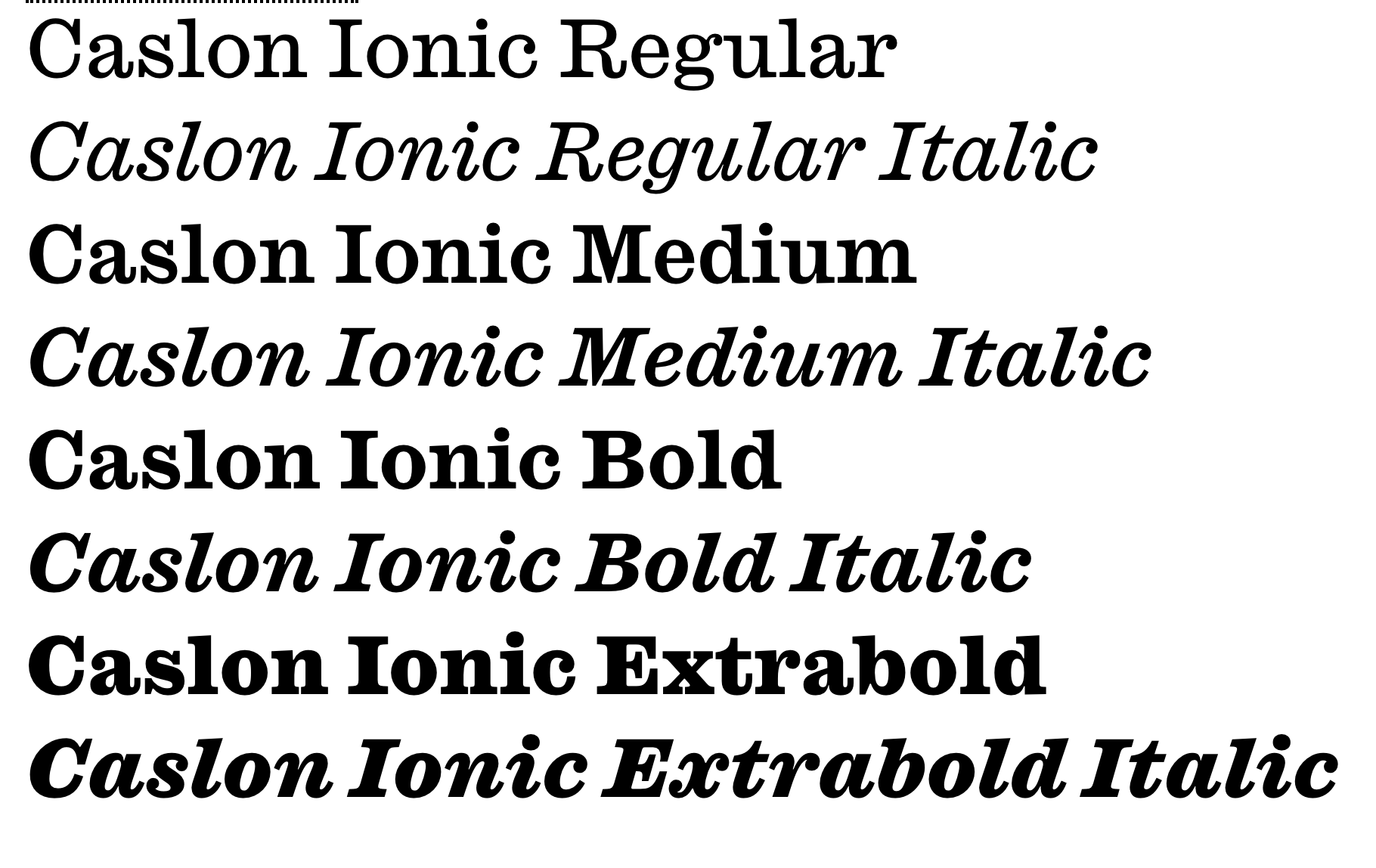
file name: Paul Barnes Greg Gazdowicz Caslon Ionic 2019

file name: Greg Gazdowicz Lucas Sharp Doughboy Pro 2014

file name: Greg Gazdowicz Lucas Sharp Doughboy Pro 2014b

file name: Greg Gadzowicz Paul Barnes Christian Schwartz Publico Text Mono 2012 2014

file name: Greg Gadzowicz Paul Barnes Christian Schwartz Publico Text Mono 2012 2014

file name: Greg Gadzowicz Paul Barnes Christian Schwartz Publico Text Mono 2012 2014

file name: Greg Gazdowicz Christian Schwartz Paul Barnes Le Jeune Deck 2016

file name: Greg Gazdowicz Christian Schwartz Paul Barnes Le Jeune Poster 2016
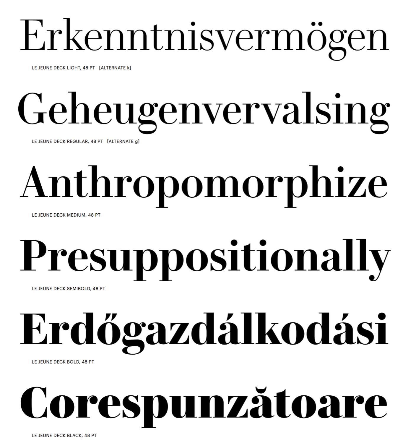
file name: Greg Gazdowicz Christian Schwartz Paul Barnes Le Jeune Deck 2016c
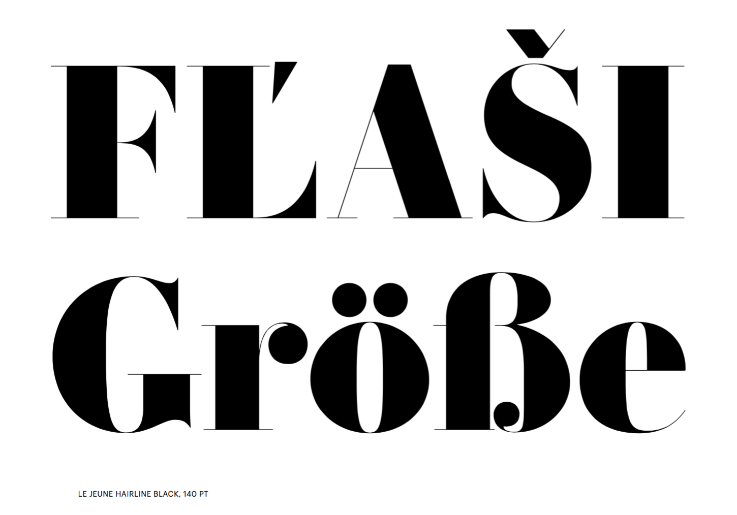
file name: Greg Gazdowicz Christian Schwartz Paul Barnes Le Jeune Hairline Black 2016
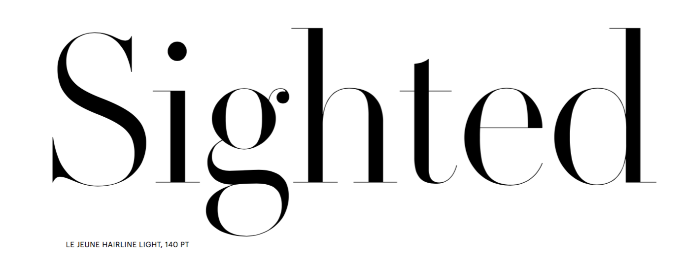
file name: Greg Gazdowicz Christian Schwartz Paul Barnes Le Jeune Hairline Light 2016
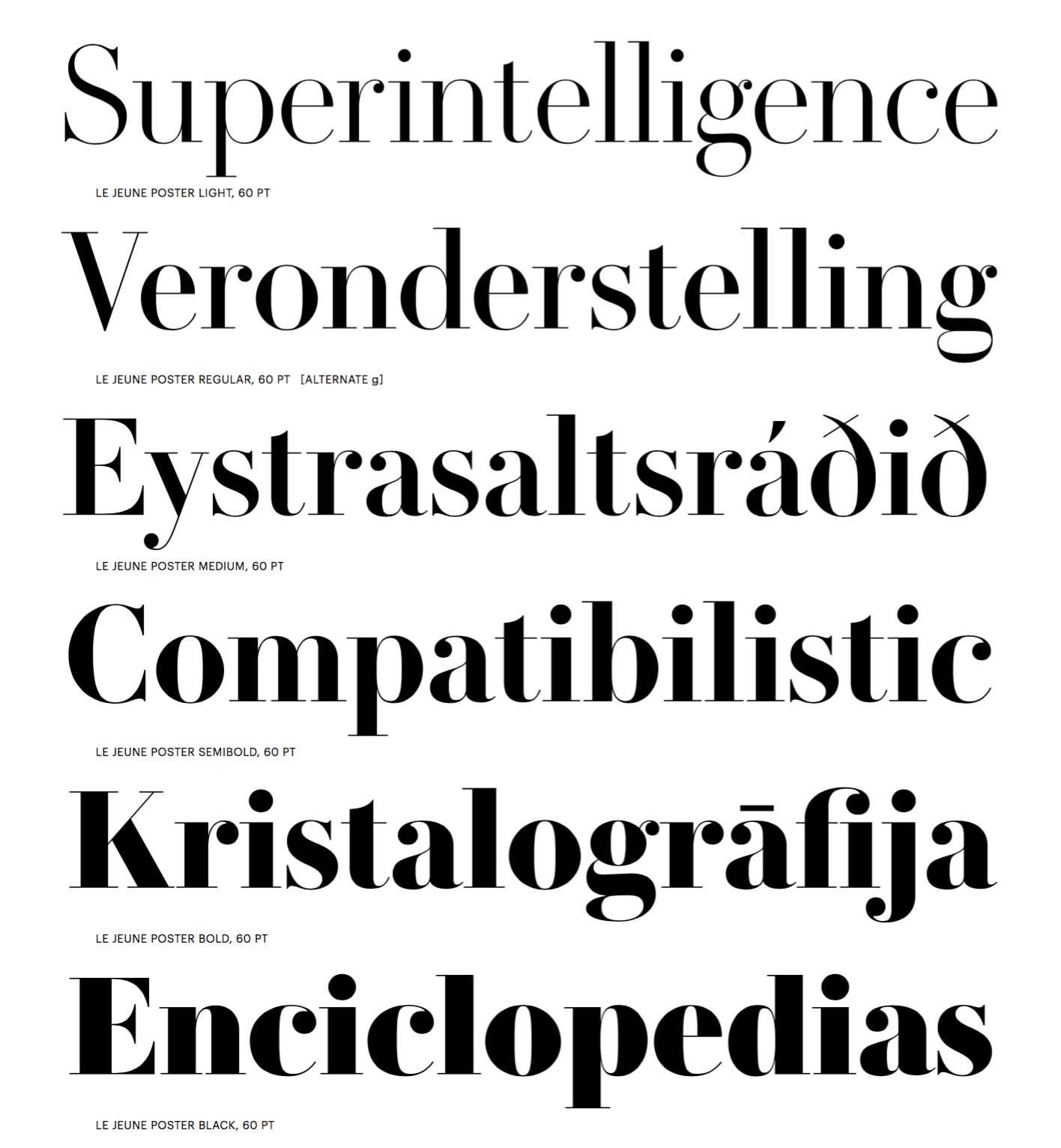
file name: Greg Gazdowicz Christian Schwartz Paul Barnes Le Jeune Poster 2016b
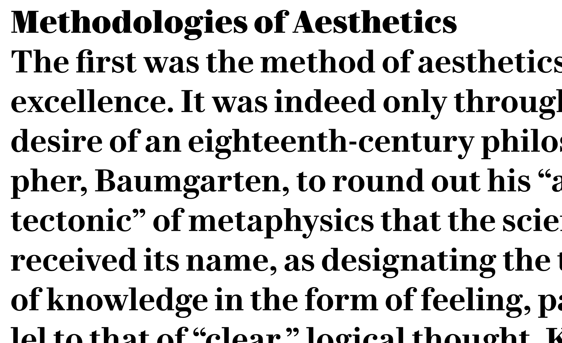
file name: Greg Gazdowicz Christian Schwartz Paul Barnes Le Jeune Text 2016

file name: Paul Barnes Greg Gazdowicz Thorowgood Dimensional 2020

file name: Paul Barnes Greg Gazdowicz Thorowgood Dimensional 2020

file name: Paul Barnes Greg Gazdowicz Thorowgood Dimensional 2020

file name: Paul Barnes Greg Gazdowicz Thorowgood Egyptian 2020

file name: Paul Barnes Greg Gazdowicz Thorowgood Egyptian 2020

file name: Paul Barnes Greg Gazdowicz Thorowgood Open 2020

file name: Paul Barnes Greg Gazdowicz Thorowgood Open 2020

file name: Greg Gazdowicz Robinson 2016

file name: Greg Gazdowicz Robinson 2016b

file name: Greg Gazdowicz Robinson 2016c

file name: Greg Gazdowicz Robinson 2016d

file name: Greg Gazdowicz Robinson 2016e

file name: Greg Gazdowicz Robinson 2016f

file name: Greg Gazdowicz Portrait

file name: Greg Gazdowicz Pic
| | |
|
Luc Devroye ⦿ School of Computer Science ⦿ McGill University Montreal, Canada H3A 2K6 ⦿ lucdevroye@gmail.com ⦿ https://luc.devroye.org ⦿ https://luc.devroye.org/fonts.html |


