TYPE DESIGN INFORMATION PAGE last updated on Wed May 6 16:25:41 EDT 2026
FONT RECOGNITION VIA FONT MOOSE
|
|
|
|
Apple Watch Font (or: the San Francisco Font)
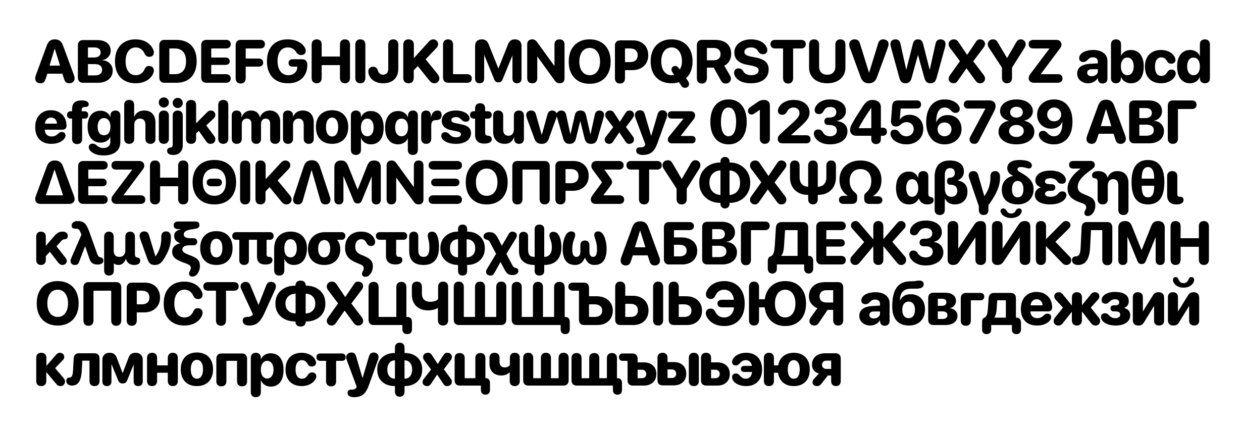
In September 2014, Apple announced the imminent arrival of the Apple Watch, which came with a new neo-grotesque sans-serif typeface developed in house. It has a legible, open DIN-like look, but the name of its designer was not released. The 35 fonts are grouped into subfamilies San Francisco Text and San Francisco Display, and are available to designers of Apple Watch applications here. The reaction of the curmudgeon society, aka The Typophiles, is quite predictably negative, with opinions including Susan Kare's original San Francisco (also done for Apple) was better [note: Kare's was a ransom note font]. I really wonder why the typophiles bother---it's not their magazine or their web page---companies are free to use anything they like, including "not wasting a lot of effort on new typefaces". Some San Francisco fonts are free from Apple's web site. These come in four groups, SF Pro Text, SF Pro Display, SF Compact Text, and SF Compact Display. Developed between 2015 and 2017, these fonts have become the Apple System fonts for basically all Apple machines. San Francisco has gradually replaced most of Apple's other typefaces on their software and hardware products and for overall branding. It was the original system typeface of watchOS and tvOS and has replaced Helvetica Neue and Lucida Grande as the system typeface of macOS and iOS since OS X El Capitan and iOS 9. Apple uses it on its website and for its product wordmarks, where it replaced Myriad Pro. It is also used on the keyboard of the 2015 MacBook and on the 2016 MacBook Pro, replacing VAG Rounded. It is also used as Apple's corporate typeface. Apple restricts the usage of the typeface by others. It is licensed to registered third-party developers only for the design and development of applications for Apple's platforms. The San Francisco typeface has four variants: "SF" (or "SF UI") for macOS, iOS, and tvOS; "SF Compact" for watchOS; "SF Mono" (based on SF Compact) for the Xcode application; and "SF Serif" for Apple Books. The main difference is that the sides of letters with round shapes, such as o, e, and s, are round in SF, whereas they are flat in SF Compact. The flat sides allow the letters to have more space between them, thereby making the text more legible at small sizes, which is particularly important for the Apple Watch. Both SF and SF Compact each have two optical sizes: "display" for large and "text" for small text. Compared to display, the letters in text have larger apertures and more generous letter-spacing. The operating system automatically chooses the display optical size for sizes of at least 20 points, and the text optical size otherwise. Additionally, included in macOS Sierra and iOS 10 is a new variant named "SF Compact Rounded". It is used in the new contact placeholder icons introduced in the OSes. The "SF Serif" variant was showcased in June 2018 when the all-new Apple Books app was introduced. This variant is exclusive to Apple Books in iOS 12 and macOS Mojave, is not mentioned in Apple's Typography design guidelines, and is not publicly downloadable like other variants of the San Francisco typeface. Open Font Library link where one can download the SF UI Text family (2015). Postscript: The 2014 San Francisco font should not be confused with Susan Kare's ransom note bitmap font San Francisco which was created in 1984 for Apple. An official TrueType version was never made, and Kare's San Francisco was rendered obsolete with the arrival of Apple's System 7. Wikipedia link. Apple font download site where one can find San Francisco Compact (this sans-serif typeface is the system font for watchOS, and includes a rounded variant), San Francisco Pro (this sans-serif typeface is the system font for iOS, macOS, and tvOS, and includes a rounded variant), and New York (a large transitional typeface family with optical and width sizing; 2017-2018, that won an award at the Type Directors Club's Type Design Competition 2019). Also included is the variable font San Francisco Rounded, which includes a weight axis and a grade axis for adjusting the stroke weight without changing glyph widths. |
EXTERNAL LINKS |
| | |

file name: Apple Watch 2014

file name: Apple Watch 2014

file name: Apple Watch 2014b

file name: Apple Watch 2014c

file name: Apple Watch 2014d

file name: Apple Watch 2014f

file name: Apple S F Compact Display Heavy 2015 2017

file name: Apple S F Pro Text Regular 2015 2017

file name: Apple S F Pro Display Black 2015 2017

file name: Apple S F U I Text Semibold 2015

file name: Apple S F U I Text Light 2015

file name: Apple New York Extra Large Regular 2017 2018

file name: Apple New York Medium Bold 2017 2018

file name: Apple San Francisco Rounded 2017 2018

file name: Apple San Francisco Display Black 2014

file name: Apple San Francisco Display Thin 2014

file name: Apple San Francisco Text Regular G3 2014
| | |
|
Luc Devroye ⦿ School of Computer Science ⦿ McGill University Montreal, Canada H3A 2K6 ⦿ lucdevroye@gmail.com ⦿ https://luc.devroye.org ⦿ https://luc.devroye.org/fonts.html |

