TYPE DESIGN INFORMATION PAGE last updated on Fri May 1 17:44:32 EDT 2026
FONT RECOGNITION VIA FONT MOOSE
|
|
|
|
Zeugler
[Reymund Schroeder]
Award-winning German type designer, who co-founded Forgotten Shapes in 2017. NaN descibes him as a type Janus with a two-sided practice, one oriented towards the past as a meticulous archivist-historian, the other towards alternate history called Typographic Uchronias. His typefaces:
|
EXTERNAL LINKS |
| | |

file name: Reymund Schroeder Na N Hyena 2022
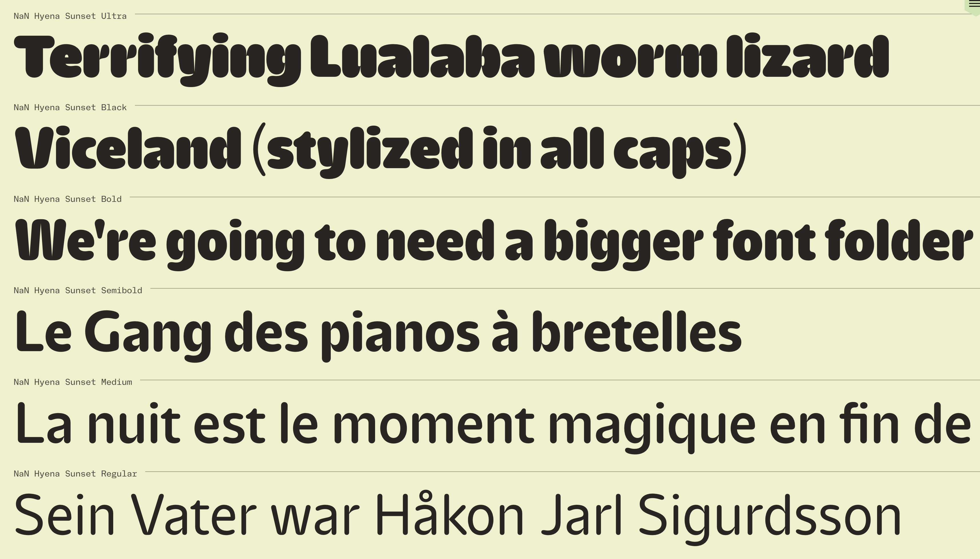
file name: Reymund Schroeder Na N Hyena 2022

file name: Reymund Schroeder Na N Hyena 2022

file name: Reymund Schroeder Na N Hyena 2022
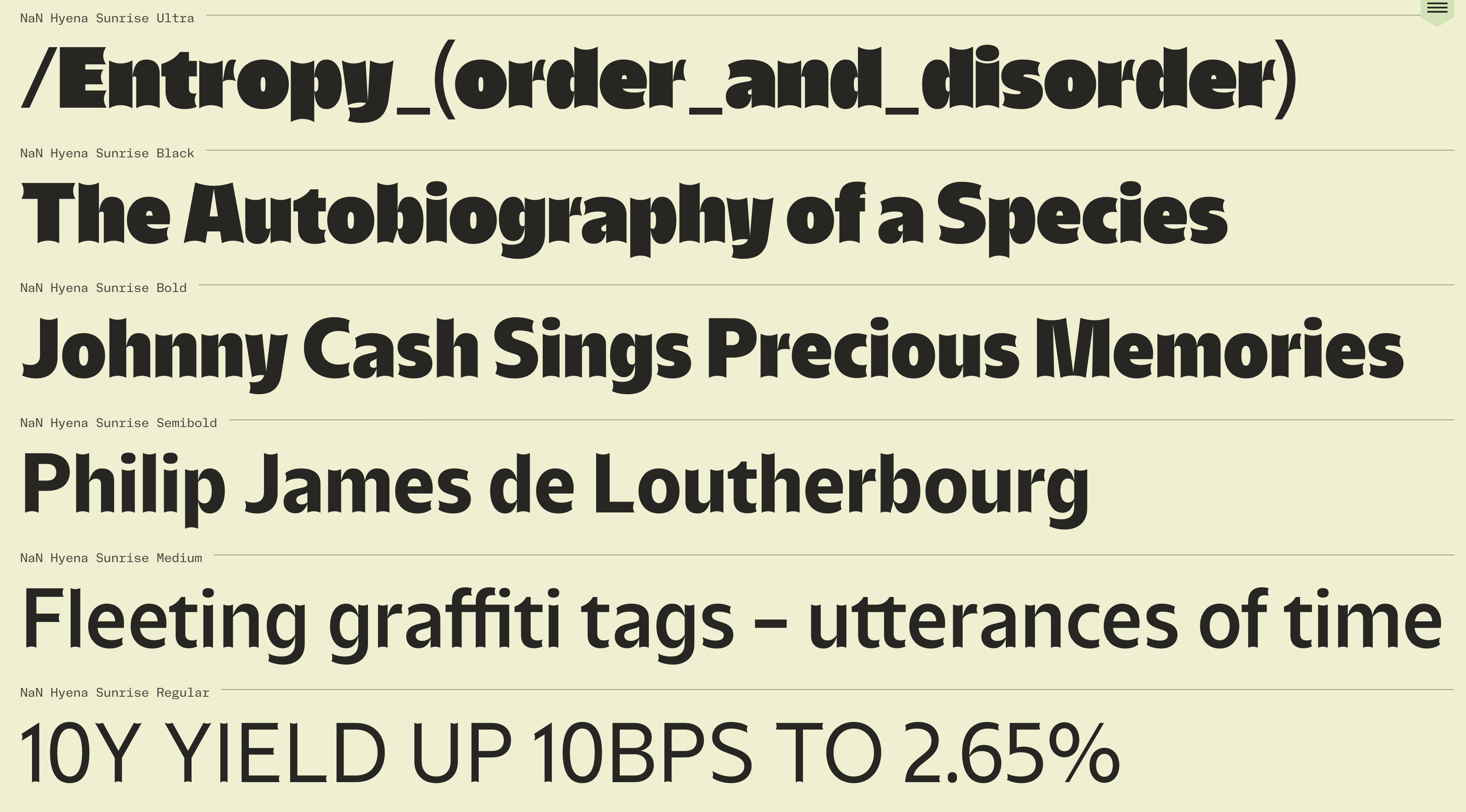
file name: Reymund Schroeder Na N Hyena 2022
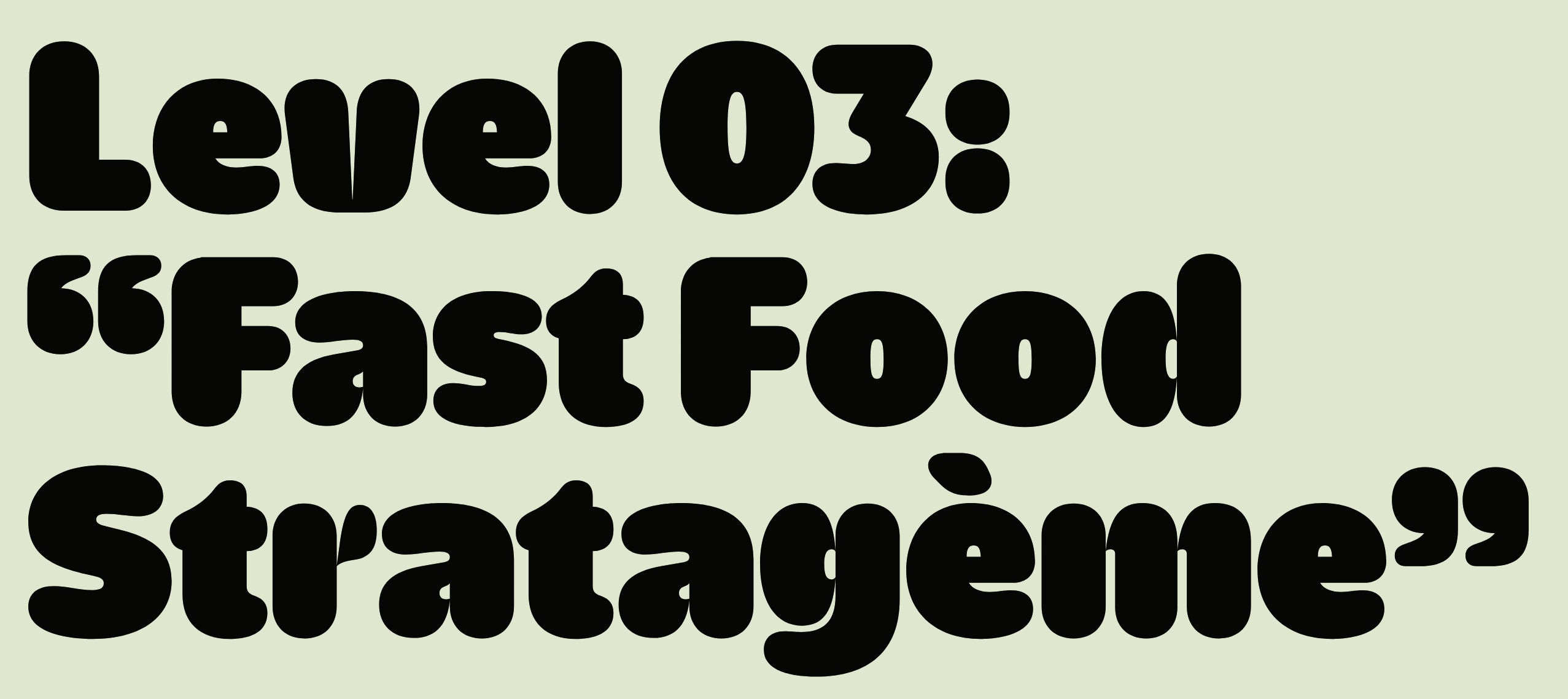
file name: Reymund Schroeder Na N Hyena 2022

file name: Reymund Schroeder Na N Hyena 2022

file name: Reymund Schroeder Na N Hyena 2022

file name: Reymund Schroeder Na N Hyena 2022

file name: Reymund Schroeder Tempel Grotesk 2021

file name: Reymund Schroeder Tempel Grotesk 2021
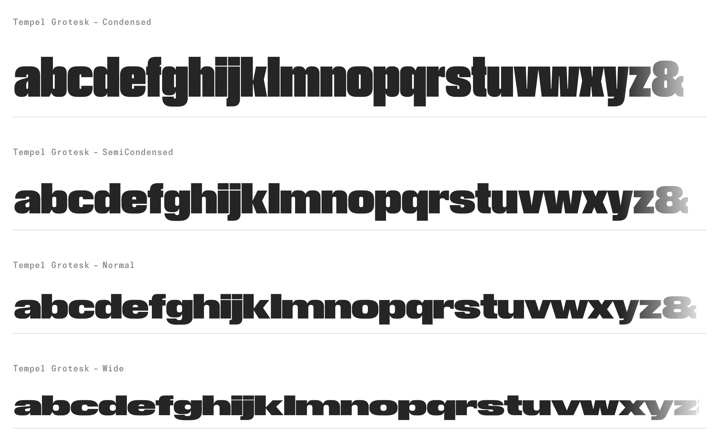
file name: Reymund Schroeder Tempel Grotesk 2021
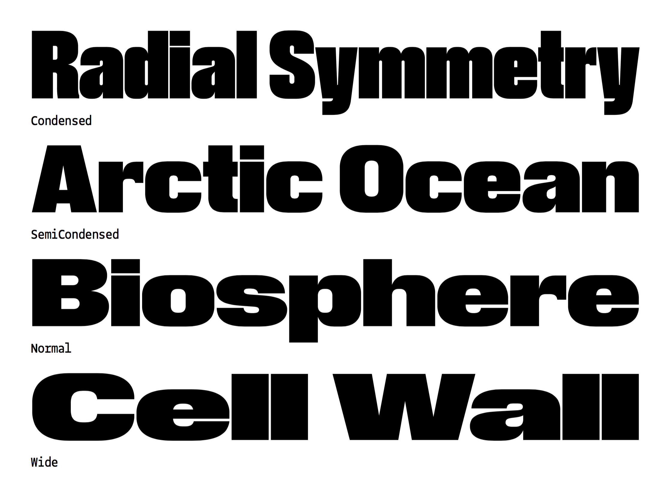
file name: Reymund Schroeder Tempel Grotesk 2021

file name: Reymund Schroeder Tempel Grotesk 2021
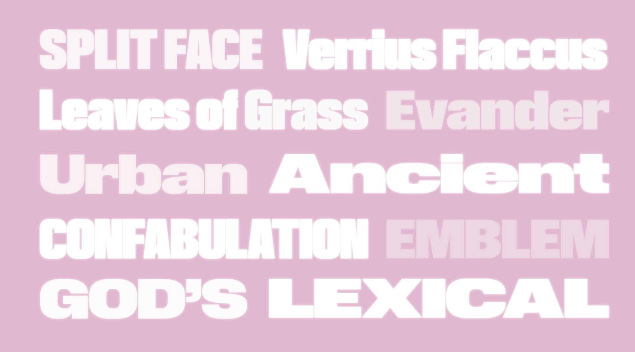
file name: Reymund Schroeder Tempel Grotesk 2021
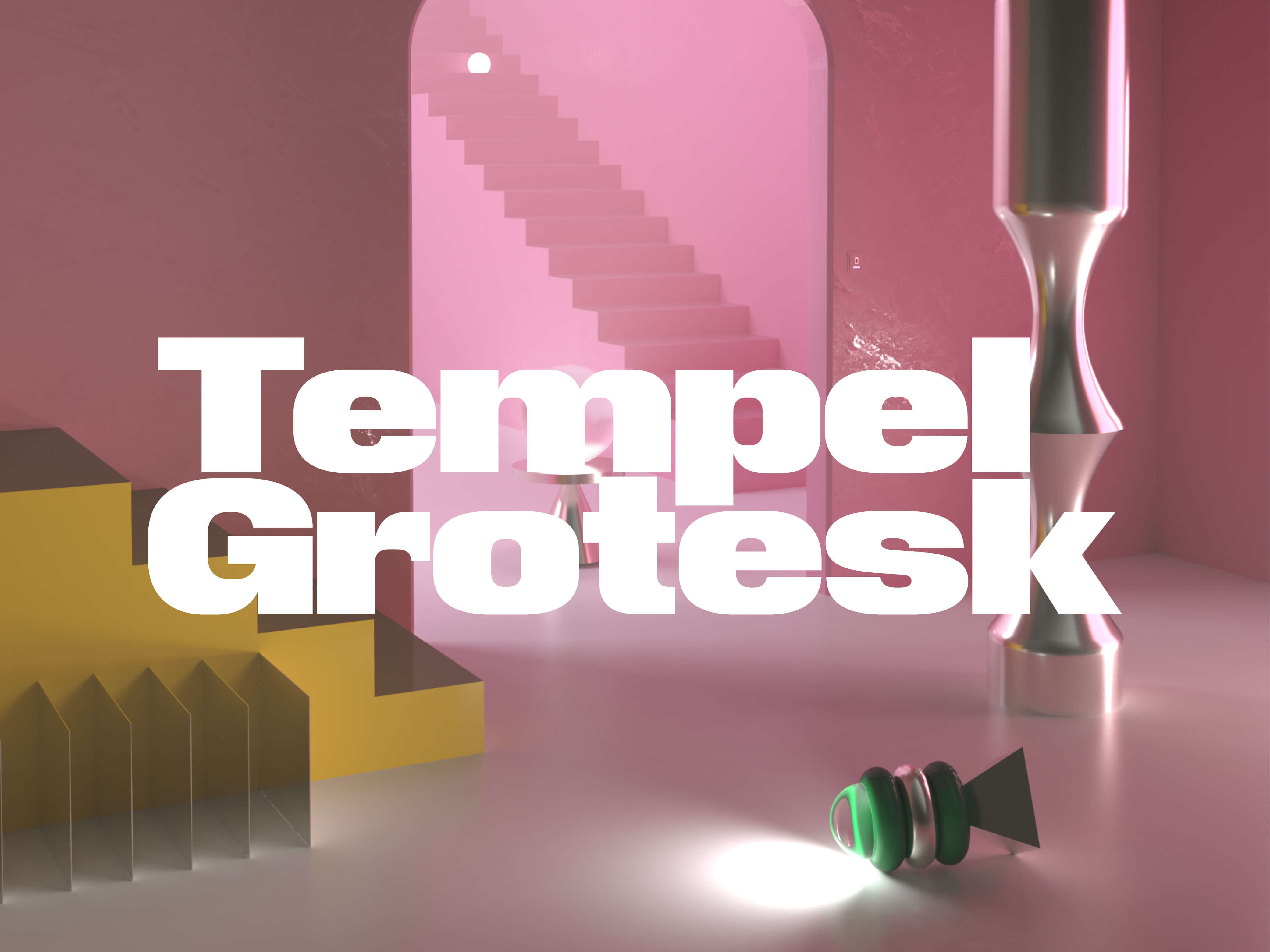
file name: Reymund Schroeder Tempel Grotesk 2021

file name: Reymund Schroeder Lector F S L Bold 2017

file name: Reymund Schroeder Andrej Loll Custom Typeface based on Jakob Erbar Candida 1936

file name: Reymund Schroeder Stephan Mueller Consul after Wilhelm Woellmer Consul 1903 1907

file name: Reymund Schroeder Edna 2016b

file name: Reymund Schroeder Edna 2016

file name: Reymund Schroeder Edna Text 2017 after Schriftgiesserei Flinsch 1908

file name: Reymund Schroeder Friedlaender after Elizabeth Friedlaender Elizabeth

file name: Reymund Schroeder Haiti after Holztypenfabrik Sachs Dumbria 1885

file name: Reymund Schroeder Huber after Holztypenfabrik Sachs Christina 1885

file name: Reymund Schroeder Zeit Tiemann Italic 2013

file name: Reymund Schroeder Polja 2014b

file name: Reymund Schroeder Polja 2014
| | |
|
Luc Devroye ⦿ School of Computer Science ⦿ McGill University Montreal, Canada H3A 2K6 ⦿ lucdevroye@gmail.com ⦿ https://luc.devroye.org ⦿ https://luc.devroye.org/fonts.html |

