TYPE DESIGN INFORMATION PAGE last updated on Fri May 1 17:44:39 EDT 2026
FONT RECOGNITION VIA FONT MOOSE
|
|
|
|
English designer in West Cork, Ireland. In 2014, he designed the classical roman caps typeface Carrig---not Trajan, but still influenced by stone carving. He also created the similar typefaces Carrig Roman (2015), Carrig Italic (2015), Carrig Refined (2015), Carrig Rough (2016), Carrigeen (2014), and Carrig Pro (2017). Woodford Bourne (2015, 8 weights for 16 fonts in all, from Hairline to Black) is a 19th century grotesque typeface that pays homage to the historic stone cast type in the building façades of the former Woodford, Bourne & Co. in Cork City, Ireland. It was imprioved and extended in 2016 as Woodford Bourne Pro. Arundel (2015) is a beveled medieval typeface. Typefaces from 2016: Didonesque (didone headline typeface characterized by a large x-height and slightly curved v, w and y), Fnord (a serif family designed with a mischievous streak), Fnord Display (in Engraved, Inline and Woodcut styles), Eponymous (an experiment with chunky serifs), Pseudonym (a subtly falred sans with interlocking and unicase features). Typefaces from 2017: Didonesque Ghost (a stylish very contrasted didone typeface family), Banjax (humanist sans, followed in 2018 by Banjax Notched), Faded Grandeur (inspired by stone engravings that have withered and decayed over time), Torus (a rounded monoline organic sans; see also Torus Variations (2018): Torus Notched, Torus Inline, Torus Outline and Torus Biline), Meccanica (an intoxicating nuts and bolts-style engineering typeface). Typefaces from 2018: Eurocine (this is in the wide elliptical sans genre: This typeface attempts to capture the mood of movie credits from European Cinema in the 1970s, with a focus on Giallo films in particular. In terms of style, Eurocine sits somewhere between Walter Baum and Konrad Friedrich Bauer's Folio, and Aldo Novarese's Eurostile), Polyphonic (a 60-font slab serif family), Majesty (flared, incised), Verbatim (a 60-font sans family that was inspired by the best (and worst) of 1970s science fiction TV shows and movies, and aims to extract the essence of futuristic type from that era). Typefaces from 2019: Didonesque Script, Modica (an 18-style geometric sans that came from Technica), Technica (a more conservative rounded geometric sans / techno family than his earlier Meccanica), Rhetoric (a semi-cursive typeface), Quorthon (blackletter, in Black, Dark and Grey substyles), Yolk (a sans family based on the shape of an egg yolk), Transcend (an all caps titling typeface), Ergonomique (a humanist sans in 18 styles), Eloquence (a renaissance font family), Didonesque Stencil. Typefaces from 2020: Rodia (an 18-style oddball (sic) geometric typeface inspired by the iconic RADIO signage that was once in place at 5041, Pico Boulevard, Los Angeles in 1985), Arise (an 18-style text typeface family characterized by hooked terminals), Slabber (a slab serif inspired by 19th century wood type), Audacious (a 20-style decorative serif), Cream (a warm text family, with the heavier weights leaning towards Cooper Black), Sqwared, Logik (sci-fi). Typefaces from 2021: Evoque (a 36-style contrast-rich text typeface; followed in 2022 by the 16-style family Evoque Text which includes two variable fonts), Sienna (14 styles and two variable fonts; a warm soft serif with some angular design elements that make it a great choice as a text typeface), Torus Pro, Harmonique (a 32-style incised serif). |
EXTERNAL LINKS |
| | |

file name: Paulo Goode Evoque Text 2022

file name: Paulo Goode Evoque Text 2022 1

file name: Paulo Goode Evoque Text 2022 2

file name: Paulo Goode Evoque Text 2022 3

file name: Paulo Goode Evoque Text 2022

file name: Paulo Goode Evoque 2021 1

file name: Paulo Goode Evoque 2021

file name: Paulo Goode Evoque 2021

file name: Paulo Goode Evoque 2021

file name: Paulo Goode Evoque 2021 3

file name: Paulo Goode Evoque 2021

file name: Paulo Goode Sienna 2021

file name: Paulo Goode Sienna 2021

file name: Paulo Goode Sienna 2021

file name: Paulo Goode Sienna 2021

file name: Paulo Goode Sienna 2021

file name: Paulo Goode Sienna 2021 1

file name: Paulo Goode Sienna 2021 2

file name: Paulo Goode Sienna 2021 4

file name: Paulo Goode Sienna 2021 5

file name: Paulo Goode Sienna 2021

file name: Paulo Goode Harmonique 2021 1

file name: Paulo Goode Harmonique 2021 2

file name: Paulo Goode Harmonique 2021

file name: Paulo Goode Harmonique 2021

file name: Paulo Goode Harmonique 2021

file name: Paulo Goode Rodia 2020

file name: Paulo Goode Rodia 2020

file name: Paulo Goode Rodia 2020

file name: Paulo Goode Rodia 2020

file name: Paulo Goode Rodia 2020 1

file name: Paulo Goode Rodia 2020 3

file name: Paulo Goode Rodia 2020 4

file name: Paulo Goode Rodia 2020

file name: Paulo Goode Arise 2020

file name: Paulo Goode Arise 2020 3

file name: Paulo Goode Arise 2020

file name: Paulo Goode Arise 2020

file name: Paulo Goode Slabber 2020 371188

file name: Paulo Goode Slabber 2020

file name: Paulo Goode Audacious 2020 364669

file name: Paulo Goode Audacious 2020

file name: Paulo Goode Audacious Display 2020

file name: Paulo Goode Audacious 2020 364670

file name: Paulo Goode Audacious 2020 364671

file name: Paulo Goode Audacious 2020 364672

file name: Paulo Goode Audacious 2020 364673

file name: Paulo Goode Audacious 2020

file name: Paulo Goode Cream 2020 349398

file name: Paulo Goode Cream 2020 349406

file name: Paulo Goode Cream 2020 349409

file name: Paulo Goode Cream 2020

file name: Paulo Goode Sqwared 2020

file name: Paulo Goode Sqwared 2020

file name: Paulo Goode Sqwared 2020 343947

file name: Paulo Goode Sqwared 2020 343948

file name: Paulo Goode Sqwared 2020 343949

file name: Paulo Goode Logik 2020 339372

file name: Paulo Goode Logik 2020 339374

file name: Paulo Goode Logik 2020 339377

file name: Paulo Goode Logik 2020

file name: Paulo Goode Modica 2019

file name: Paulo Goode Modica 2019

file name: Paulo Goode Modica 2019 324666

file name: Paulo Goode Modica 2019 324669

file name: Paulo Goode Modica 2019 324670

file name: Paulo Goode Modica 2019 324671

file name: Paulo Goode Modica 2019

file name: Paulo Goode Technica 2019

file name: Paulo Goode Technica 2019

file name: Paulo Goode Technica 2019 322764

file name: Paulo Goode Technica 2019 322767

file name: Paulo Goode Technica 2019 322768 002

file name: Paulo Goode Technica 2019

file name: Paulo Goode Rhetoric 2019 320483

file name: Paulo Goode Rhetoric 2019 320485

file name: Paulo Goode Rhetoric 2019

file name: Paulo Goode Quorthon 2019 316878

file name: Paulo Goode Quorthon 2019 316880

file name: Paulo Goode Quorthon 2019 316882

file name: Paulo Goode Quorthon 2019 316883

file name: Paulo Goode Quorthon 2019 316885

file name: Paulo Goode Quorthon 2019 316890 002

file name: Paulo Goode Quorthon 2019

file name: Paulo Goode Yolk 2019 3

file name: Paulo Goode Yolk 2019 311902

file name: Paulo Goode Yolk 2019 311908

file name: Paulo Goode Yolk 2019 311910 002

file name: Paulo Goode Yolk 2019 311912

file name: Paulo Goode Yolk 2019

file name: Paulo Goode Transcend 2019 306794 002

file name: Paulo Goode Transcend 2019

file name: Paulo Goode Ergonomique 2019 302332

file name: Paulo Goode Ergonomique 2019 302334

file name: Paulo Goode Ergonomique 2019 302335

file name: Paulo Goode Ergonomique 2019 302336

file name: Paulo Goode Ergonomique 2019 302337

file name: Paulo Goode Ergonomique 2019 302338

file name: Paulo Goode Ergonomique 2019 302339 002

file name: Paulo Goode Ergonomique 2019 302340 002

file name: Paulo Goode Ergonomique 2019 303148

file name: Paulo Goode Ergonomique 2019

file name: Paulo Goode Eloquence 2019 297495

file name: Paulo Goode Eloquence 2019

file name: Paulo Goode Eloquence 2019

file name: Paulo Goode Eurocine 2018 282509

file name: Paulo Goode Eurocine 2018 282510

file name: Paulo Goode Eurocine 2018 282511 002

file name: Paulo Goode Eurocine 2018 282512

file name: Paulo Goode Eurocine 2018 282513

file name: Paulo Goode Eurocine 2018 282513 002

file name: Paulo Goode Eurocine 2018 282514

file name: Paulo Goode Eurocine 2018 282517

file name: Paulo Goode Eurocine 2018 282523

file name: Paulo Goode Eurocine 2018

file name: Paulo Goode Polyphonic 2018 278688 002

file name: Paulo Goode Polyphonic 2018 278689

file name: Paulo Goode Polyphonic 2018 278690

file name: Paulo Goode Polyphonic 2018 278691 002

file name: Paulo Goode Polyphonic 2018 278692 002

file name: Paulo Goode Polyphonic 2018 278693

file name: Paulo Goode Polyphonic 2018 278695

file name: Paulo Goode Polyphonic 2018 278697

file name: Paulo Goode Polyphonic 2018 278698

file name: Paulo Goode Polyphonic 2018 278699

file name: Paulo Goode Polyphonic 2018 278700

file name: Paulo Goode Polyphonic 2018 278702

file name: Paulo Goode Polyphonic 2018

file name: Paulo Goode Polyphonic Condensed 2018

file name: Paulo Goode Majesty 2018 270749 002

file name: Paulo Goode Majesty 2018 270750 002

file name: Paulo Goode Majesty 2018 270751

file name: Paulo Goode Majesty 2018 270755

file name: Paulo Goode Majesty 2018 270757

file name: Paulo Goode Majesty 2018

file name: Paulo Goode Verbatim 2018 262764

file name: Paulo Goode Verbatim 2018 262770

file name: Paulo Goode Verbatim 2018 262771

file name: Paulo Goode Verbatim 2018 262772

file name: Paulo Goode Verbatim 2018 262775

file name: Paulo Goode Verbatim 2018 262776

file name: Paulo Goode Verbatim 2018

file name: Paulo Goode Banjax 2017 244006

file name: Paulo Goode Banjax 2017 244018

file name: Paulo Goode Banjax 2017a

file name: Paulo Goode Banjax Notched 2018 258872

file name: Paulo Goode Banjax Notched 2018 258874

file name: Paulo Goode Banjax Notched 2018

file name: Paulo Goode Banjax Notched 2018

file name: Paulo Goode Faded Grandeur 2017b

file name: Paulo Goode Torus Pro 2021 1

file name: Paulo Goode Torus Pro 2021 2

file name: Paulo Goode Torus Pro 2021 3

file name: Paulo Goode Torus Pro 2021 4

file name: Paulo Goode Torus Pro 2021

file name: Paulo Goode Torus Biline 2018

file name: Paulo Goode Torus Outline 2018

file name: Paulo Goode Torus Variations 2018 261496

file name: Paulo Goode Torus Variations 2018 261497

file name: Paulo Goode Torus Variations 2018 261498

file name: Paulo Goode Torus Variations 2018 261499

file name: Paulo Goode Torus Variations 2018

file name: Paulo Goode Torus 2017 232607

file name: Paulo Goode Torus 2017 232609

file name: Paulo Goode Torus 2017 232611

file name: Paulo Goode Torus 2017 232612

file name: Paulo Goode Torus 2017 232613

file name: Paulo Goode Torus 2017

file name: Paulo Goode Torus Notched 2018

file name: Paulo Goode Torus Notched 2018b

file name: Paulo Goode Torus Notched 2018b

file name: Paulo Goode Torus Notched 2018c

file name: Paulo Goode Torus Notched 2018d

file name: Paulo Goode Meccanica 2017 229406

file name: Paulo Goode Meccanica 2017 229420

file name: Paulo Goode Meccanica 2017 229421

file name: Paulo Goode Meccanica 2017 229422

file name: Paulo Goode Meccanica 2017 229424

file name: Paulo Goode Meccanica 2017 229425

file name: Paulo Goode Meccanica 2017 229426

file name: Paulo Goode Meccanica 2017 229429

file name: Paulo Goode Meccanica 2017 229431

file name: Paulo Goode Meccanica 2017 229434

file name: Paulo Goode Meccanica 2017

file name: Paulo Goode Meccanica Bold 2017

file name: Paulo Goode Meccanica Light 2017

file name: Paulo Goode Meccanica Semi Bold 2017

file name: Paulo Goode Meccanica Ultra 2017

file name: Paulo Goode Meccanica Ultra 2017a

file name: Paulo Goode Didonesque Script 2019 331358

file name: Paulo Goode Didonesque Script 2019 331361

file name: Paulo Goode Didonesque Script 2019 331362

file name: Paulo Goode Didonesque Script 2019

file name: Paulo Goode Didonesque Stencil 2018

file name: Paulo Goode Didonesque Stencil 2019 287567

file name: Paulo Goode Didonesque Ghost 2017 246016

file name: Paulo Goode Didonesque Ghost 2017 246018

file name: Paulo Goode Didonesque Ghost 2017 246020

file name: Paulo Goode Didonesque Ghost 2017 246021

file name: Paulo Goode Didonesque Ghost 2017 246022

file name: Paulo Goode Didonesque Ghost 2017 246023

file name: Paulo Goode Didonesque Ghost 2017 246024

file name: Paulo Goode Didonesque Ghost 2017

file name: Paulo Goode Didonesque 2016

file name: Paulo Goode Didonesque 2016 223279

file name: Paulo Goode Didonesque 2016 223280

file name: Paulo Goode Didonesque 2016 223281

file name: Paulo Goode Didonesque 2016 223282

file name: Paulo Goode Didonesque 2016 223285

file name: Paulo Goode Didonesque 2016 223287

file name: Paulo Goode Didonesque 2016 223288

file name: Paulo Goode Didonesque 2016 223289

file name: Paulo Goode Didonesque 2016b

file name: Paulo Goode Didonesque 2016c

file name: Paulo Goode Didonesque 2016d

file name: Paulo Goode Didonesque 2016

file name: Paulo Goode Fnord 2016 215863

file name: Paulo Goode Fnord 2016

file name: Paulo Goode Fnord Engraved Fnord Inline 2016

file name: Paulo Goode Fnord Ninety Three Condensed 2016

file name: Paulo Goode Fnord Display 2016

file name: Paulo Goode Fnord Display 2016b

file name: Paulo Goode Fnord Display 2016c

file name: Paulo Goode Eponymous 2016 201717

file name: Paulo Goode Eponymous 2016 201718

file name: Paulo Goode Eponymous 2016 201718b

file name: Paulo Goode Eponymous 2016 201719

file name: Paulo Goode Eponymous 2016 201720

file name: Paulo Goode Eponymous 2016 201722

file name: Paulo Goode Eponymous 2016 201724

file name: Paulo Goode Eponymous 2016 201727

file name: Paulo Goode Eponymous 2016 201728

file name: Paulo Goode Eponymous 2016

file name: Paulo Goode Pseudonym 2016

file name: Paulo Goode Pseudonym 2016b

file name: Paulo Goode Pseudonym 2016c

file name: Paulo Goode Pseudonym 2016d

file name: Paulo Goode Pseudonym 2016e

file name: Paulo Goode Pseudonym 2016f

file name: Paulo Goode Pseudonym 2016g

file name: Paulo Goode Pseudonym 2016 197548

file name: Paulo Goode Pseudonym 2016 197549

file name: Paulo Goode Pseudonym 2016 197552

file name: Paulo Goode Pseudonym 2016

file name: Paulo Goode Woodford Bourne 2015

file name: Paulo Goode Woodford Bourne 2015 185390

file name: Paulo Goode Woodford Bourne 2015 185392

file name: Paulo Goode Woodford Bourne 2015 185393

file name: Paulo Goode Woodford Bourne 2015 185394

file name: Paulo Goode Woodford Bourne 2015

file name: Paulo Goode Woodford Bourne Black 2015

file name: Paulo Goode Woodford Bourne Hairline 2015

file name: Paulo Goode Woodford Bourne 2015b

file name: Paulo Goode Woodford Bourne 2015c

file name: Paulo Goode Woodford Bourne 2015d

file name: Paulo Goode Woodford Bourne 2015e

file name: Paulo Goode Arundel 2015

file name: Paulo Goode Arundel 2015b

file name: Paulo Goode Carrig Pro 2017 239792

file name: Paulo Goode Carrig Pro 2017 239794

file name: Paulo Goode Carrig Pro 2017 239795

file name: Paulo Goode Carrig Pro 2017 239796

file name: Paulo Goode Carrig Pro 2017

file name: Paulo Goode Carrigeen 2014

file name: Paulo Goode Carrigeen 2014a

file name: Paulo Goode Carrig Roman 2015

file name: Paulo Goode Carrig Italic 2015

file name: Paulo Goode Carrig Refined 2015

file name: Paulo Goode Carrig Refined 2015b

file name: Paulo Goode Carrig 2014
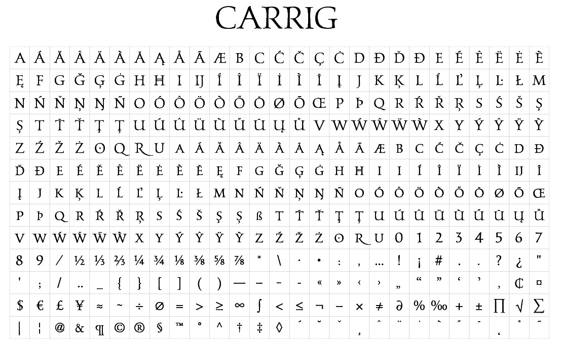
file name: Paulo Goode Carrig 2014a
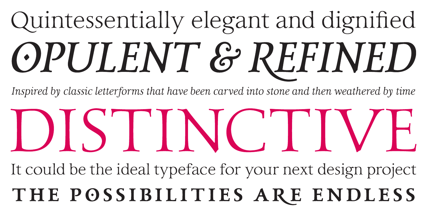
file name: Paulo Goode Carrig 2015 184437

file name: Paulo Goode Carrig 2015 184444

file name: Paulo Goode Carrig 2015
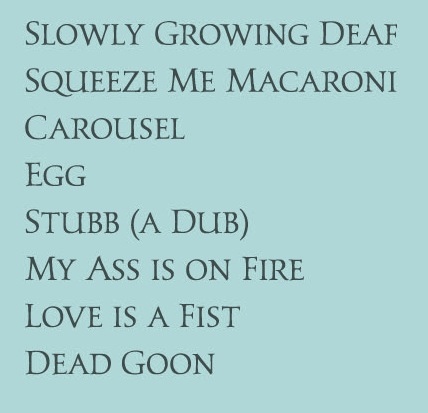
file name: Paulo Goode Carrig 2014b
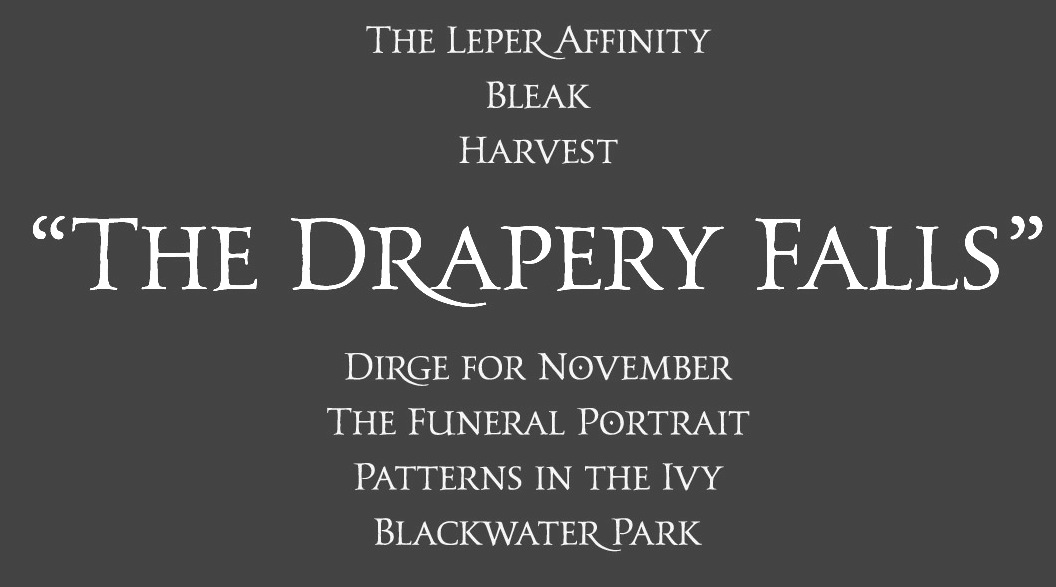
file name: Paulo Goode Carrig 2014d

file name: Paulo Goode Pic
| | |
|
Luc Devroye ⦿ School of Computer Science ⦿ McGill University Montreal, Canada H3A 2K6 ⦿ lucdevroye@gmail.com ⦿ https://luc.devroye.org ⦿ https://luc.devroye.org/fonts.html |

