TYPE DESIGN INFORMATION PAGE last updated on Thu Apr 16 22:17:15 EDT 2026
FONT RECOGNITION VIA FONT MOOSE
|
|
|
|
Jamie Clarke Type
[Jamie Clarke]
Jamie Clarke (Bristol and London, UK, and at some point, Sydney, Australia) creates illustrative type and lettering. He ran his own digital agency for ten years, and retrained after that period by studying type design at the University of Reading and letterpress at the St. Bride Foundation in London. His commercial typefaces include Brim Narrow (2015). He writes about this engraved layered typeface: Brim is inspired by antique woodtype and chromatic type from the 1800s. Its various styles stack together creating a variety of decorative combinations. Each layer can be assigned its own colour. The horizontal etching in some styles and subtle shadow effects can give the typeface the appearance of a vintage money font. In 2016, he added Brim Combined. His commissioned led him to the Kelmscott Bakehouse K (2016), a decorative letter commissioned by Kelmscott Bakehouse and based based on William Morris's ats and crafts style. Typefaces from 2017: Rig Shaded (a large 3d shaded typeface family---the best such collection available to date). Typefaces from 2018: Shovel Knight Drop Caps (partial woodblock print alphabet), Rig Solid (a superb family of layered 3d fonts). Typefaces from 2020: Span (a 3-style a modern glyphic type family that flaunts its engraved heritage with sweeping serifs and sculptural forms). Typefaces from 2021: Rig Sans (a 16-style geometric sans). Author of the very informative article The Evolution of Chromatic Type (2017). |
EXTERNAL LINKS |
| | |

file name: Jamie Clarke Span 2020

file name: Jamie Clarke Span 2020

file name: Jamie Clarke Span 2020 334368

file name: Jamie Clarke Span 2020 334370

file name: Jamie Clarke Span 2020 334371

file name: Jamie Clarke Span 2020 334374

file name: Jamie Clarke Type Span 2020 334376

file name: Jamie Clarke Type Span 2020 334377

file name: Jamie Clarke Type Span 2020 334378

file name: Jamie Clarke Type Span 2020 334379

file name: Jamie Clarke Type Span 2020 334380

file name: Jamie Clarke Type Span 2020

file name: Jamie Clarke Shovel Knight Drop Caps 2018

file name: Jamie Clarke Shovel Knight Drop Caps 2018b

file name: Jamie Clarke Shovel Knight Drop Caps 2018c

file name: Jamie Clarke Shovel Knight Drop Caps 2018d

file name: Jamie Clarke Shovel Knight Drop Caps 2018e

file name: Jamie Clarke Shovel Knight Drop Caps 2018f

file name: Jamie Clarke Shovel Knight Drop Caps 2018g

file name: Jamie Clarke Type Rig Sans 2021 1

file name: Jamie Clarke Type Rig Sans 2021 2

file name: Jamie Clarke Type Rig Sans 2021 3

file name: Jamie Clarke Type Rig Sans 2021 4

file name: Jamie Clarke Type Rig Sans 2021 5

file name: Jamie Clarke Type Rig Sans 2021

file name: Jamie Clarke Rig Solid 2018 256584

file name: Jamie Clarke Rig Solid 2018 256584

file name: Jamie Clarke Rig Solid 2018 256585

file name: Jamie Clarke Rig Solid 2018 256587

file name: Jamie Clarke Rig Solid 2018 256588

file name: Jamie Clarke Rig Solid 2018 256873

file name: Jamie Clarke Rig Solid 2018 256890

file name: Jamie Clarke Rig Solid 2018 256891

file name: Jamie Clarke Rig Solid 2018 256891

file name: Jamie Clarke Rig Solid 2018 256921

file name: Jamie Clarke Rig Shaded 2017 225072

file name: Jamie Clarke Rig Shaded 2017 225073

file name: Jamie Clarke Rig Shaded 2017 225075

file name: Jamie Clarke Rig Shaded 2017 225077

file name: Jamie Clarke Rig Shaded 2017b

file name: Jamie Clarke Type Rig Shaded 2017 225069

file name: Jamie Clarke Type Rig Shaded 2017 225071

file name: Jamie Clarke Type Rig Shaded 2017 225074

file name: Jamie Clarke Type Rig Shaded 2017 225076

file name: Jamie Clarke Type Rig Shaded 2017

file name: Jamie Clarke Kelmscott Bakehouse K 2016

file name: Jamie Clarke Kelmscott Bakehouse K 2016b

file name: Jamie Clarke Kelmscott Bakehouse K 2016c

file name: Jamie Clarke Brim Narrow 2015

file name: Jamie Clarke Brim Narrow 2015b

file name: Jamie Clarke Brim Narrow 2015c

file name: Jamie Clarke Brim Narrow 2015d

file name: Jamie Clarke Brim Narrow 2015e

file name: Jamie Clarke Brim Narrow 2015f

file name: Jamie Clarke Brim Narrow 2015g

file name: Jamie Clarke Brim Narrow 2015h

file name: Jamie Clarke Type Brim Narrow 2015

file name: Jamie Clarke Type Brim Combined 2016 200139

file name: Jamie Clarke Type Brim Combined 2016 200137

file name: Jamie Clarke Type Brim Combined 2016 200138

file name: Jamie Clarke Type Brim Combined 2016 200141

file name: Jamie Clarke Type Brim Combined 2016 200142

file name: Jamie Clarke Type Brim Combined 2016 200143

file name: Jamie Clarke Type Brim Combined 2016 200144

file name: Jamie Clarke Type Brim Combined 2016 200145

file name: Jamie Clarke Type Brim Combined 2016 200166

file name: Jamie Clarke Type Brim Combined 2016

file name: Jamie Clarke Ghost Stories Lettering 2015

file name: Jamie Clarke Ghost Stories Lettering 2015b

file name: Jamie Clarke Ghost Stories Lettering 2015c

file name: Jamie Clarke Ghost Stories Lettering 2015d

file name: Jamie Clarke Pic

file name: Jamie Clarke University Of Reading Typeface 2015

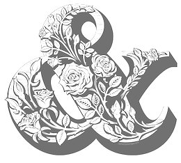
file name: Jamie Clarke Type Rose Ampersand 2015
| | |
|
Luc Devroye ⦿ School of Computer Science ⦿ McGill University Montreal, Canada H3A 2K6 ⦿ lucdevroye@gmail.com ⦿ https://luc.devroye.org ⦿ https://luc.devroye.org/fonts.html |


