TYPE DESIGN INFORMATION PAGE last updated on Thu Apr 16 22:17:34 EDT 2026
FONT RECOGNITION VIA FONT MOOSE
|
|
|
|
Frere Jones Type
[Tobias Frere-Jones]
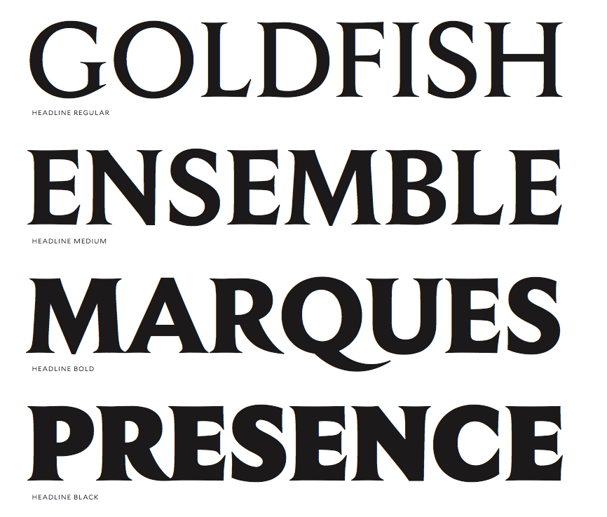
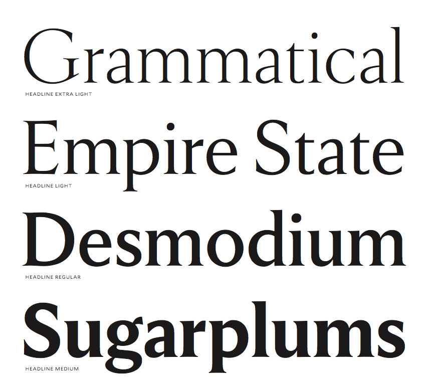
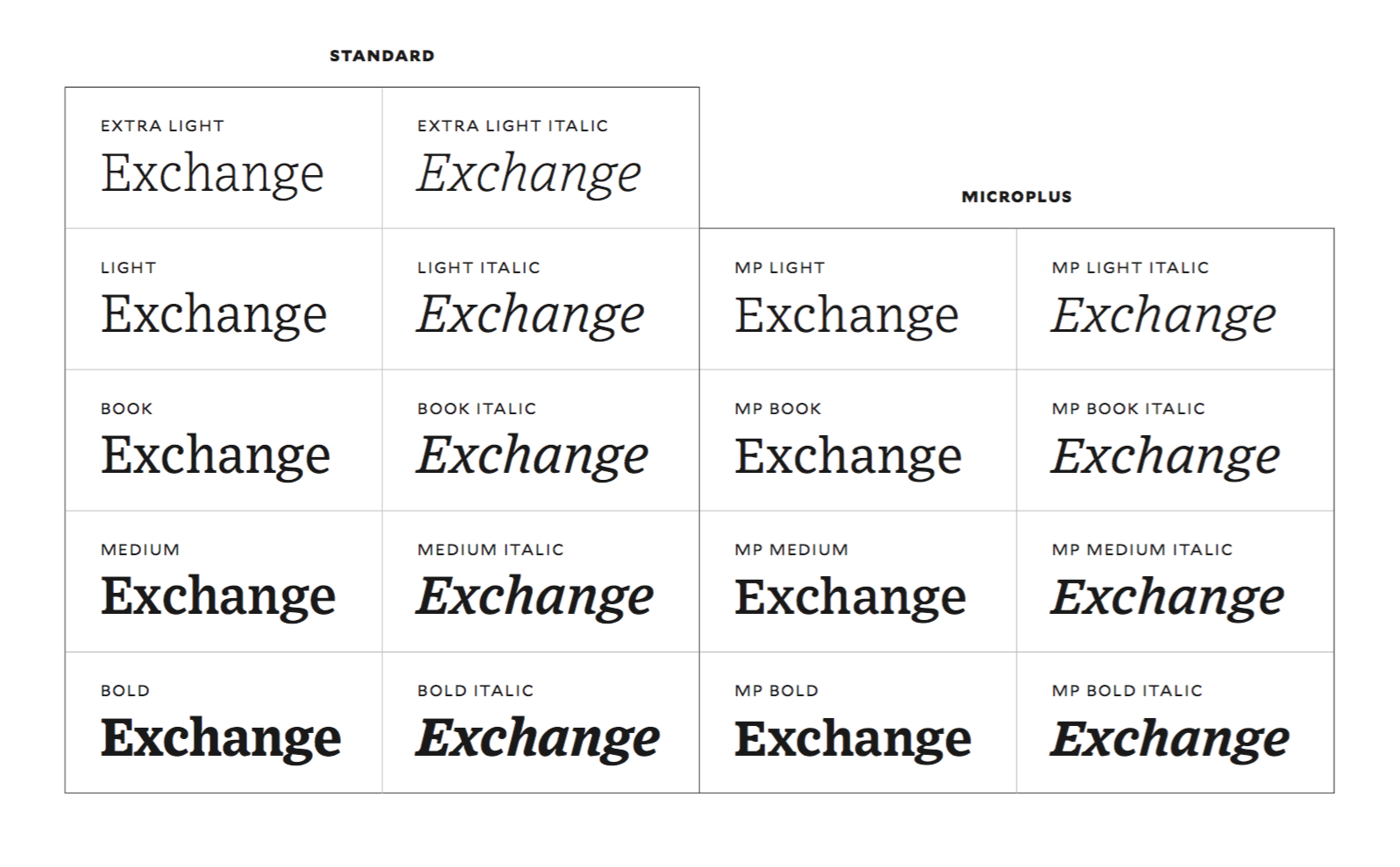
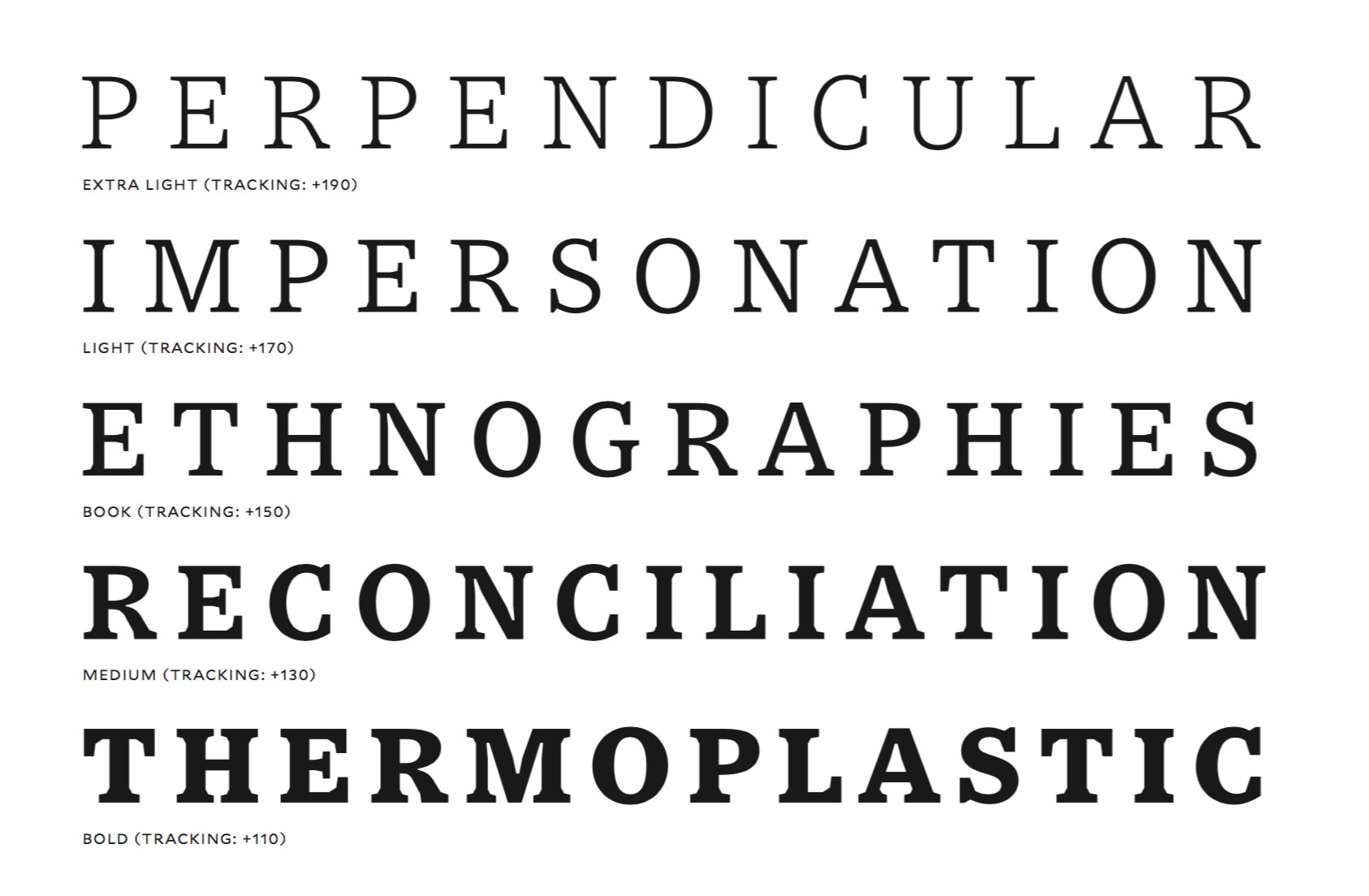
After his break-up with Jonathan Hoefler, Tobias Frere-Jones set up shop as Frere Jones Type in Brooklyn, NY, in 2015, and joined Type Network in 2020. His first typeface in his new skin is the sans typeface Mallory (2015: contributions by Graham Bradley, Erin McLaughlin, Aoife Mooney and Tim Ripper). Mallory is an all-purpose font but is motivated by small mobile devices. It is legible on screen and in print. It includes currencies for countries that have released new symbols like the Indian rupee and Turkish lira. In 2016, he published the sans family for screen, mobile app and desktop, Retina, in seven weights, three widths and two sizes. Retina's MicroPlus styles are engineered to occupy the same space in any weight. To remain legible, deep notches and exaggerated carefully studied ink traps are applied. The Museum of Modern Art has recognized Retina as a milestone in type design, and acquired it for its Architecture and Design Collection. Retina was designed by Tobias Frere-Jones, with contributions by Graham Bradley, Nina Stössinger, Tim Ripper, Dave Foster, Octavio Pardo, Ksenya Samarskaya and Colin Ford. Exchange (2006-2017) was designed by Tobias Frere-Jones, with contributions by Nina Stössinger, Fred Shallcrass, Tim Ripper and Graham Bradley: Originally designed for newspaper text, Exchange strives for clarity and efficient copyfit across multiple platforms. Its strategy relies on an unorthodox collection of historical references, from nineteenth-century Britain to Depression-era America. The strategy for word shape coherence comes from the early Ionic style of slab serifs, while Bell Gothic offers a lesson in reinforcing the individual identities of letters. Sure-footed sobriety, inherited from Victorian text faces, runs throughout. The deep notches and amplified details make Exchange a kind of cousin to Retina, bringing the same defensive strategy to more traditional text settings. Early inspiration came from the British Ionic style of slab serif, Lynn B. and M.F. Benton's Century Expanded, and C.H. Griffith's Bell Gothic. In 2018, Tobias Frere-Jones and Nina Stössinger co-designed the modernized roman inscriptional typeface Empirica Headline (with contributions by Fred Shallcrass). It has original lower case letters and italics, and is largely based on Louis Perrin. Conductor (2018, Tobias Frere-Jones and Nina Stoessinger) is originally based on the delicate, blocky numerals from vintage Bulgarian lottery tickets. It also incorporates elements of vernacular shopfront lettering and mid-century type design. Conductor has power and pizzazz in all of its four widths, from condensed to wide. Custom typefaces: Sixty Thirty (for Cooper Hewitt), Donors Choose (with Nina Stössinger), TD Ameritrade Sans, Culver (for Hyperakt), Bosca, Essex Market (with Nina Stössinger), ACLU, Tableau (with Tim Ripper; for Tableau Software), AdAge (for OCD), Mallory Condensed (for Academy Sports), Topic (a piano key typeface), MSL Elzevir (for Martha Stewart Weddings). In 2021, Tobias Frere-Jones, Nina Stössinger and Fred Shallcrass designed Seaford for use in Microsoft's Office. They write: Seaford is a robust, versatile sans serif that evokes the familiarity and comfort of old-style seriffed type. With everyday Office users in mind---professionals typing up reports or correspondence, preparing school handouts or corporate presentations---we designed Seaford to be inviting, engaging, and effortlessly readable. A good font family for a miserable piece of software. At Frere Jones / Type Network, one can buy Tobias's older typefaces: Armada, Asphalt, Cafeteria, Citadel, Epitaph, Garage Gothic, Grand Central, Griffith Gothic, Hightower, Interstate, Interstate Mono, Interstate Pi, Niagara, Nobel, Pilsner, Reiner Script, Stereo. |
EXTERNAL LINKS |
| | |

file name: Tobias Frere Jones Nina Stoessinger Fred Shallcrass Seaford 2021

file name: Tobias Frere Jones Nina Stoessinger Fred Shallcrass Seaford 2021
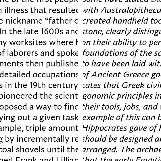
file name: Tobias Frere Jones Nina Stoessinger Fred Shallcrass Seaford 2021
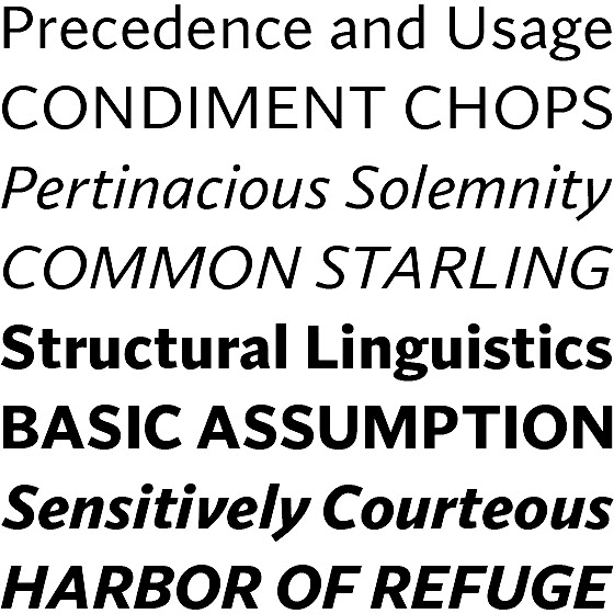
file name: Tobias Frere Jones Nina Stoessinger Fred Shallcrass Seaford 2021

file name: Tobias Frere Jones Nina Stoessinger Fred Shallcrass Seaford 2021

file name: Microsoft Corporation Seaford Bold 2020

file name: Tobias Frere Jones Nina Stossinger Empirica 2018

file name: Tobias Frere Jones Nina Stossinger Empirica 2018b
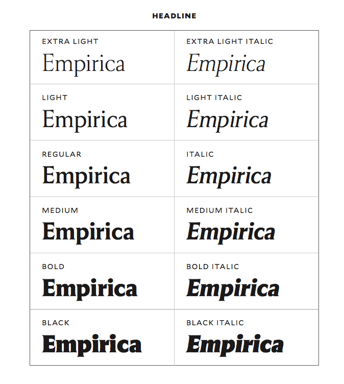
file name: Tobias Frere Jones Nina Stossinger Empirica 2018c
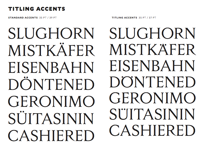
file name: Tobias Frere Jones Nina Stossinger Empirica 2018d
file name: Tobias Frere Jones Nina Stossinger Empirica 2018e

file name: Tobias Frere Jones Nina Stossinger Empirica 2018f
file name: Tobias Frere Jones Nina Stossinger Empirica 2018g

file name: Tobias Frere Jones Nina Stoessinger Conducto 2018

file name: Tobias Frere Jones Nina Stoessinger Conductor 2018

file name: Tobias Frere Jones Nina Stoessinger Conductor 2018

file name: Tobias Frere Jones Nina Stoessinger Conductor Bold Regular 2018
file name: Tobias Frere Jones Exchange 2017
file name: Tobias Frere Jones Exchange 2017
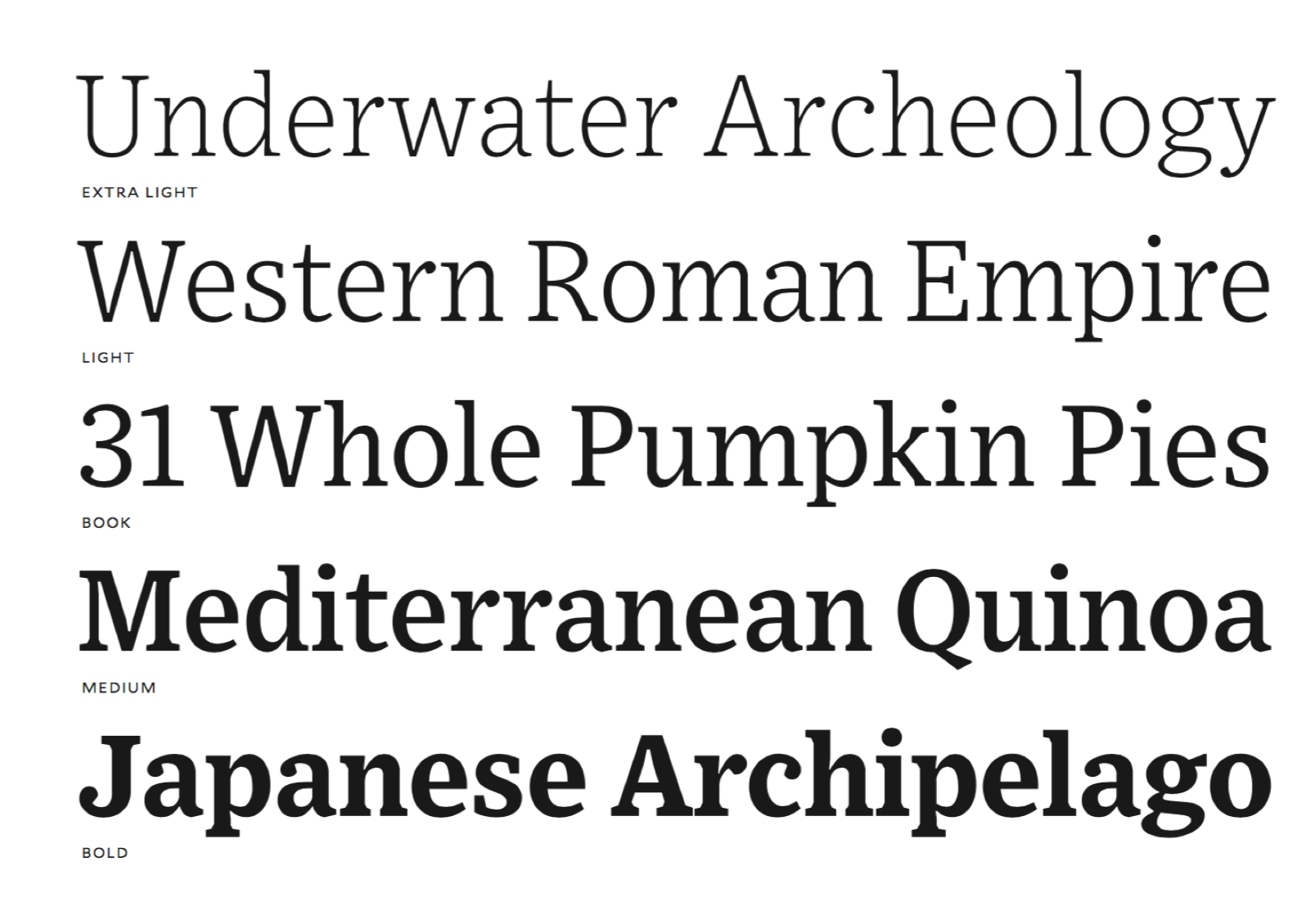
file name: Tobias Frere Jones Exchange 2017
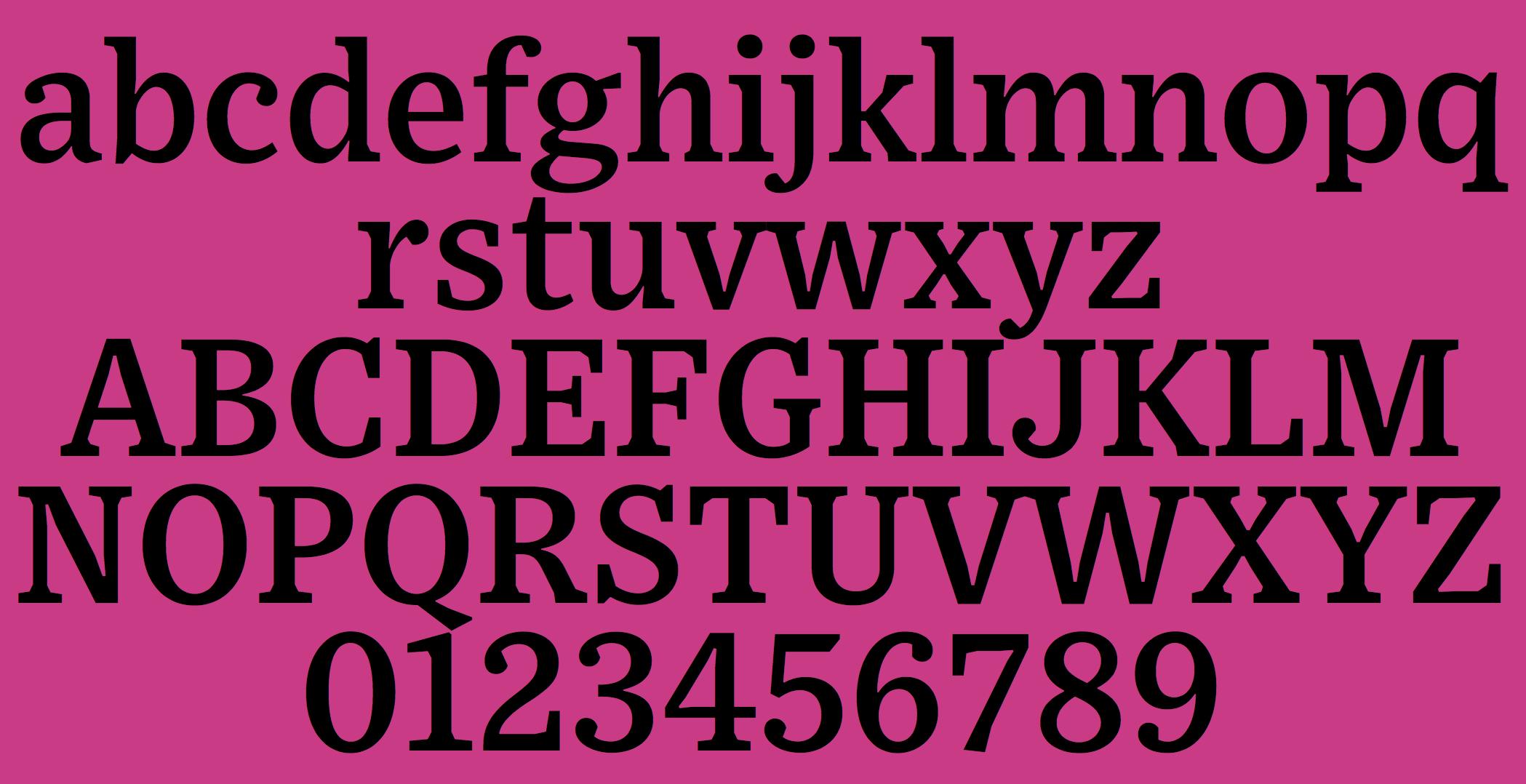
file name: Tobias Frere Jones Exchange 2017

file name: Tobias Frere Jones A C L U

file name: Tobias Frere Jones Ad Age

file name: Tobias Frere Jones Bosca

file name: Tobias Frere Jones Culver

file name: Tobias Frere Jones Donors Choose

file name: Tobias Frere Jones Elzevir

file name: Tobias Frere Jones Essex Market

file name: Tobias Frere Jones Mallory Condensed

file name: Tobias Frere Jones Sixty Thirty

file name: Tobias Frere Jones T D Ameritrade

file name: Tobias Frere Jones Tableau

file name: Tobias Frere Jones Topic

file name: Mallory Calibrated Book 600x160

file name: Tobias Frere Jones Mallory 2015b

file name: Tobias Frere Jones Mallory 2015c

file name: Tobias Frere Jones Mallory 2015d

file name: Tobias Frere Jones Mallory 2015e

file name: Tobias Frere Jones Mallory 2015f

file name: Tobias Frere Jones Mallory 2015k

file name: Tobias Frere Jones Mallory 2015h

file name: Tobias Frere Jones Mallory 2015i

file name: Tobias Frere Jones Mallory 2015j

file name: Tobias Frere Jones Retina 2016 c

file name: Tobias Frere Jones Retina 2016 d

file name: Tobias Frere Jones Retina 2016 e

file name: Tobias Frere Jones Retina 2016 f

file name: Tobias Frere Jones Retina 2016

file name: Tobias Frere Jones Retina 2016b

file name: Tobias Frere Jones Retina 2016c

file name: Tobias Frere Jones Retina 2016d

file name: Tobias Frere Jones Retina 2016e

file name: Tobias Frere Jones Retina 2016f

file name: Tobias Frere Jones Retina 2016g

file name: Tobias Frere Jones Retina 2016h

file name: Tobias Frere Jones Retina 2016i

file name: Tobias Frere Jones Retina 2016j

file name: Tobias Frere Jones Retina Micro Plus 2016

file name: Tobias Frere Jones Retina Micro Plus 2016b

file name: Tobias Frere Jones Retina Standard 2016

file name: Tobias Frere Jones Retina Standard 2016b

file name: Tobias Frere Jones Retina Standard 2016c

file name: Tobias Frere Jones F U S E 1995

file name: Tobias Frere Jones Pic
| | |
|
Luc Devroye ⦿ School of Computer Science ⦿ McGill University Montreal, Canada H3A 2K6 ⦿ lucdevroye@gmail.com ⦿ https://luc.devroye.org ⦿ https://luc.devroye.org/fonts.html |

