TYPE DESIGN INFORMATION PAGE last updated on Thu Apr 16 22:17:57 EDT 2026
FONT RECOGNITION VIA FONT MOOSE
|
|
|
|
Denis Gorohovskiy
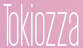
Kiev, Ukraine-based "designer" of the sans typefaces Axiom (2016) and Equilibrium (2016), Arsenal Slab (2016), Parabola (2016, geometric display font), the hairline avant-garde typeface Amsterdam (2016), the minimal rounded sans typeface family Straus (2016), the sans family Aurora (2016), the condensed sans display typeface Tokiozza Light (2016) and the circle-based display typeface Parabola (2016). Typefaces from 2017: Arson (sans family), Arthur, Adderley, Ashley, Azalea, Havana (a great super-heavy display sans), Atlas, Alicia, Martin, Apollo, Aroma, Tilt (modern geometric sans), Napster (ultra-condensed sans), Equilibrium, Arizona (condensed rounded sans), Argentina (a smooth high-contrast brush typeface), Aroma, Melony Sans, Argo (rounded monospaced sans), Aura (squarish sans), Bloke, Arnold Thin, Arnold Black (heavy geometric titling sans), Anima (rounded sans), Axiom Sans, Arcadia (minimalistic sans), Diod (a tall minimalist sans), Diod Bold, Aurora Thin, Emerald Modern Serif (a skyline typeface), Aqueduct, Arcanzas (a didone, +3D), Alabama (squarish and tall small caps), Antsy (a slab serif that comes across as a typewriter font), Steady Hand (handcrafted caps). Graphicriver link. Now, alert typophiles have pointed out that most---if not all---of Gorohovskiy's fonts are renamed and plainly stolen fonts. I leave the images on my site for the historical record. Here is a list of equivalences, as reported by this Italian blog:
|
EXTERNAL LINKS |
| | |

file name: Denis Gorohovskiy Adderley 2017

file name: Denis Gorohovskiy Adderley 2017b

file name: Denis Gorohovskiy Alabama 2017b

file name: Denis Gorohovskiy Alicia 2017

file name: Denis Gorohovskiy Amsterdam 2016

file name: Denis Gorohovskiy Amsterdam 2016a

file name: Denis Gorohovskiy Anima 2017

file name: Denis Gorohovskiy Anima 2017b

file name: Denis Gorohovskiy Antsy 2016

file name: Denis Gorohovskiy Antsy 2016b

file name: Denis Gorohovskiy Apollo 2017

file name: Denis Gorohovskiy Apollo 2017b

file name: Denis Gorohovskiy Aqueduct 2017

file name: Denis Gorohovskiy Aqueduct 2017a

file name: Denis Gorohovskiy Arcadia 2017

file name: Denis Gorohovskiy Arcadia 2017b

file name: Denis Gorohovskiy Arcadia 2017c

file name: Denis Gorohovskiy Arcadia 2017d

file name: Denis Gorohovskiy Arcadia Bold 2017

file name: Denis Gorohovskiy Arcanzas 2016

file name: Denis Gorohovskiy Arcanzas 2016b

file name: Denis Gorohovskiy Arcanzas 2016c

file name: Denis Gorohovskiy Arcanzas 2017

file name: Denis Gorohovskiy Arcanzas 2017b

file name: Denis Gorohovskiy Arcanzas3 D 2017

file name: Denis Gorohovskiy Arcanzas3 D 2017b

file name: Denis Gorohovskiy Argentina 2017

file name: Denis Gorohovskiy Argentina 2017a

file name: Denis Gorohovskiy Argentina 2017b

file name: Denis Gorohovskiy Argo 2017

file name: Denis Gorohovskiy Arizona 2017

file name: Denis Gorohovskiy Arizona 2017a

file name: Denis Gorohovskiy Arnold Black 2017

file name: Denis Gorohovskiy Arnold Black 2017b

file name: Denis Gorohovskiy Arnold Black 2017c

file name: Denis Gorohovskiy Arnold Thin 2017

file name: Denis Gorohovskiy Arnold Thin 2017b

file name: Denis Gorohovskiy Aroma 2017

file name: Denis Gorohovskiy Aroma 2017

file name: Denis Gorohovskiy Arsenal Slab 2016

file name: Denis Gorohovskiy Arsenal Slab 2016b

file name: Denis Gorohovskiy Arsenal Slab 2016c

file name: Denis Gorohovskiy Arsenal Slab 2016d

file name: Denis Gorohovskiy Arson Bold 2017

file name: Denis Gorohovskiy Arson Pro 2017

file name: Denis Gorohovskiy Arson Pro 2017b

file name: Denis Gorohovskiy Ashley 2017

file name: Denis Gorohovskiy Ashley 2017b

file name: Denis Gorohovskiy Atlas 2017

file name: Denis Gorohovskiy Atlas 2017b

file name: Denis Gorohovskiy Aura 2017

file name: Denis Gorohovskiy Aurora 2016

file name: Denis Gorohovskiy Axiom 2016

file name: Denis Gorohovskiy Axiom Bold 2017

file name: Denis Gorohovskiy Axiom Sans 2016

file name: Denis Gorohovskiy Bloke 2017

file name: Denis Gorohovskiy Diod 2017

file name: Denis Gorohovskiy Diod 2017b

file name: Denis Gorohovskiy Diod Bold 2017

file name: Denis Gorohovskiy Emerald Modern Serif 2017

file name: Denis Gorohovskiy Emerald Modern Serif 2017b

file name: Denis Gorohovskiy Emerald Modern Serif 2017c

file name: Denis Gorohovskiy Equilibrium 2016

file name: Denis Gorohovskiy Equilibrium 2017

file name: Denis Gorohovskiy Havana 2017

file name: Denis Gorohovskiy Havana 2017

file name: Denis Gorohovskiy Havana 2017b

file name: Denis Gorohovskiy Martin 2017

file name: Denis Gorohovskiy Melony Sans 2017

file name: Denis Gorohovskiy Napster 2017

file name: Denis Gorohovskiy Parabola 2016

file name: Denis Gorohovskiy Steady Hand 2017

file name: Denis Gorohovskiy Straus 2016

file name: Denis Gorohovskiy Tilt 2017

file name: Denis Gorohovskiy Tilt 2017b

file name: Denis Gorohovskiy Tokiozza Light 2016

file name: Denis Gorohovskiy Tokiozza Light 2016b

file name: Denis Gorohovskiy Tokiozza Light 2016c
| | |
|
Luc Devroye ⦿ School of Computer Science ⦿ McGill University Montreal, Canada H3A 2K6 ⦿ lucdevroye@gmail.com ⦿ https://luc.devroye.org ⦿ https://luc.devroye.org/fonts.html |

