TYPE DESIGN INFORMATION PAGE last updated on Thu Apr 16 22:18:06 EDT 2026
FONT RECOGNITION VIA FONT MOOSE
|
|
|
|
London Underground
[Edward Johnston]
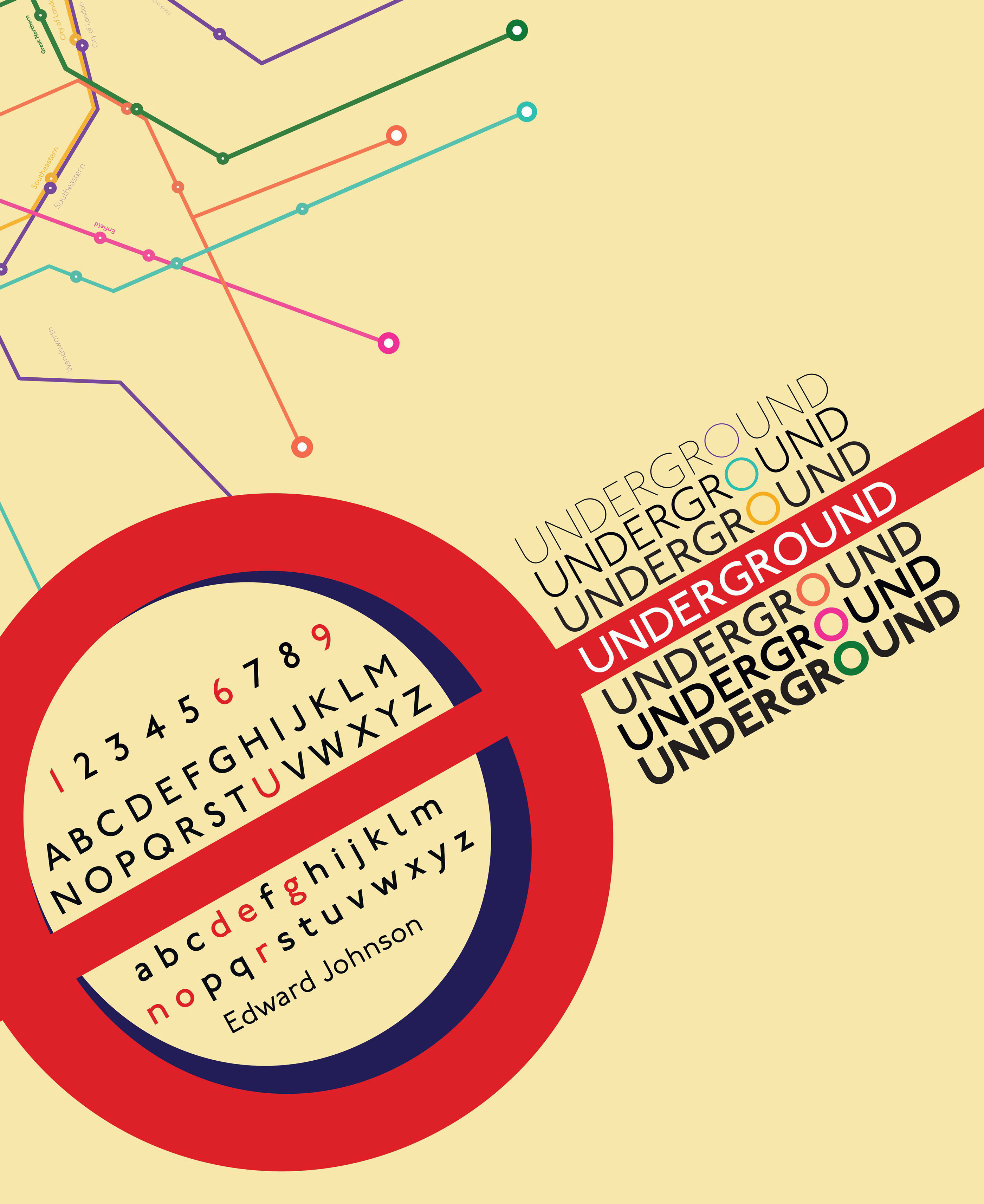
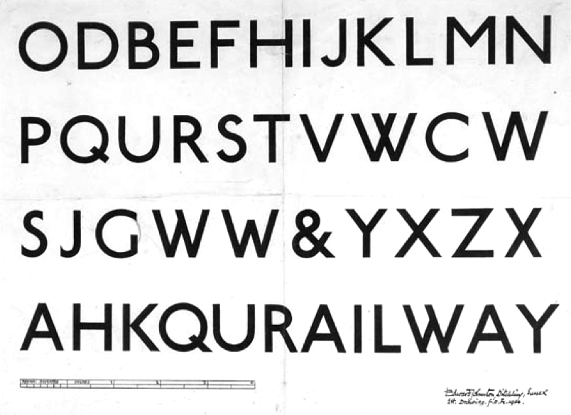
Born in Uruguay in 1872 to Scottish parents, Edward Johnston interrupted his medical studies in 1898 to become an artist. An introduction to the principal of the new Central School of Arts & Crafts in London, an institution developed directly from the Arts and Crafts movement of William Morris and John Ruskin, led him to calligraphy. Johnston became a teacher at the school, which is largely credited with the modern British Craft revival. In 1913, Johnston was commissioned to design a brand new lettering for the architecture, signage, and logos of the Underground by Frank Pick, commercial manager for the London Underground Railway. The station signs at the time were a mixture of serif and sans serif lettering. Pick wanted a signage design that had consistency and clarity with the bold simplicity of the authentic lettering of the finest periods, and yet belonging unmistakably to the 20th century. Edward Johnston drew the entire alphabet by hand---a sans serif typeface now known as Johnston Sans. Delayed by the outbreak of World War I, the typeface was finished in 1916. Some of the initial signage was painted by hand. By 1929, Johnston Sans was the basis for all signage across the London Underground, and has only been altered once, in 1979. It has since become a cornerstone of the visual identity of London. |
EXTERNAL LINKS |
| | |

file name: Edward Johnston London Underground 1916

file name: Edward Johnston London Underground 1916b

file name: Edward Johnston London Underground 1916c

file name: Edward Johnston Underground 1916 poster by Emily Lopes Pedro Philipe 2020

file name: I T C I T C Johnston 2011

file name: P22 P22 London Underground 2011

file name: P22 P22 Underground Basic 2011

file name: P22 P22 Underground Pro 2021

file name: P22 P22 Underground Pro 2011

file name: Edward Johnston Railway Type Design 1914
| | |
|
Luc Devroye ⦿ School of Computer Science ⦿ McGill University Montreal, Canada H3A 2K6 ⦿ lucdevroye@gmail.com ⦿ https://luc.devroye.org ⦿ https://luc.devroye.org/fonts.html |
