TYPE DESIGN INFORMATION PAGE last updated on Thu Apr 16 22:18:38 EDT 2026
FONT RECOGNITION VIA FONT MOOSE
|
|
|
|
Bank Gothic
Bank Gothic, in three weights and two widths, was designed in 1930-1933 by Morris Fuller Benton for ATF, which introduced the normal widths in 1930. Mac McGrew writes: It is a more squarish, contemporary adaptation of letters on the order of Copperplate Gothic, useful primarily for the same sort of forms and stationery work. Linotype has the same typeface in regular widths; it is called Commerce Gothic on Ludlow and DeLuxe Gothic on Intertype, while Monotype Stationers Gothic is similar. From these sources it follows the usual custom of small lining types with several sizes being made for each of several body sizes so that they can readily be used in a variety of cap-and-small-cap combinations. But Linotype cut condensed versions in 1936 as Card Gothic, in only one size each of6- and 12-point. Poster Gothic (q.v.) is the same design as Bank Gothic Condensed Medium but made in larger sizes and fitted more tightly. In the digital era, Bank Gothic has continued its progress, with new styles and weights added by various companies. Incredibly, Bank Gothic was trademarked by the Grosse Pointe Group / FontHaus in 2007 [a black eye to the trademark office in the USA]. Digital versions of Bank Gothic include:
|
EXTERNAL LINKS |
| | |
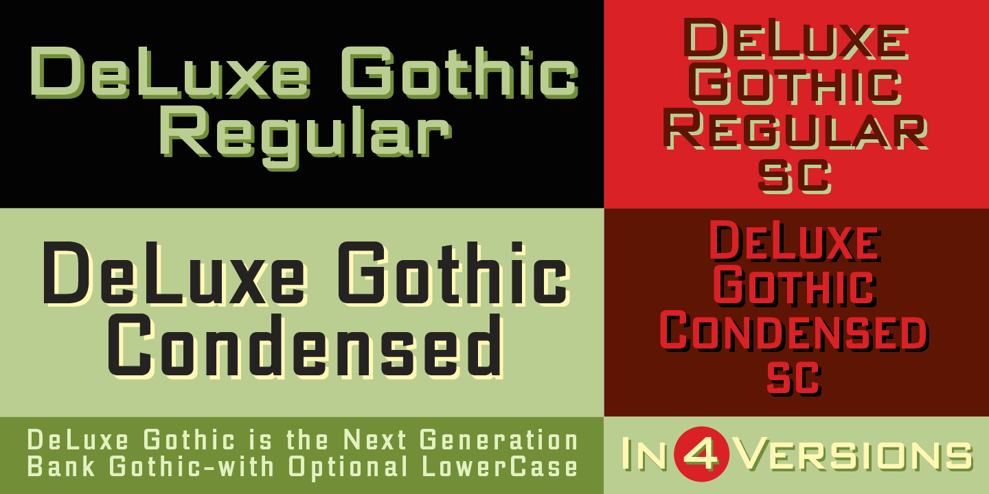
file name: Alphabet Soup De Luxe Gothic 2010 127643

file name: Alphabet Soup De Luxe Gothic 2010 46652

file name: Bitstream Bank Gothic 2000 197328

file name: Bitstream Bank Gothic 2000 197329

file name: Bitstream Bank Gothic 2000 197329
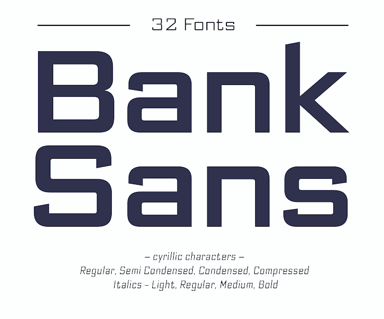
file name: Elsner Flake Bank Sans E F 2016 208760
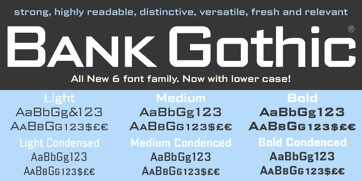
file name: Group Type Bank Gothic 2006 47502
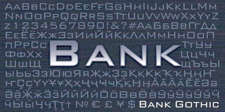
file name: Para Type Bank Gothic 2000 28892
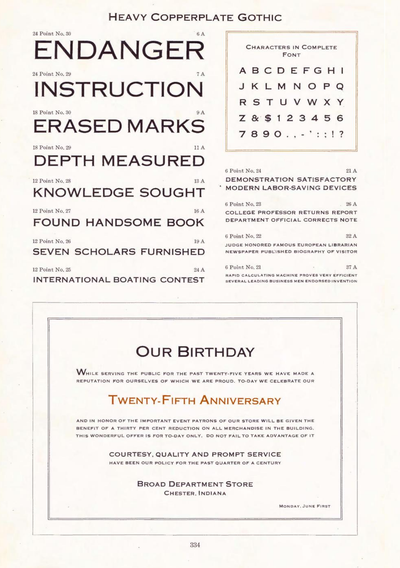
file name: A T F Heavy Copperplate Gothic 1923
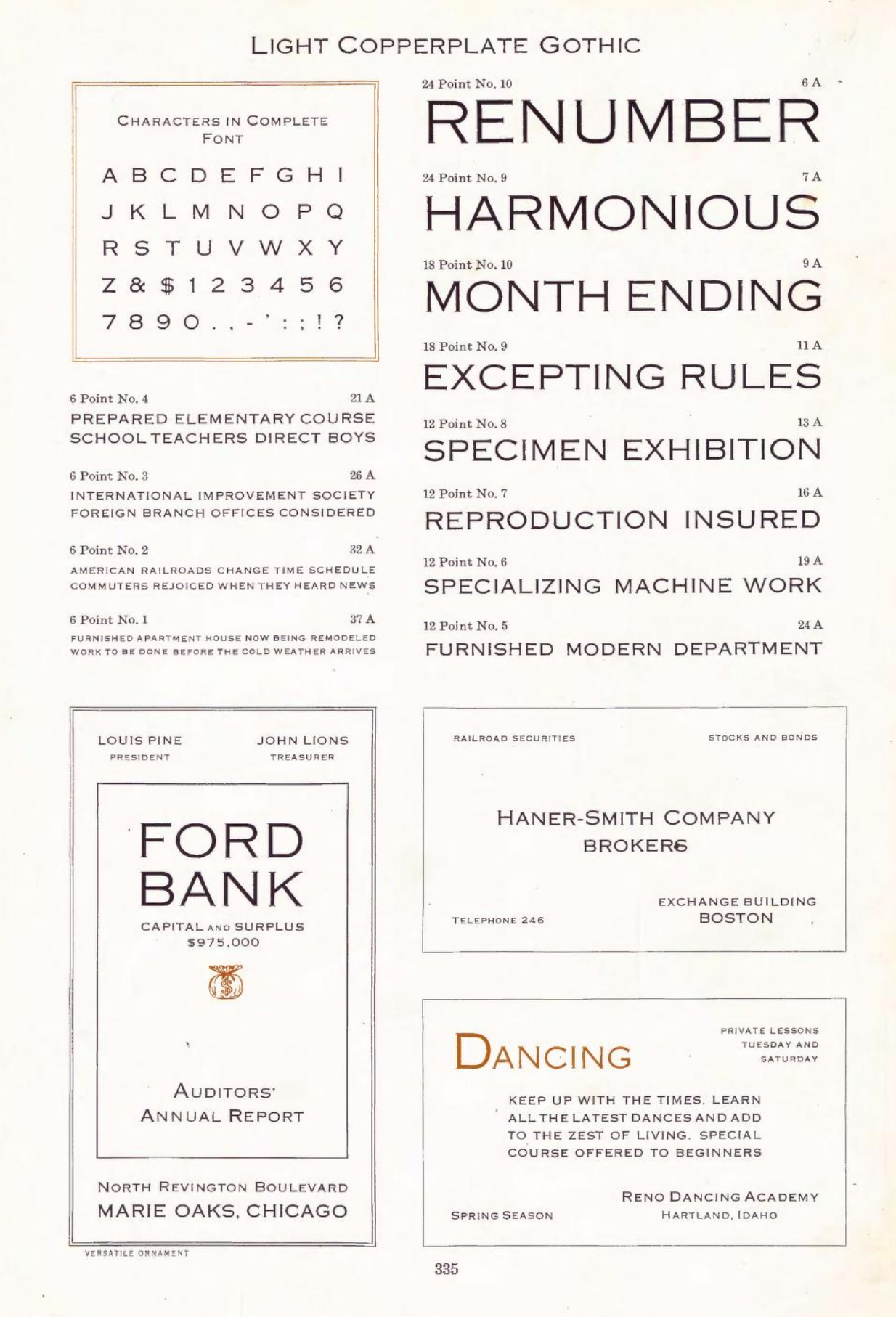
file name: A T F Light Copperplate Gothic 1923

file name: Dan Reynolds Morris Sans 2008

file name: Dan Reynolds Morris Sans 2008

file name: Dan Reynolds Morris Sans 2008

file name: Dan Reynolds Morris Sans 2008

file name: Typodermic Nesobrite 2006 181753
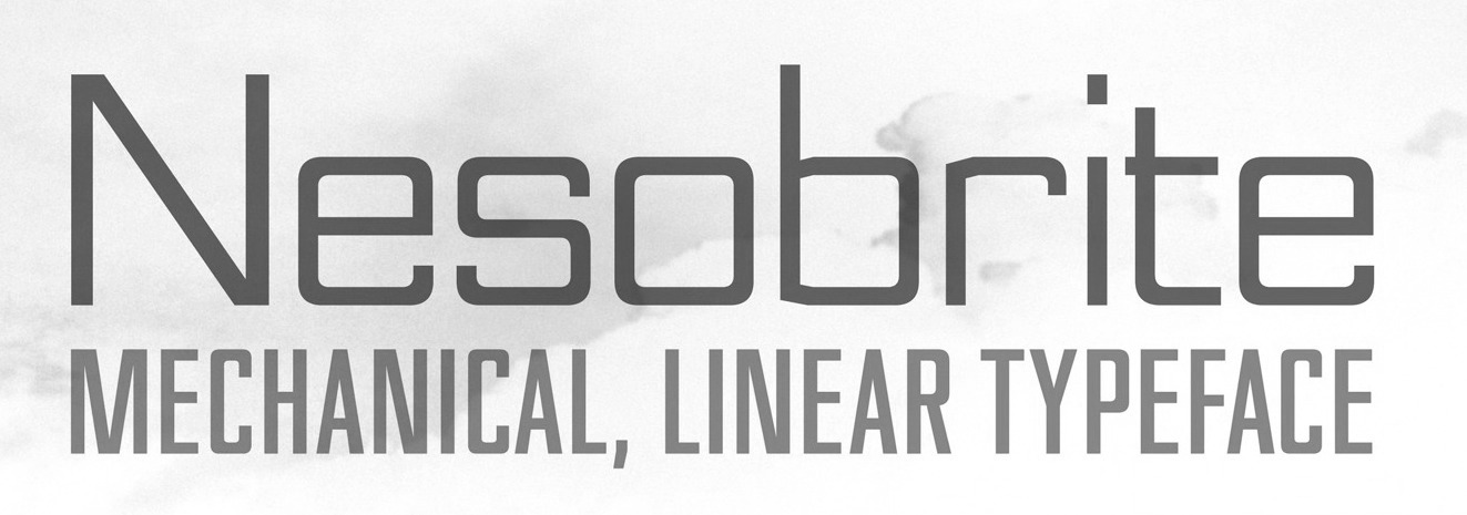
file name: Typodermic Nesobrite 2006 184599

file name: Typodermic Nesobrite 2006 191584
| | |
|
Luc Devroye ⦿ School of Computer Science ⦿ McGill University Montreal, Canada H3A 2K6 ⦿ lucdevroye@gmail.com ⦿ https://luc.devroye.org ⦿ https://luc.devroye.org/fonts.html |
