TYPE DESIGN INFORMATION PAGE last updated on Thu Apr 16 22:18:56 EDT 2026
FONT RECOGNITION VIA FONT MOOSE
|
|
|
|
Nonpareil Type
[Jerry Kelly]
Type foundry offering exclusive typefaces, often revivals or interpretatins of historic types. Their typefaces include:
|
EXTERNAL LINKS |
| | |

file name: Jerry Kelly Foundry Centaur 2015 based on Bruce Rogers Centaur 1914

file name: Jerry Kelly Rilke 2015

file name: Jerry Kelly Rilke 2015a

file name: Jerry Kelly Rilke 2015b
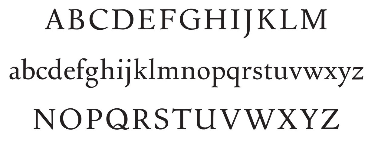
file name: Nonpareil Emerson

file name: Nonpareil Emerson
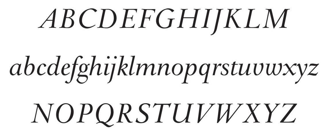
file name: Nonpareil Emerson
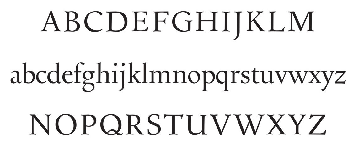
file name: Nonpareil Emerson
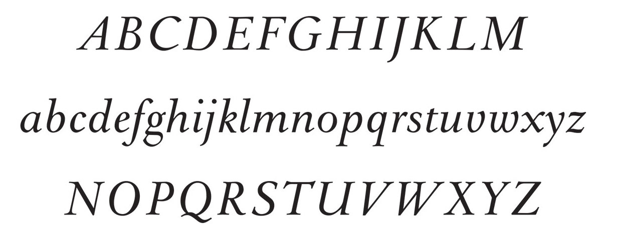
file name: Nonpareil Emerson
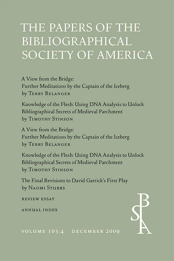
file name: Nonpareil Emerson
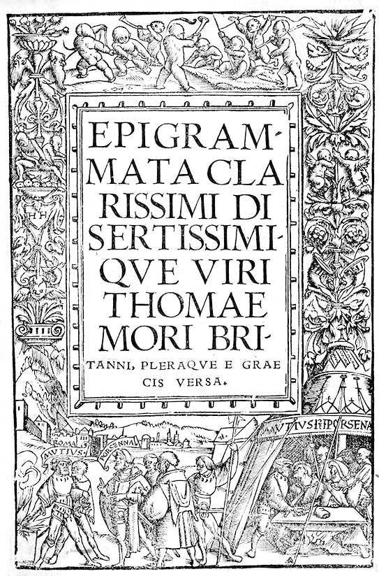
file name: Nonpareil Epigrammata

file name: Nonpareil Epigrammata
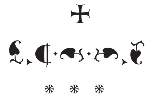
file name: Nonpareil Epigrammata
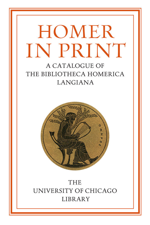
file name: Nonpareil Epigrammata
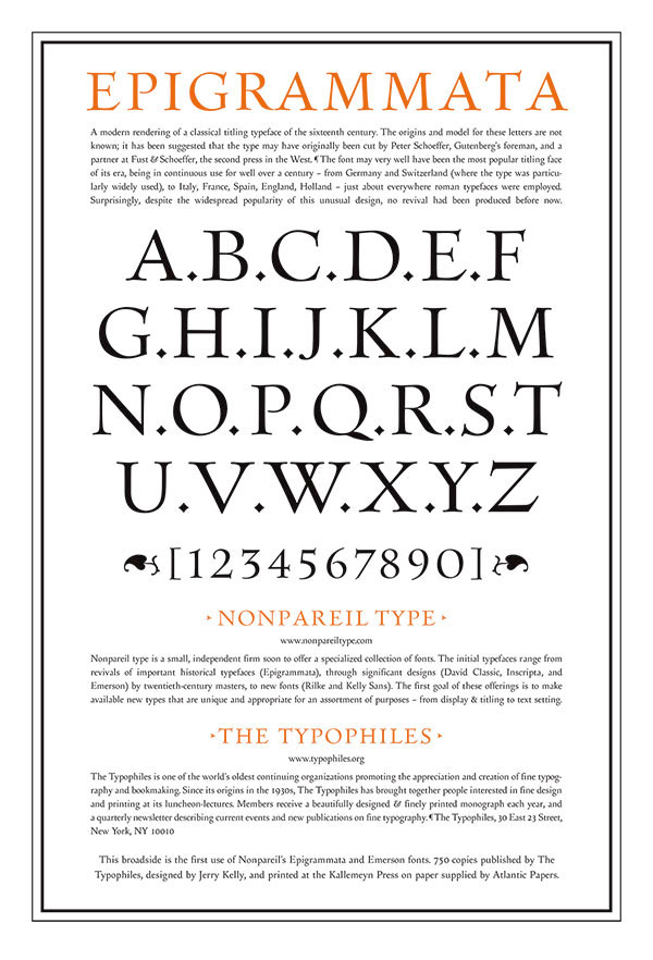
file name: Nonpareil Epigrammata

file name: Nonpareil Logo

file name: Nonpareil David Hadash 2012 after Ismar David David Hebrew 1954

file name: Nonpareil David Hadash 2012 after Ismar David David Hebrew 1954b

file name: Nonpareil David Hadash 2012 after Ismar David David Hebrew 1954c

file name: Nonpareil David Hadash 2012 after Ismar David David Hebrew 1954f

file name: Monotype David Hadash 2012

file name: Monotype David Hadash Biblical 2012

file name: Monotype David Hadash Formal 2012

file name: Monotype David Hadash Sans 2012

file name: Monotype David Hadash Script 2012
| | |
|
Luc Devroye ⦿ School of Computer Science ⦿ McGill University Montreal, Canada H3A 2K6 ⦿ lucdevroye@gmail.com ⦿ https://luc.devroye.org ⦿ https://luc.devroye.org/fonts.html |

