TYPE DESIGN INFORMATION PAGE last updated on Fri May 1 17:48:13 EDT 2026
FONT RECOGNITION VIA FONT MOOSE
|
|
|
|
Deepdene
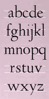
A typeface made in 1927 by Frederic Goudy. Mac McGrew on Deepdene: The roman of this series was designed and cut by Frederic W. Goudy in 1927 for his own Village Letter Foundery, and named for his estate at Marlboro-on-Hudson, which in turn was named for the street in Forest Hills, New York, where Goudy worked before moving to Marlboro in 1923. The accompanying italic was designed the following year, with matrices for the first trial size being cut by the designer's wife, Bertha M. Goudy. Of this italic, Goudy says, "I chose more or less to disregard tradition in an attempt to follow a line of my own, and drew each character without reference to any other craftsman's work. I think this italic shows a disciplined freedom which retains the essential quality of legibility." It has been described as having "an acid, typey quality," with interest, color, movement, and quaintness. Like many of Goudy's italics, the inclination is slight. When Monotype obtained rights to reproduce Deepdene, slight adjustments were necessary to adapt it to mechanical requirements in keyboard sizes. Goudy resented not being asked to make these adjustments, as some of them displeased him although they are not apparent to others. Deepdene Medium was designed by Goudy in 1931, and he cut one size. Monotype assigned a number to this face, but no evidence has been found that it was ever cut for that machine. Deepdene Bold and Italic were designed by Goudy in 1932-33 for Monotype, and released in 1934. Goudy says, "The Deepdene Bold Italic drawings gave me more trouble than any italic I had hitherto attempted. I finally scrapped all of my preliminary sketches and began a design that would not be merely a heavier facsimile of the italic Deepdene, since I had come to believe that a bold letter can do little more than approximate in form the roman it is to complement." Compare Californian. Deepdene was recut with the addition of swash letters and redesign of several other characters by Richard Ellis, with Goudy's approval, for a Knopf edition of Arthur Waley's Translations From the Chinese. He continues: Deepdene Open Text was designed by Frederic W. Goudy in 1931 as a heading type for Edmund G. Gress's book, Fashions in American Typography. for which Goudy had been asked to write an introduction. His Deepdene type was being used for text. Finding that nearly all letters were required for the many headings, Goudy completed the font. All letters are highlighted with a white line in the heavy strokes. The capitals are somewhat similar to Lombardic Caps, while the lowercase is somewhat like Goudy Text Shaded (q. v.). but much less rigid. Later Goudy cut the same typeface with the white line of the lowercase letters filled in, and called it Deepdene Text (1931). Also see Tory Text. Digital versions: LTC Deepdene (Lanston Type Company), Deepdene BQ (Berthold), D690 (Softmaker), Opti Deligne (Castcraft), Opti Deepdene (Castcraft), Linden Hill (2010, Barry Schwartz: free), URW Deepdene. |
EXTERNAL LINKS |
| | |

file name: Frederic Goudy Deepdene 1927

file name: Frederic Goudy Deepdene Bold Italic 1933

file name: Frederic Goudy Deepdene Italic 1928

file name: Frederic Goudy Deepdene Italic 1932

file name: Frederic Goudy Deepdene Medium 1931

file name: Frederic Goudy The Type Speaks Keepsake 1933 set in Deepdene Italic

file name: Frederic Goudy Deepdene Open Text 1931

file name: Frederic Goudy Deepdene Text 1931

file name: Berthold Deepdene

file name: Frederic Goudy Deepdene

file name: Frederic Goudy Deepdene

file name: Frederic Goudy Deepdene

file name: Frederic Goudy Deepdene

file name: Frederic Goudy Deepdene

file name: Barry Schwartz Linden Hill 2010

file name: Castcraft O P T I Deepdene

file name: U R W Deepdene

file name: U R W Deepdene

file name: U R W Deepdene 21153

file name: Berthold Deepdene F Goudy 1927 1934 G G Lange 1982 1983

file name: Berthold Deepdene Bold F Goudy 1927 1934 G G Lange 1982 1983
| | |
|
Luc Devroye ⦿ School of Computer Science ⦿ McGill University Montreal, Canada H3A 2K6 ⦿ lucdevroye@gmail.com ⦿ https://luc.devroye.org ⦿ https://luc.devroye.org/fonts.html |

