TYPE DESIGN INFORMATION PAGE last updated on Wed May 6 16:29:49 EDT 2026
FONT RECOGNITION VIA FONT MOOSE
|
|
|
|
Goudy Antique -- Goudy Lanston
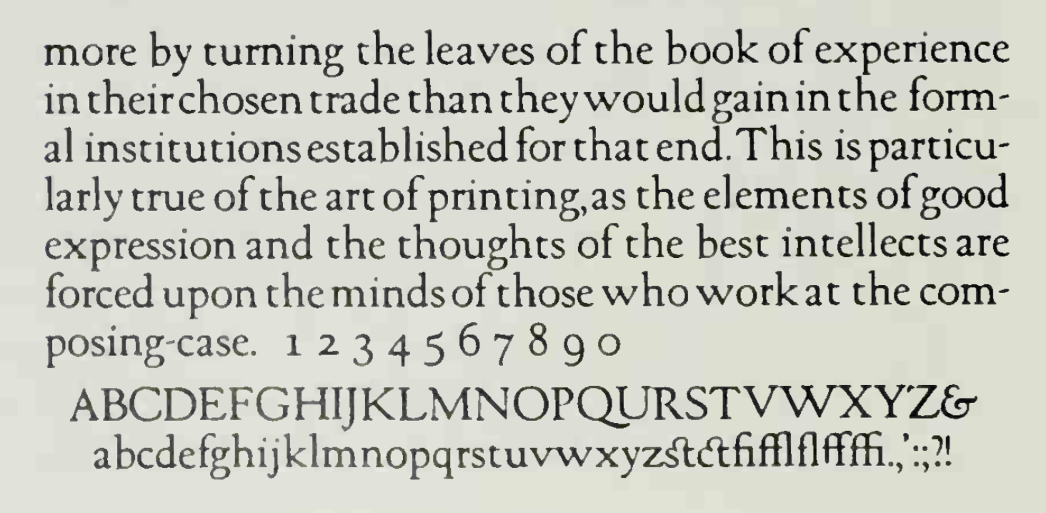
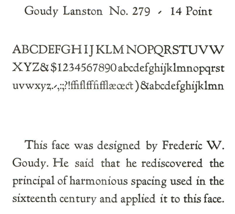
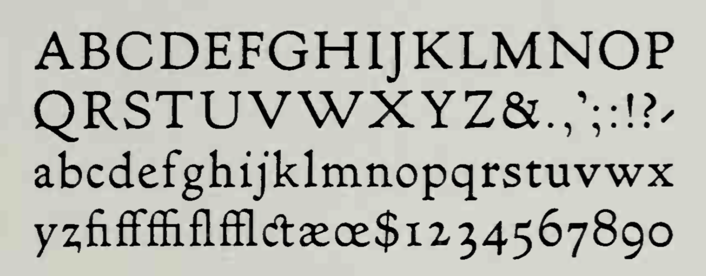
The Goudy Antique typeface was designed by Frederic Goudy in 1919. D.J.R. Bruckner: The date (1919) marks the beginning of the designs, which were first shown at the American Institute of Graphic Arts printing show in 1921. The matrices, the first Goudy cut himself, were finally engraved in 1926. Berry, Johnson and Jaspert write: [Lanston Monotype, Caslon c. 1922] Begun, says F.W. Goudy, in 1919. It is a Venetian in some respects, but it was intended as a Bold Face, and has the abbreviated descenders of such faces. The H has a high bar and there is the usual Goudy Q. In the lower case note the narrow f and the position of the dot over the i and j. The name RATDOLT ROMAN, after the Venetian printer, appears to be due to the Caslons. Italics were not cut to this face. Goudy Antique is the name, first indeed applied to Goudy's design No. 22 of 1912, cut by Lanston Monotype and rechristened Goudy Lanston, also cast (but not originated) by Stephenson Blake as Ratdolt Roman, but it was later applied to design No. 39, designed in 1919, cut in 1930 by Goudy himself. Mac McGrew gives different dates: Goudy Antique was designed by Goudy in 1919, but except for a few characters it was not cut until 1930, when three sizes were completed. Goudy says, "My intention was to design a letter which would displace the monotonous Bookman of the same color or weight, the individual letters of my Antique show a greater variety in their forms." Also see Goudy Lanston. Mac McGrew tells the story of Goudy Lanston: Goudy Lanston is the ultimate and best-known name for a typeface with a confusing set of earlier names. When Frederic Goudy designed it in 1912 for a private book project, he called it Goudy Old Style, and cut it in 16-point only. When the book project fell through, he offered the type for sale through his own Village Letter Foundery. Three years later, when he drew a new typeface for ATF, that company requested permission to use the name for this new face, so Goudy renamed his older typeface Goudy Antique. A dozen years later, Lanston Monotype arranged to put this typeface on their machine, but asked permission to call it Goudy Lanston, in honor of Tolbert Lanston, inventor of the machine. In announcing this typeface in 1912, Goudy said, "It is a sturdy letter free from affectation or caprice. ...Mr. Goudy believes that in this new letter he has rediscovered a principle in spacing individual letters used by letter founders before the 16th century, but not since, a principle to which the harmonious quality of a page of Jenson is largely due. Each letter stands on solid serifs of unusual shape which are so planned as to make each letter form conterminous with the type body, while permitting sufficient white space to set each letter off from its neighbor without destroying the unity of the word formed by its separate characters, thus permitting close spacing and avoiding looseness of composition." Caslon and Company of London acquired English rights to the face, but, in Goudy's words, "ruined the typeface (in my estimation) by putting it on standard line, and shortening the descenders to fit; also adding insult to injury by calling it 'Ratdolt.' It does not resemble Ratdolt's famous letter in any particular. The Caslons cut matrices and sent them to this countryman act contrary to customary ethics, since they owned English rights only---giving Hart, Schaffner&Marx the 'exclusive' right to the face. To this I protested, but took no other action. ..." In the widespread search for specimens for this book, a typeface which is surely this "exclusive" casting turned up in the cases of an Iowa private press operator, Rick von Holdt. He had acquired the type from a San Francisco typographer who knew nothing of its background. The typographer had shown it in his specimen book as Foster, although the cases were labeled Moore. It has the pin-mark of BB&S, but appears to match specimens of Ratdolt as shown by Stephenson Blake, successors to Caslon and Company. It has the shortened descenders which Goudy disliked, and a number of other little departures from his design. But surprisingly there is also a matching italic, likewise pinmarked BB&S. A line in a 1948 magazine refers to such a face---undoubtedly this one---as having been designed by Richard N. McArthur, advertising manager of that foundry at the time of that design. A footnote: That original book project in 1912 came from Robert Hewitt of Ardsley, New York, who had commissioned Frederic Trevor Hill to write a book about Abraham Lincoln and had asked Goudy to design a new type for it. Hewitt died before the book was set in type, and Goudy, who had not been paid, named the face Goudy Old Style and put it on the market. Revivals of Goudy Lanston include Goudy Lanston N. 279 (1976, ade Type Foundry). |
EXTERNAL LINKS |
| | |

file name: Frederic Goudy Goudy Antique 1919

file name: Frederic Goudy Goudy Antique 1919 Stephenson Blake Ratdolt Roman

file name: Cade Type Foundry Goudy Lanston No279 1976

file name: Frederic Goudy Goudy Lanston 1912
| | |
|
Luc Devroye ⦿ School of Computer Science ⦿ McGill University Montreal, Canada H3A 2K6 ⦿ lucdevroye@gmail.com ⦿ https://luc.devroye.org ⦿ https://luc.devroye.org/fonts.html |
